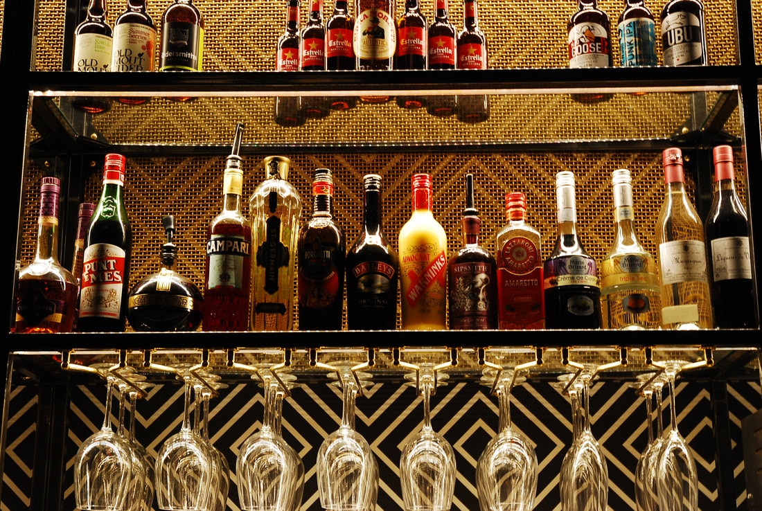
Structure
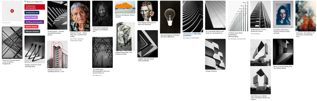
Structure can be divided into two; it can be the form and structure of the subject of the photo or the composition of the photo. If it is the subject one is changing you can photograph and separate the structure from it's background, or it can refer to the subject being an interesting structure. However, structure also refers to the composition of one's photograph, which people can use to create a different effect in the photograph or to make the photograph more aesthetically appealing.
Structure in Nature
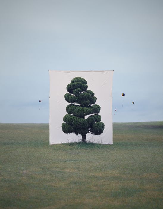
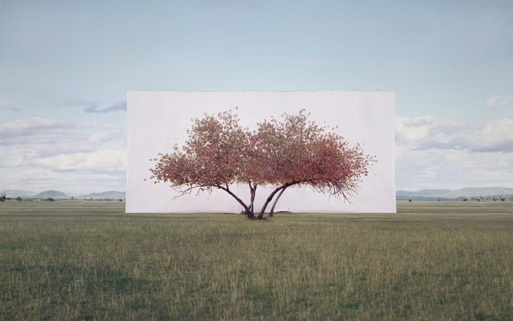
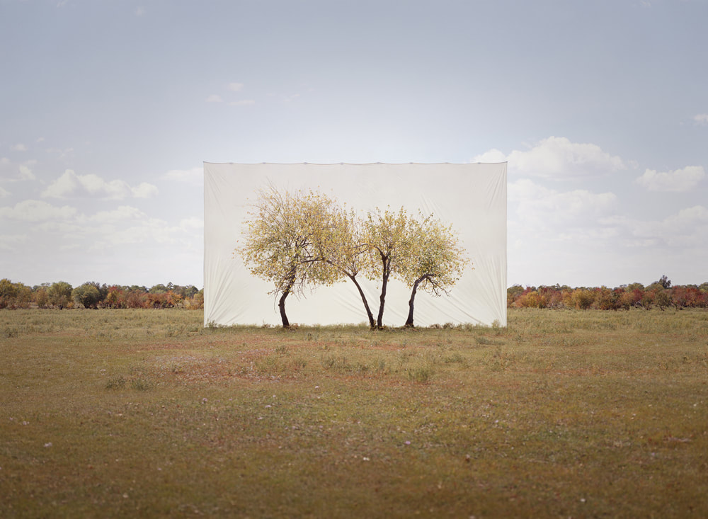
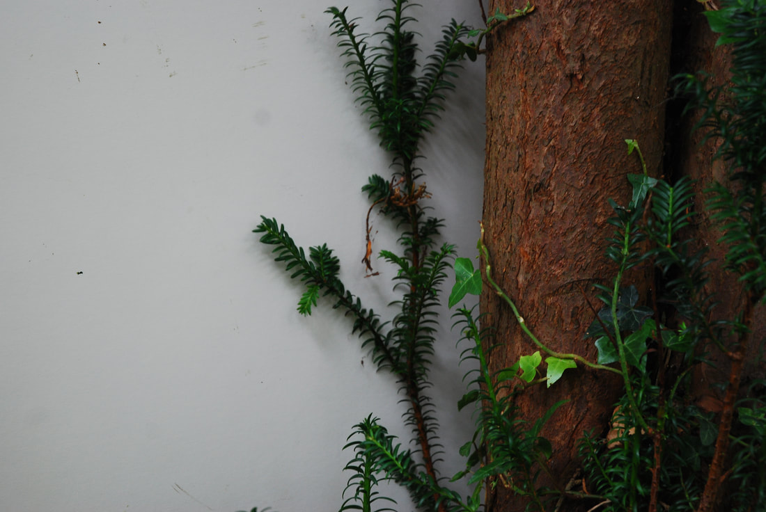
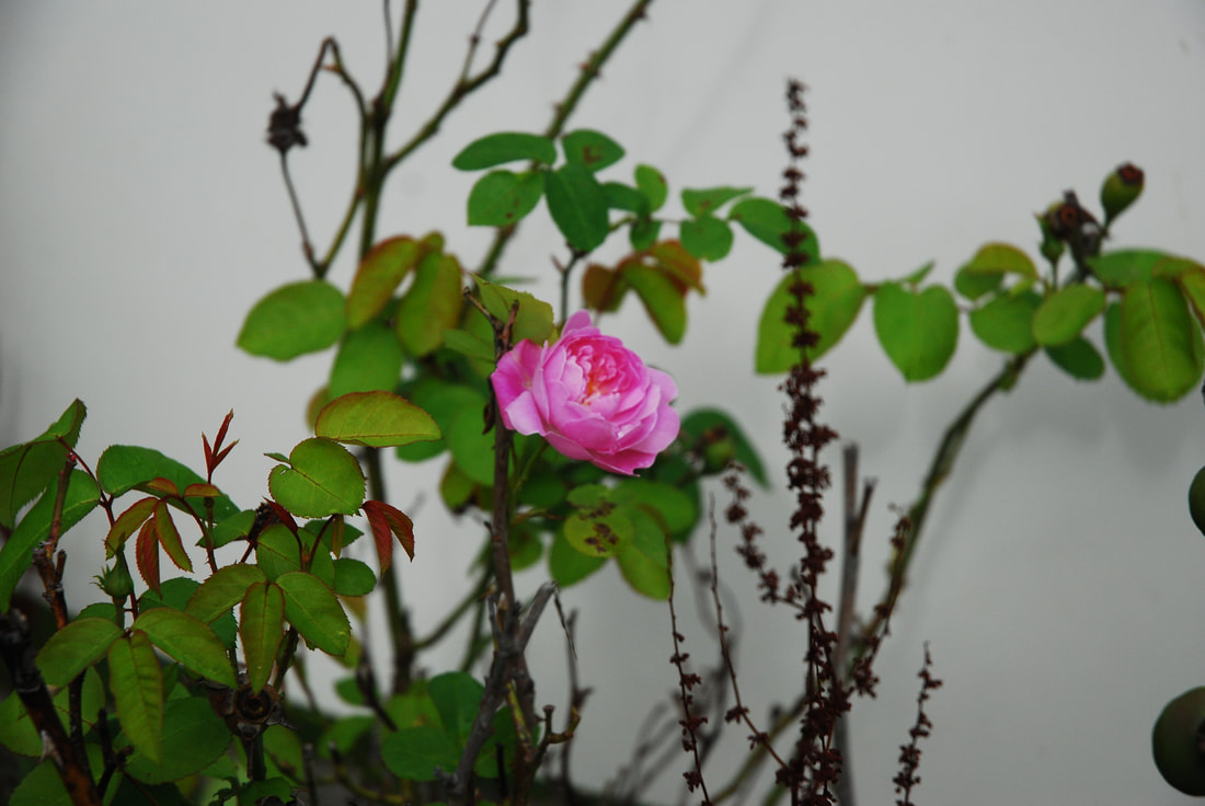
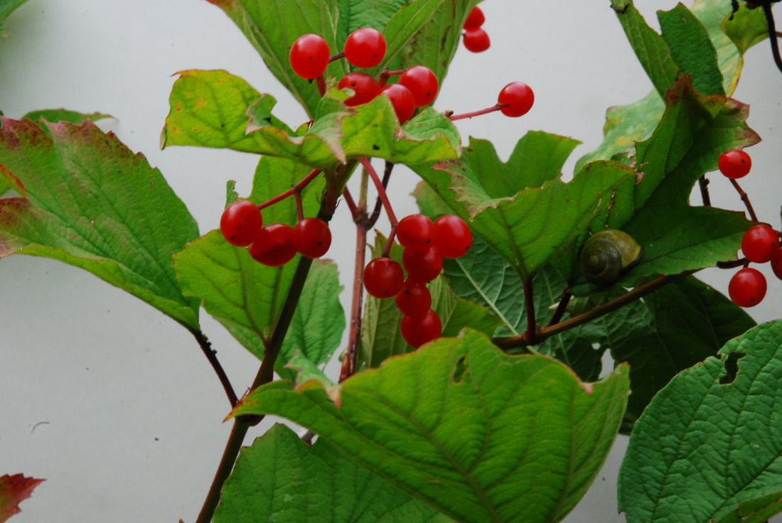
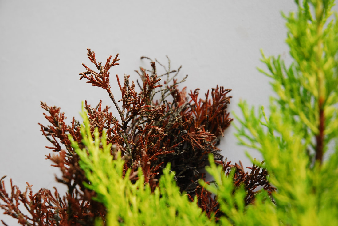
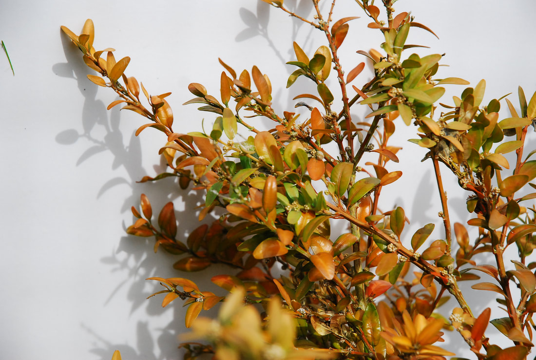
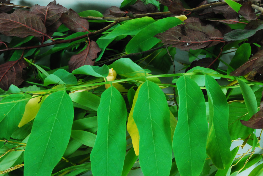
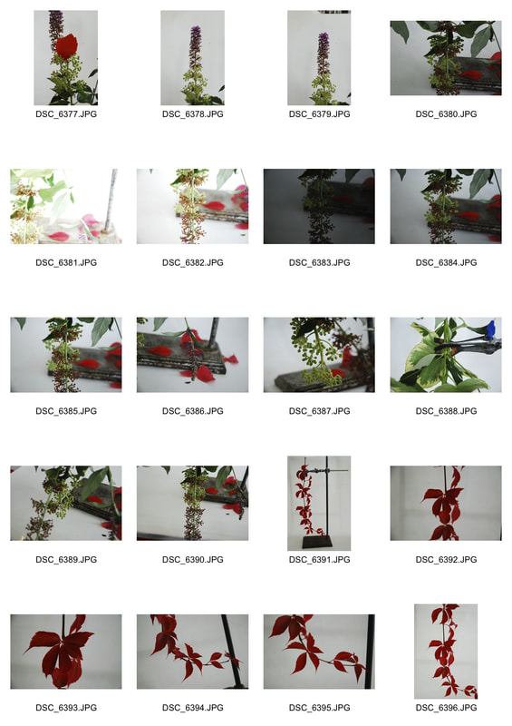
For this task we had to isolate a natural structure, such as a plant, by placing a white background behind it so it looks as if it is in a different environment. This was inspired by Myuong Ho Lee's work where she would go out to the nature surrounding Seoul, where she lives, and find an isolated group of trees or a single isolated tree and place a white background behind it to isolate it.
|
MYOUNG HO LEE
Myoung Ho Lee is a South Korean artist who wanted to explore questions about representation, reality, art, environment and perception through his work. He has famously done this through his project on trees. In this project Myoung Ho Lee aimed to separate the subjects from their original circumstances to create a border between subject and image. To achieve this separation between subject and image Myoung Ho Lee used a large 60x45 feet white sheet of fabric therefore separating the subject with a neutral background from it's |
|
original context therefore making the object ambiguous and alien to it's newfound location.
His pictures are generally composed through 4 steps:
1. Selection of the subject
2. Separation of the subject
3. Photographing
4. Confirmation of the separation
For Myoung Ho Lee the execution of the process and photograph was essential to the success of the project. Myoung Ho Lee carefully selects the tree in South Korea and then places it against the 60x45 feet canvas with the help of two cranes, ropes, bars and a production team. He then removes all of this after through digital retouching to make the canvas look like it is floating. However, it is not just the background that concerns Myoung Ho Lee but the time of day, season and the tree's surroundings; all three of these lend themselves to creating the ambience of the tree and photograph.
Myoung Ho Lee chose to use the tree "because you see it everyday but people forget it's there." So by isolating it he forces the audience to focus entirely on the tree and only later give thought to it's surroundings and therefore successfully exploring the questions he had.
First Response
|
Selects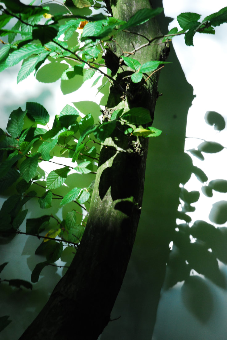 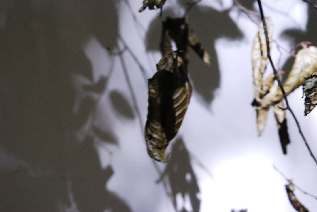 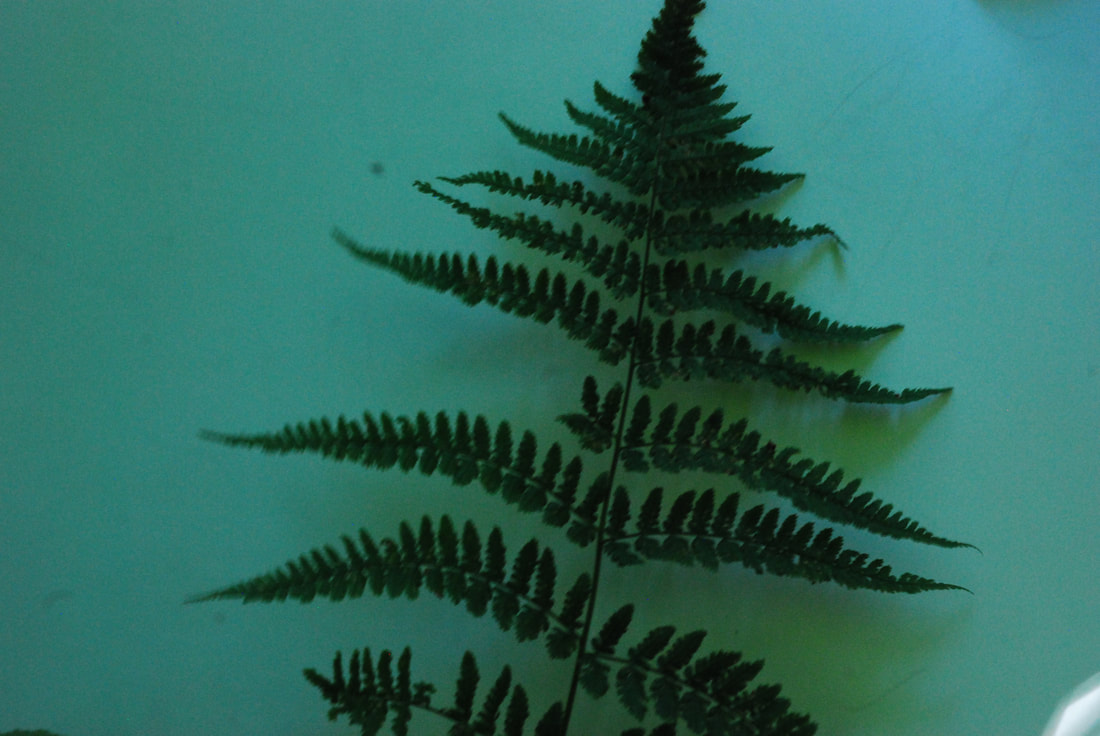 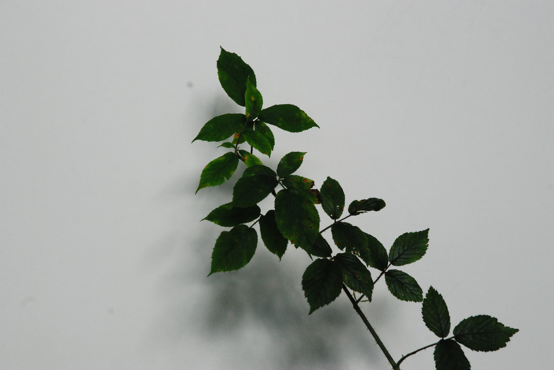 |
I think that the last photograph is the most successful out of these four selects as I think that I achieved the best separation of nature as the image has a greatly defined separation with the white background and minimal shadow. It is slightly dark so the leaves are not the most vivid in colour, however, this also improves the image as it makes it more abstract in nature and also like a photogram. Another problem could be that some might find the shadows detractive from the image as they make it more noisy. Another successful image is the first one, this is due to it being quite unkept in nature. Therefore this has a much different nature compared to the fourth image, which is much more scientific, clean and precise. I think that the first image has successfully created this character through the mixture of light, colours and shadow; this therefore creates this as it makes it appear as a collage of light and shades. However, this unkemptness could be interpreted as a bad photograph and it being uncontrolled and misinformed in the processes. The second image is also partially successful in that it is also quite unkept, however, the leaves themselves are quite out of focus and so have blunt edges. On the other hand the shadows are quite nice and can get away with being out of focus. I feel that the third image is the most unsuccessful as it is underexposed and too dark and the white background has become green, which takes away from the effectiveness of the separation. Overall I think that this has been quite successful in separating nature from it's surroundings even though some have become noisy and in that aspect have become less successful.
Your annotation is very detailed but I don't think it's necessary to write about each individual photo because then it becomes quite a long, dense paragraph which can be quite difficult for the examiner to read. Could you also explain (if possible) what you did which made the card in photo 3 green? Why is it good that the 4th photo is similar to a photogram? (I actually think that the shadow in the 4th photo isn't distractive but adds depth to the photo- it is more noisy in photo 1 and 2.)
Second Response
|
|
|
Selects
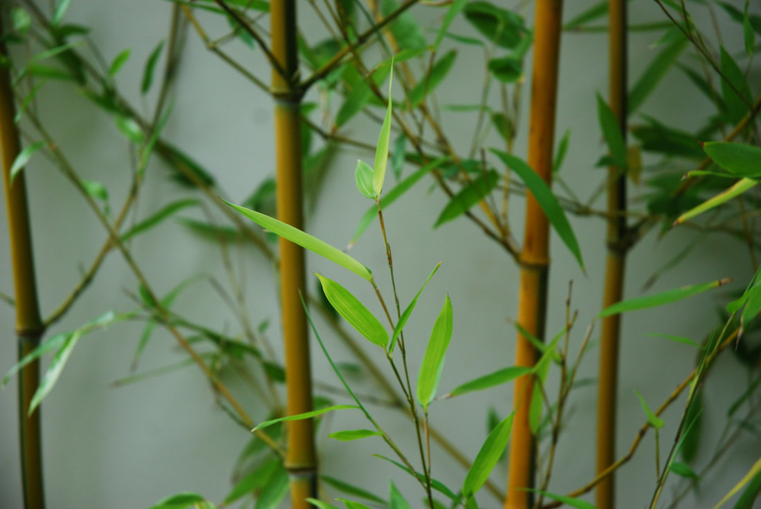
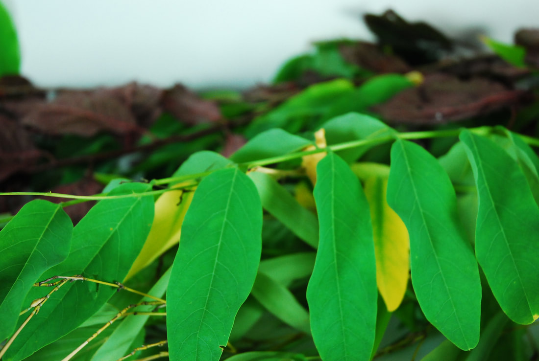
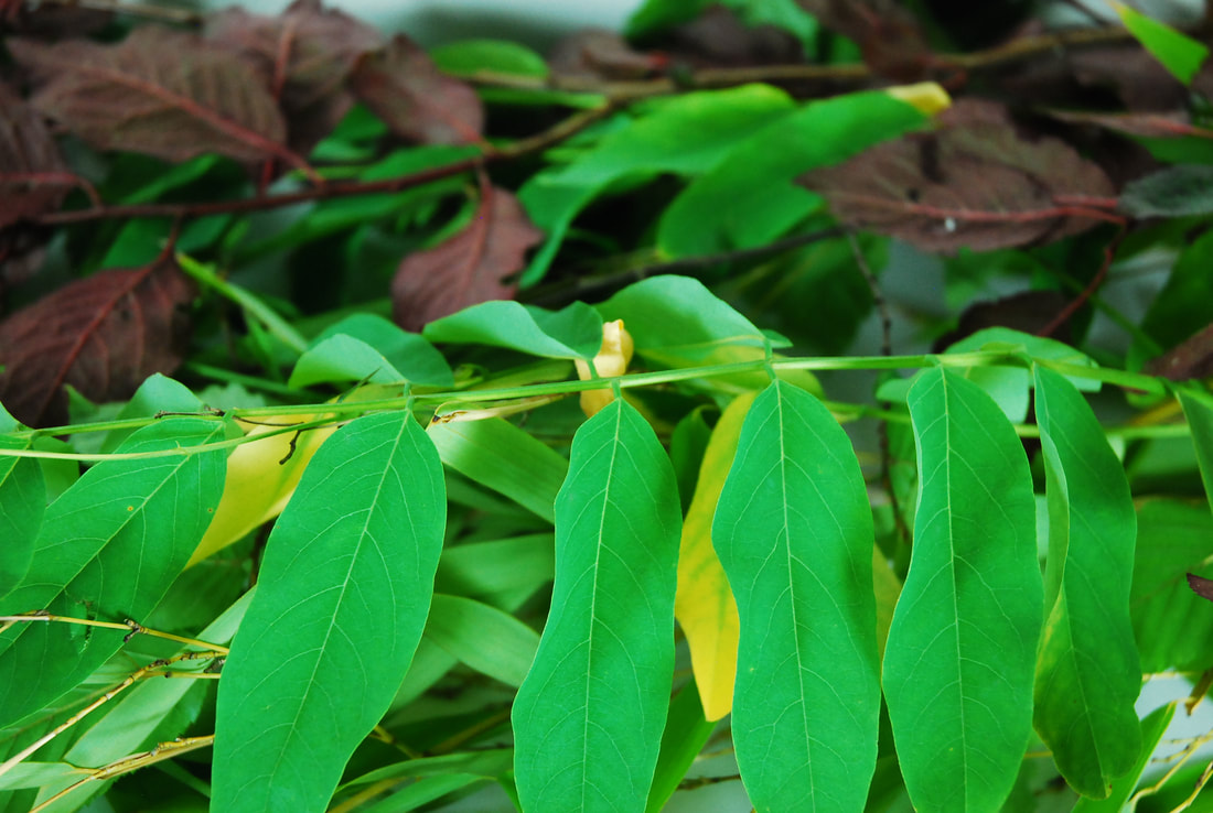
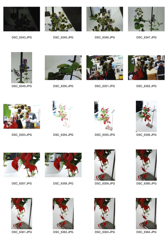
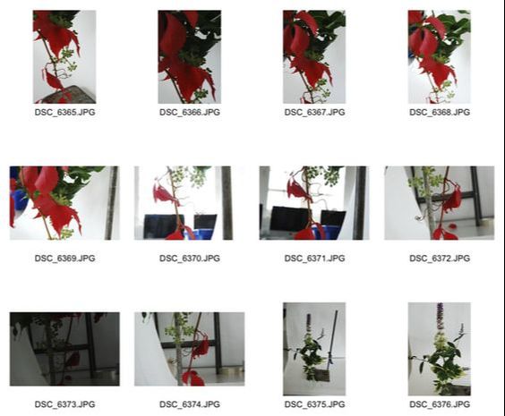
I think that there was more success with this series of images compared to the previous response due to the lighting of the images. This was because the first response was taken in a forest where the light was blocked by a canopy and so therefore became green in shade when it hit the light sensor. This lets the second response have crisper edges and a more refined image, generally. However, in the image of the bamboo I think that the green shade is light enough to add to the image and create a natural effect for the image. But I don't like that that many of the images crop out the whole plant like in the bottom three images, this means that instead of isolating the plants with the white background it makes it seem more as if that is the actual background, which isn't necessarily a negative but is different to my intentions. On the other hand in the first image I like that it has become it's cropped as it gives a large amount of negative space in the image but still lets the tree have a sense of magnitude.
Technical Focus - Aperture
For this focus we had to research and discover the effect of aperture on photographs. Aperture refers to the opening and closing of the lens through which light passes. The smaller the f stop (F/) the greater the size of the hole in the lens, which leads to a greater depth of field. While a larger F/ means the lens's hole is smaller and so there is a smaller depth of field. The depth of field refers to how much is in focus. If there is a greater depth of field only the foreground will be in focus while if there is a smaller depth of field, more will be in focus.
Nature in Science
|
For this task we were inspired by Sanna Kannisto
|
|
First Response
|
|
I think that there was some success with this development but also quite a bit of failure. I don't like how the sixth image has a cropped end as it seems accidental and unfinished. I also don't like how the second image has an exposed top and the fourth image is mostly out of focus and off camber. The fifth image is also tilted. But I do like the first and fourth image. I like the isolation of the fourth image and how the plant is completely centred in the image. However, the leaf coming down from above can perhaps be a bit detractive from the image as a whole but that is a minor issue. I also like the first one as the clamp is captured and it seems to capture the essence of Kannisto's work.
|
Selects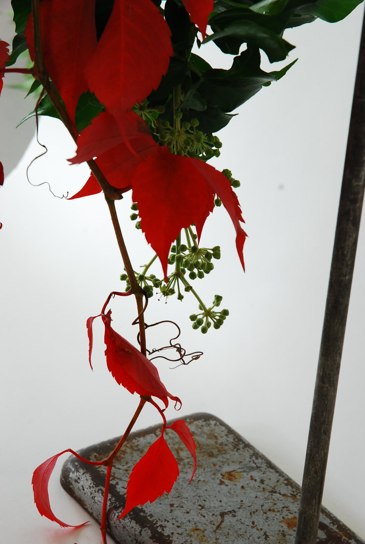 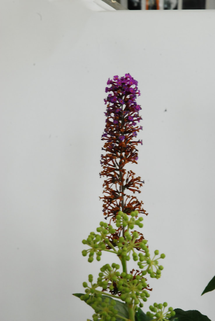 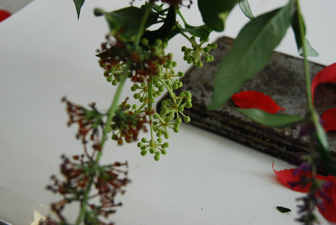   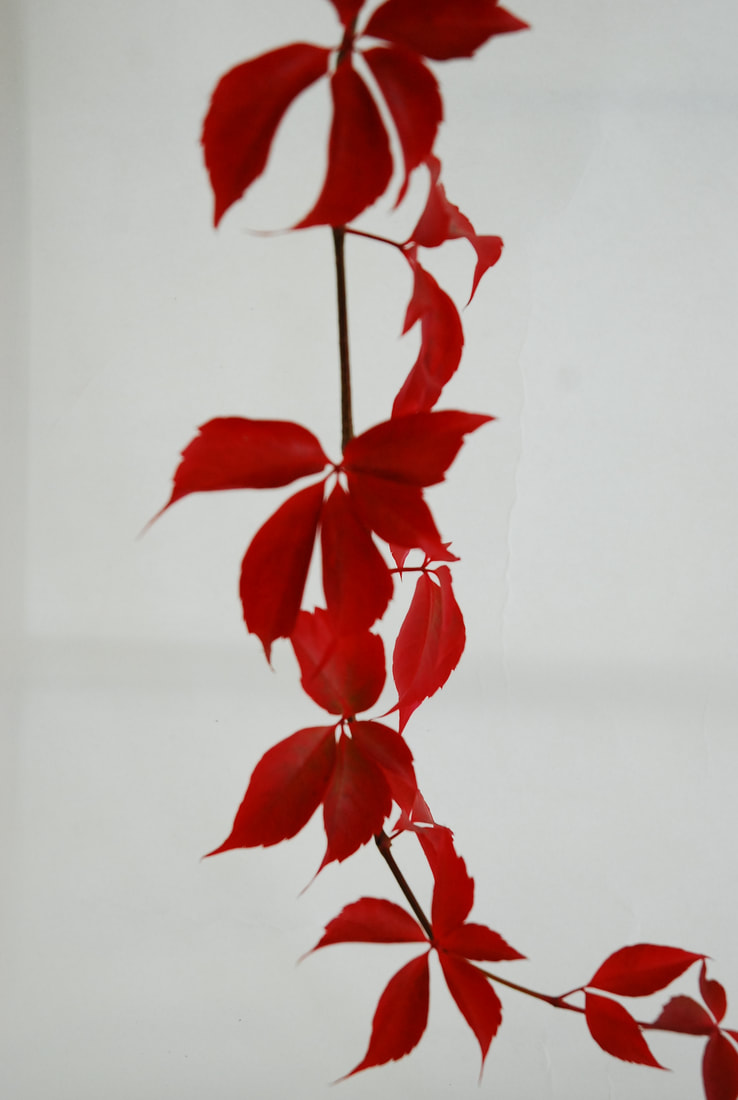 |
Second Response
For this response we had to isolate nature by doing photograms of nature. This is the first time we went into the darkroom in A level. We brought in flowers and then composed them on our photographic paper and exposed them.
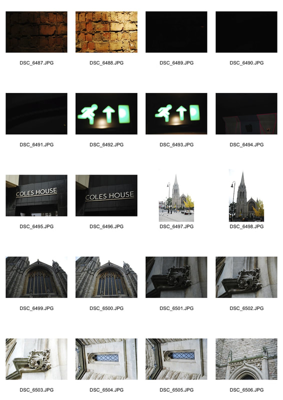
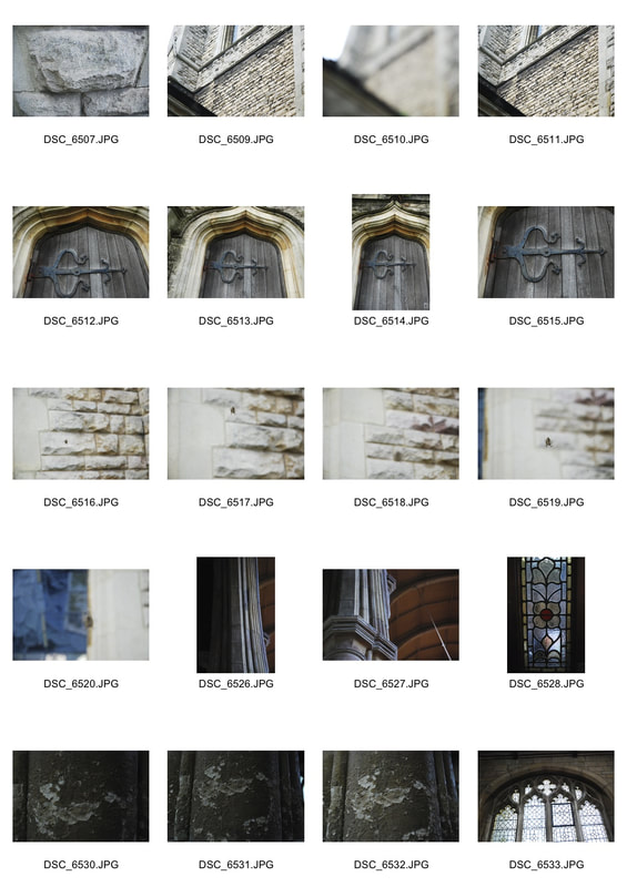
Architecture
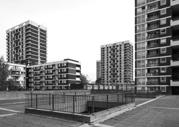
Architecture on the Hill
For this task we went out into Muswell Hill to capture two iconic buildings; the Odeon Cinema, now the everyman, and the Church. The cinema is an iconic example of Art Deco Architecture and was built in the 1930s and the new everyman has tried to recreate this atmosphere. On the other hand the church on the hill, St James's Church, was rebuilt in the 50s after being bombed and is an example of gothic architecture. So with these two iconic buildings we had to try and capture the ambience of the buildings.
|
|
|
|
|
Selects

On one hand there's been a lot of success within the cinema but with the church I didn't select any as I felt that there weren't any good enough. I liked the abstract nature of the images within the cinema. The colour scheme differs from the palette of my usual images. However, I think this palette adds to the image's atmosphere because even though it is not monochrome it is still reduced and there is not much variation in the colour like in the third image which has a very reduced palette. Following this theme of less being better is reflected in that I feel that the first and fourth images are the worse and how I didn't have any images from the church as they were too noisy
Technical Focus - ISO
In digital photography ISO is the sensitivity of the image sensor at the back of the camera. A lower number e.g. 100, 200, 400 means the sensor is less sensitive so the image will have a finer grain and have less noise. While if there is a higher number e.g. 1200, 1600 the grain will be less fine and there will be more noise. However, a higher ISO means that the camera can take images in darker areas while still being light and a low ISO means a longer shutter speed to get the same lightness.
EXAMPLE?
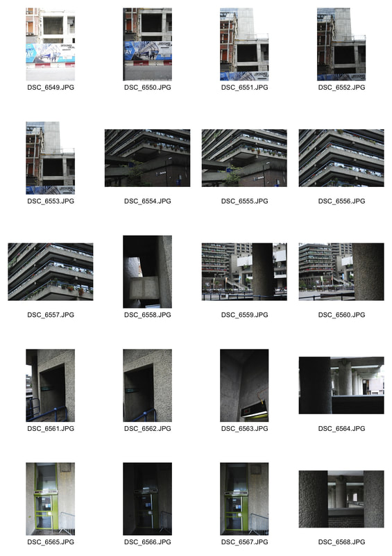
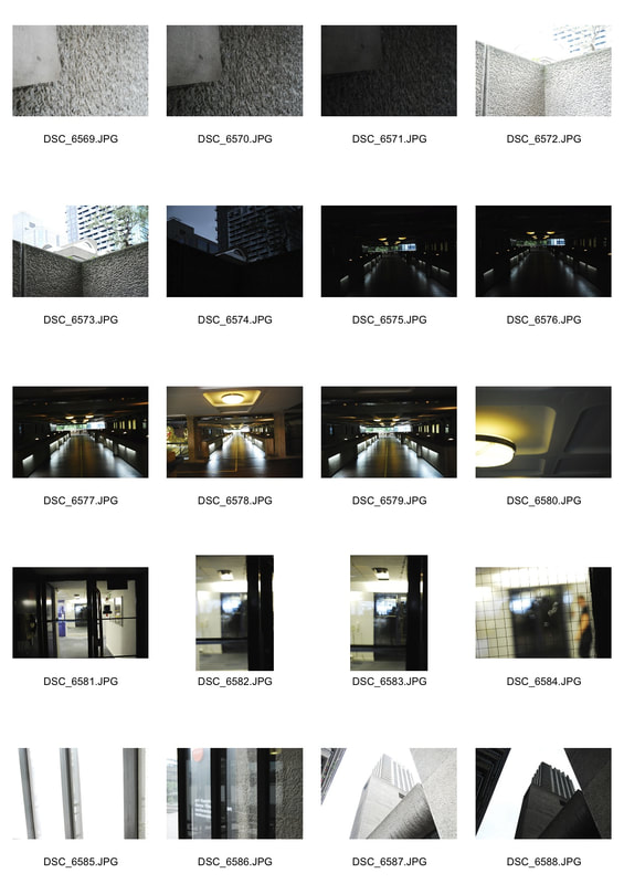
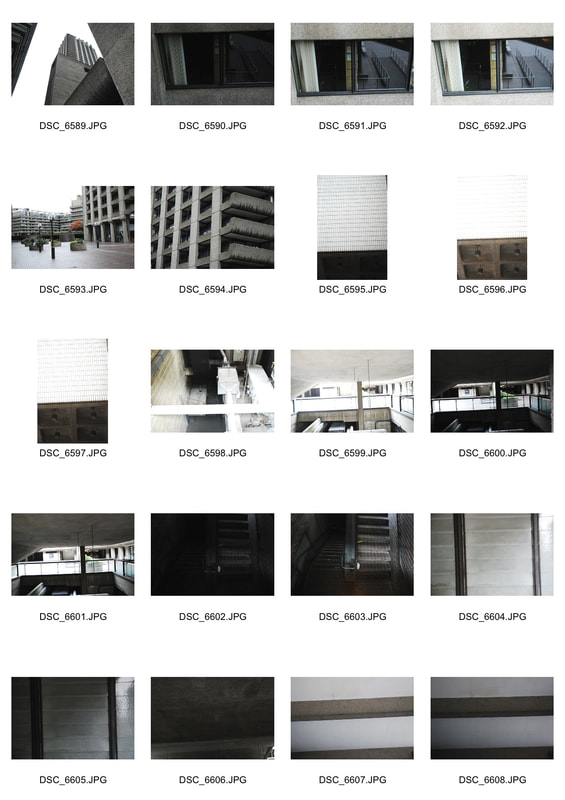
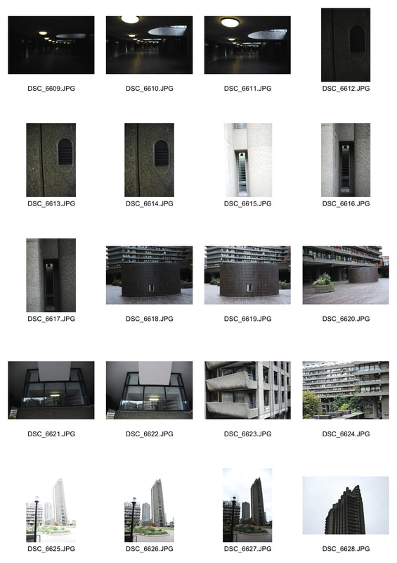
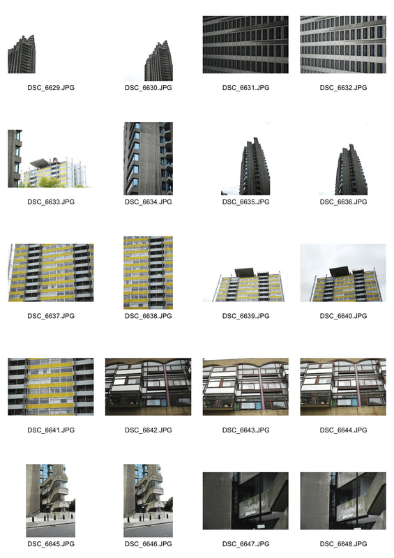
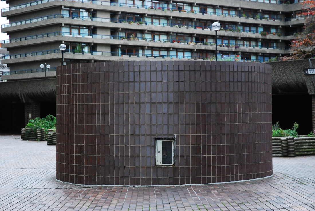
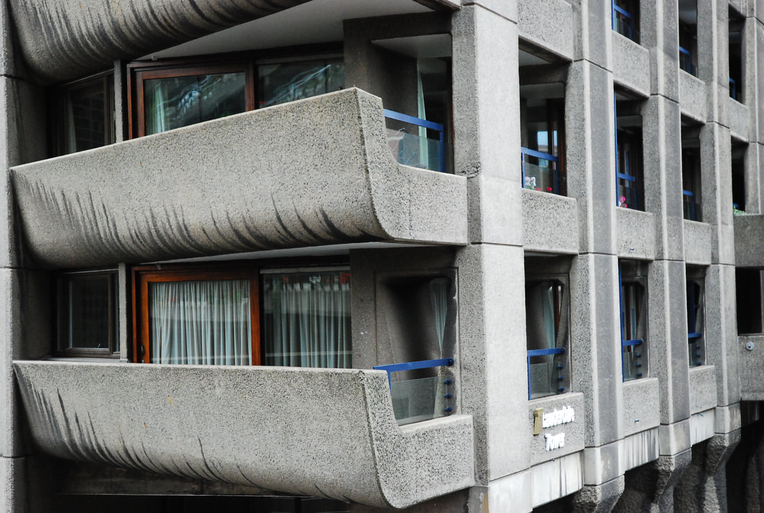
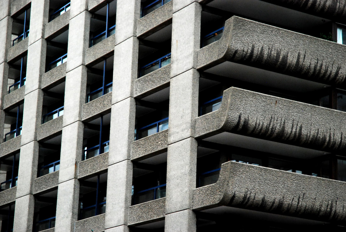
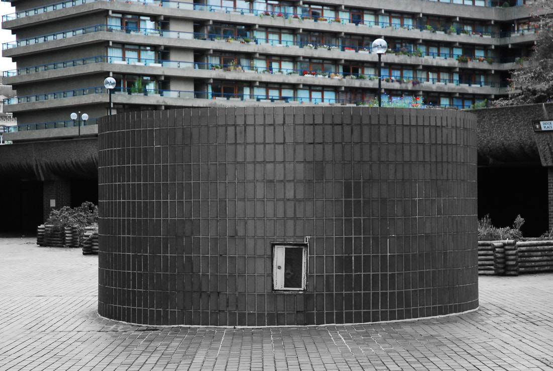
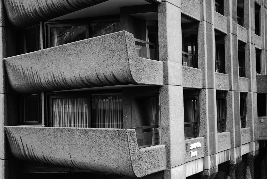
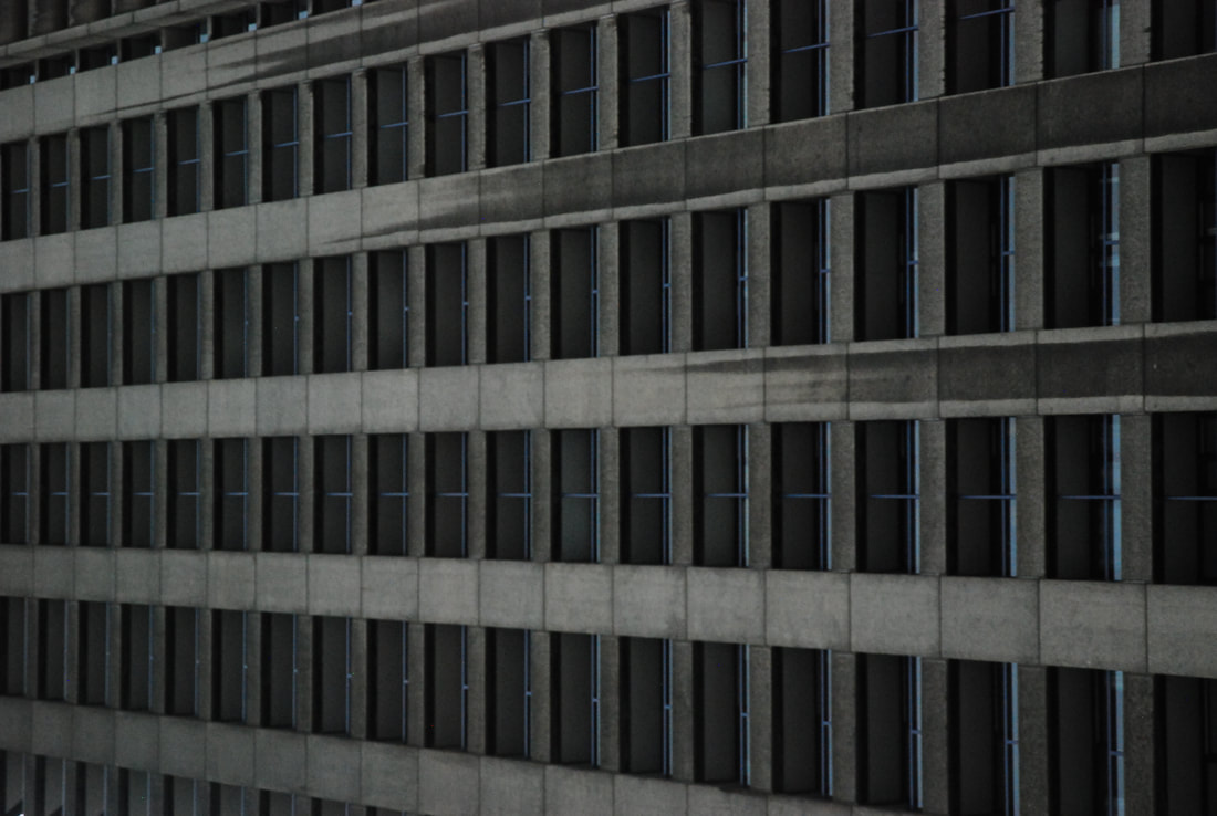
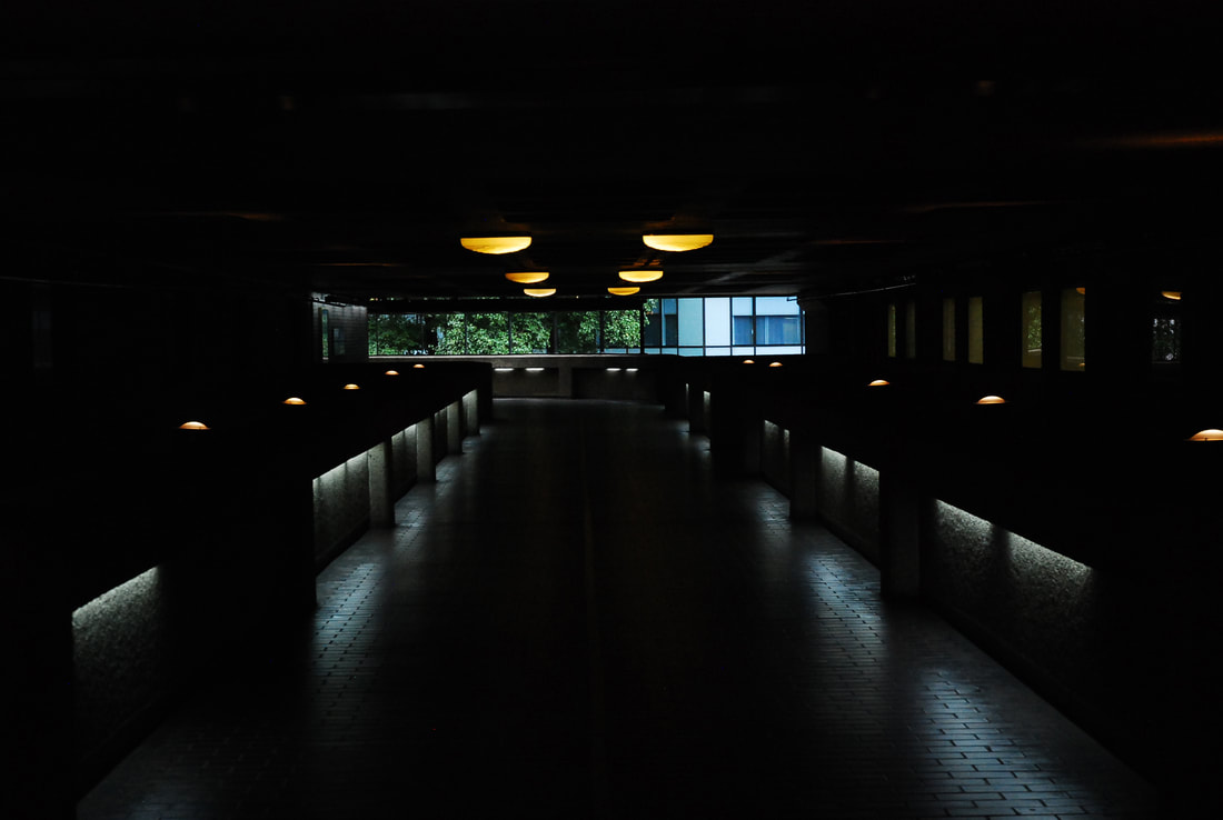
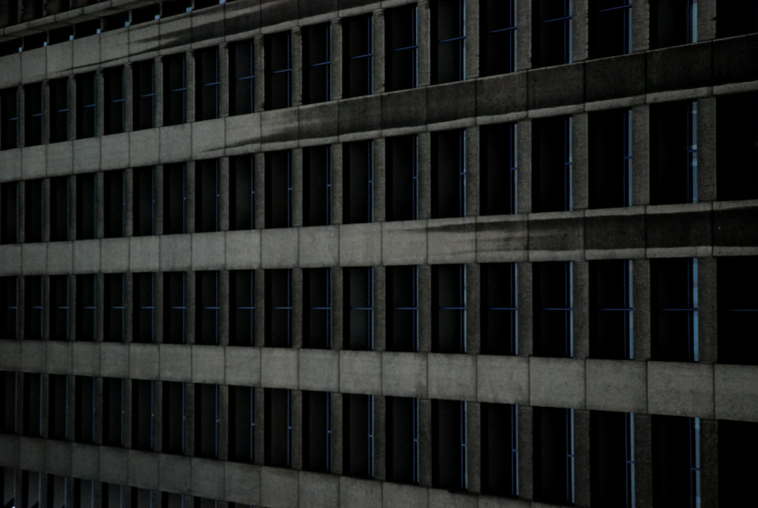
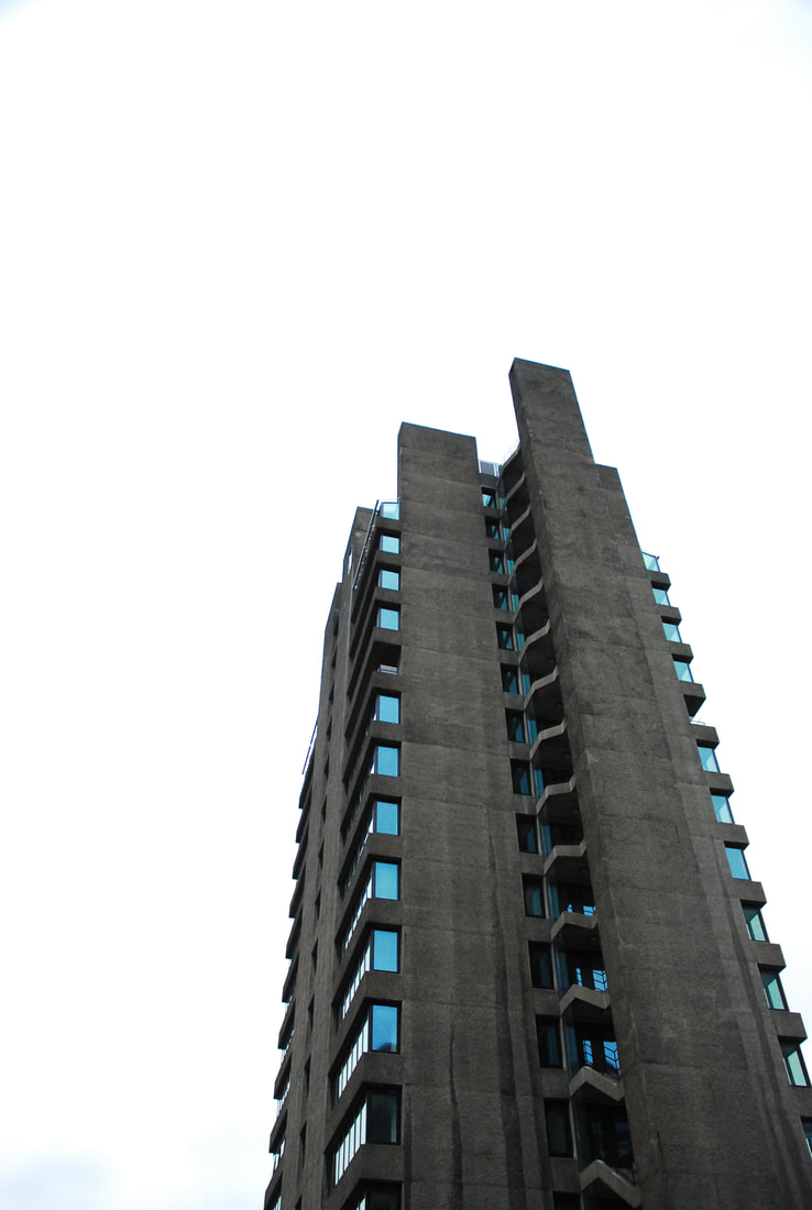
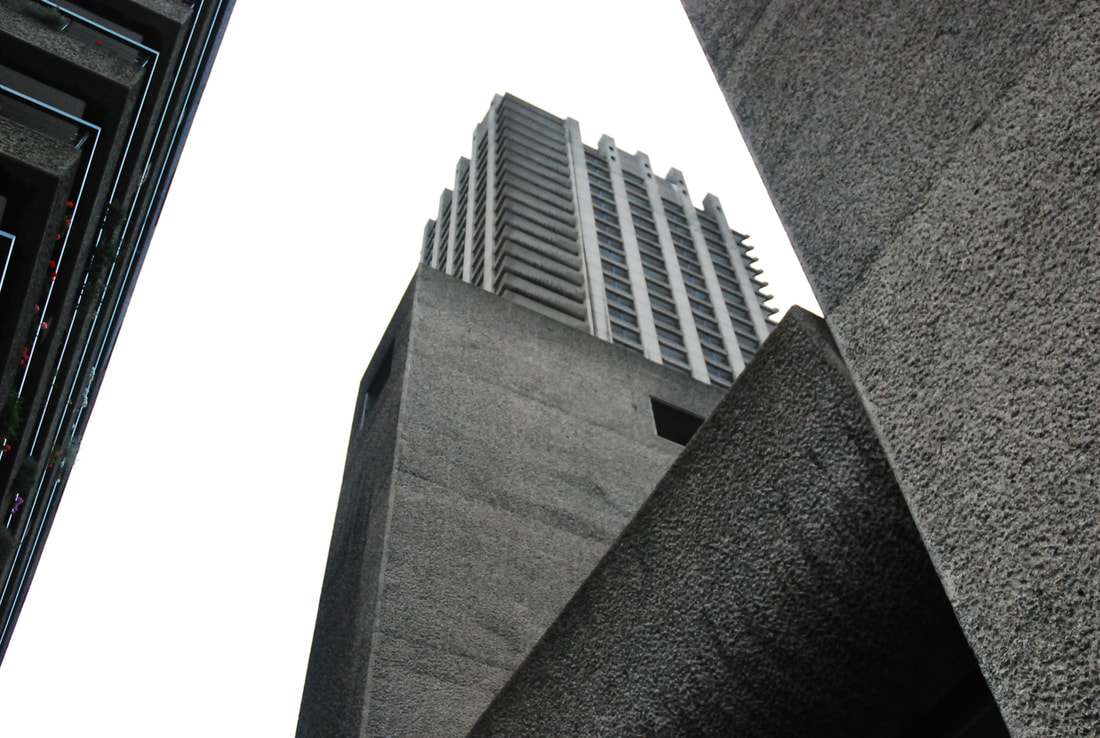
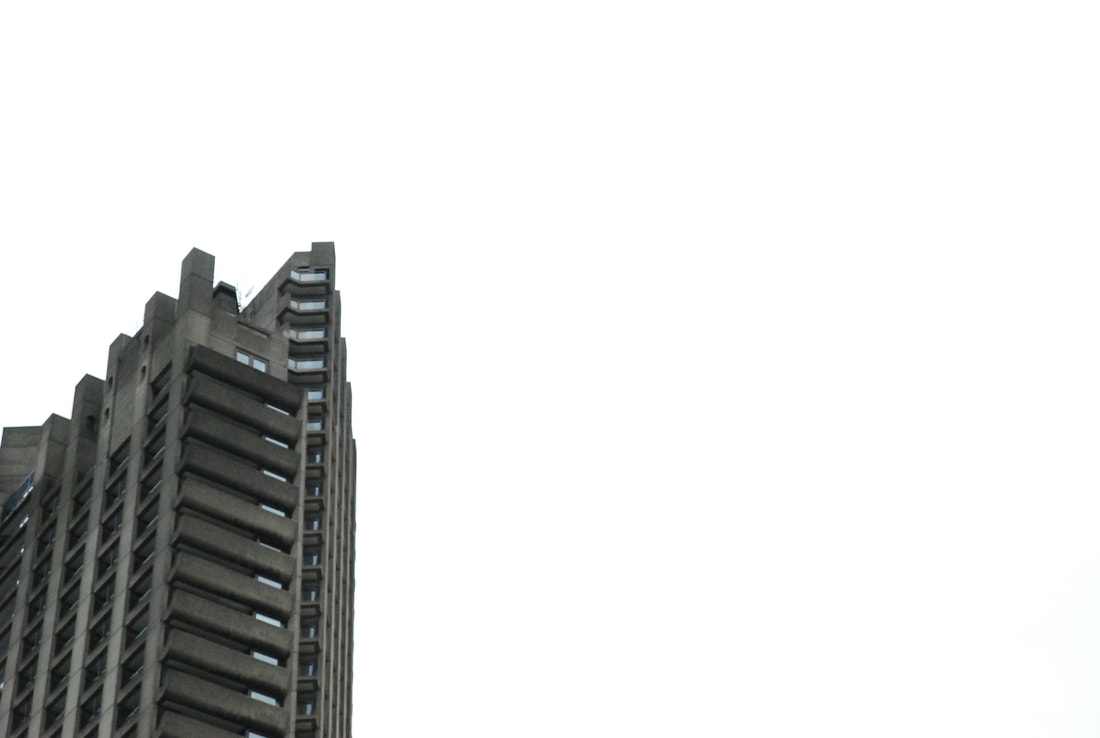
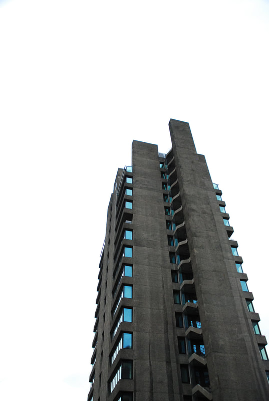
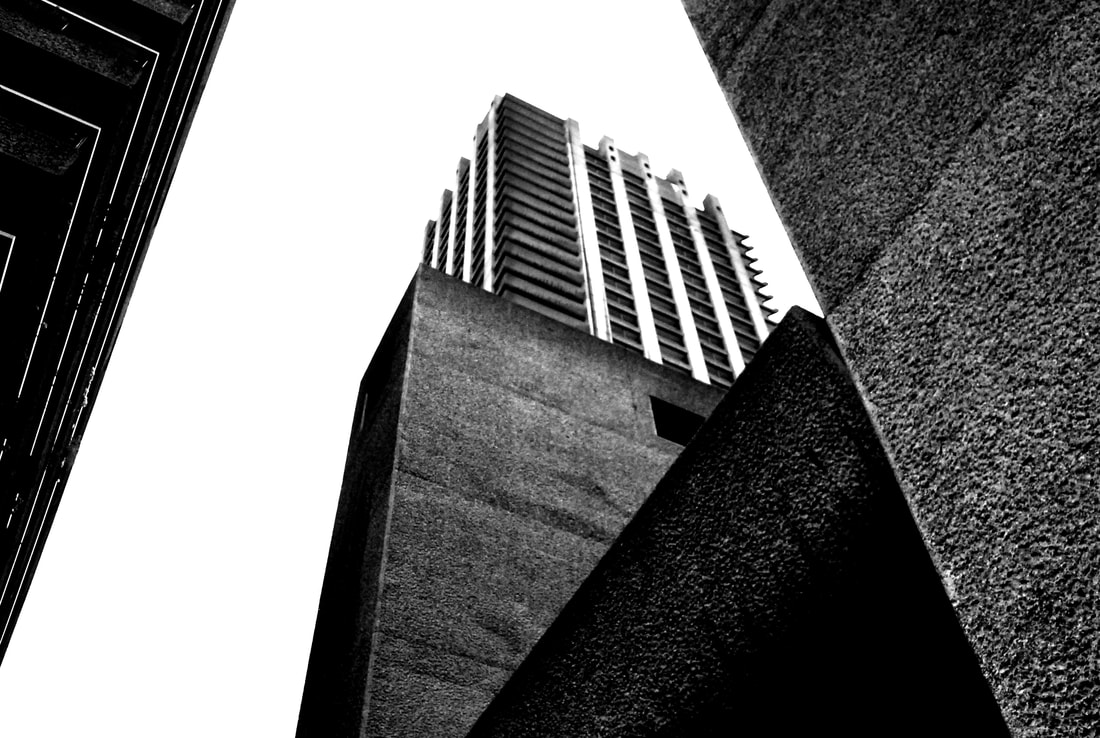
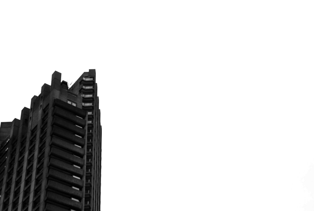
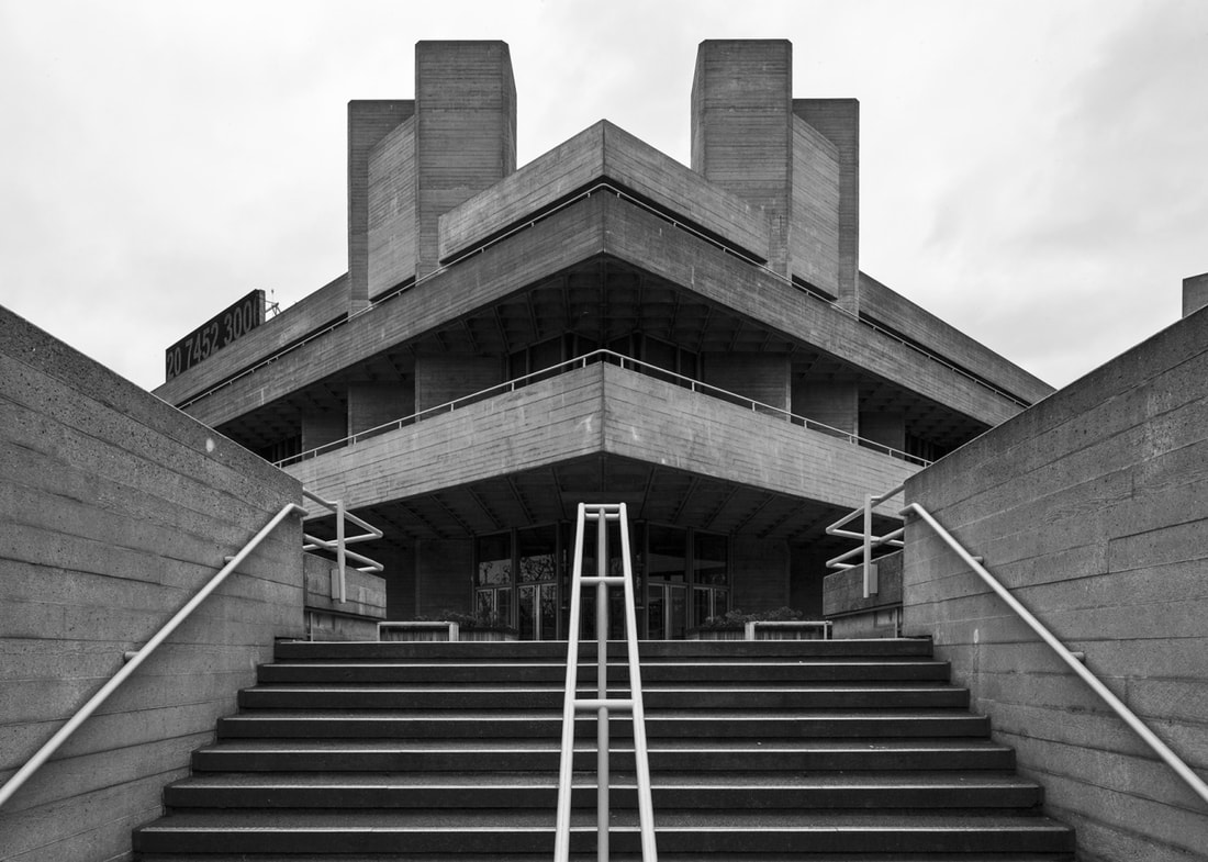
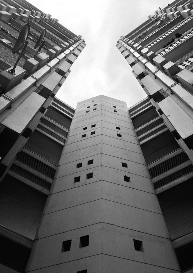
Brutalism
For this task we continued to look at structure in architecture but this time in brutalism. Brutalism is one of the best examples of finding structure in architecture due to it's exposed nature and so therefore the raw shapes which are created by this. I went to the Barbican as it is one of the best examples of brutalism in London due to the magnitude of it.
|
|
|
|
|
Selects
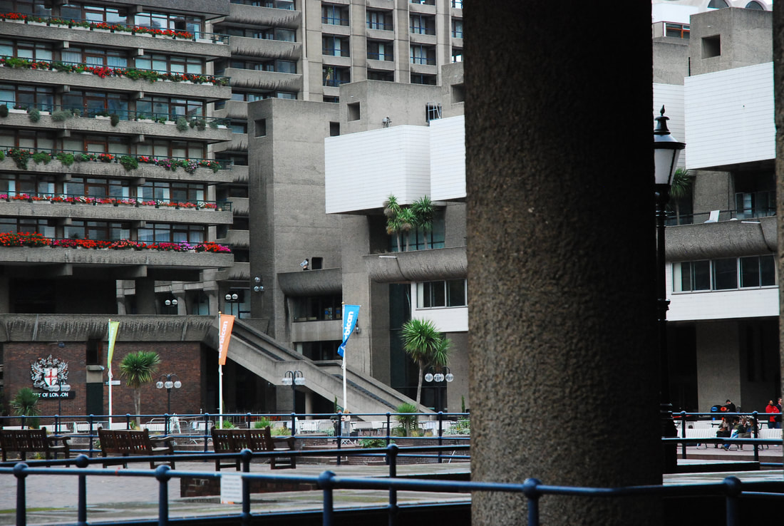
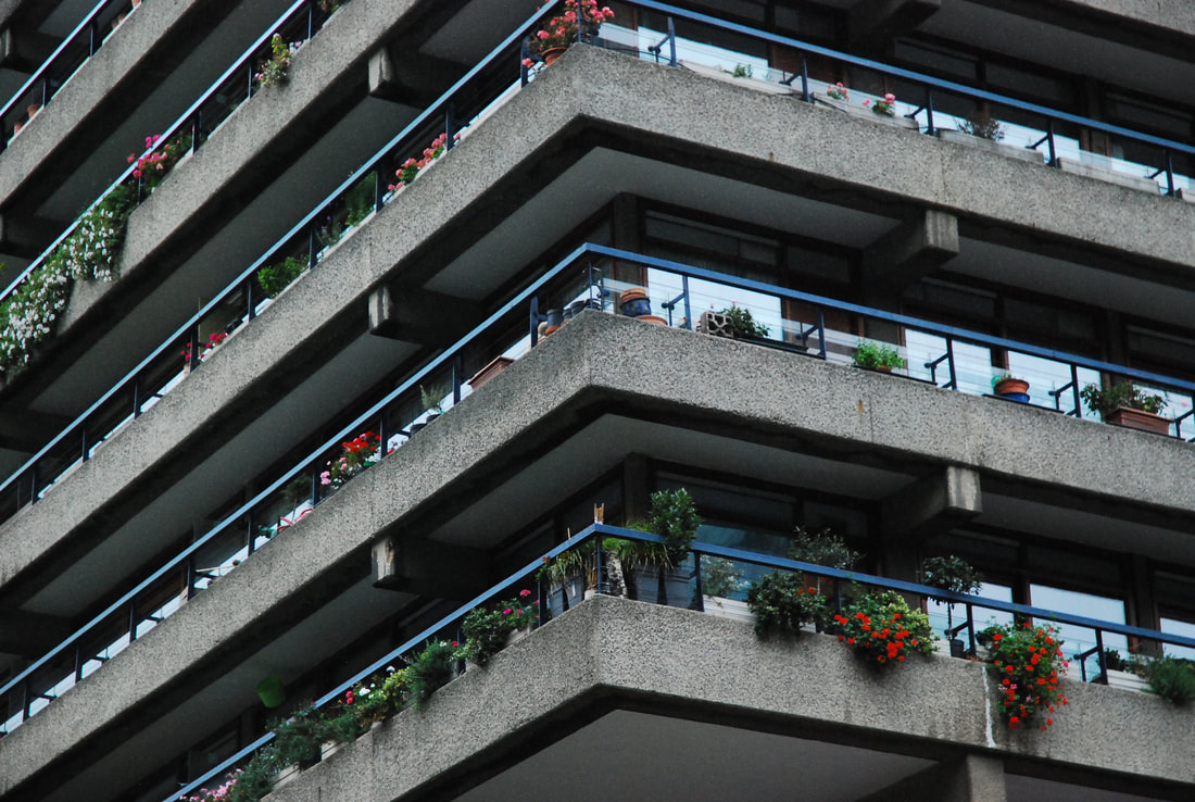


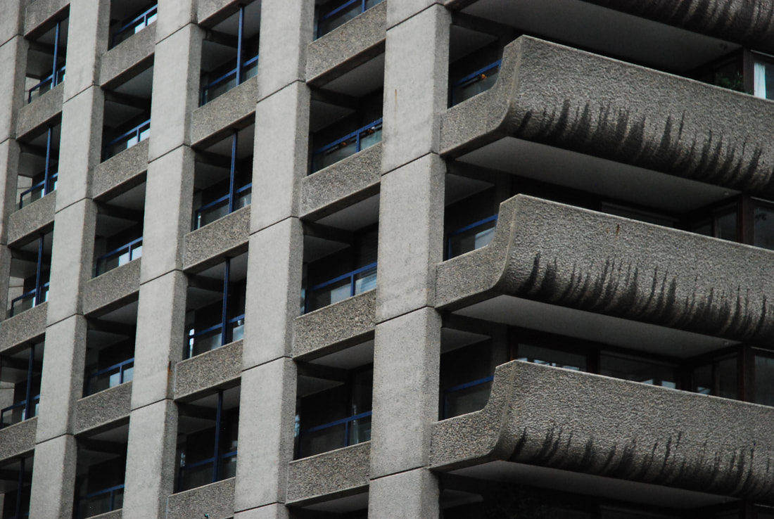

There was a lot of success in this set of observations as I feel that I successfully captured the structure of brutalism and it's exposed nature. I think that by capturing the extremely blocky nature of Brutalism, I was able to capture it's structure. I also feel I used layering to great effect with the first and fourth image creating a sense of depth in the images. On the other hand I also captured the uniformity of the structure of Brutalism successfully in the second and sixth images. I think overall as a development it has been extremely successful.
Form
Form and shape is breaking down objects to create new shapes or finding other shapes inside larger structures.

Perspectives
Perspectives is the angle at which the picture is viewed from. By altering the perspective we can create a different mood for the image and give it a different purpose.


Negative Space
Negative space is the area that is not occupied by a fully or partially opaque subject and so is not covered and therefore negative. Artists use negative space to highlight the occupied, positive, space in an image.
Simon Phipps
Second Response
For this response we were inspired by the work of Thomas Danthony (below). We captured brutalist buildings and then used their blocky nature to define shapes in them and make them into block colours.

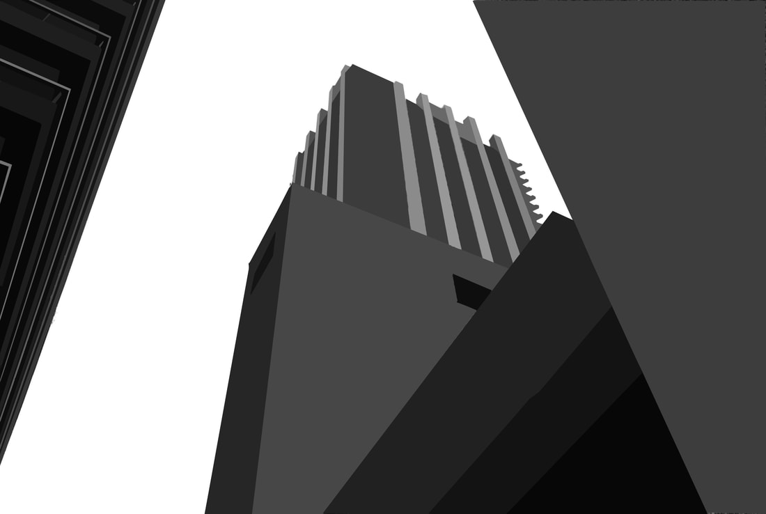
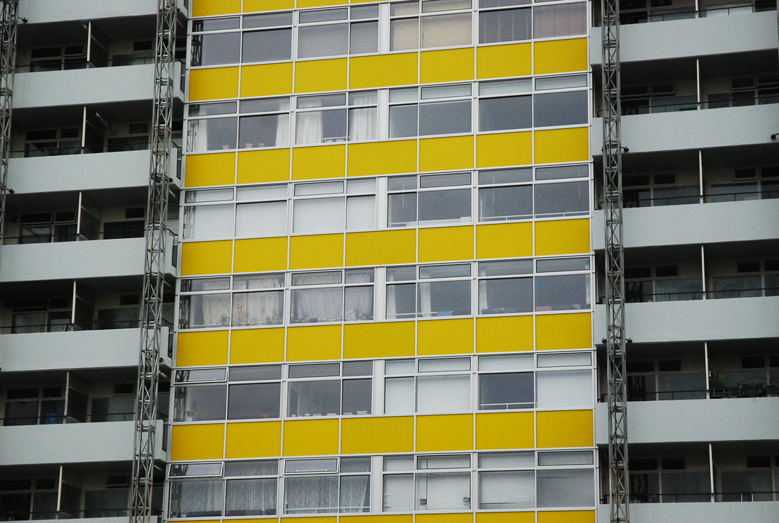
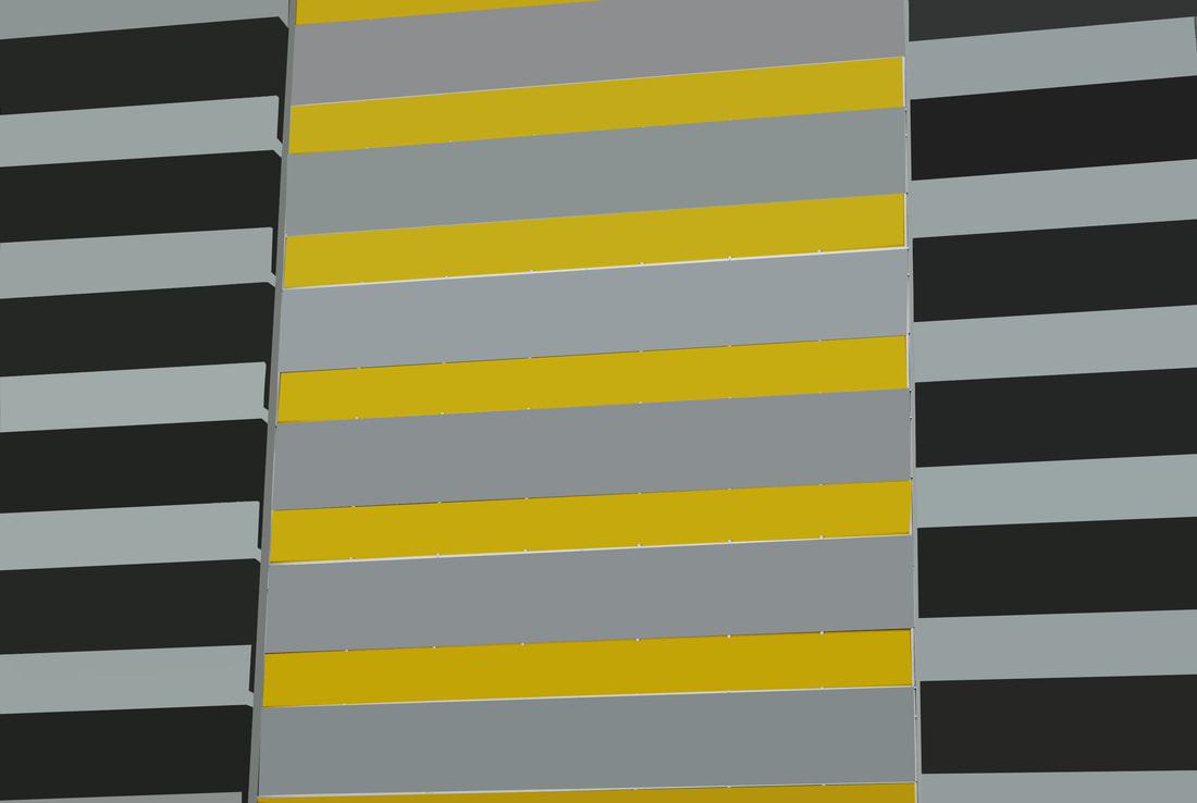
I think that this response was quite successful. The first image is the closest representation to Danthony's work due to it being without colour. However, I forgot to turn the background to black and therefore deviates from Danthony's work. Perhaps it is better that I deviated from the work of Danthony's work as it might've become overly dark instead of having that contrast between the light and the dark. I think that it was also successful due to the level of simplification in the image. Even thought Danthony's large amount of simplification is nice but I feel that perhaps it becomes too graphic and flat but if it isn't simplified enough it becomes too different from the task. On the other hand I think that the second image, of Arthur House in Golden Lane estate, isn't actually a massive deviation from the work of Thomas Danthony because even though it uses colour unlike Danthony's brutalist work. This is become the second image captures the featureless nature of Danthony's work with it being an image that was originally quite flat and featureless except for it's colour. Even though the bright colour of the yellow contrasts the often dull style of brutalism, in terms of colour, and is very reminiscent to the unite d'habitation one of the first examples of brutalism by Le Corbusier.
Thomas Danthony
Third Response
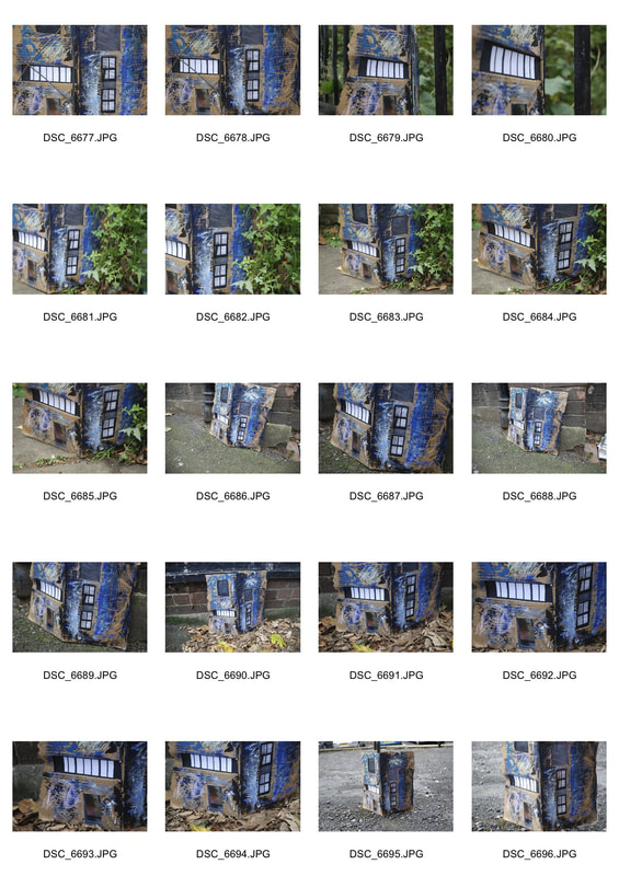
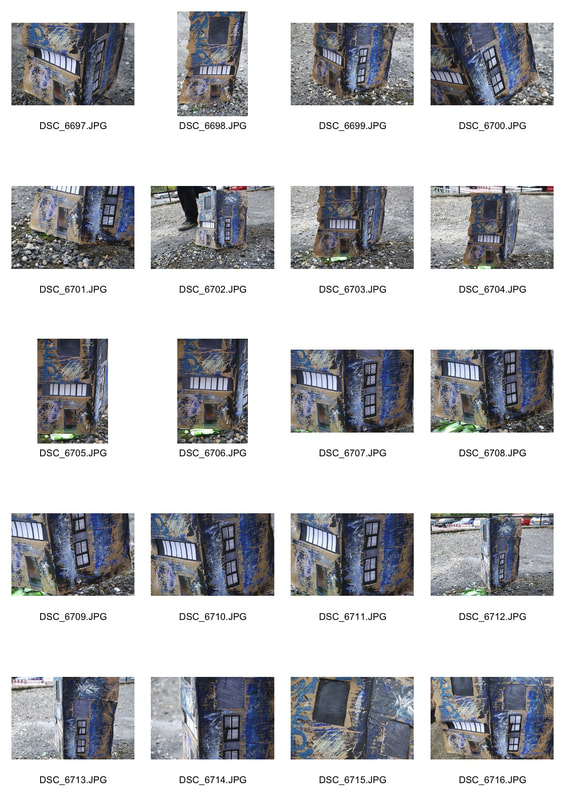
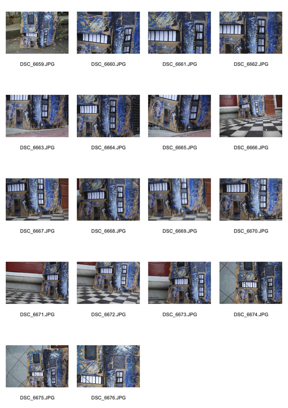
For this third response we were inspired by the work of EVOL. We had to create miniature buildings recreating urban landscapes. We then had to photograph them in the studio and then outside in fitting scenarios and landscapes.
In the Studio
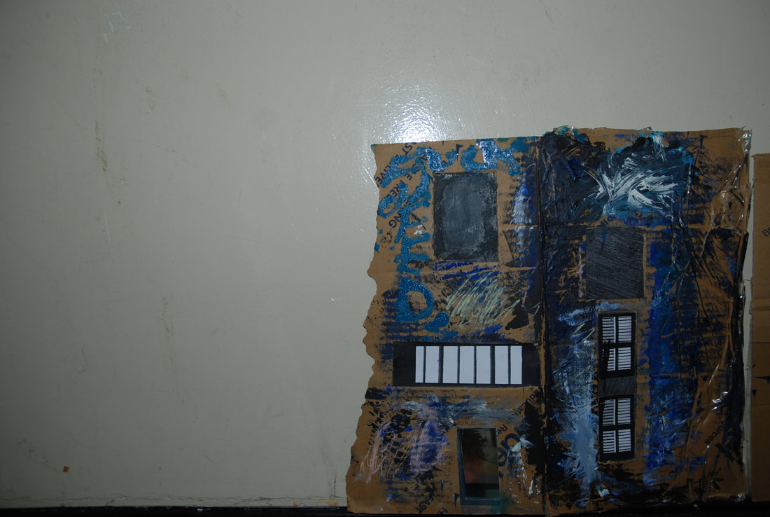
In the World
|
|
|
Selects
Originally I thought that there wasn't a lot of success in this response especially when I was taking photos in the studio. However, when I took the model building outside it seemed to work by using angles, focus and surroundings I was able to create something similar to reality. Even though I didn't create something that looks realistic but that wasn't what the brief was and so therefore I feel I succeeded.
EVOL
|
Artist Analysis
|
|
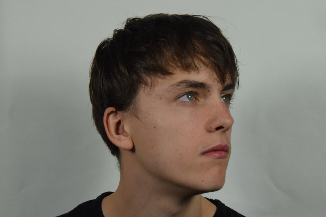
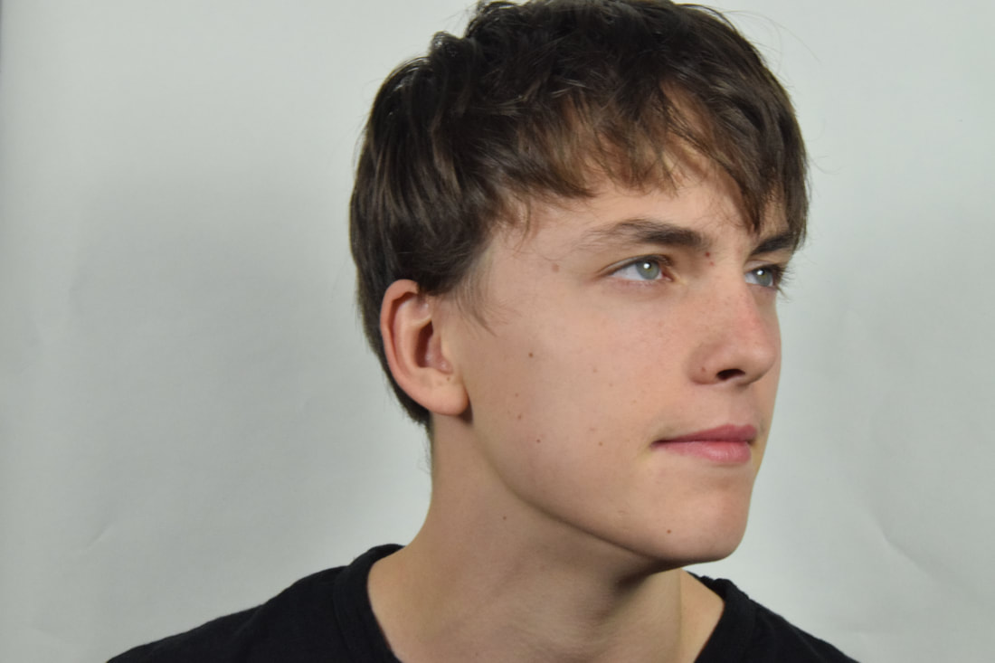
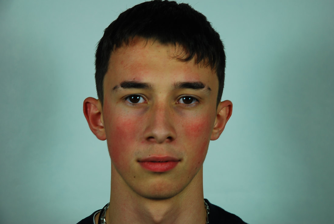
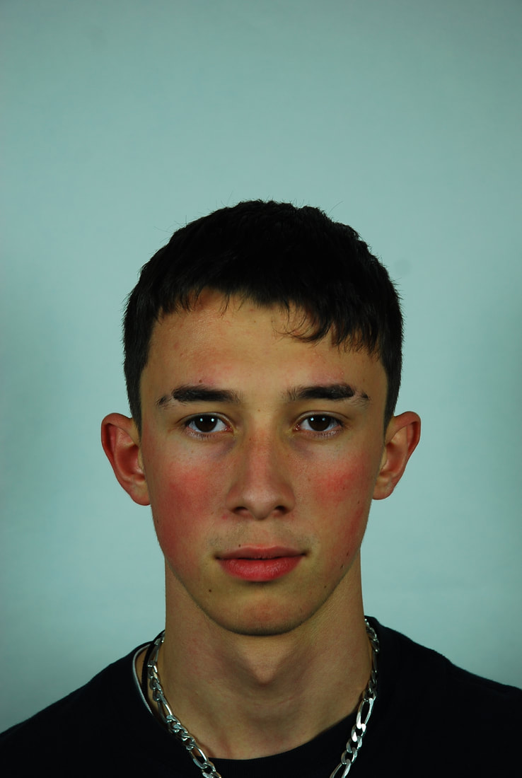
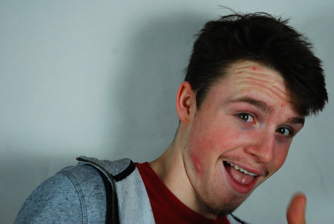
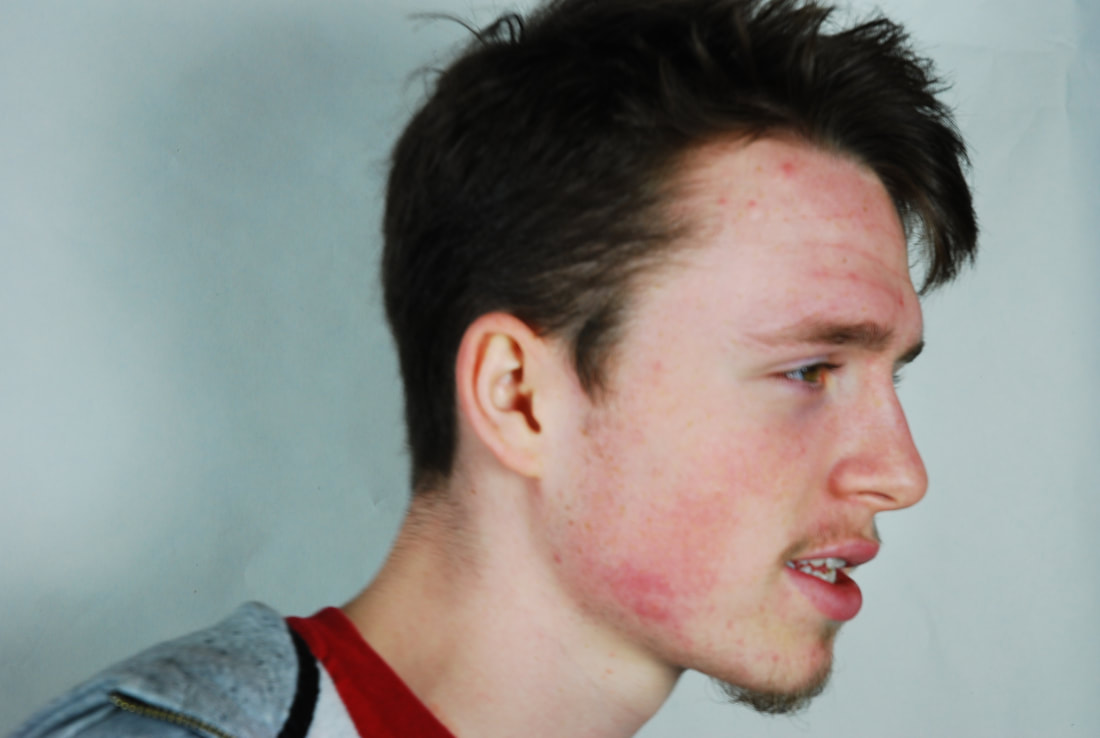
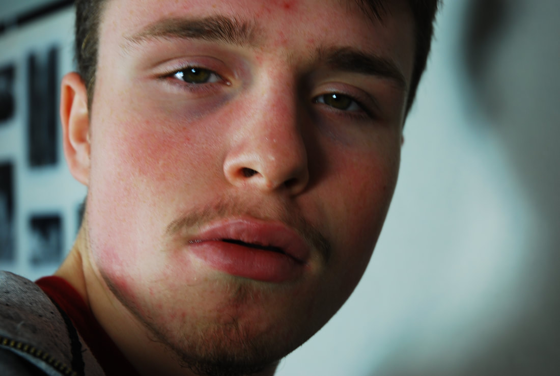
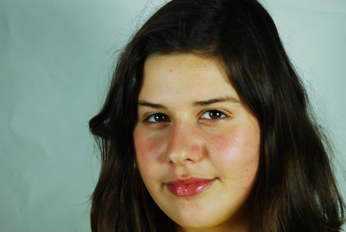
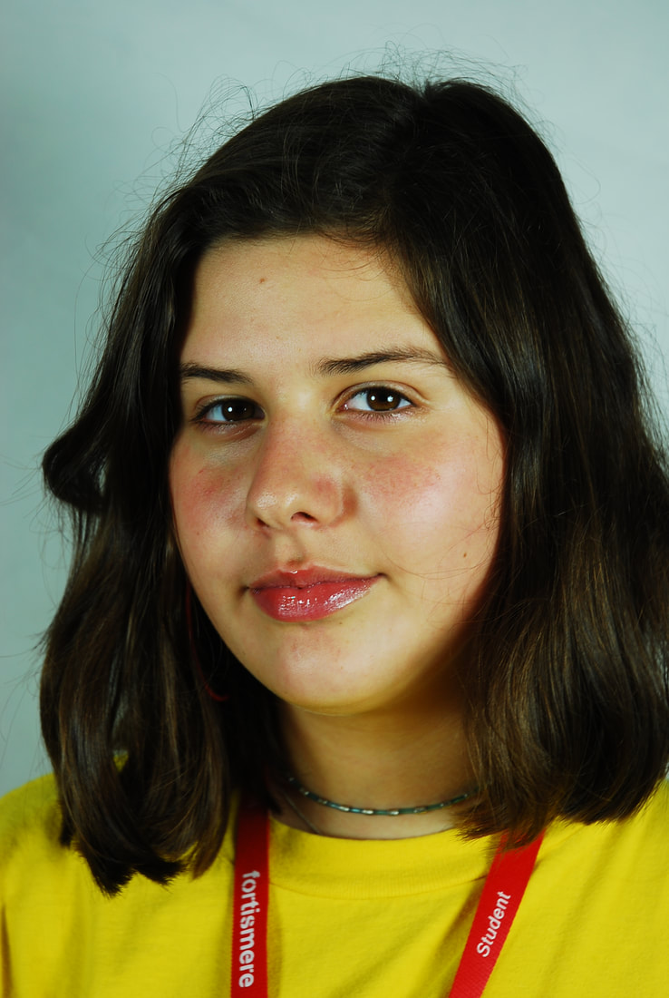
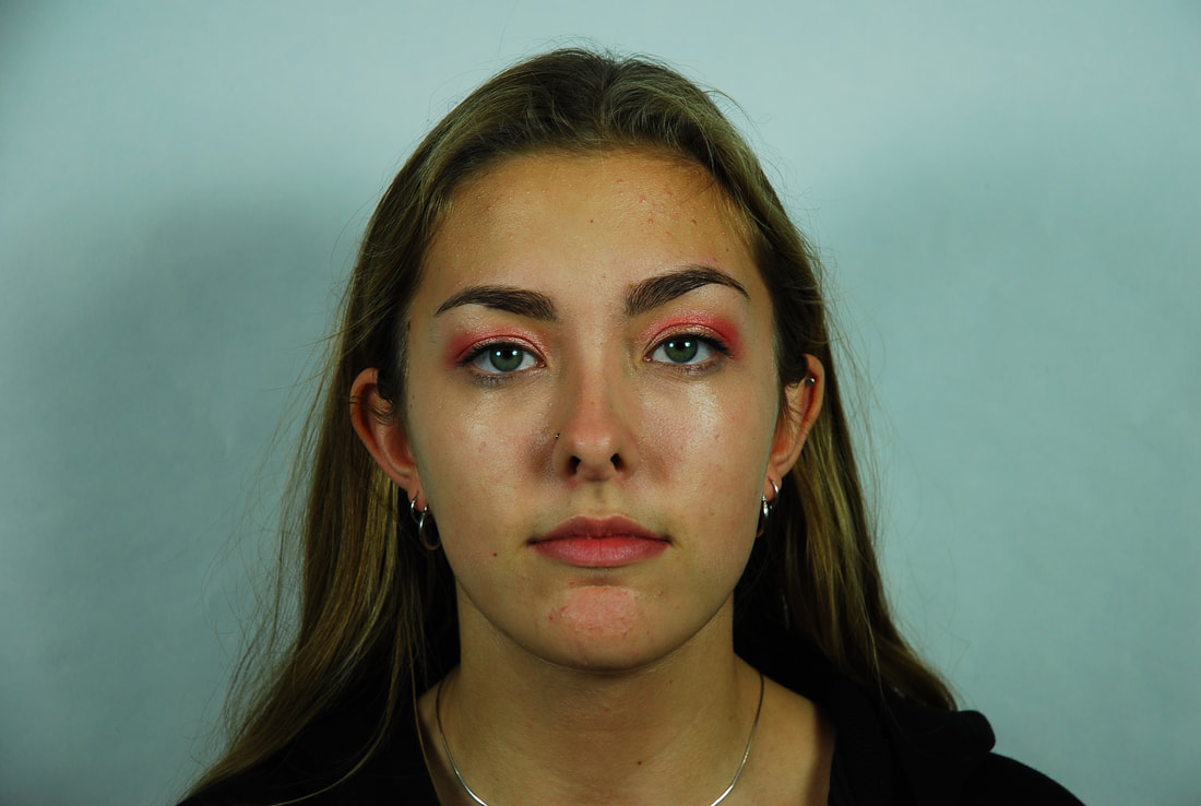
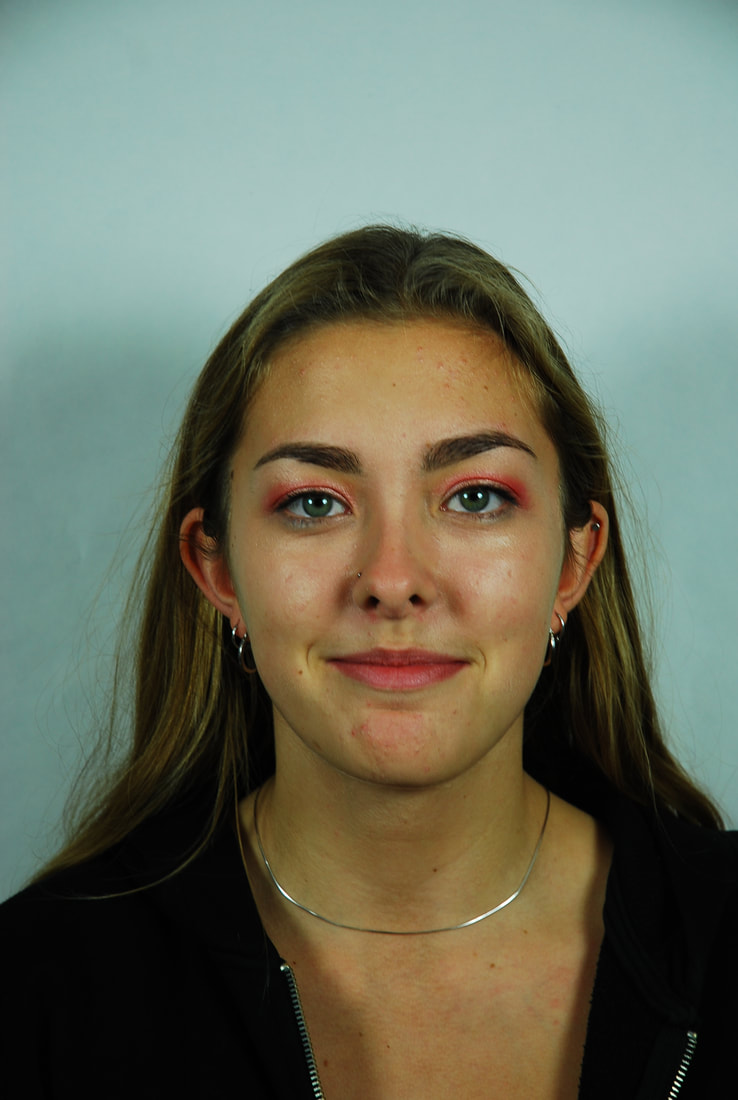
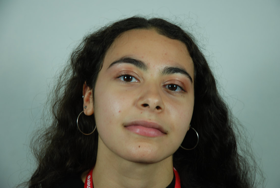
Structure in the Body
Skeletal Bodies
For this we had to take an image of a person and then a skeleton. Then on photoshop we had to layer the skeleton above the person. Then hide the skeletal layer
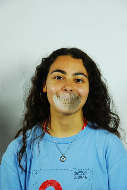
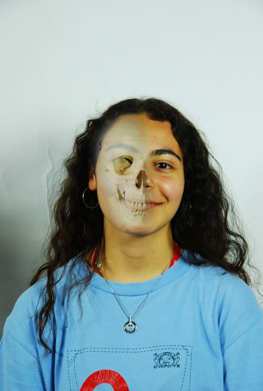
Dr. Gunther von Hagens
|
|
3 Strands
Advertisements
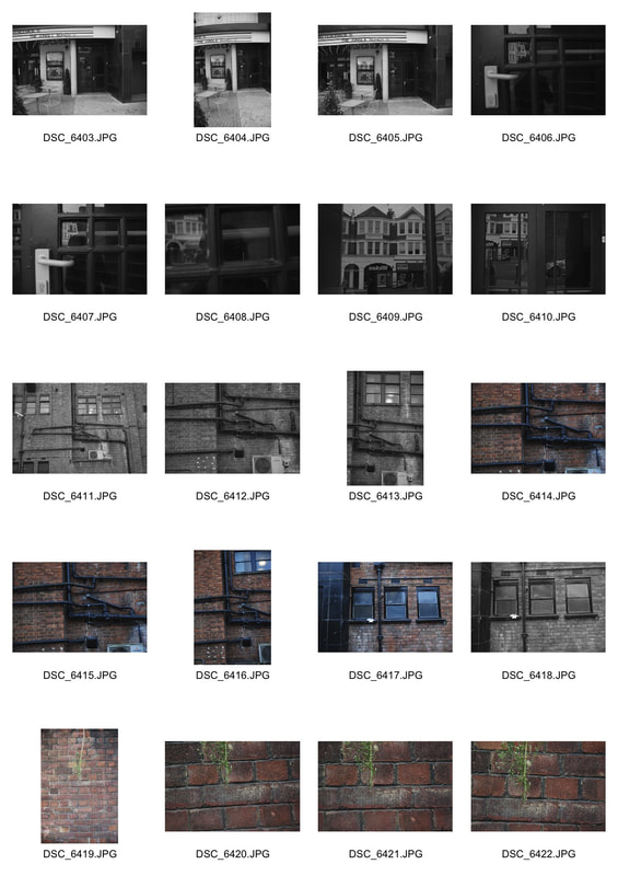
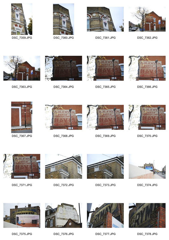
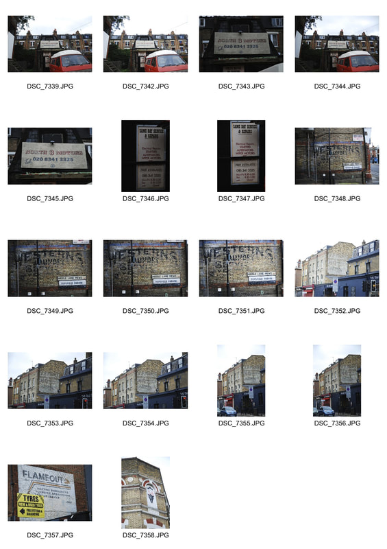
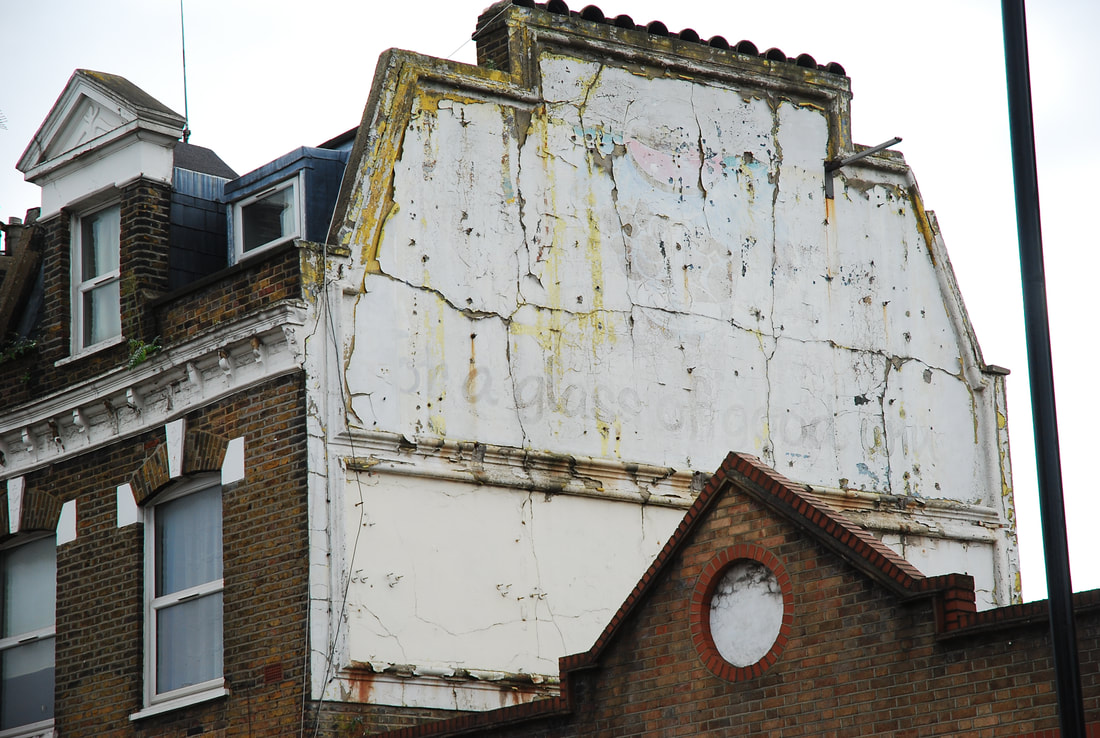
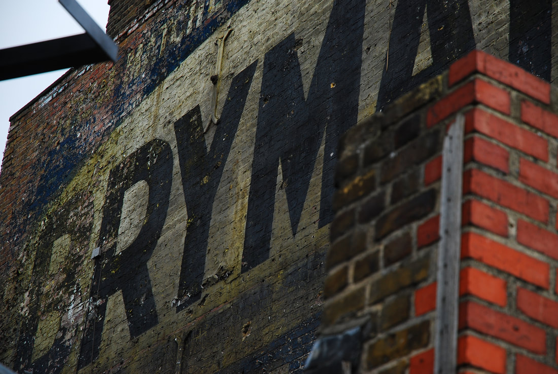
For this strand I have decided to photograph old advertising in urban areas. I focused on photographing old advertisements that were painted on the side of buildings. Nowadays they are referred to as ghostsigns as they have faded over the decades that they have been there for and are now a telescope into a bygone time. Ghostsigns have become landmarks for some of the crafts that existed in places before and there are now tours around areas of London looking at these. However, these ghostsigns are in fact just advertising but signify how advertising has been omnipresent in society throughout history. But they also played an important role in the structure of society as a way for craftsmen and businesses to publicise their work and so have been an integral part to the economic development of societies.
CONTACT SHEET
|
|
SELECTS
|
I think that this strand was quite successful as I was able to capture a multitude of different ghostsigns across London that captured the essence of them nowadays but also of how they were when they were originally painted. Furthermore I was able to uncover the previous purposes of abandoned buildings and renovated buildings. However, quite often the ghostsigns were difficult to photograph due to their remote and often distant location. This meant that the ghostsigns were often far away from where I could get to so the ghostsigns would often be small and faint. Furthermore as they have been their for multiple decades they were often faint due to time and so some were too faint to be of worth to be photographed.
|
|
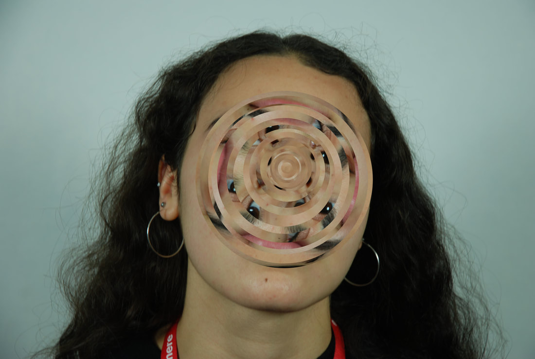
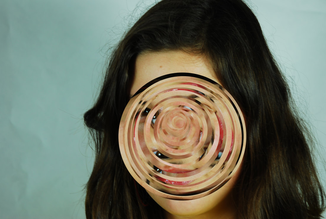
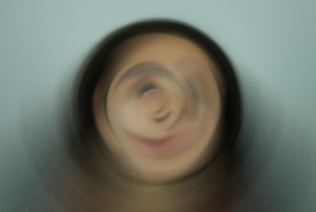
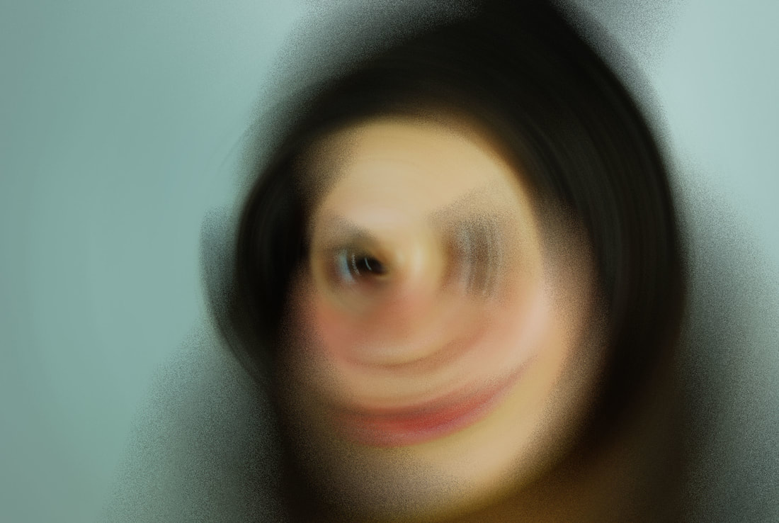
Distortion
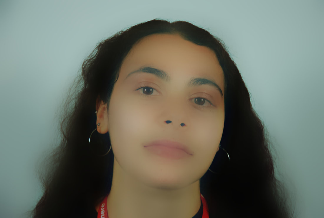
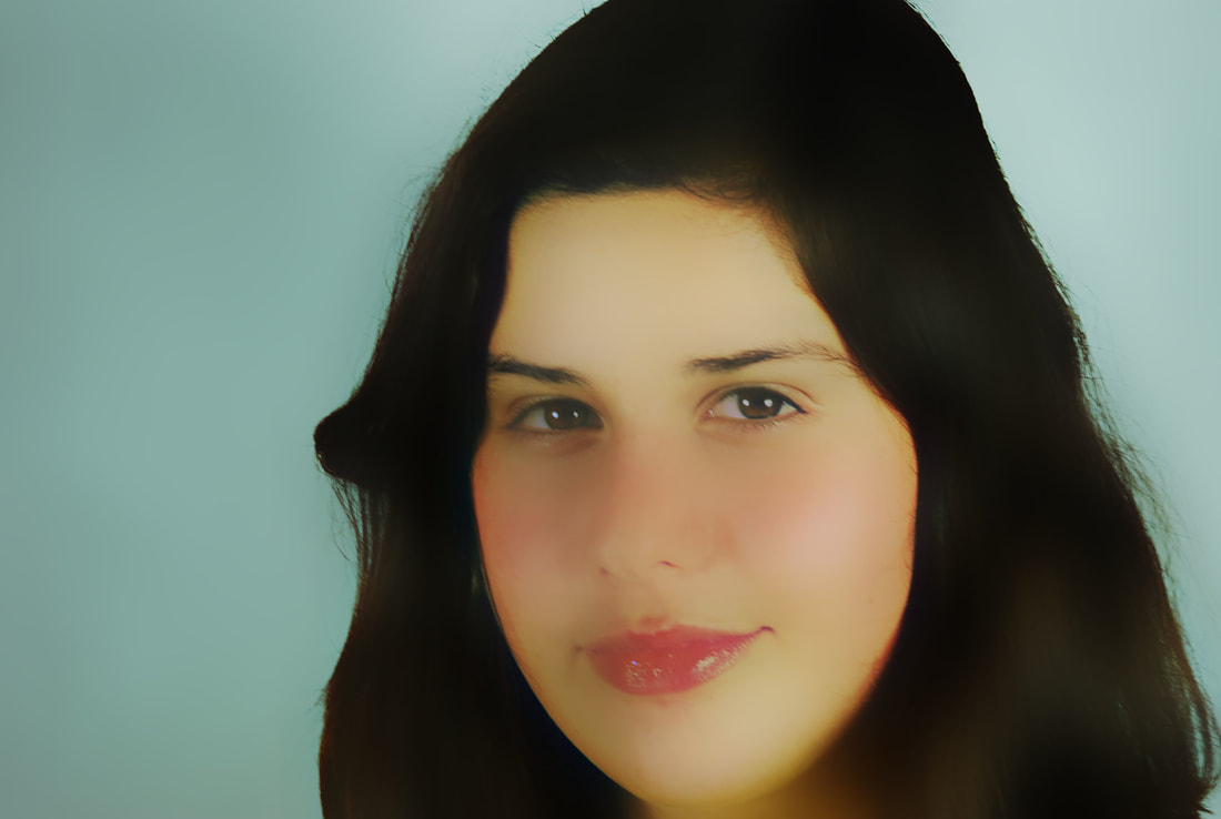
For this strand instead of looking at what is the makeup of structures and what is integral to them, I decided to look at how to alter or distort structures. I decided that organic structures and especially the human face would be the best to distort. This was because I found that it had so many distinct features in such a small area. Thus giving it the most flexibility and options of distortion. Furthermore each face is unique in it's structures in the prominence of certain bones and how certain bones are shaped.
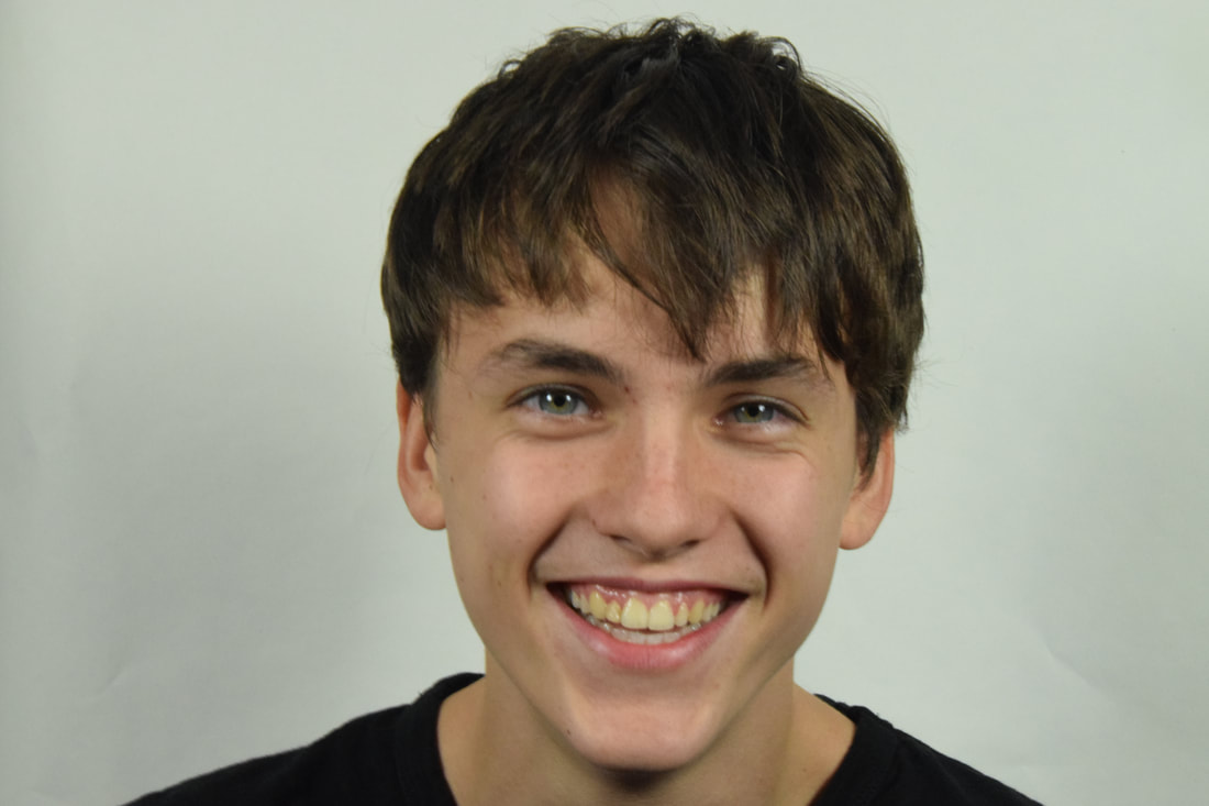
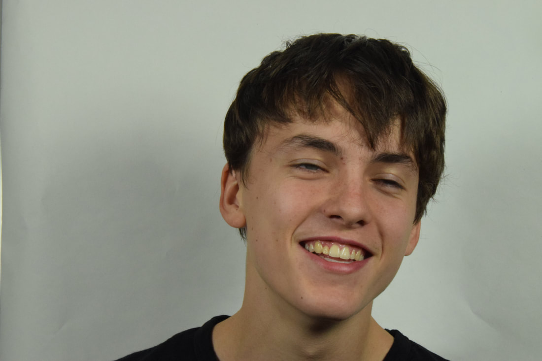
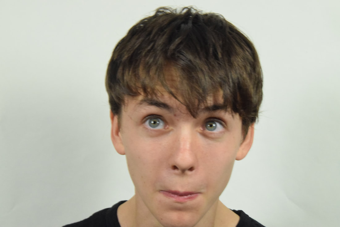
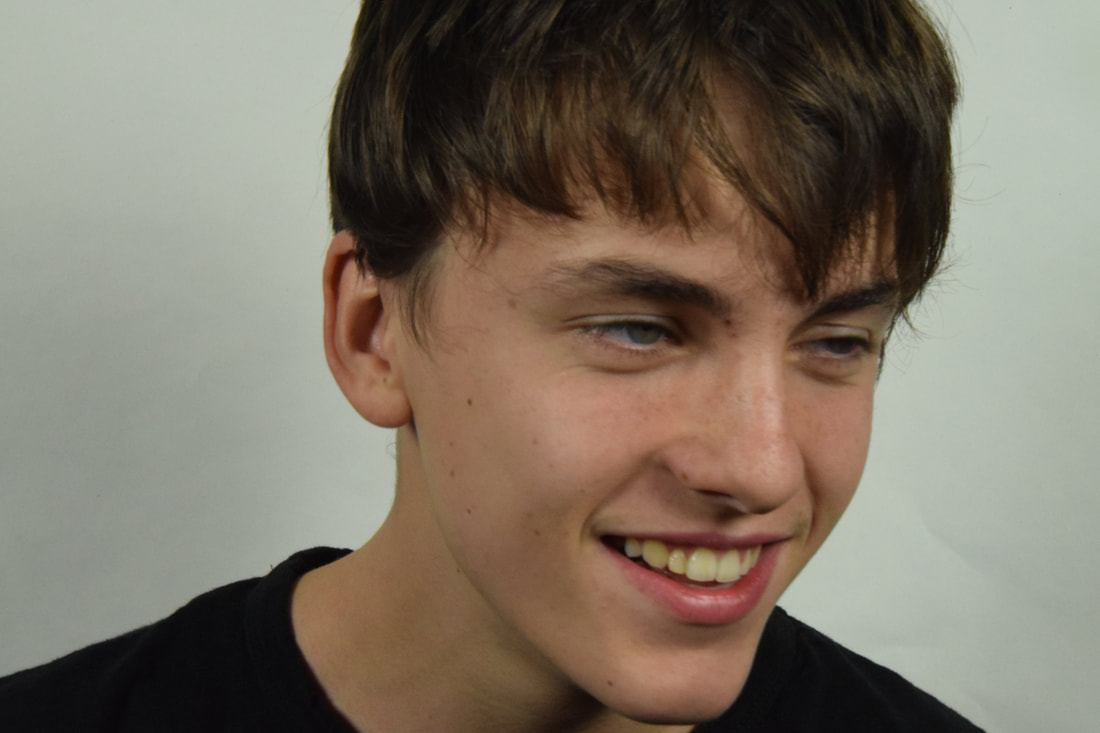
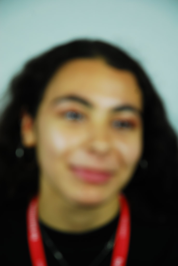
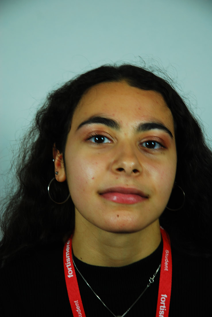

Distorted
I adopted three distortions for each portrait I chose. The first distortion was one where I captured the central features of the face with the polygon tool and then rotated them I did this in ever decreasing circle diameters till there as none left sometimes they would veer upwards. For the second distortion I used a radial blur to create a circular blur around the centre of the image and for the final image I used gaussian blur which softened all the features of the face.
|

|
|
|
|
|
|
|
ARTIST
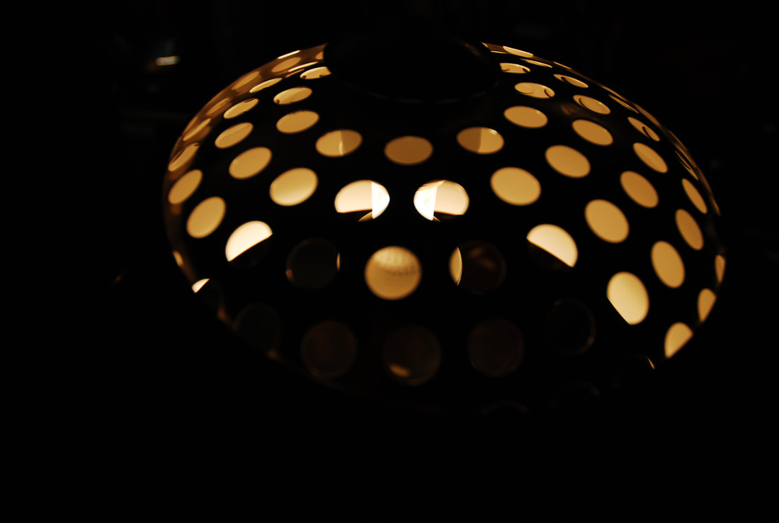
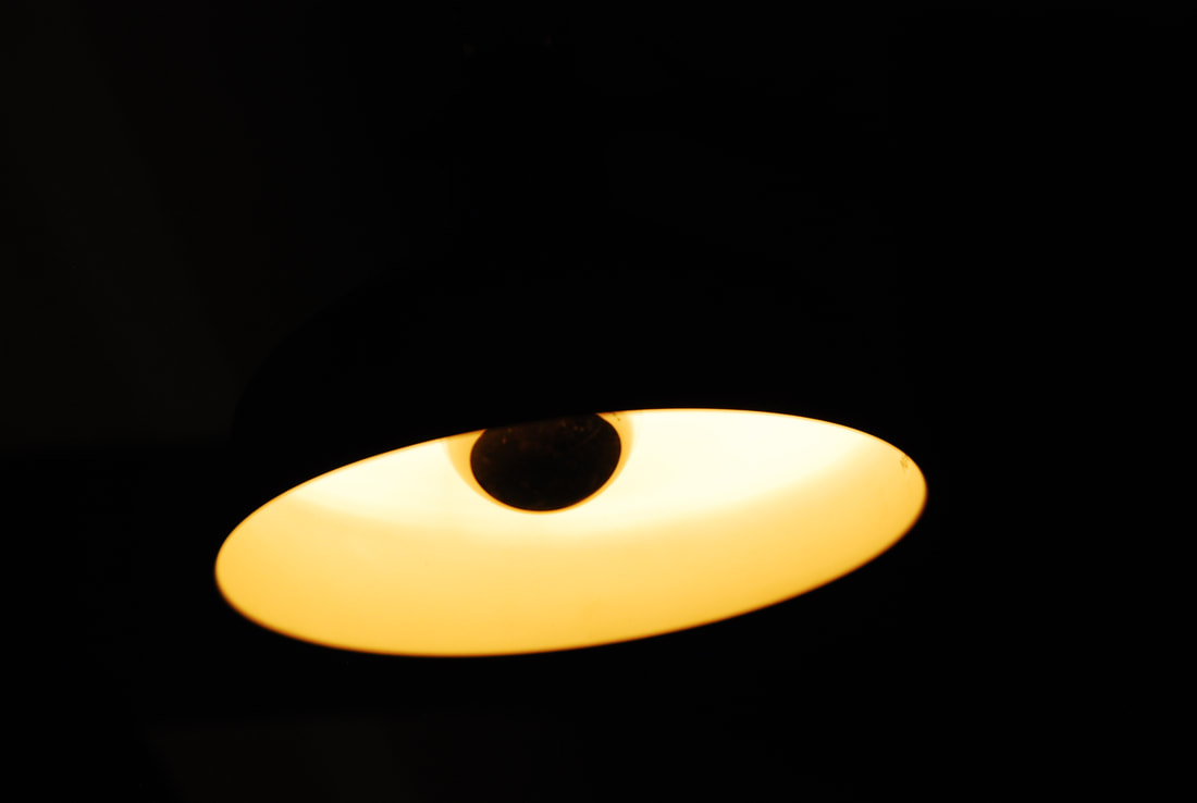
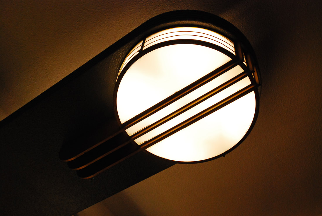
Light
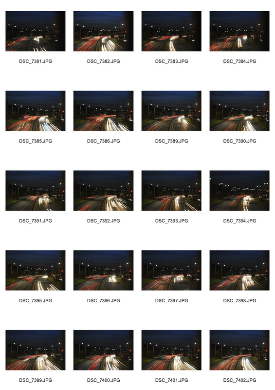
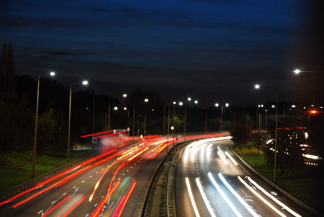
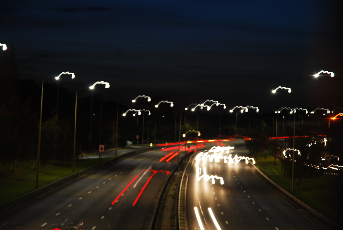
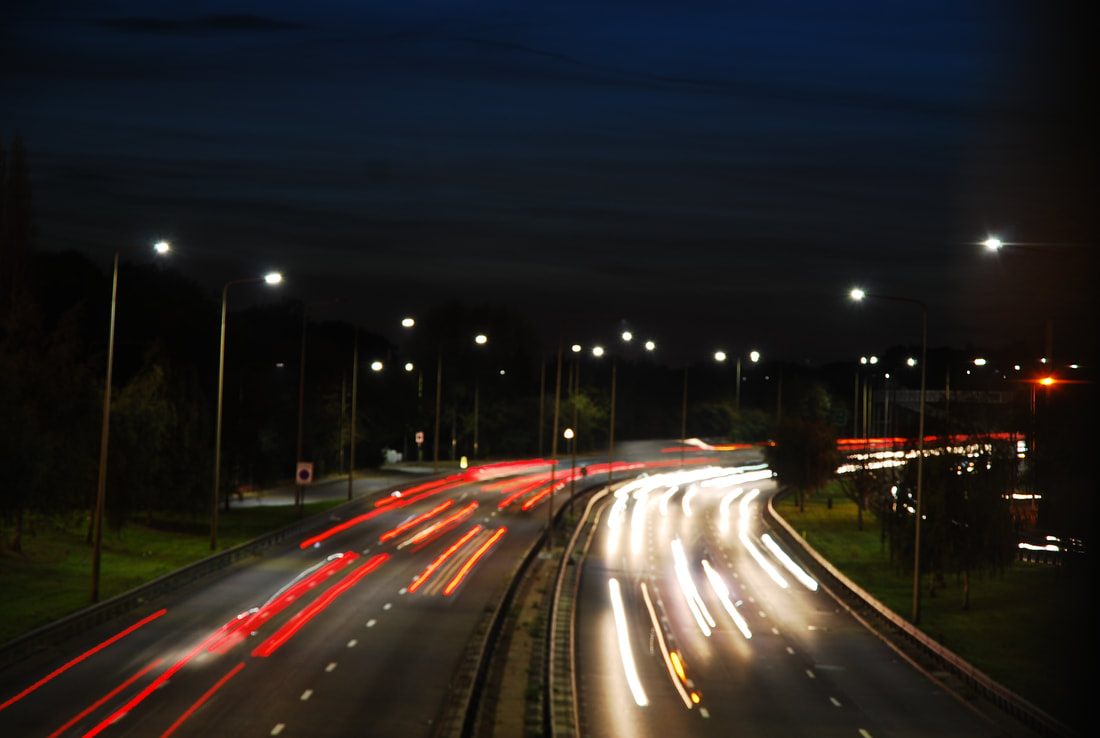
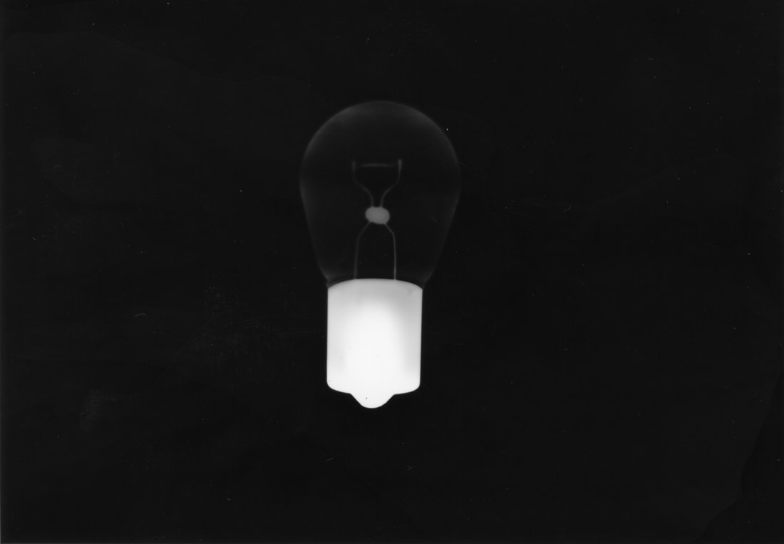
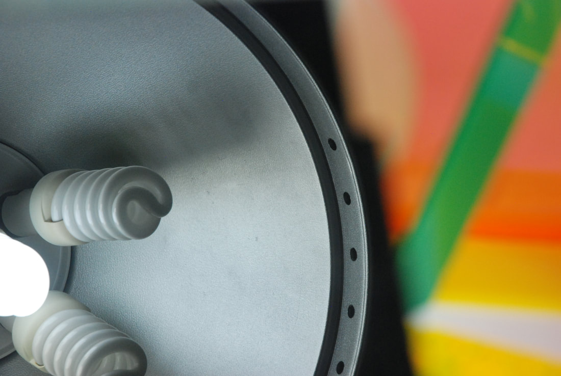
For this strand I decided to look at what composes the structure of an image and how to alter it by looking at the use of light. For this first development I decided to do traffic light trails as an example of long exposure. It was essential to have full control of the length of the shutter speed, and therefore the exposure time. If the exposure time was too long the image would become too light and the trails would become lost, however, if the exposure time was too short; there would be no trails.
|
CONTACT SHEET
|
SELECTS
|
|
I think that there was some success in these photos. There was a variety in the length of exposure and therefore different atmospheres were created. However, I think perhaps a better background would've improved the images, perhaps being at the same level as the cars so they don't seem so distant and separated from the image.
|
ARTIST
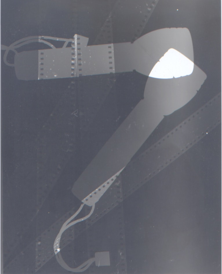
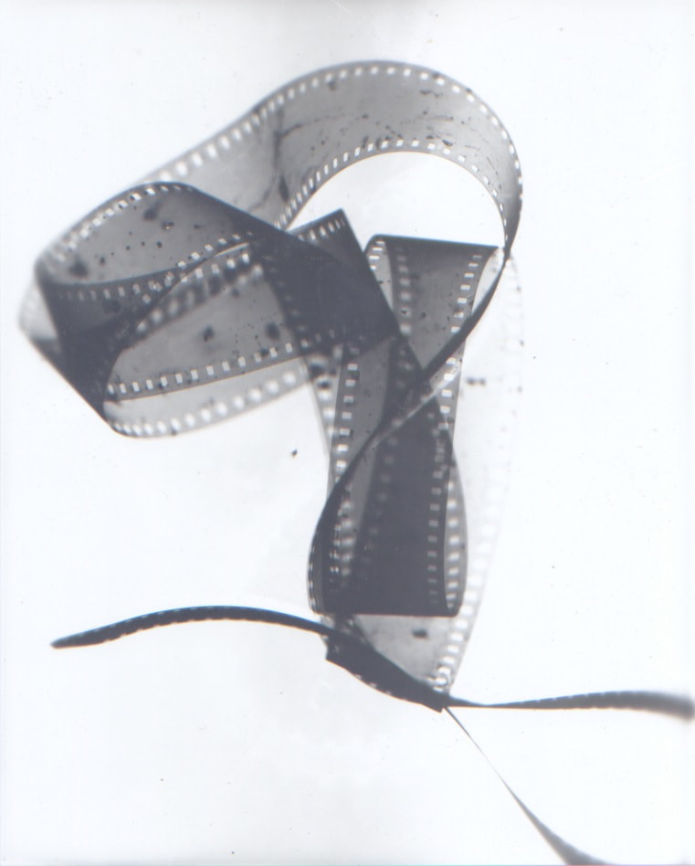
Second Development - Photograms
For this development I decided to take another direction with the structure of light. I decided to see how light could be used as the sole creator of the image bypassing the camera. By focusing solely on using light I can look further into light and the effects it has on images. By making the images more abstract, I can focus more on the effect that light has on the image. Furthermore by abstracting them I repurpose the conventional use of the objects making them solely aesthetic and remove their utilitarian nature.
|
This first development had many failures but it helped teach me some important things about the darkroom. The first test strip was one of many that failed but it was the first of many test strips except that it was visible. This let me realise that the paper I had been using had been previously left out, exposed and ruined for future purposes. The next four test strips were all very visible but I could not diagnose why they were coming out in a strange shade until I finally realised that it might be the chemicals and so i found out the chemicals had been left out over the weekend and so couldn't be used.
|
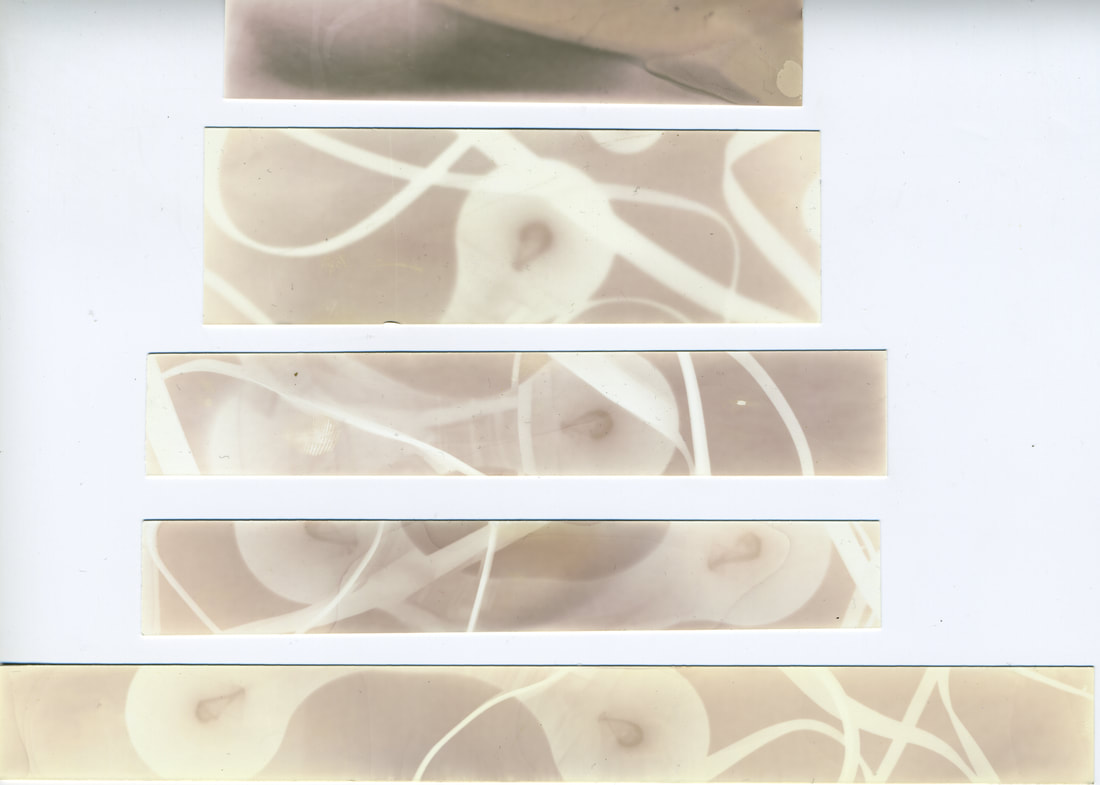
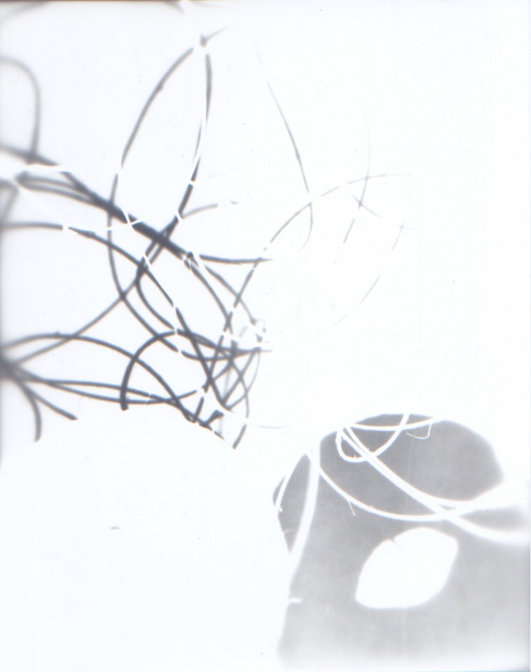
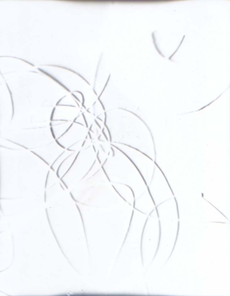
Third Development - Successful Photograms
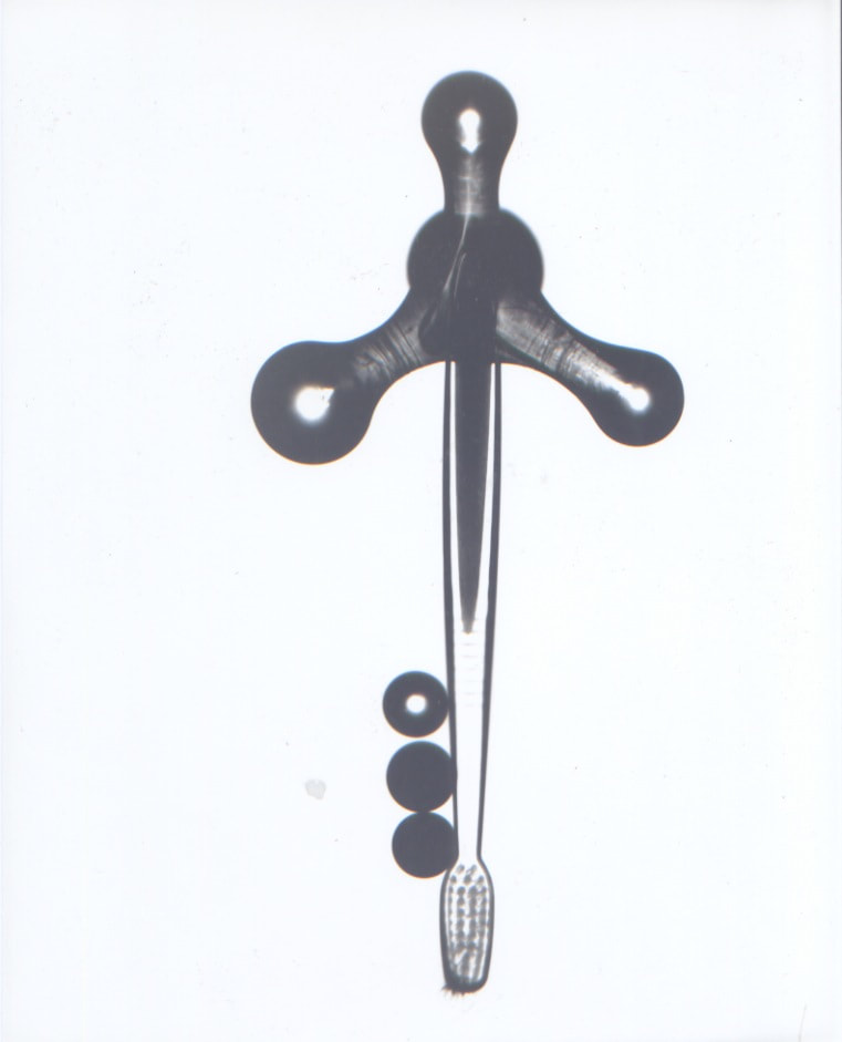
After replacing the ruined chemicals and finding some new photographic paper, I went onto finding the right exposure time for the enlarger I was using. I finally found the right length of exposure with the third test strip. Then I went onto composing the images, with the objects I had brought in. As mentioned previously my purpose often is to abstract the items and remove their utility and make them purely aesthetic, whether that is a new or old aesthetic.
Test Strips
|
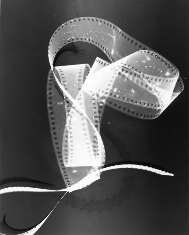 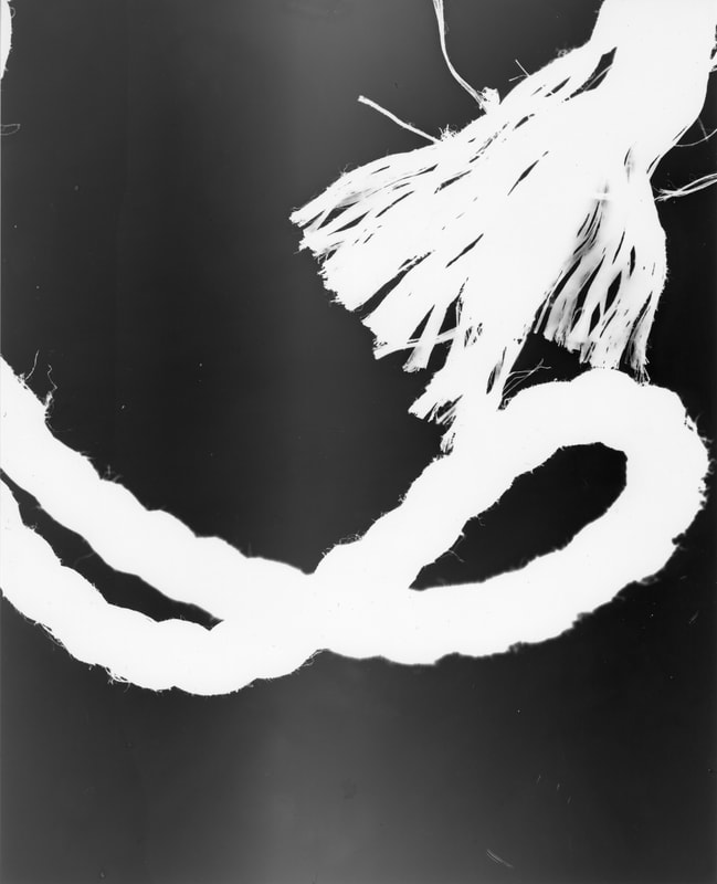 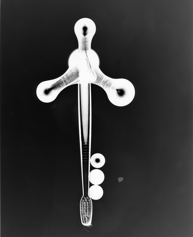 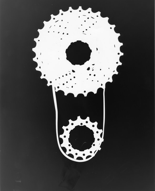 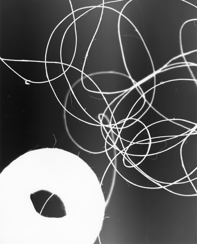     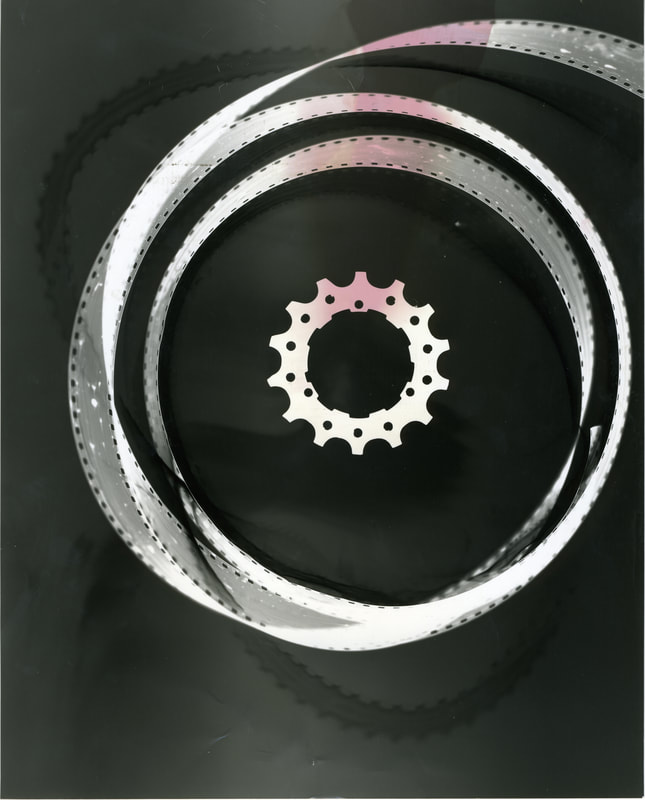 |


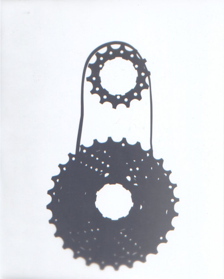
I think that there was a lot of success with this series of photograms. With some of them I kept their old aesthetic such as with the cogs or with the string. While with others I created a new aesthetic such as with the cog and film, the toothbrush or the film. I think that by abstracting the objects I create a new atmosphere for the objects and image.
ARTIST
|
Man Ray
|
|
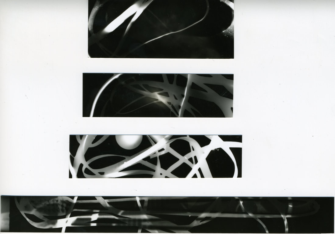
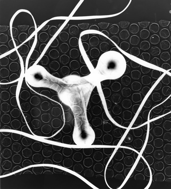
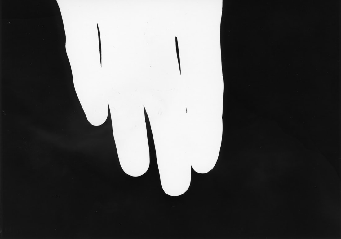
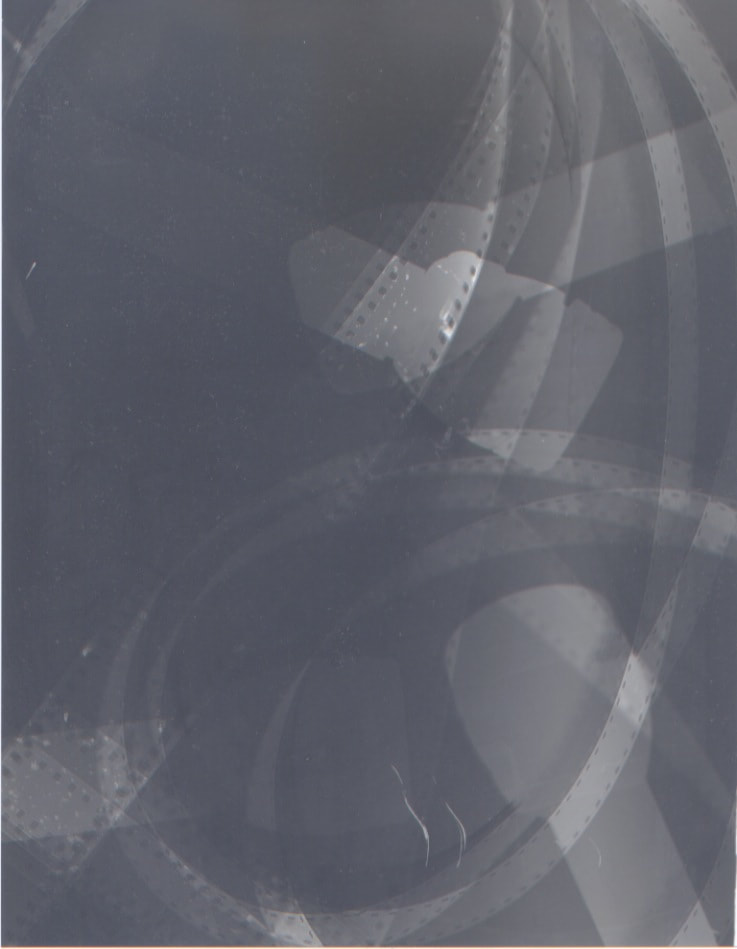
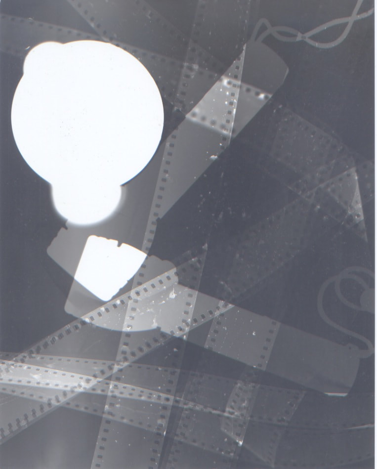
Fourth Development - Multiple Exposures and Positives
To further the abstraction of my images I decided to use multiple exposures and then start playing around with making the images positive. To create a positive photogram you need to place the original photogram, image side down, on top of a new piece of photographic paper, shiny side up like normal. Then expose but for a much longer time than for the original photogram so the light could travel through the previous photogram.
    |
        |

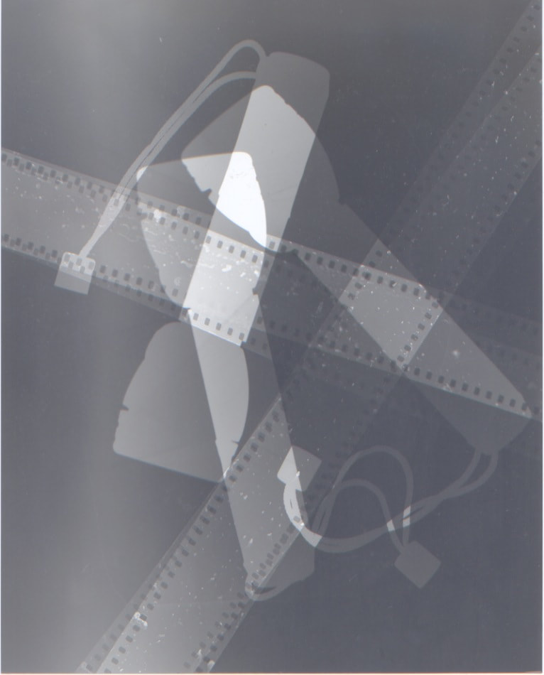
I think that there was some success especially as my experimentation developed and I further grasped making multiple exposures and positive versions. I think that the images became much crisper like the multiple exposure with the torches and especially the positive of the toothbrush. However, the photographic paper seems to be speckled and worn this could be due to a lack of care when handling or that before I got the paper it had been slightly fuddled with.
ARTIST
|
Laszlo Moholy-Nagy
|
|
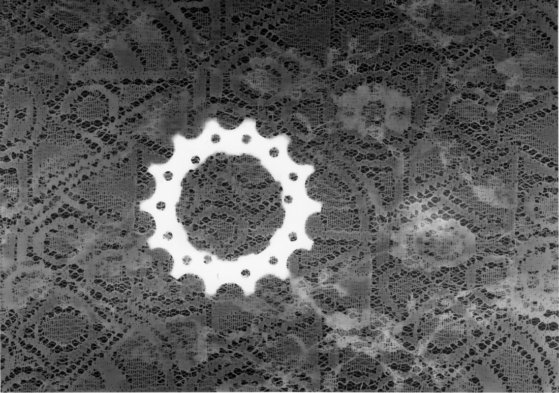
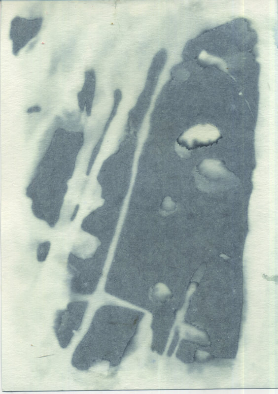
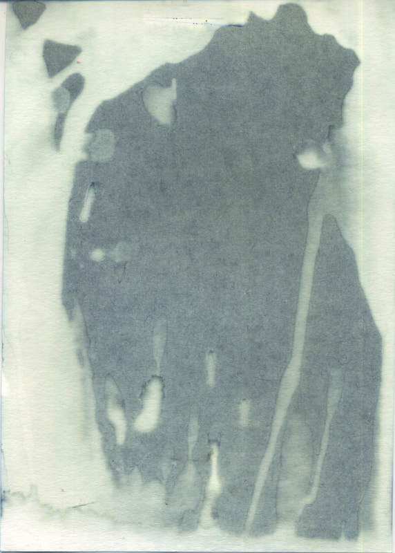
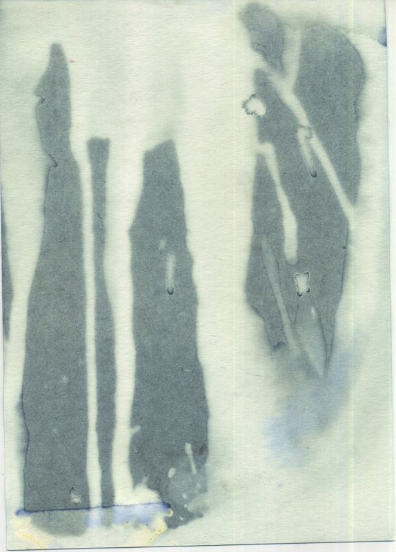
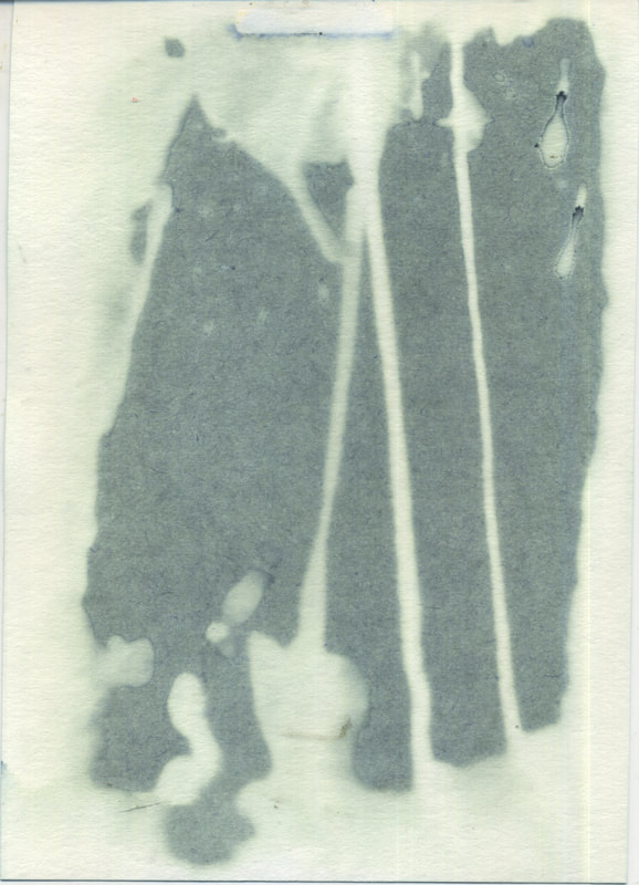
Fifth Development - Using Colour - Cyanotypes
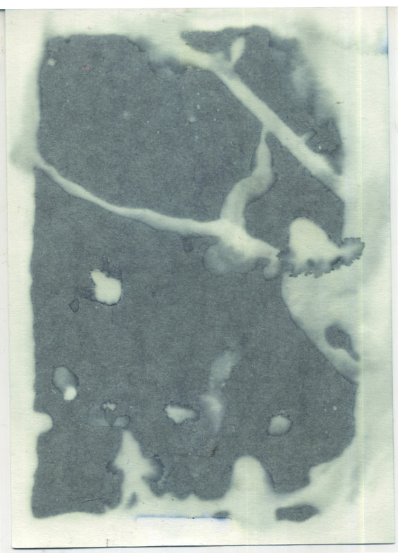
For this development I wanted to start using colours and seeing how you could create colour in photograms. Through this objective I discovered cyanotypes. Cyanotypes are a form of photographic printing where a piece of paper has chemicals applied to it. An object will be applied to the paper and the covered space will stay white as the rest of the paper reacts to sunlight or ultraviolet light and creates a blue. I used a pre prepared cyanotype paper as I did not have access to the chemicals needed.
     |
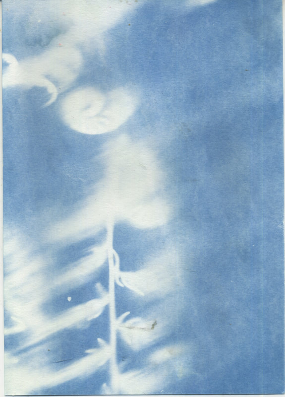 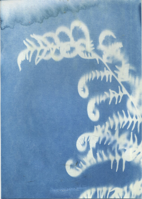 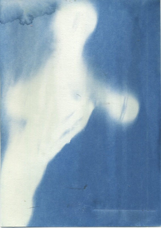 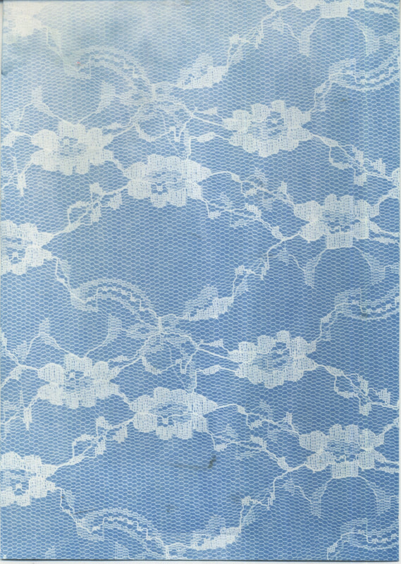 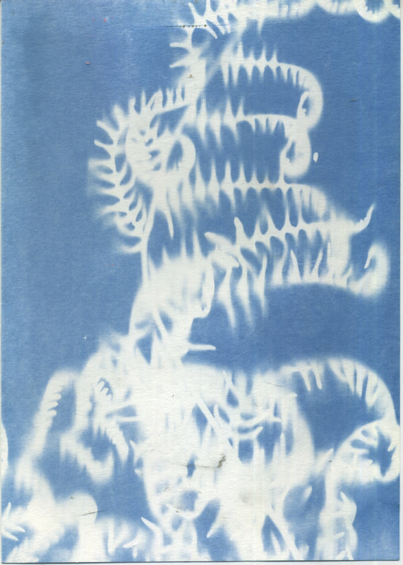 |


The issue with the cyanotypes was that the objects would move if they weren't flat like a fern. However, the images still weren't completely crisp as I had to do it in a closed box so the objects would move a little bit. However, while there wasn't much success with the actual cyanotypes as it was a pre prepared paper the back also had chemicals on it these chemicals create really weird shapes when washed to clear the chemicals and actually and so there was some success just not the intended one.
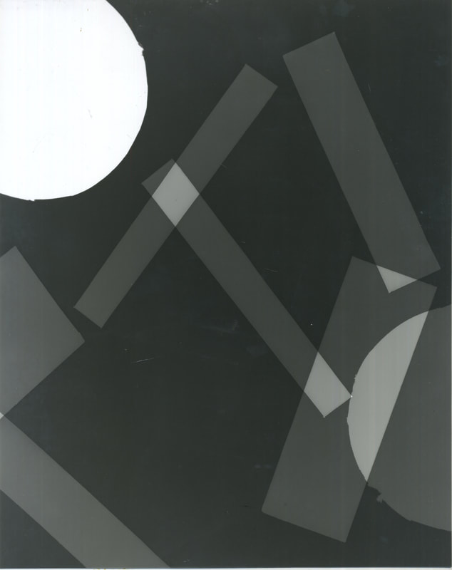
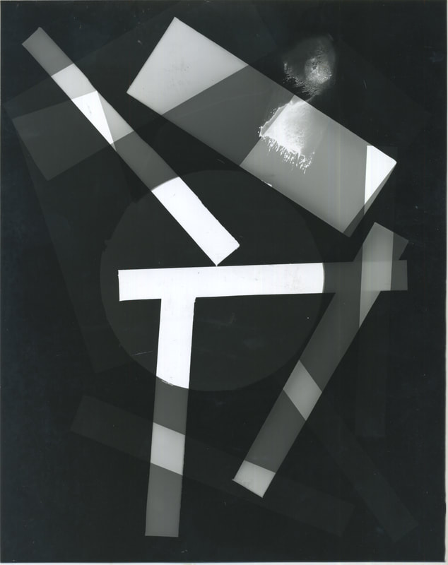
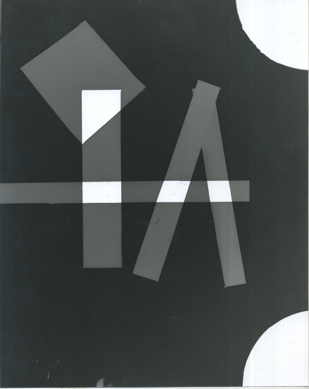
Sixth Development - Using Colour - Compositions
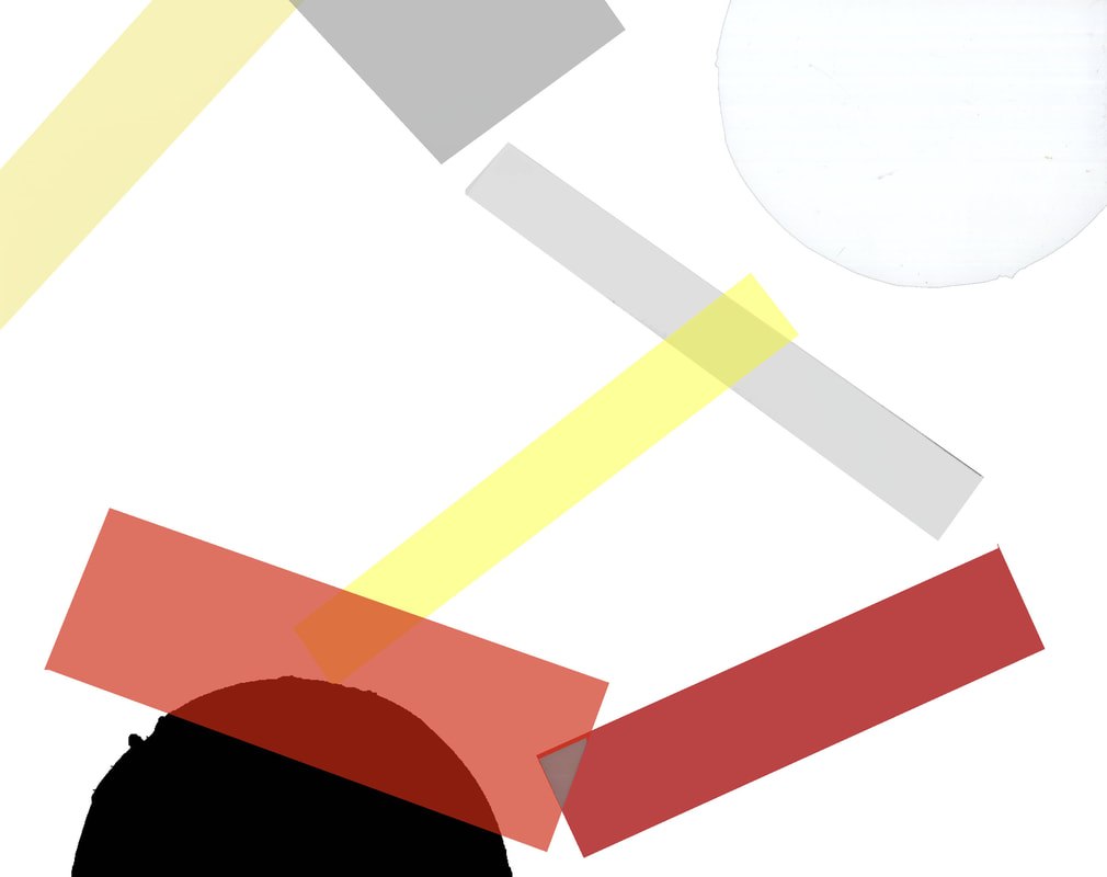
For this development even though I was successful in having achieved colour in a cameraless image, it was still only limited to two tones, blue and white instead of black and white. After trying to find ways to create colour in the development process of the photogram, including researching different types of photographic paper, I decided that to achieve the control of colour that I desired I would have to use a post-production process such as photoshop. Instead of having a photogram like Man Ray's or Laszlo Moholy-Nagy I looked at the suprematist work of Kazimir Malevich, or Kazimierz Malewicz. Even though he didn't create photograms like Ray or Moholy-Nagy and instead made prints and paintings; it was his obsession with form that inspired me as it would help alleviate the colour and the shape of the photo therefore not creating a distraction. Furthermore Malevich's use of bright primary colours interested me as it worked well together with the simple forms in the images.
|
|

|
|

|

|
I think that this series had some success but lacks a lot of refinement. For example some of the shapes are rough around the edges especially the large circle and some of the overlaps don't work especially on the top left image like the two reds overlapping and creating grey or one shape having a different colour or shade around the edges. This was especially apparent with the coloured backgrounds.
On the other hand I think that the colour combinations work well in the images especially the bottom right image where the use of a pale blue and grey palette creates a continuity throughout the image which is inexistent in the other images. If I was to do this again I would implement a continuous palette through the series or just per image as it gives a crisper finish to it. In the top left image there are the foundations of a complimentary colour scheme so instead of just having a reduced palette I could use a complimentary colour scheme or a triadic colour scheme, which would give an ample selection for the background colour to have a contrast to the forms in the foreground. In general I think that they seem to be aesthetically pleasing but lacks the meaning and emotion of an actual suprematist piece.
On the other hand I think that the colour combinations work well in the images especially the bottom right image where the use of a pale blue and grey palette creates a continuity throughout the image which is inexistent in the other images. If I was to do this again I would implement a continuous palette through the series or just per image as it gives a crisper finish to it. In the top left image there are the foundations of a complimentary colour scheme so instead of just having a reduced palette I could use a complimentary colour scheme or a triadic colour scheme, which would give an ample selection for the background colour to have a contrast to the forms in the foreground. In general I think that they seem to be aesthetically pleasing but lacks the meaning and emotion of an actual suprematist piece.
KAZIMIR MALEVICH AND SUPREMATISM
|
In the above series of images I was inspired by the work of Kazimir Malevich and the movement of suprematism that he founded. Suprematism partially developed out of constructivism, one of the largest art movements of the 20th century. Whereas constructivism was meant as to help social movements such as the Russian Revolution; Suprematism meant to explore the feeling of art through visual means: "To the Suprematist, the visual phenomena of the objective world are, in themselves, meaningless; the significant thing is feeling, as such, quite from the environment in which it is called forth." Malevich in his book 'The Non-objective World' where he stated the purpose and concept of Suprematism. Each choice of shape and colour represents something particular in each suprematist piece. However, the ultimate form is the square representing the 'Zero of Form' for Malevich. Malevich therefore achieved the idea in it's pure form no longer distracted by appearance. This was best achieved in the pieces 'Black Square' or 'White on White'.
There were three phases to the Suprematist movement: Black, Coloured and White. The two previously mentioned paintings were from the first and last phase respectively and are regarded as two of the finest paintings of suprematism and Malevich. After suprematism Malevich reflected that the Coloured phase also known as dynamic suprematism was the worst as it was like aerial photography, he nicknamed it aerial suprematism. He hated this aerial perspective because it resonated the angle of satellite photos and so became too objective and moves away from 'zero of form'. |
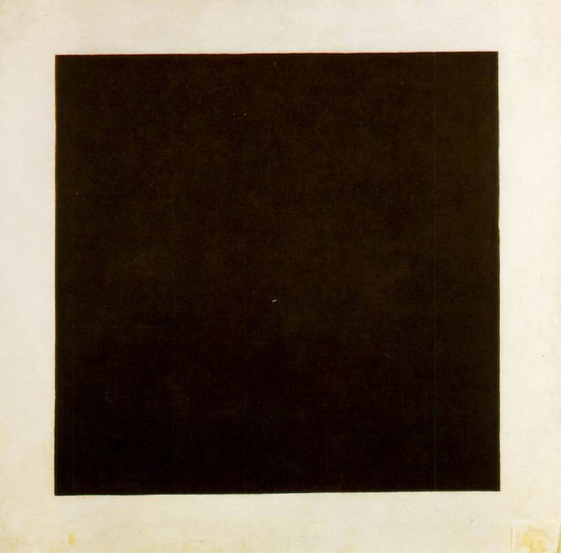
Black Square, 1915
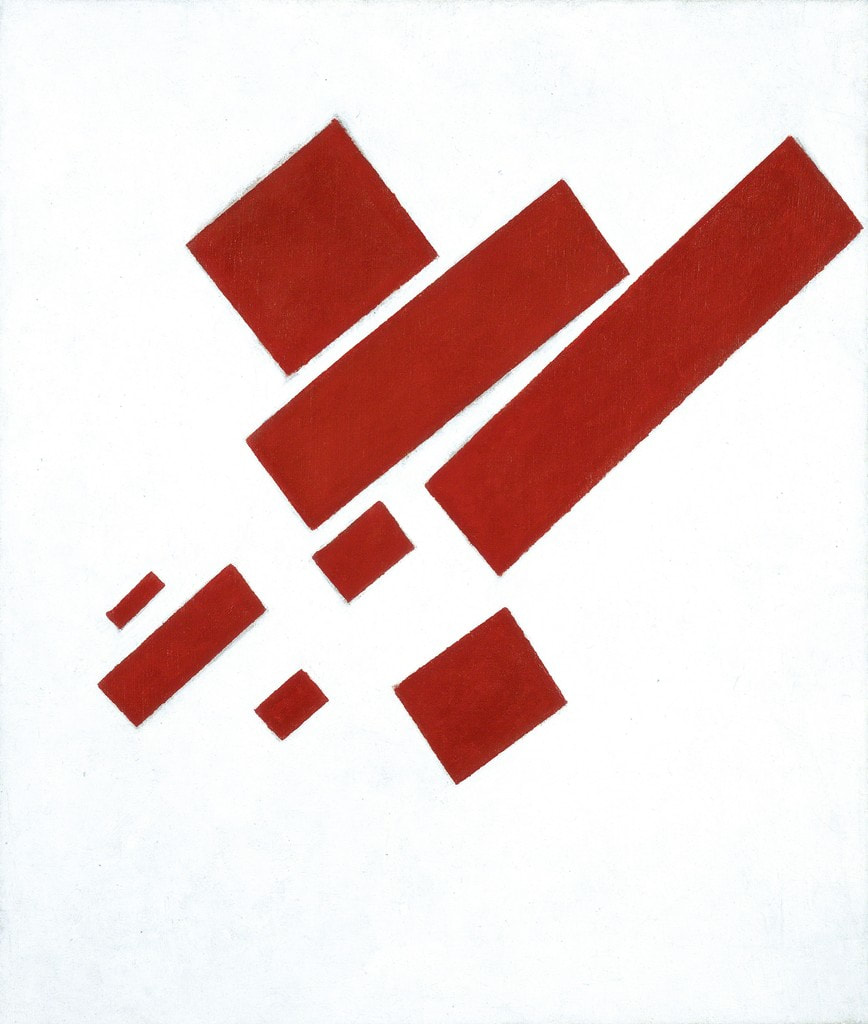
Eight Red Rectangles, 1915
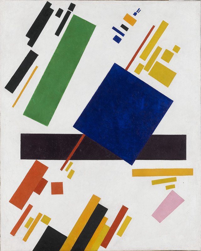
Suprematist Composition, 1916
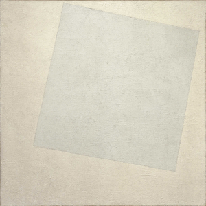
White on White, 1918
|
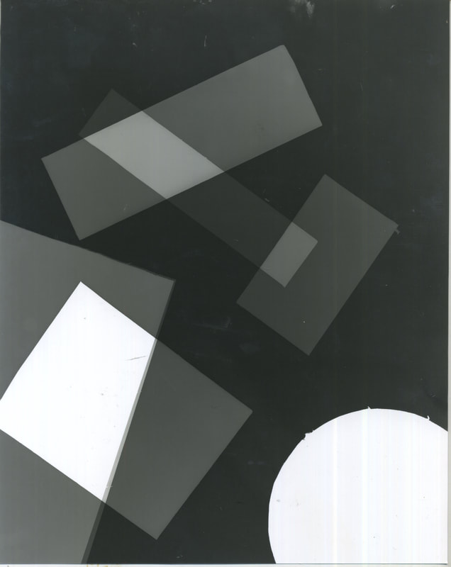
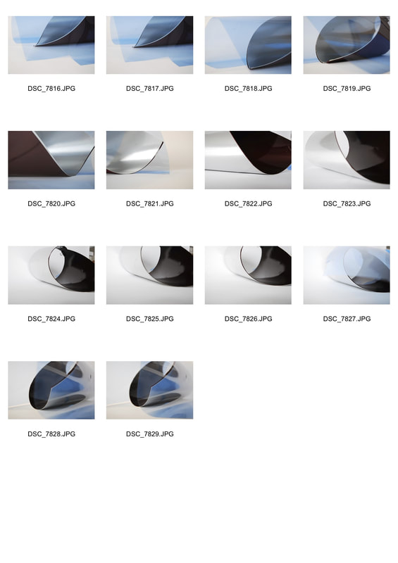
Seventh Development - Perspex Structures
|
The abstract coloured shapes from the previous development fascinated and so when I discovered Laszlo Moholy-Nagy's work with Dufaycolor photography I found out that I should go away from photograms and back into camera photography. In this Moholy-Nagy was experimenting with Dufaycolor film that had just been released for still cameras and testing how it photographed colour. However, in the process took some really nice images using a translucent plastic which captured the natural light really well and so created a variety of different shades.
|
|
|
|
|
|
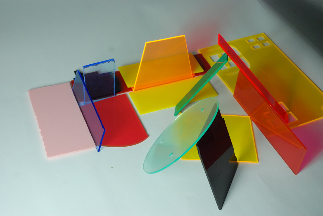
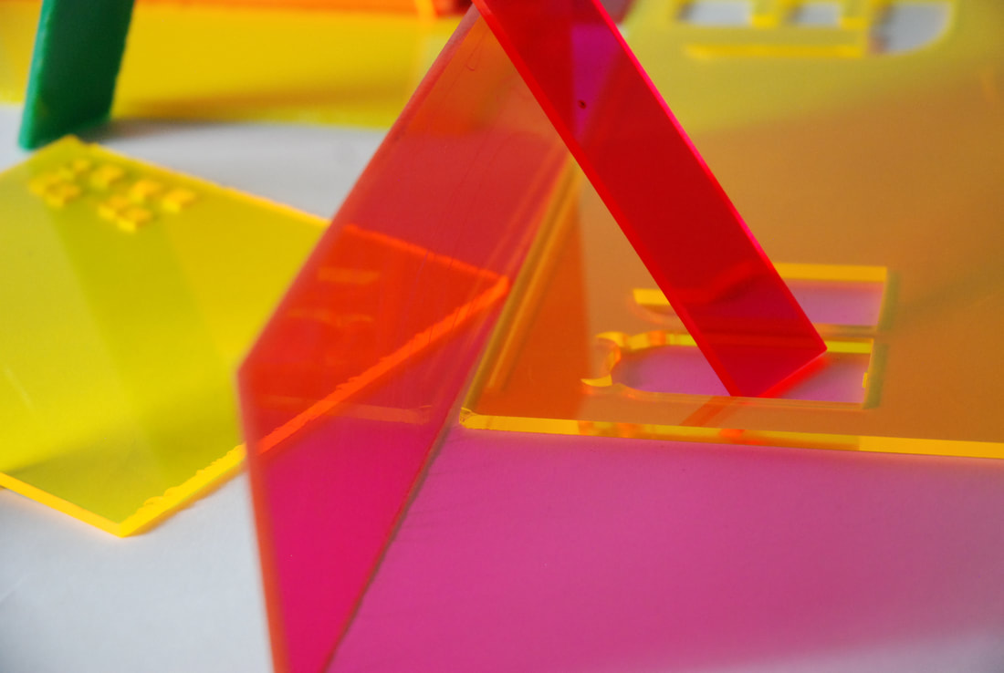
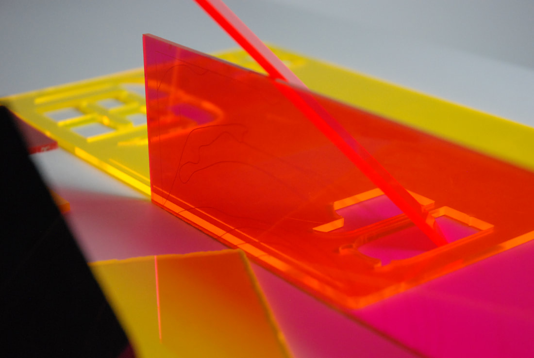
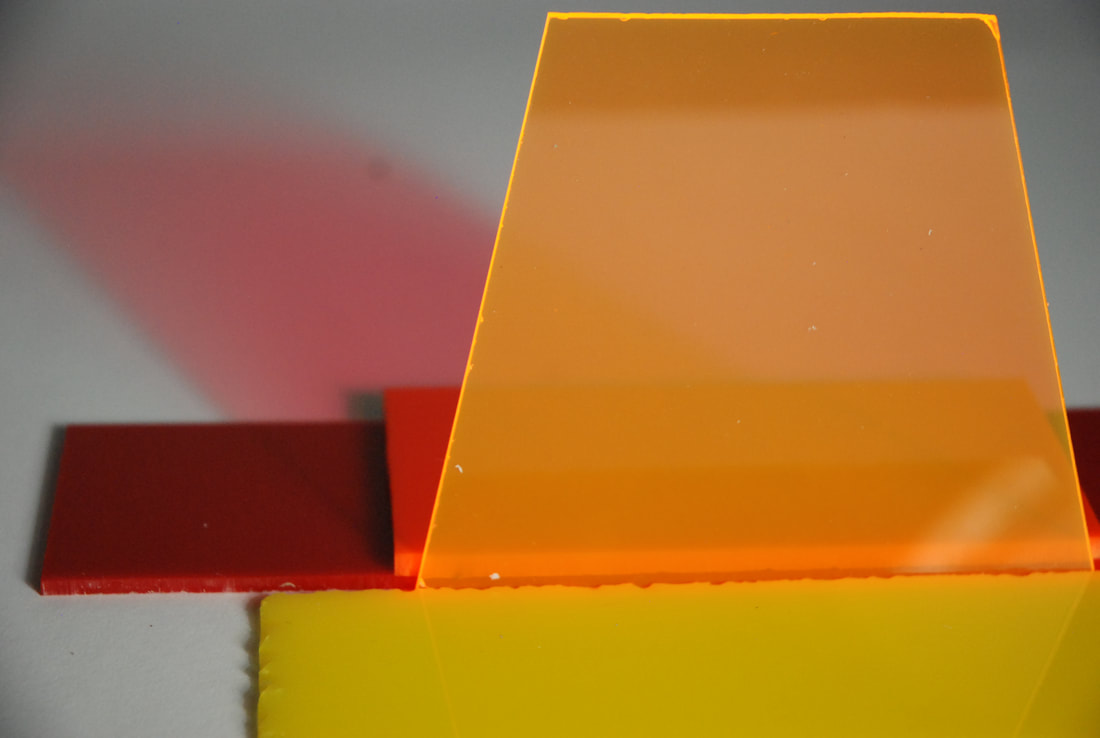
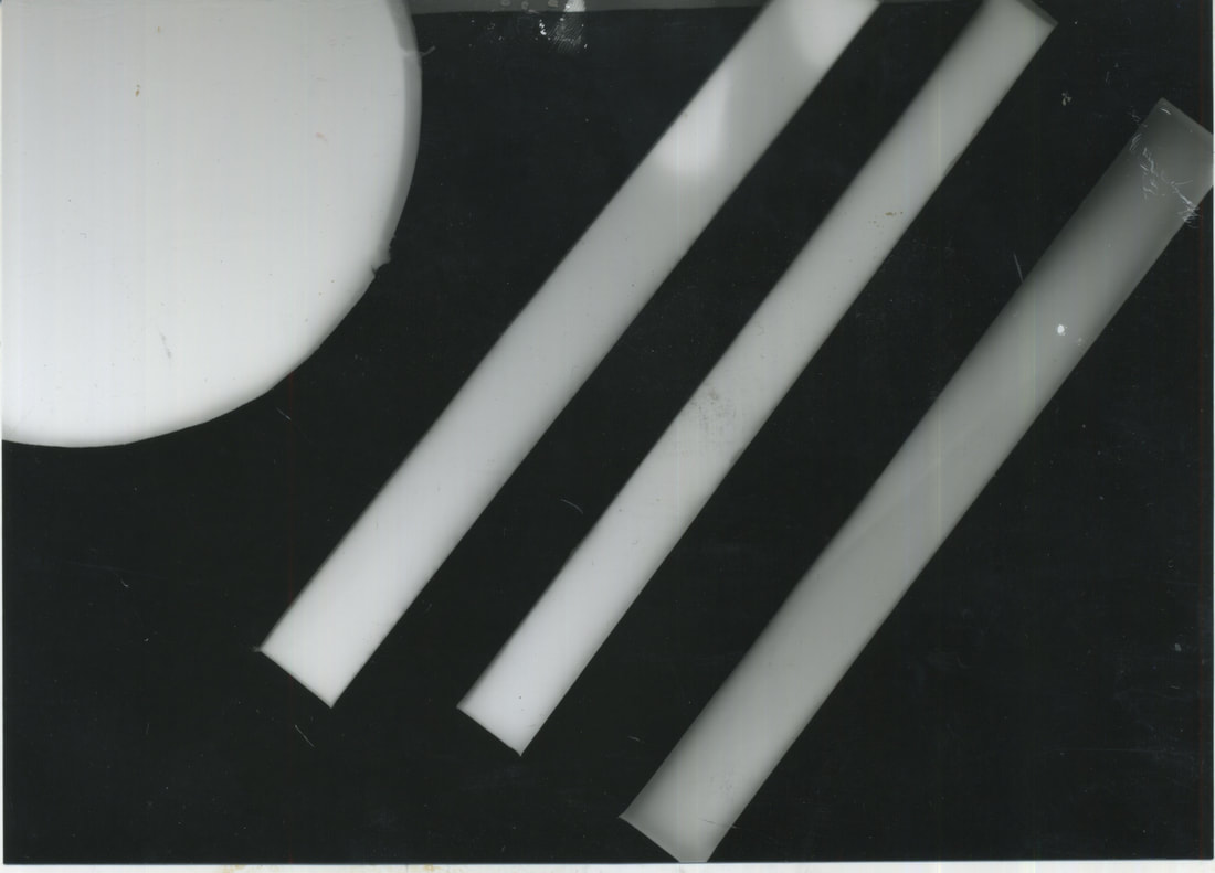
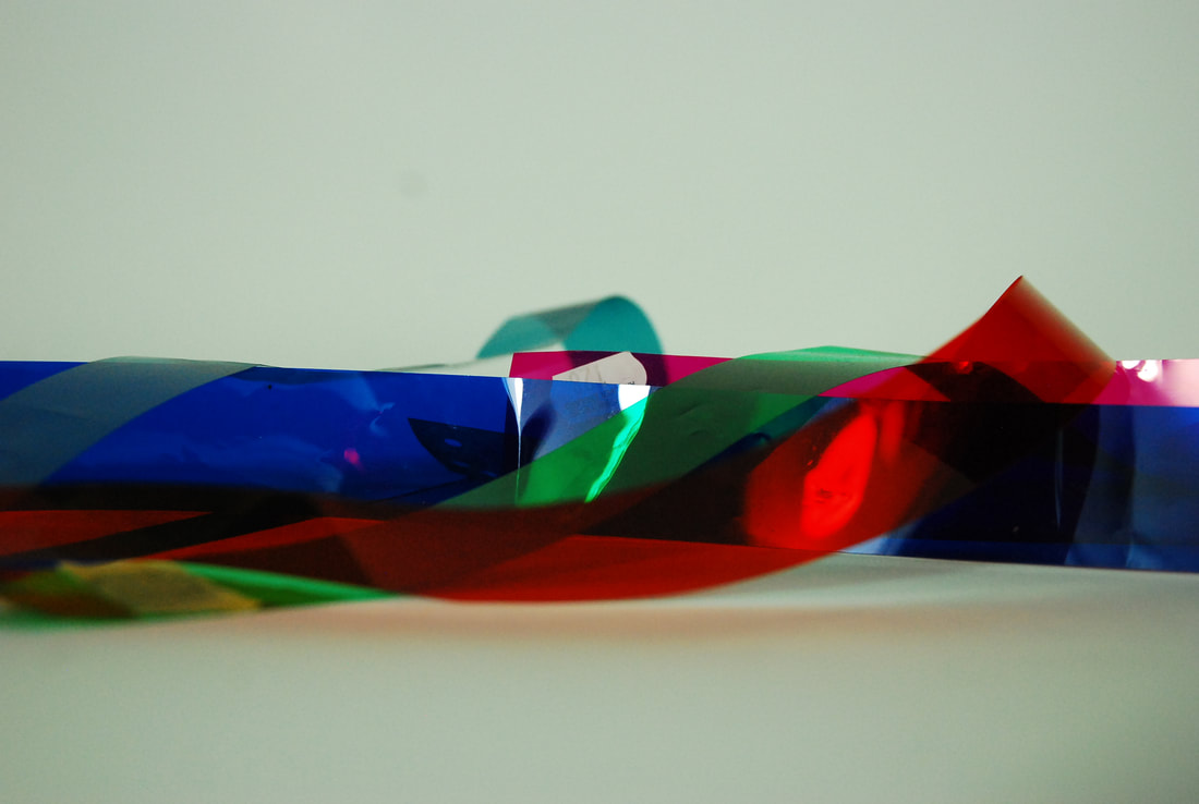
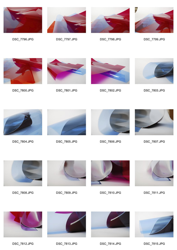
Eighth Development - Colour Ribbons
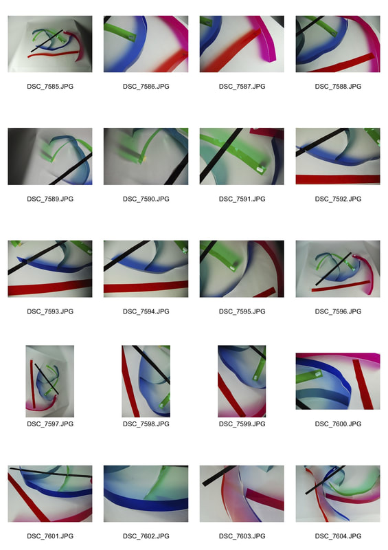
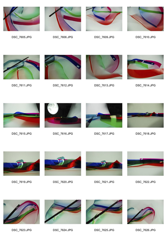
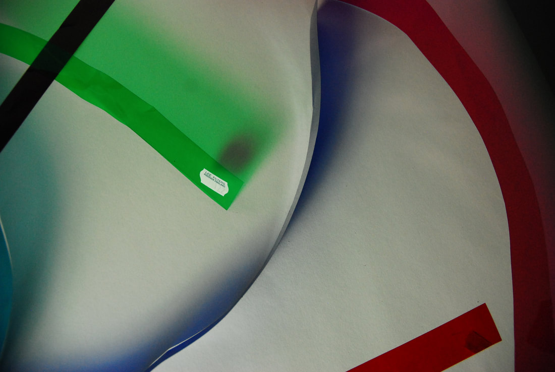
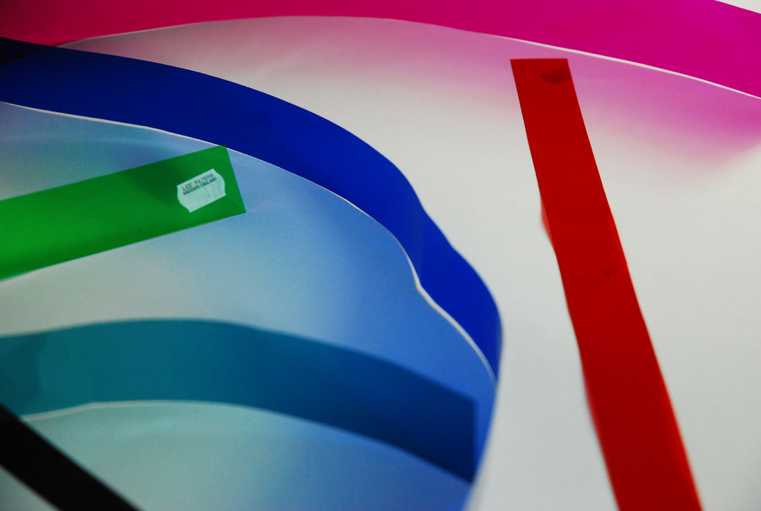
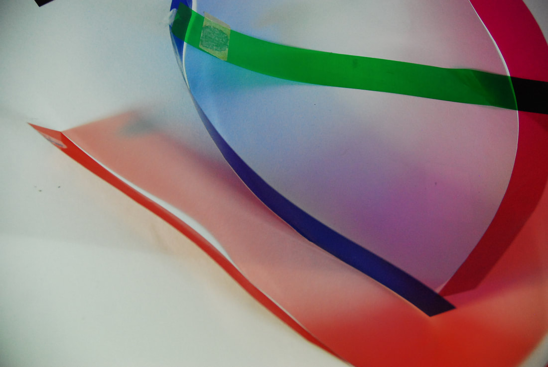
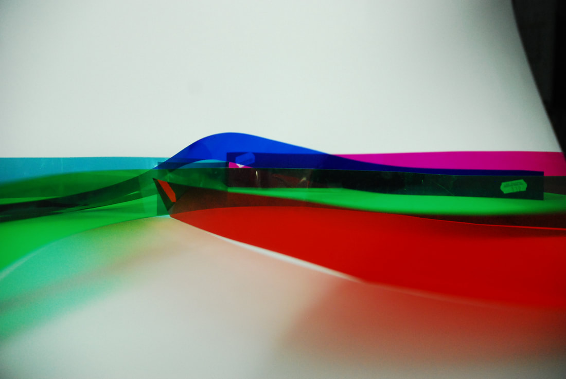
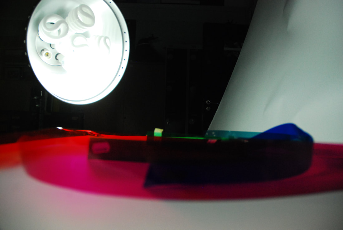
For this development after capturing the coloured shadows in the previous image I wished to attempt to try to create and capture these coloured shadows to a greater extent. So instead of using perspex I used coloured acetate strips as they could mould more easily but let more light through, which would enable me to capture these shadows more easily.
|
|
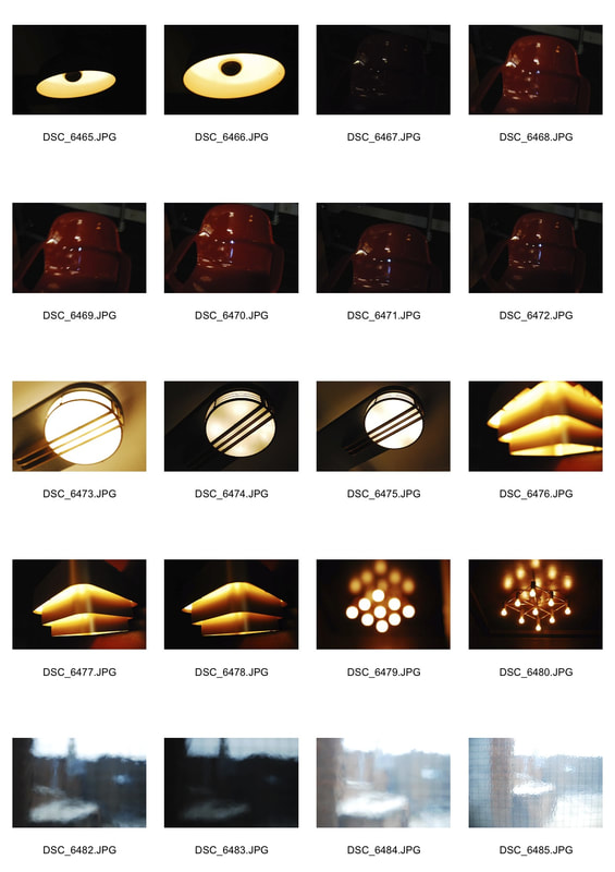
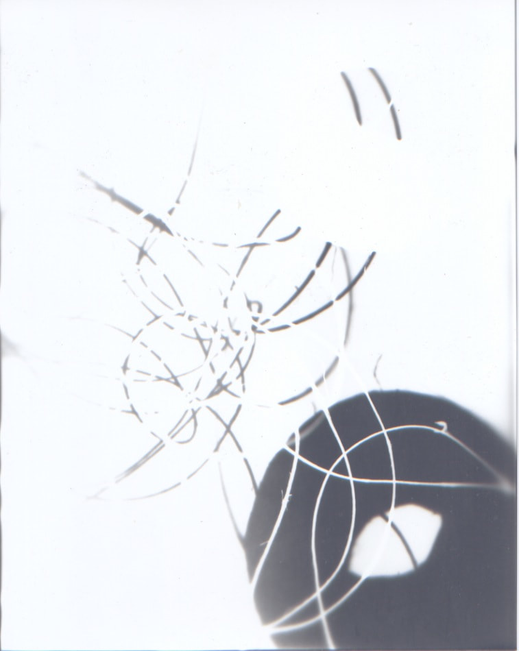
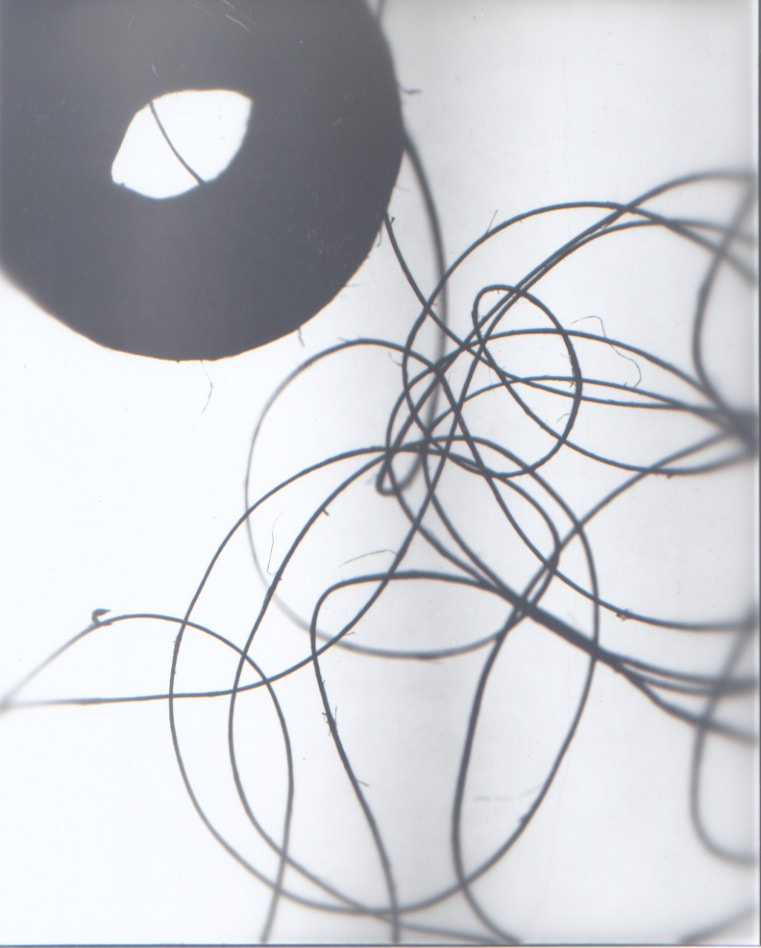
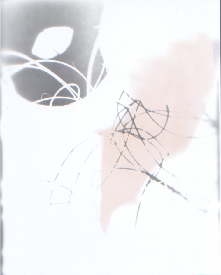
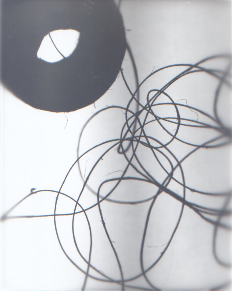
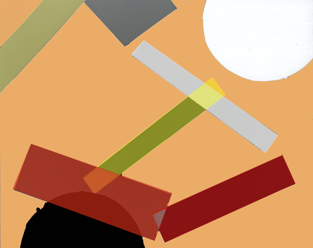
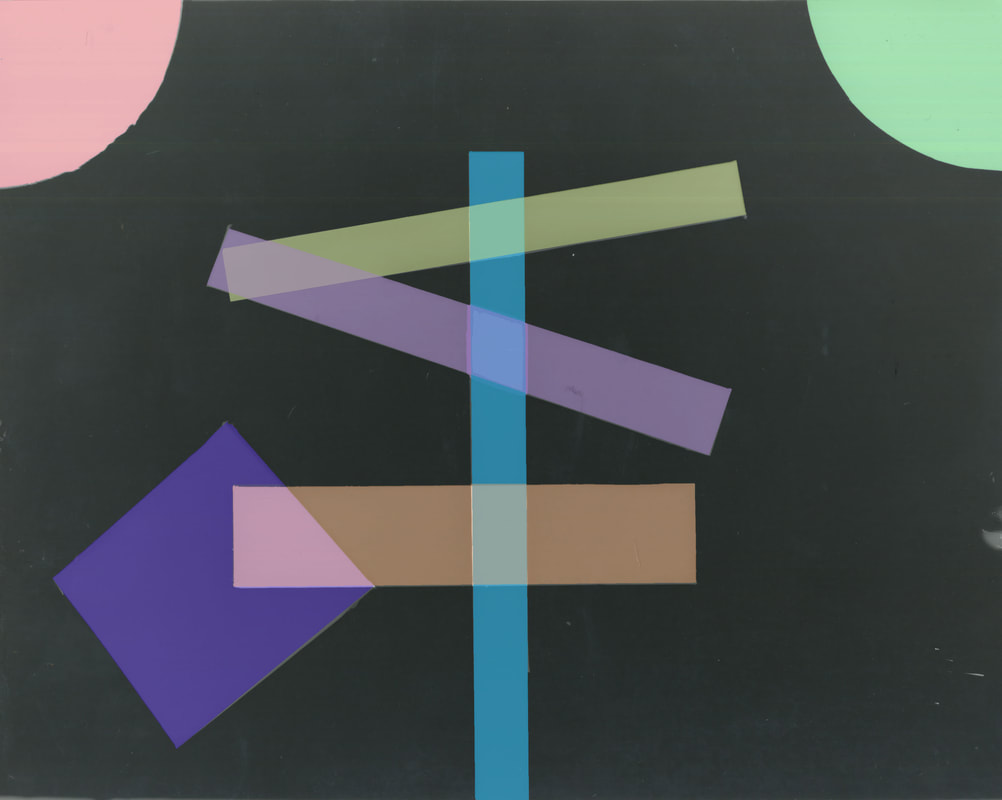
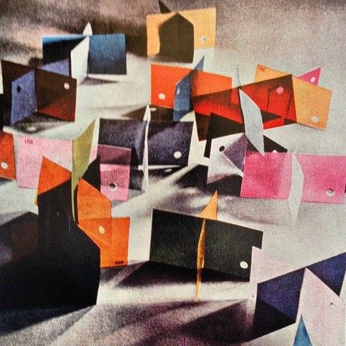
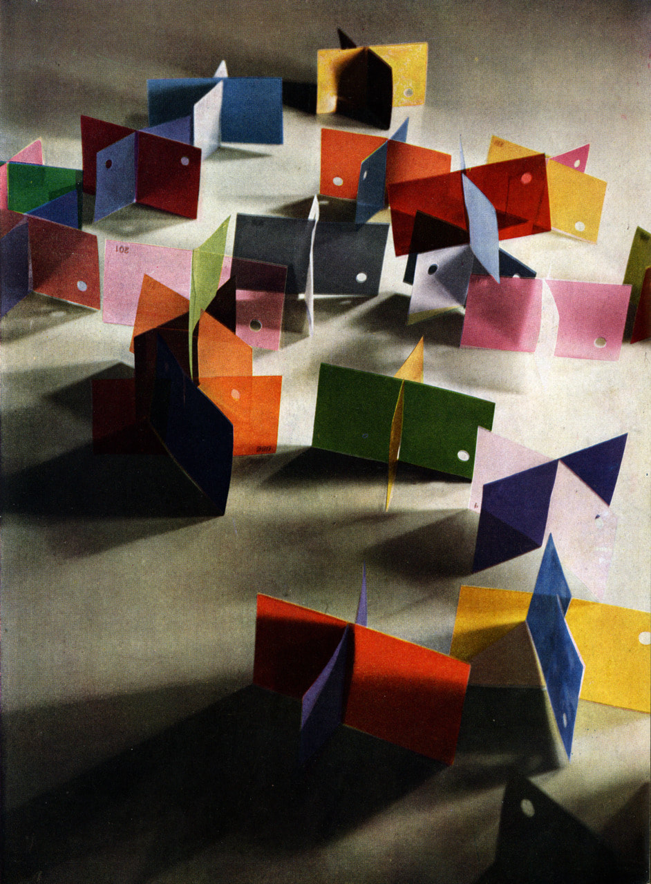
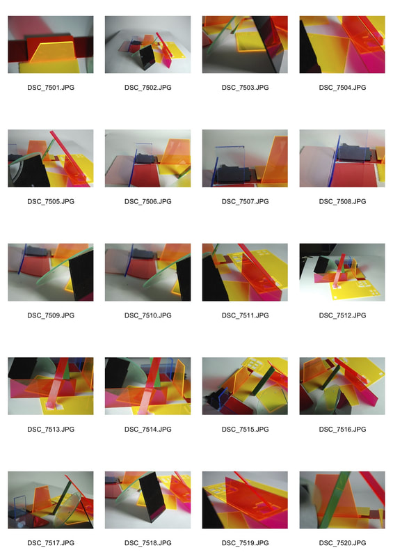
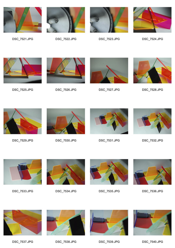
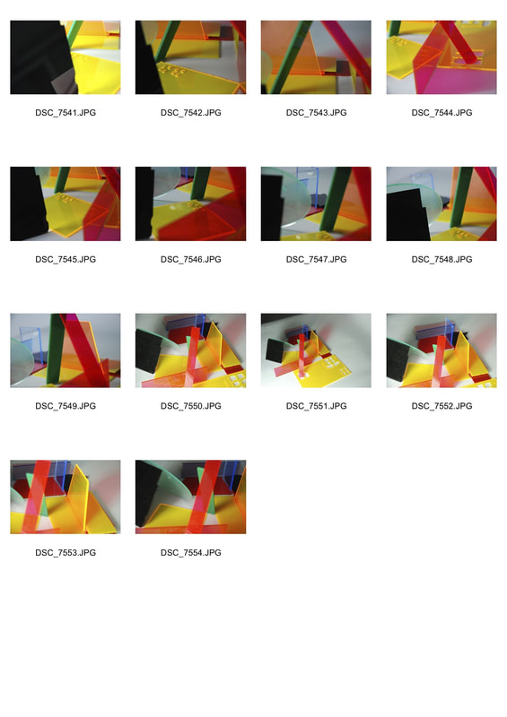
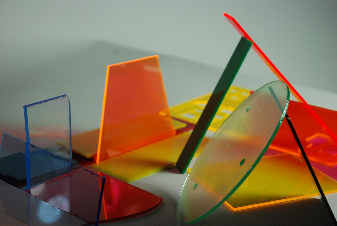
Ninth Development - Colour Card Abstractions
For this development I was inspired by the work of Timo Kelaranta. Timo Kelaranta is a Finnish Artist who studied at the Helsinki school and graduated in 1975. I was mostly inspired by his 'Anniversary' and 'Juego' works. Kelaranta's intention is to explore the area between the material and the immaterial through his photographs like poets do. He does this through using space and 'emptiness' in his photos and using simple forms like triangles or ellipses. This therefore creates a focus on the aesthetic of the image and the space in the photo. By using simple forms and shapes he emphasises and helps draw further attention to the space in the images. This large emphasis on both form and space in his images helps further emphasise his focus on exploring the area between the material and immaterial like a poet.

Only one of the images was a success in being aesthetically appealing which was the top right edit. The brightness gives the image a freshness and crispness, which is lacking in the other three. While the negative space adds greater emphasis on the subject of the image and it's depth. On the other hand the other three the images are overly dark and the ISO was overly high creating too much noise and making the images messy and unclear, something that could've been easily avoided and meant a higher quality of images by using studio lights and a lower ISO.
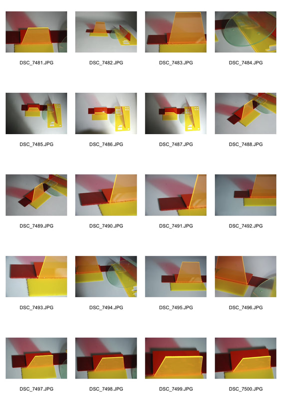
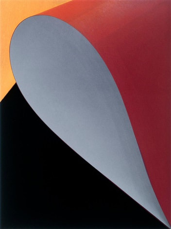
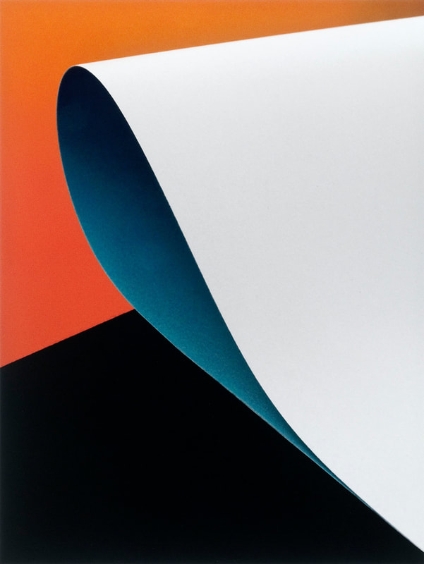
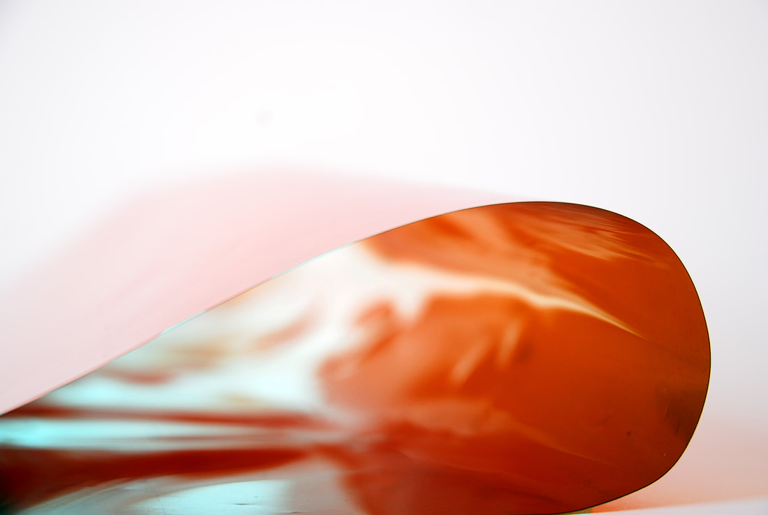
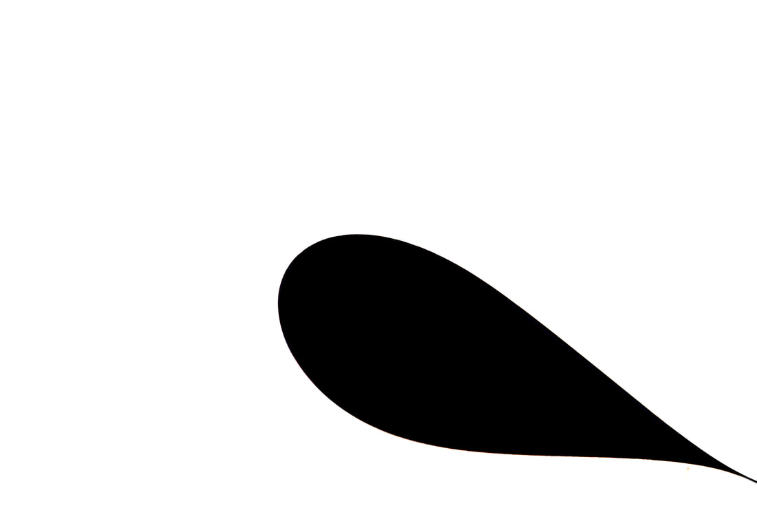
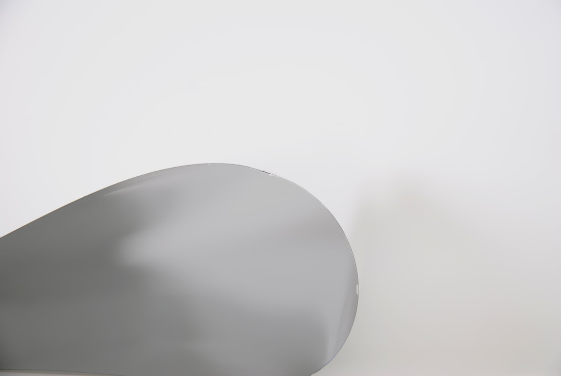
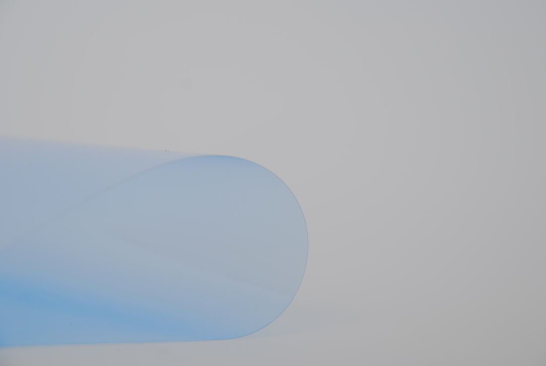
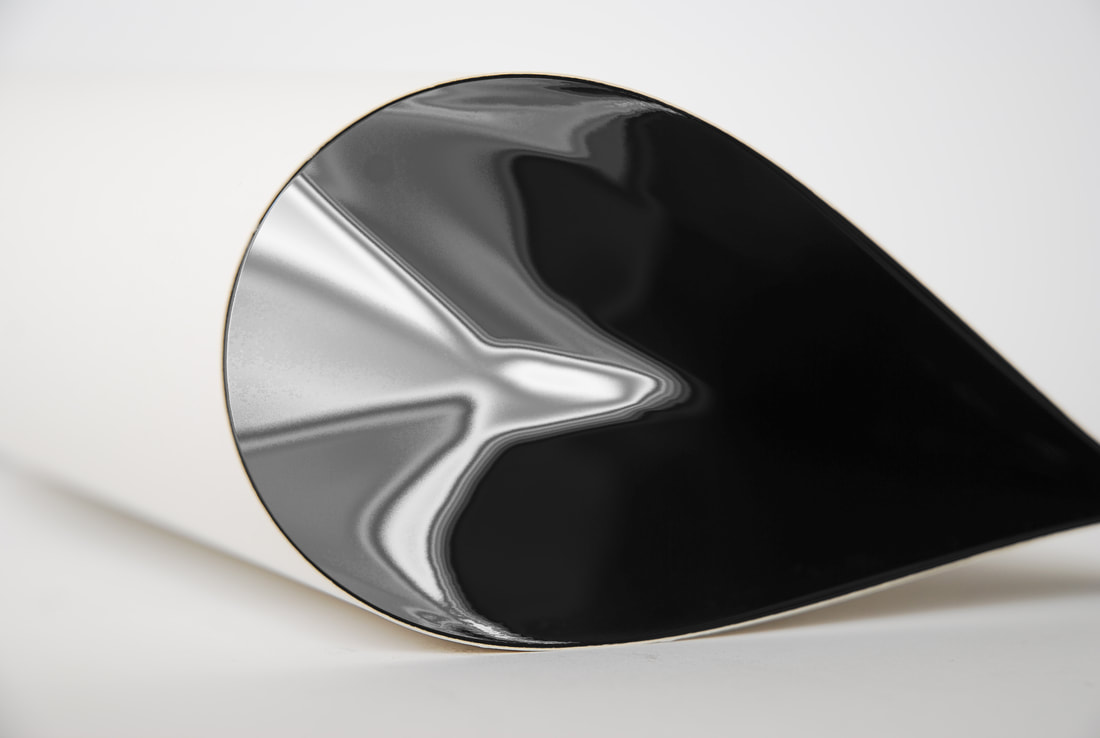
Mock Exam
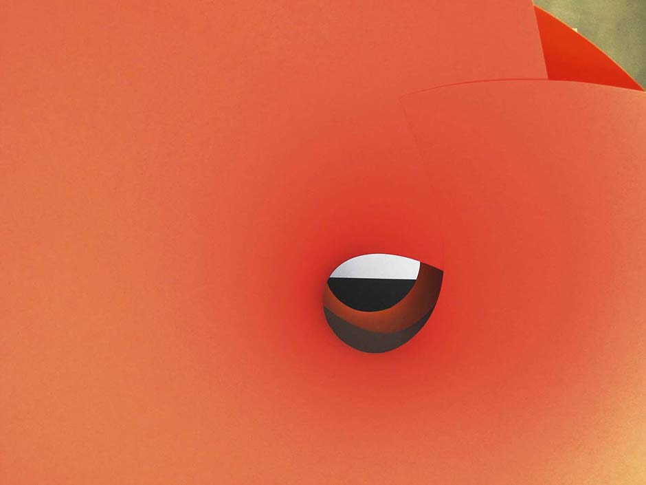
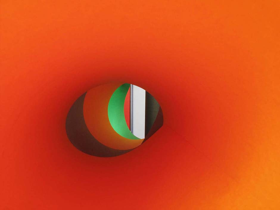
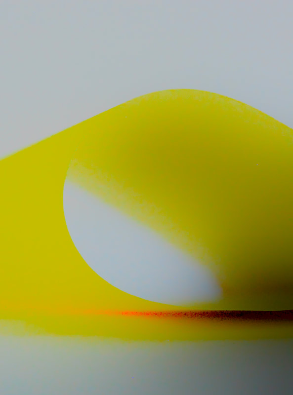
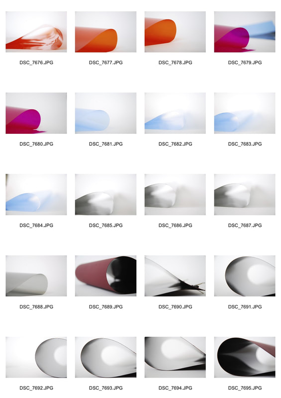
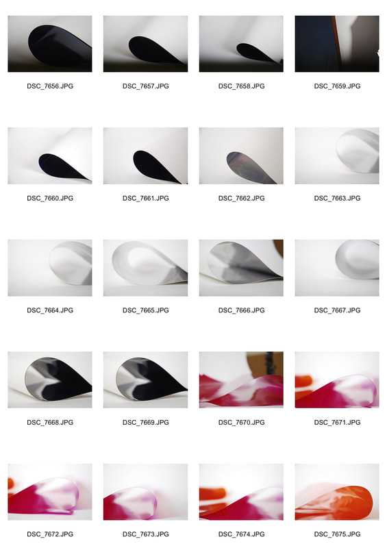
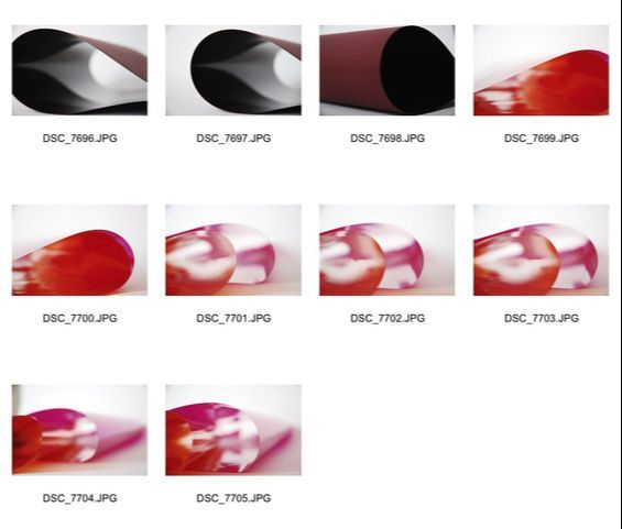
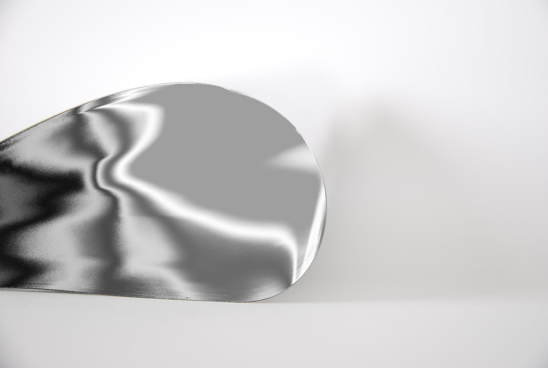
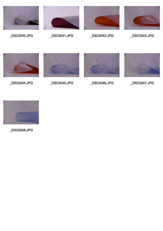
After doing my previous development I realised that the folded paper had a clear resemblance to Wolfgang's Tillman's 'Paper Drop'. Compared to Kelaranta's paper work, Tillman's work is much more crisp and clear using lighting and focus to enhance the crispness of the paper and the images. By focusing the camera on the edge of the paper Tillmans creates a clear border between the interior of the paper drop and the exterior side of the paper drop therefore referring back to his idea that there are two worlds: the abstract and the real according to Ideelart. In the Paper Drop's interior represents the abstract world, the blurred background, wacky colours and empty black are all interpretations of the abstract world according to Tillmans. So through looking at the work of Tillmans I decided to put greater focus on the lighting of the image and where the camera focused on. Therefore like Tillmans I achieved a crisper image and therefore created a subject of the image of the edge of the card and acetate.
|
|
 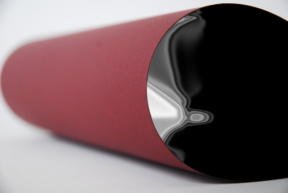 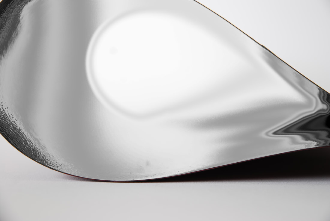 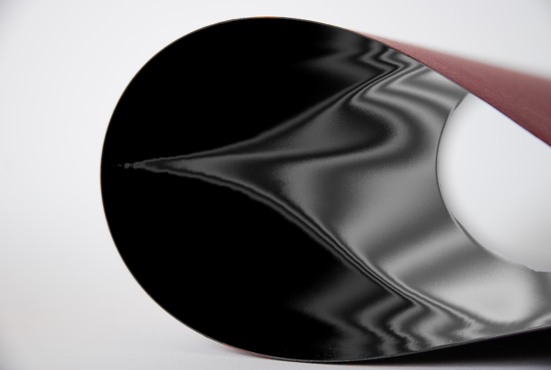   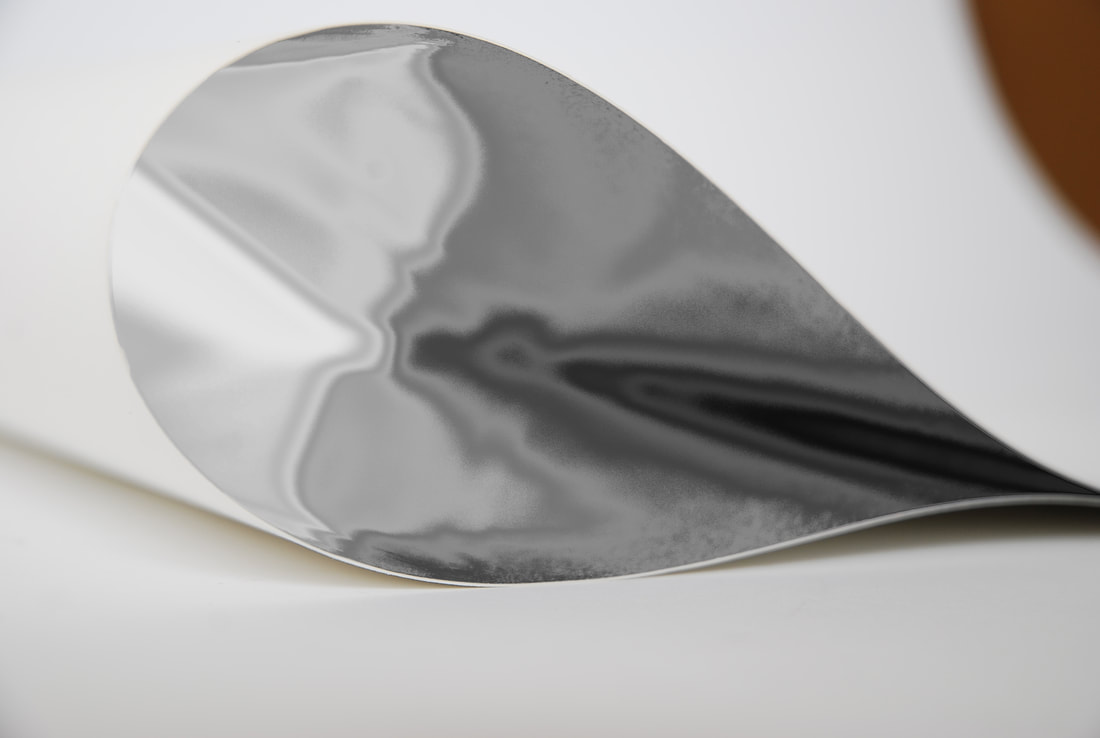 |
For this series of edits I altered the interiors of the paper, which were all originally black or white. I altered them by creating a wavy light on the curves that distorted the pattern of the light. However, most importantly the light was already in abnormal shapes due to the lighting of the set and the reflective nature of the material used.
|
|
|
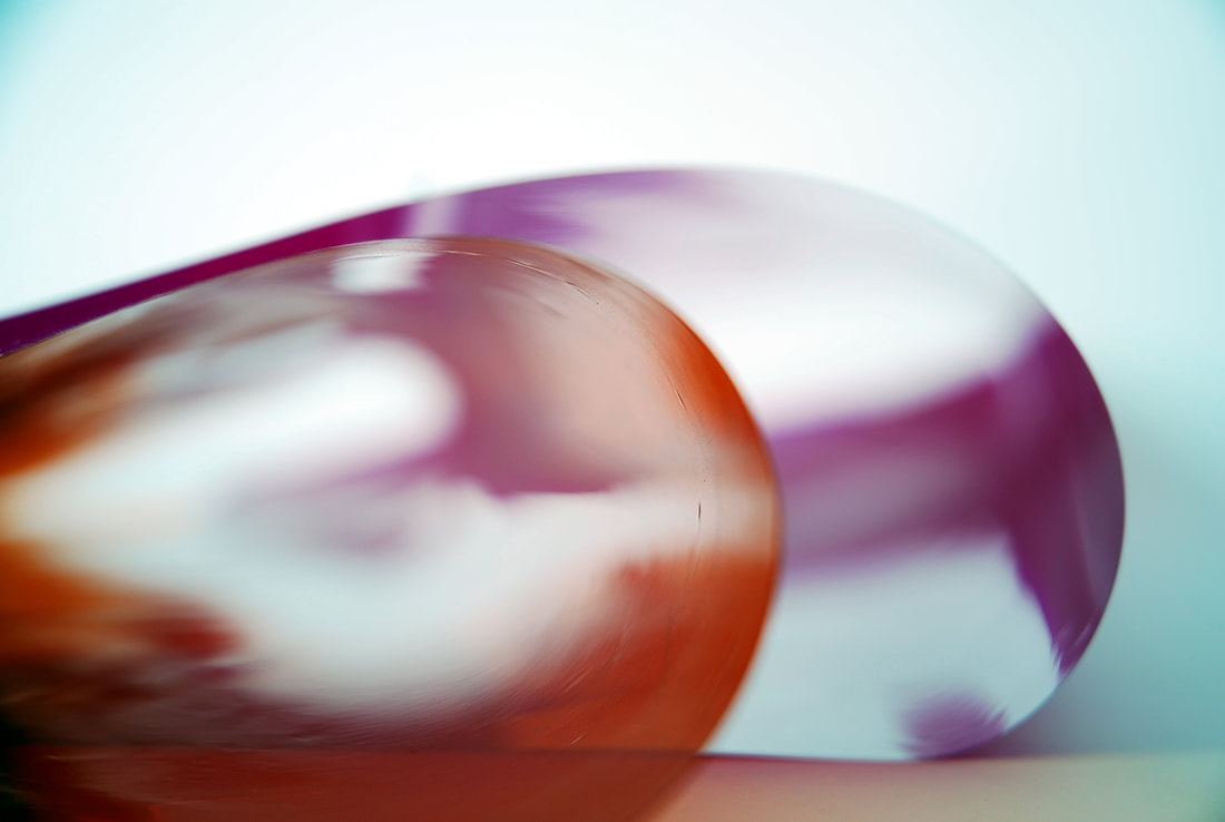
For this series I used the acetate "drops". Due to the nature of the acetate and the lighting it naturally created weird ripples and forms on the acetate. I then furthered the definition of these on photoshop. This set of images most resemble Wolfgang Tillmans' 'Paper Drop' that inspired the work.
|


|
|
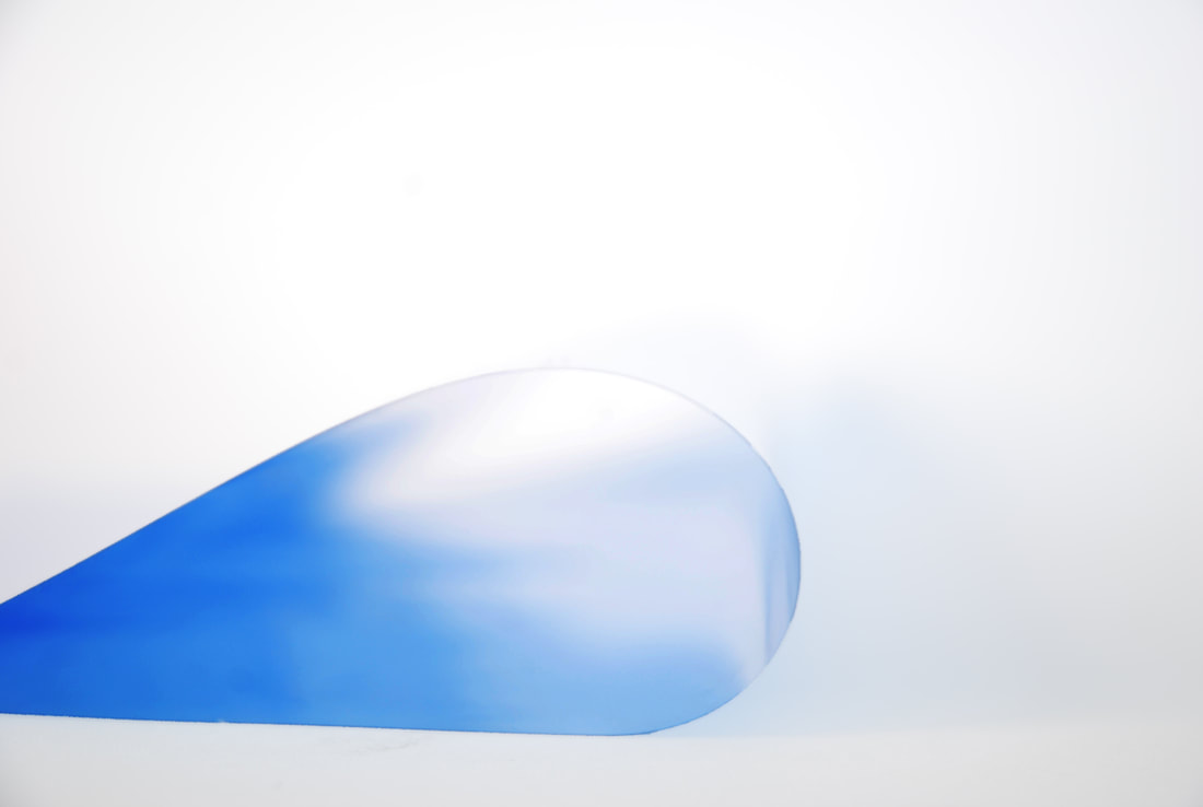
Adversely to the previous two versions I used both acetate and card in these 'simplifications'. I used a variety of methods to simplify these ones but negative space and simplicity were essential in the original image. It helped to have a defined border between the subject and the background and help accentuate the contrast between them.
|


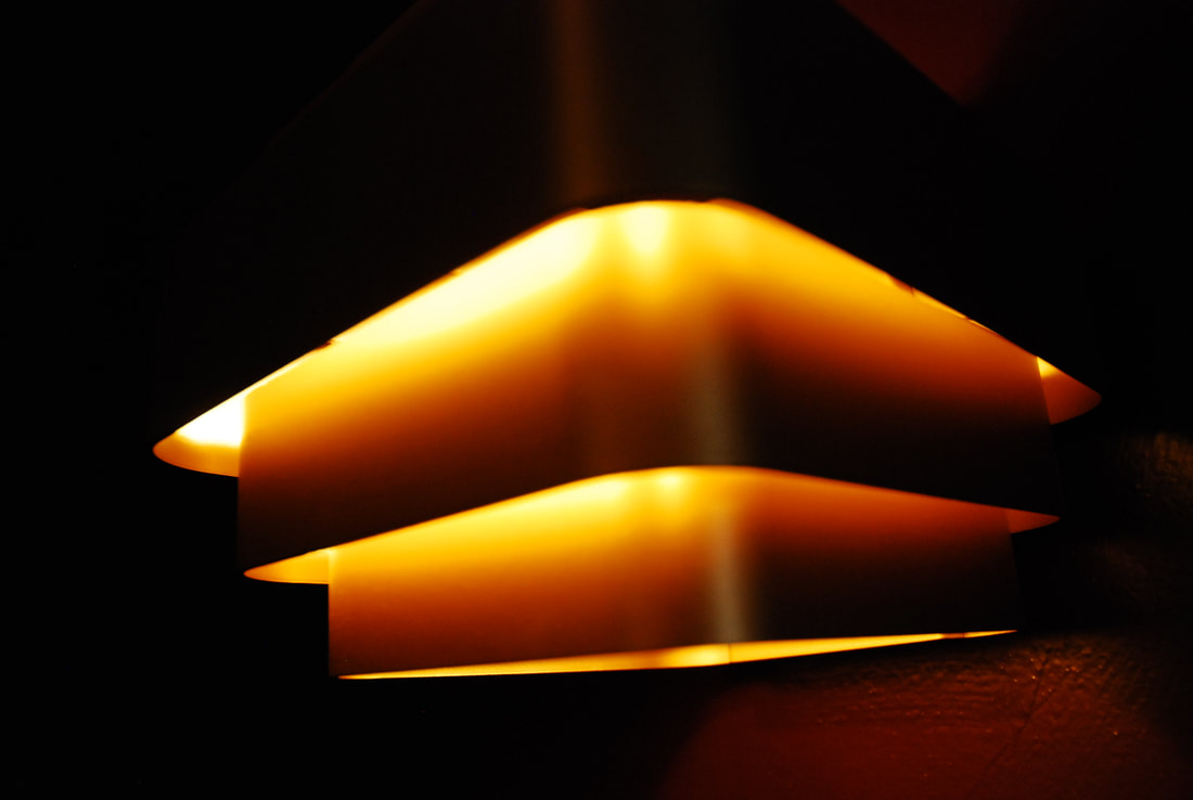
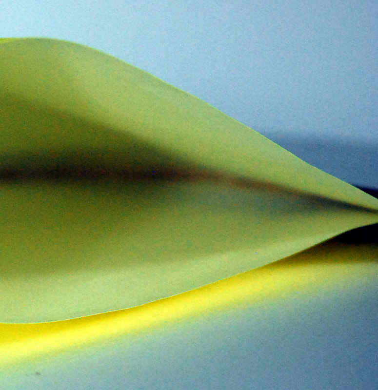
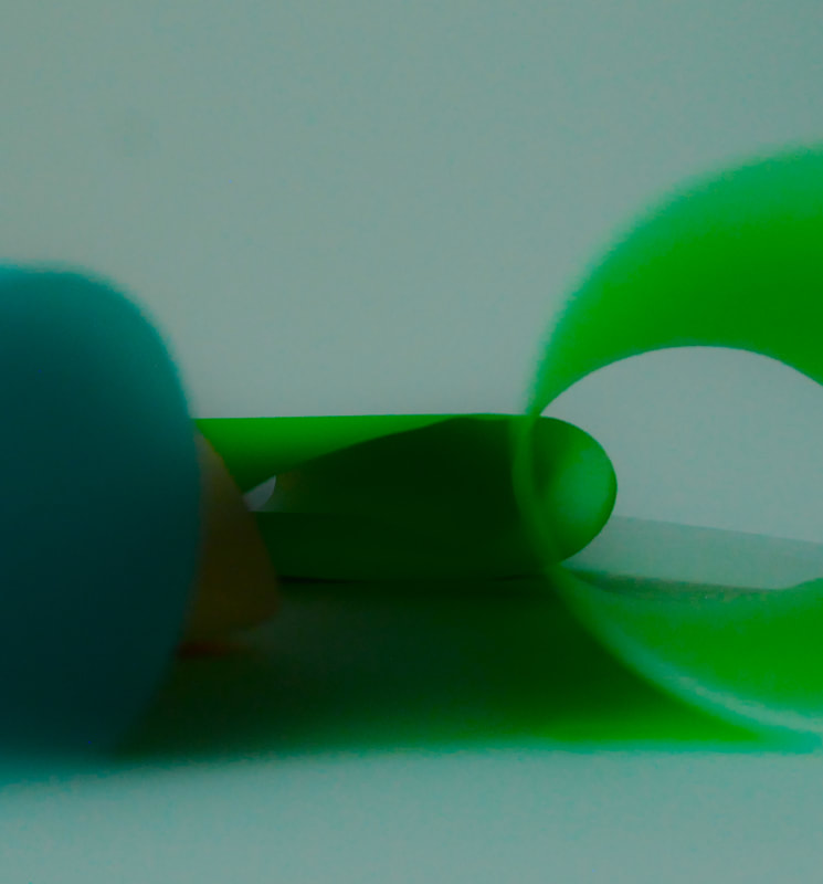
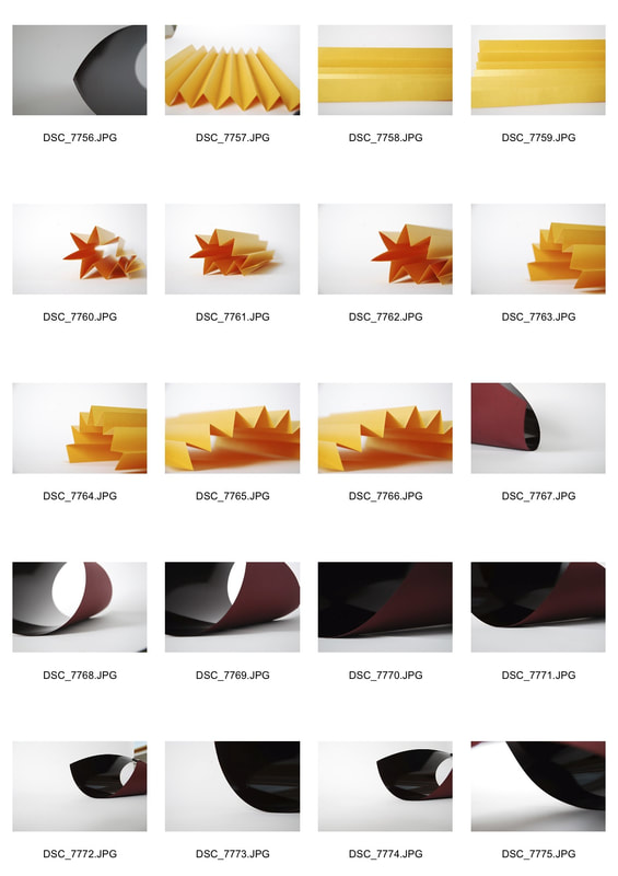
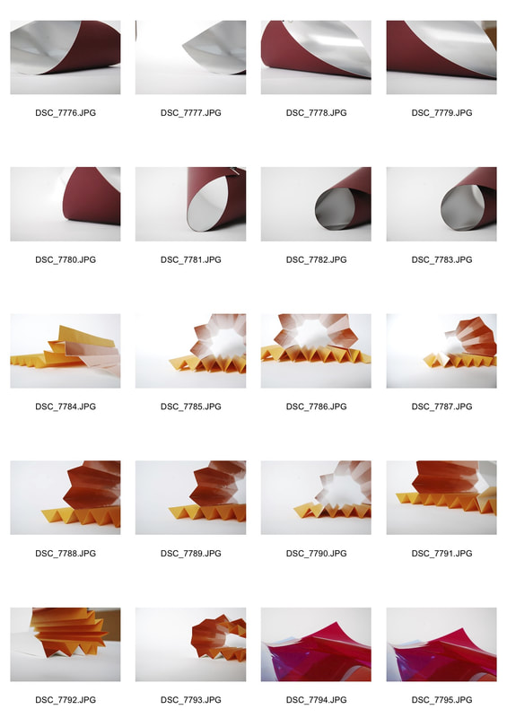
Eleventh Development
After the success of the mock exam I wanted to combine the materials that I had used in the mock, acetate and card, but also use different shapes and forms such as concertinas or stars. This was in order to achieve more shadows, and depth to the images. Whether this is through creating shadows with the shadows or using multiple layers to add texture and depth to the image
|
|
|
|
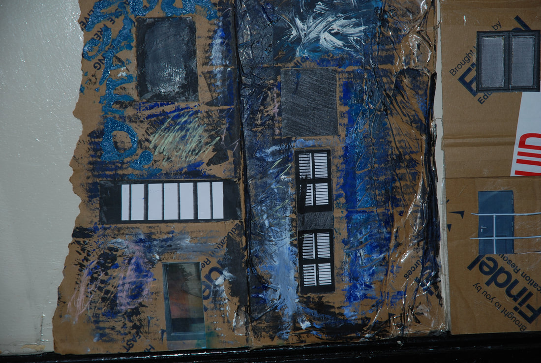
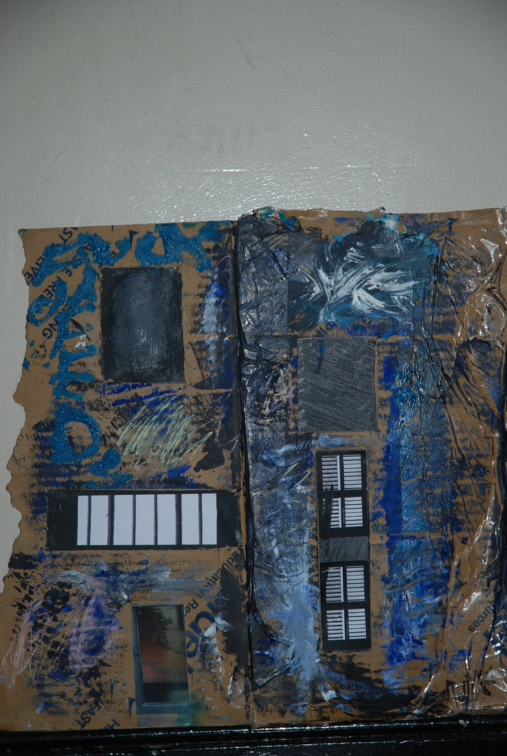
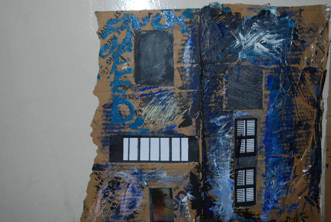
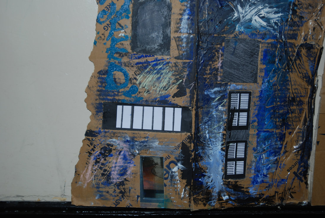
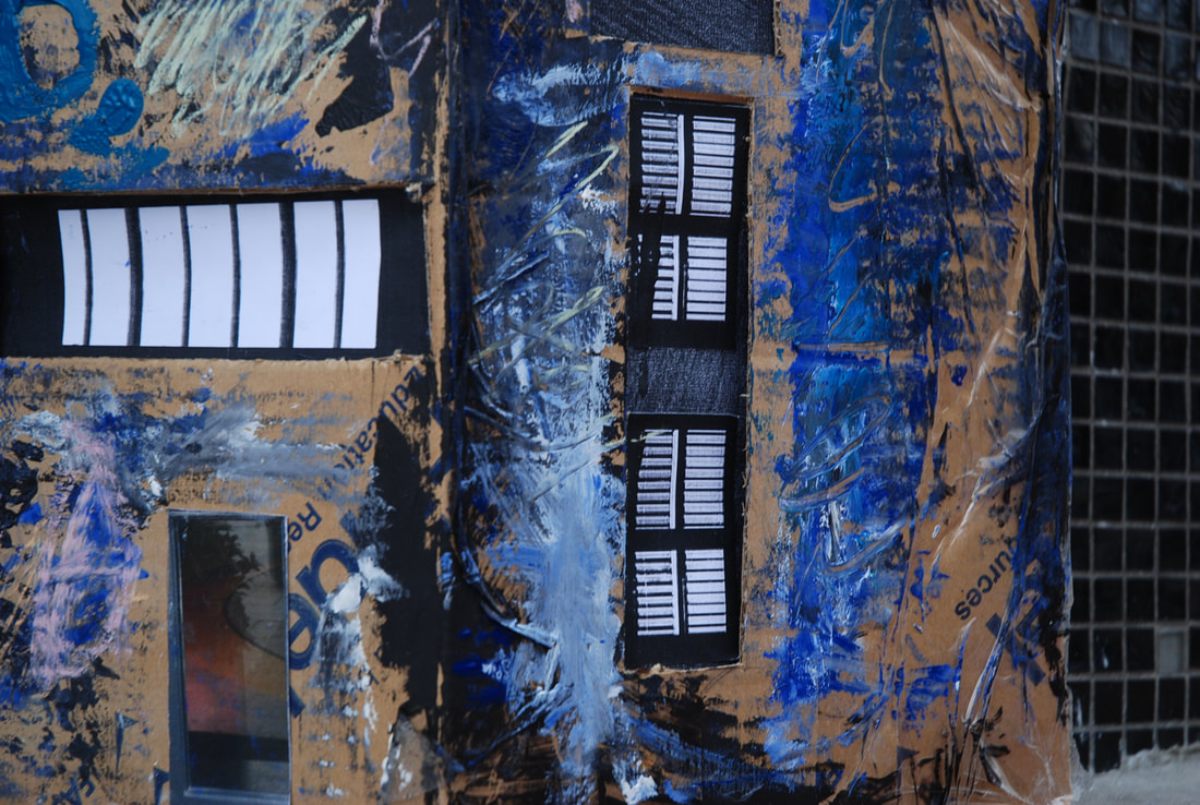
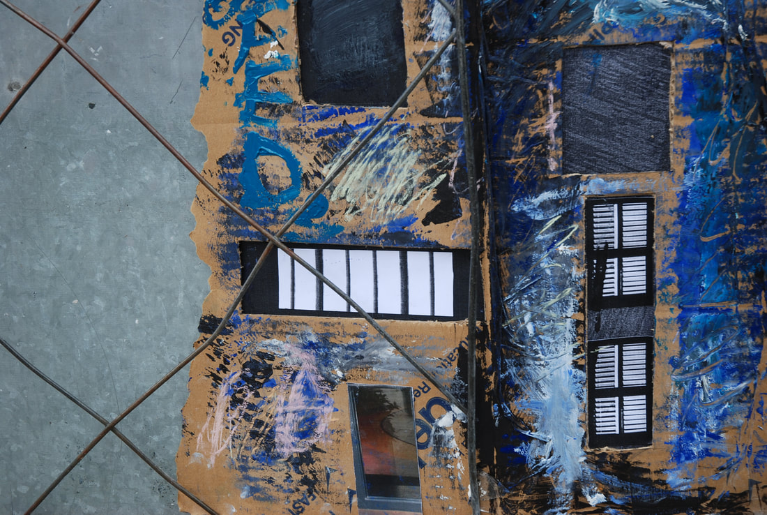
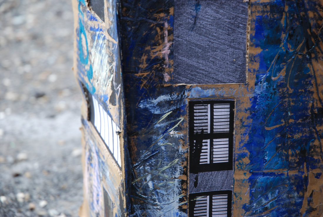
Final Piece
For my final piece after

|
|
