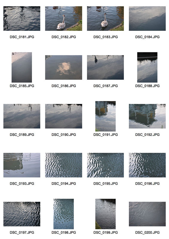
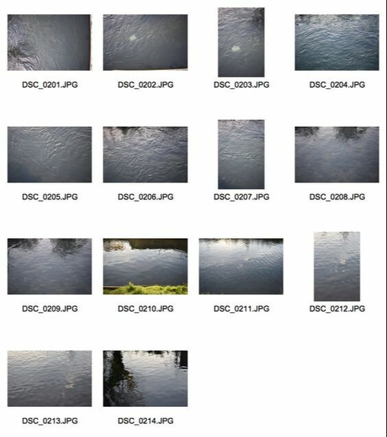
Personal Brief
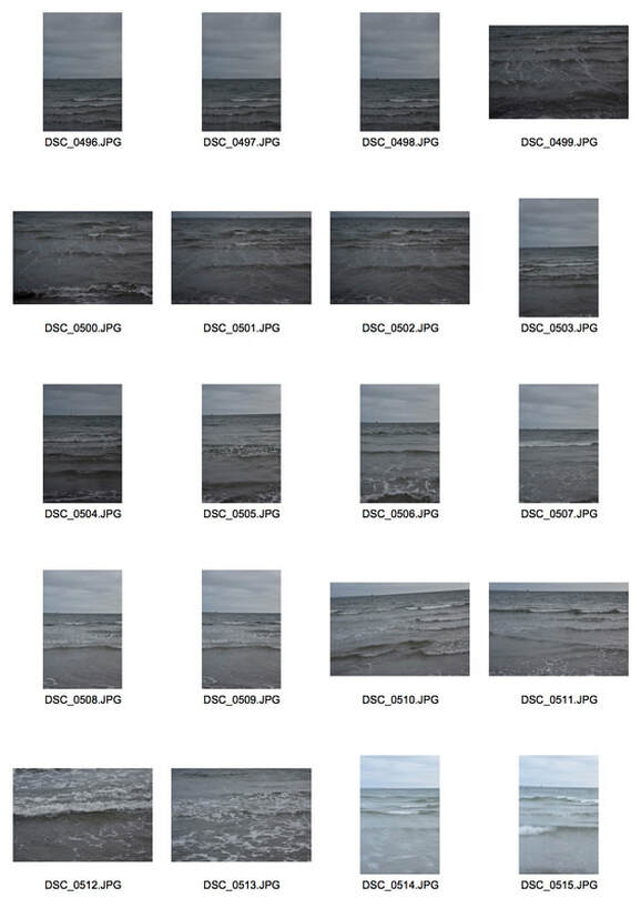
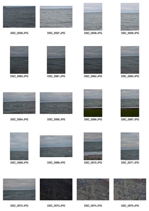
My practical work follows on from my curatorship: "Minimalist Landscapes". For my practical I shall focus on different types of minimalist landscapes and seeing how the artists I studied in my curatorship can influence my own work and style and help develop my ideas. Therefore I shall focus on trying to find certain minimalist aspects in landscapes and also how I can manipulate my photographs and perspectives to help create minimalist photographs.
|
TATE'S SHAPE OF LIGHT:
100 YEARS OF PHOTOGRAPHY AND ABSTRACT ART The shape of light exhibition is the first to explore the relationship between photography and abstract art and how photography developed alongside abstract art over time. Ranging from the start of the 20th century up to contemporary times it explores how photographers have reacted and contributed to abstraction in art from the early pioneers of Man Ray and Alvin Langdon Coburn to modern artists such as Daisuke Yokota and Anthony Cairns.
For me the exhibition stood out due to my preference for abstract art and this showed the direct link between abstract art and the attempts of photographers to replicate this in the beginning and then how abstract photography developed overtime. However, I was disappointed by the absence of |
|
Kazimir Malevich's work especially 'Black Square' my favourite piece of art.
The Museum of London's 'London Nights'
|
London Nights explores the city after dark through both contemporary and historic imagery, ranging from the late 19th century to the present day. From the unexplored to the imagined, from Soho to Sydenham, the city at night reveals itself moment by moment from the mundane to the beguiling or even alarming. There was over 200 photographs with multiple film pieces as well from around 50 photographers ranging from Bill Brandt to Alvin Langdon Coburn and Rut Blees Luxemburg and other less well known artists.
The exhibition will be split into three sections: The first, London Illuminated, showcased the varied ways in which photographers have been inspired by and captured the aesthetic of the city at night, depicting London illuminated by |
|
limited natural and artificial light in contrast to the familiar daytime.
Dark Matters explored the darker side of the city, exploring the uncomfortable, the unknown and the mysterious. Visitors will be immersed in imagery relating to night-walking, the blackout of the Blitz, isolation, threat and vulnerability.
The final part of the exhibition, Switch On…Switch Off…, looked at Londoners at work, rest and play in the city after dark. The familiar commute home, a quick change of pace as office workers head out for the night, or indeed workers commence their night shift.
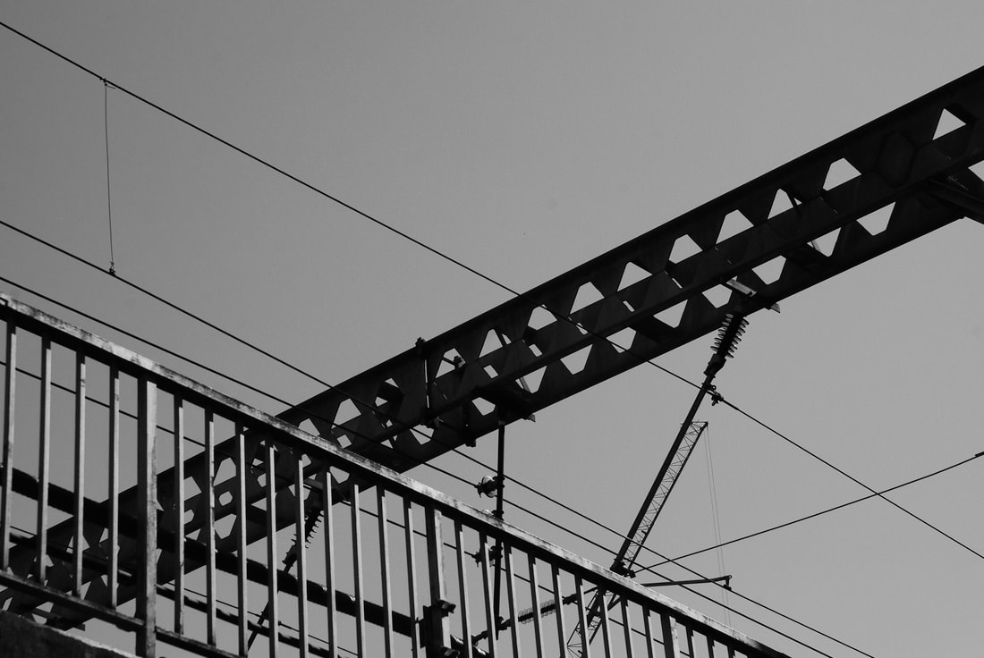
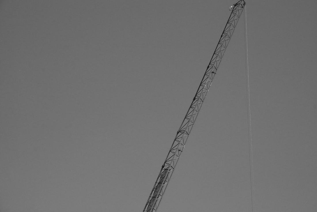
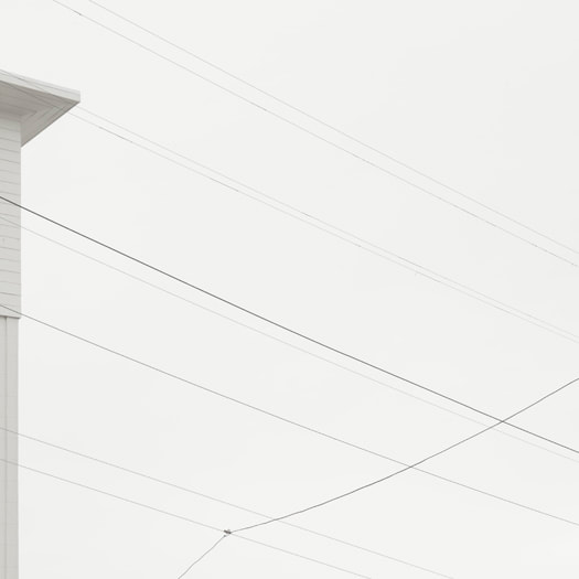
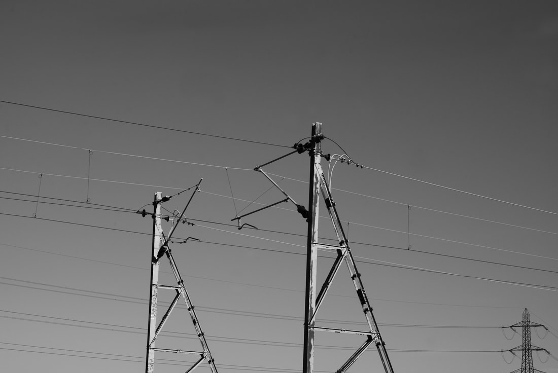
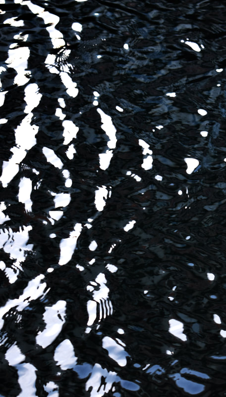
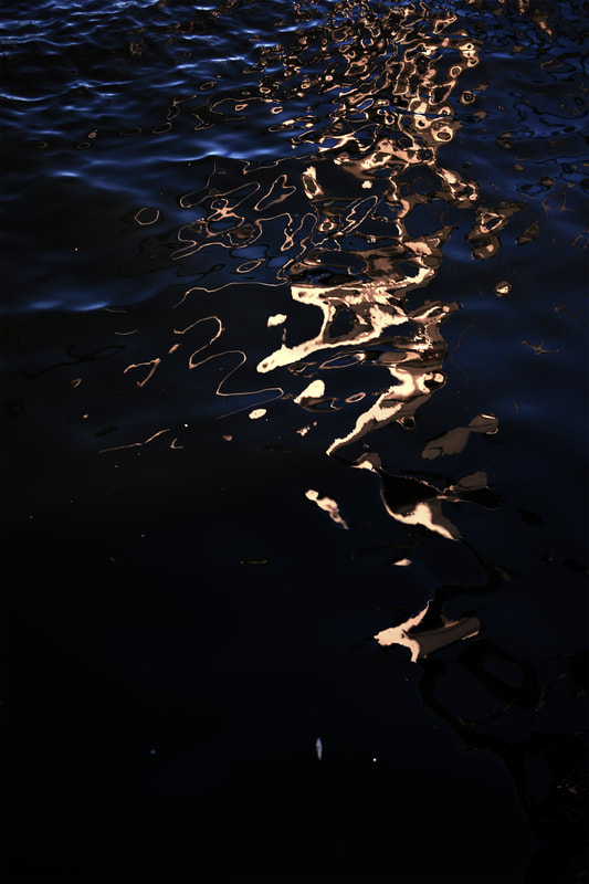
First DevelopmentIn this first development I have decided to respond to László Moholy-Nagy's interpretations of minimalist landscapes and his works that focused on creating a minimalist landscape through perspective: this can be seen in his Sailing' series. In these pieces Moholy-Nagy uses perspective and angle to distort the reality and provide a minimalist landscape. Furthermore the manipulation of colour in 'Das Atelierhaus des Bauhaus Dessau' and 'Blick vom Berliner Funkturm im Winter' also help Moholy-Nagy distort reality and create surreal,
|
|
minimalist landscapes especially in 'Blick vom Berliner Funkturm im Winter' where the snow covers the complicated landscape and simplifies it. This can also be seen in 'Sailing' where the white sail blends in with the pale negative space combining both. For my response to Moholy-Nagy I went down to the Hornsey train station where there is a bridge that allows me to gain a vantage point above the wires and infrastructure of the British train system. This gave me the ability of manipulating the perspective of the photograph in an attempt to replicate Moholy-Nagy's use of it and create a minimalist landscape through areas of negative space.
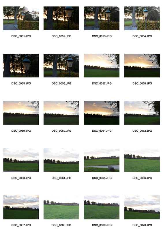
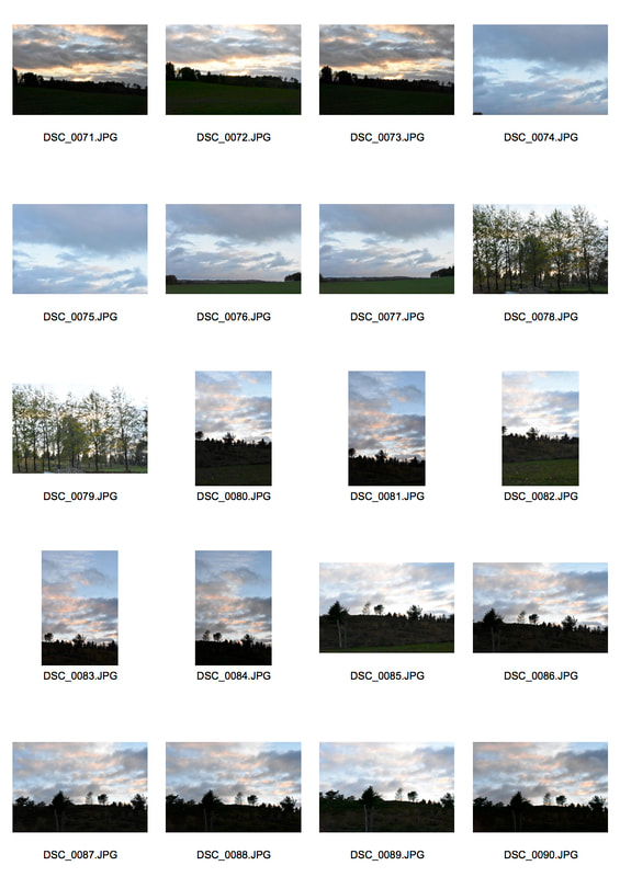
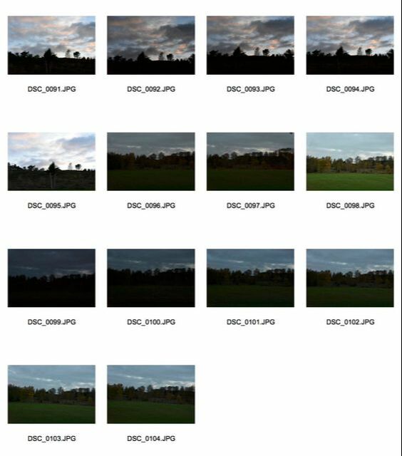
Contact Sheets
Edits
|
|
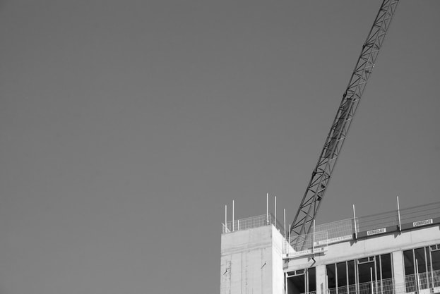
I think that this development was very successful in creating a minimalist landscape due to the large swathes of negative air being intersected by the contrasting industrial train wires and construction sites. The contrast between the heavy machinery and the soft sky. However, I think if I was able to make the grey lighter it would have emphasised the minimalism and also the construction site and train wires can be a little bit messy especially in the top left photograph where I would day there is not enough negative space to fully be considered minimalist.
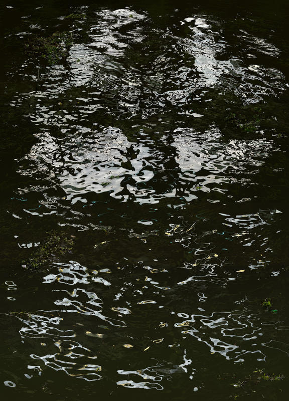
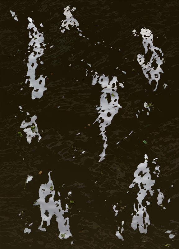
Second Development
|
For this development I was inspired by the minimalist work of Uwe Langmann particularly his 'Lines' project with Katja Gregart. Where he captured electricity lines in the snowy terrain of
|
|

|
Heligoland. Langmann creates minimalist monochrome images. He creates large volumes of negative space in the image to let the main subject shows it's symbolic and literary glory. Langmann often uses a long exposure to create a more minimalist image as it makes the background mould into a single layer removing the noise that can happen in the image. This can be seen in his 2012 image 'Time' of the El Niño statue in Lake Constance in Radolfzell where he takes a long exposure of it. Through this he makes the water and background
|
|
entirely minimalist and simplistic making the audience focus on the statue and the blurred bird standing in the hands of the stature.
Edits
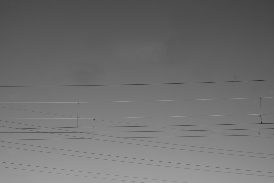


I think that this development was particularly successful as I was able to capture the negative space of all the cable effectively and in a similar style to Uwe Langmann's. Even though I didn't have the same pure white of Langmann's images, albeit I would have been able to do this on Photoshop, I thought that the gradation of grey befitted the image better and looked more natural than when I attempted to recreate the white of Langmann's backgrounds. I was generally able to remove the blemishes from the image as my lens needed cleaning, however, sometimes the process lead to blotches in the image such as in the first one but generally it is only noticeable on further inspection.
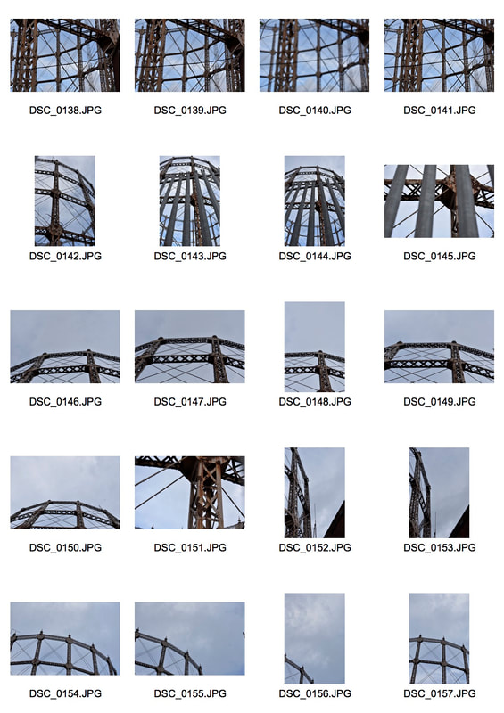
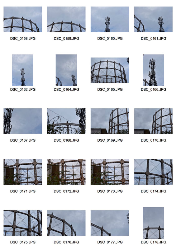
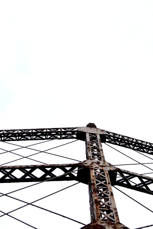
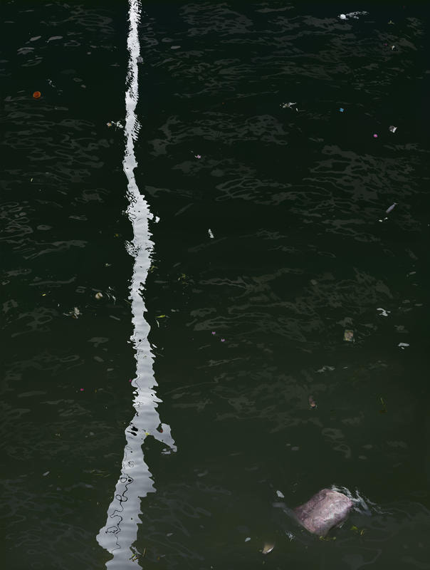
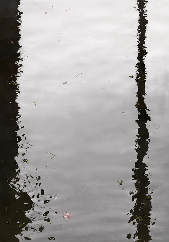
Third Development
For this development I wanted to frame the negative space like the cables had in the above development. To do this I visited the abandoned gasworks on the north circular due to the geometric shapes that would naturally frame the blue sky of the day. Furthermore due to the repetitive and constant nature of the steel framework that would easily overlay on each other and create further and more complicated frames.
|
|
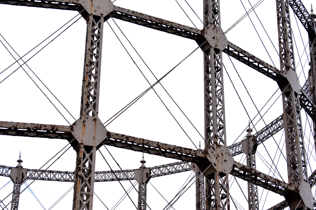
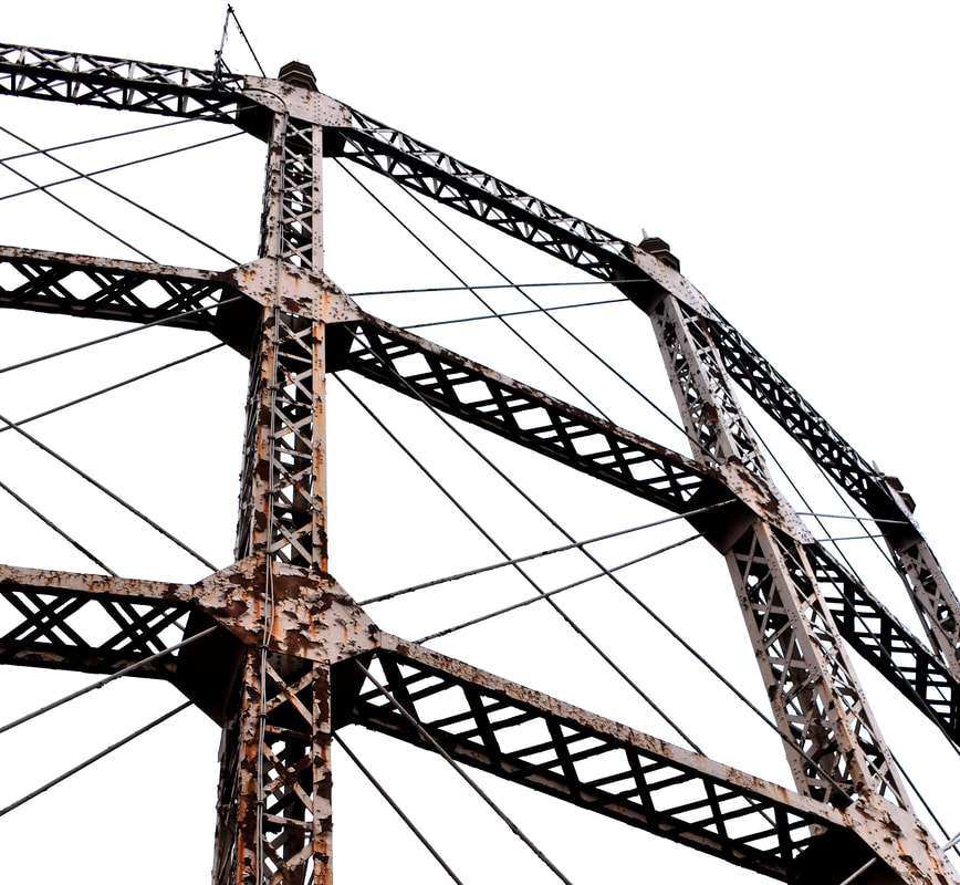
I think that this development was very successful as I was able to completely whitewash the background so that it provided a complete contrast to the rusting, paint-peeling, abandoned gasworks. Furthermore, the large size of the images create an overwhelming sense furthered by the pedestrian perspective of the audience. Furthermore, the colouration of the gasworks varies greatly from the pink paint to rust to the raw metal.
Fourth Development
|
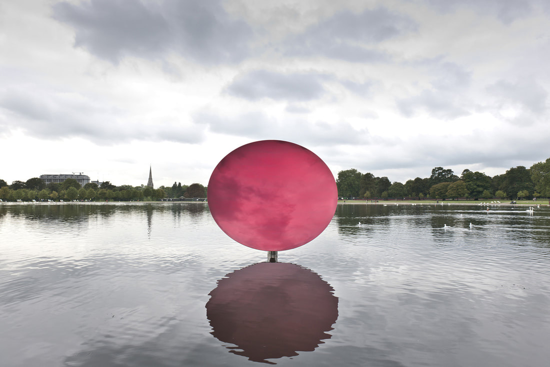
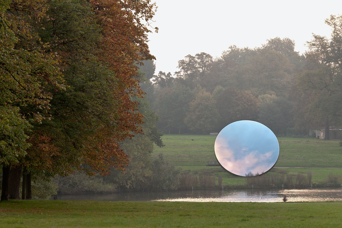
For this development I was inspired by both Anish Kapoor's 'Sky Mirror' and Robert Smithson's 'Mirror Displacement'. In 'Sky Mirror' Anish Kapoor placed large six meter wide concave polished stainless steel circles from Finland originally outside a theatre in Nottingham and then later around Kensington Gardens. They captured the change of time in the sky and create an immediate contrast to their surroundings particularly with the greenery of Kensington gardens described by Anish Kapoor as "the best site in London for a piece of art, probably in the world". In 'Yucatan Mirror Displacements' Smithson uses mirrors to abstract the environment that he is photographing. For Smithson the mirror is "in a sense is both the physical mirror and the reflection: the mirror as a concept and abstraction; then the
|
 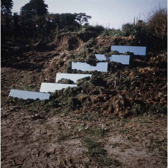   |
mirror as a fact within the mirror of the concept." Furthermore the mirrors for Smithson were reflecting and refracting their surroundings, breaking the forms of the landscape. While the mirrors also record the passage of time and therefore a photograph of them leaves the mirrors suspended in time creating a contradiction in the movement of time. In accompaniment to his 'Yucatan Mirror Displacements' Smithson penned an essay titled "Incidents of Mirror-Travel in the Yucatan" inspired by John Lloyd Stepehens 1841 expedition "Incidents of Travel in Yucatan" where Stephens collected archaeological and anthropological artefacts for the American museum of natural history.
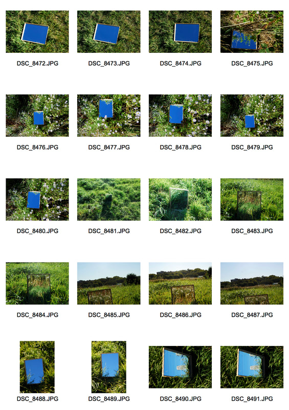
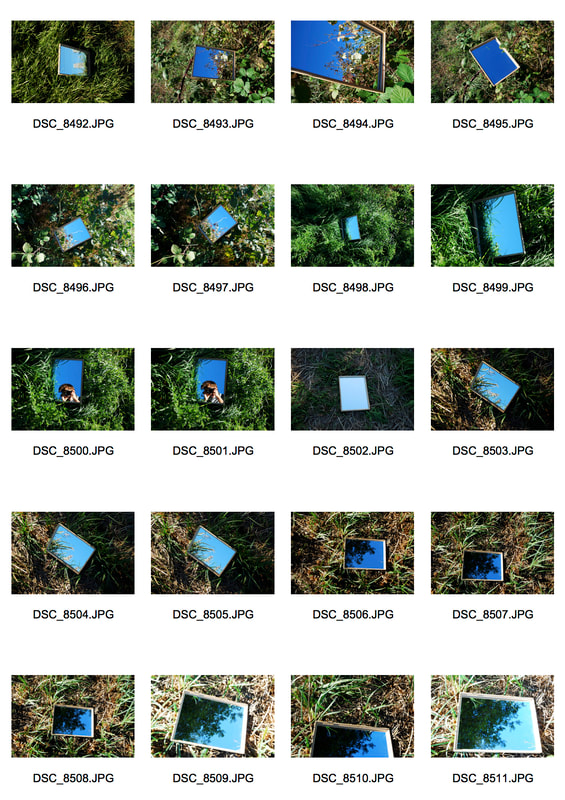
Contact Sheets
Selects
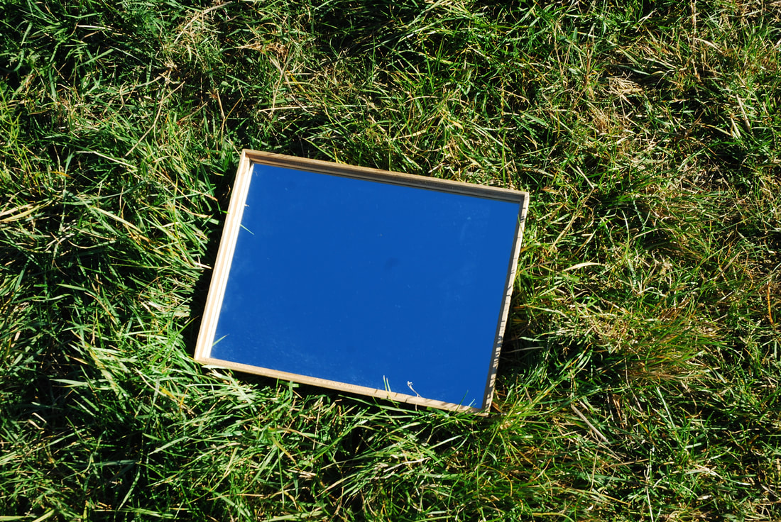
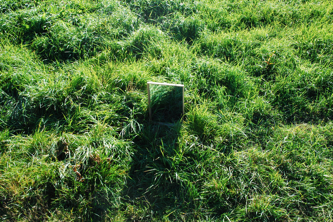
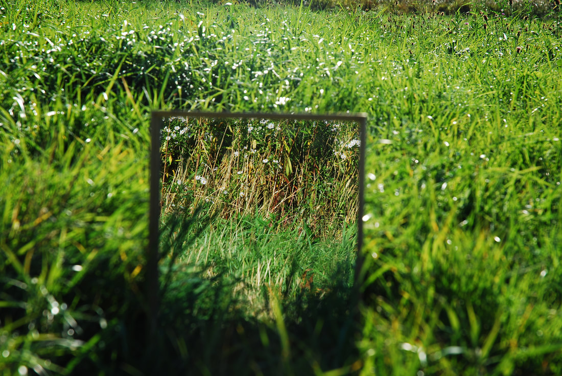
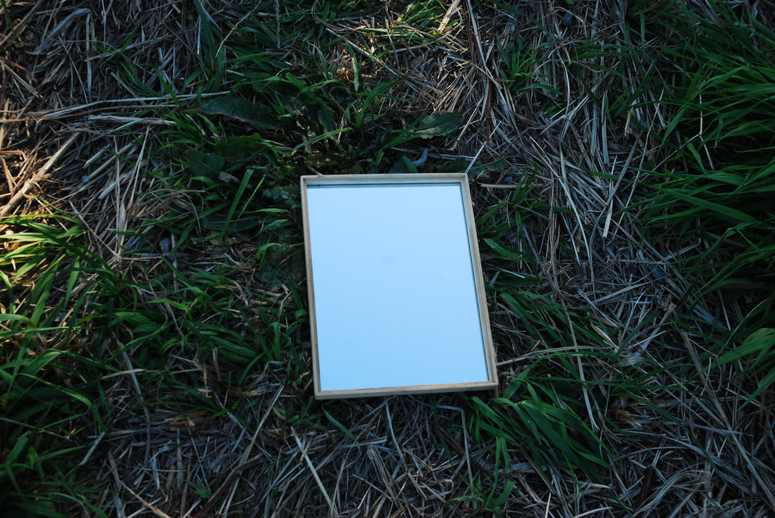
I think that there was some success in this but I think that overall the images came out overly vibrant in their green hues and the mirror is sometimes out of focus in favour of other aspects in the image such as the reflection. However, there were some successes in this development such as with the bottom right image where the background is not overly busy and actually helps bring the focus onto the mirror's negative space working especially well with the light blue of the mirror. I also think that the shadows in the top left image work really well creating the sense that the mirrors is in fact a portal into another world but sadly the image again seems to be out of focus.
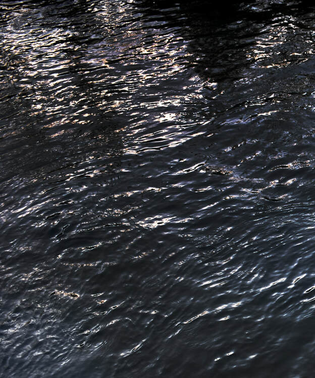
Fifth Development
For this fourth development I was inspired by parts of Nadav Kander series "Dark Line - The Thames Estuary". The Dark Line series for Kander was a celebration of the solitude and history of the river. The series was taken over 3 years on a set of solitary trips where Kander would walk along the estuary in moments of solitary contemplation where he'd feel himself "quiet and alive as emotions come and go." For Kander the solitary is particularly important and is the time he works most effectively: "Rising early, I often find myself working for hours before it gets light. The greater majority of the image-creation process happens here"
For Nadav Kander in the dark solitude along the Thames Estuary it became "a mystical space, somehow otherworldly and full on intrigue." more so than just a geographical landscape. This was reflected in the nature of his images "by showing the Thames as sparse and monochromatic, with immeasurable distances disappearing into the fog," and the compositions of the images reflect that of the Shan Shui scroll paintings that inspired him, with their mystical obsession with nature and nature's sacred position in China, with their vertical expanse bridging the sky with the ground. Furthermore the river is "a metaphor for the perpetual cycle of change and removal" and mirrors the cyclical slow process of his own work where he continuously revisits and tinkers his work, spending months refining his images.
For Nadav Kander in the dark solitude along the Thames Estuary it became "a mystical space, somehow otherworldly and full on intrigue." more so than just a geographical landscape. This was reflected in the nature of his images "by showing the Thames as sparse and monochromatic, with immeasurable distances disappearing into the fog," and the compositions of the images reflect that of the Shan Shui scroll paintings that inspired him, with their mystical obsession with nature and nature's sacred position in China, with their vertical expanse bridging the sky with the ground. Furthermore the river is "a metaphor for the perpetual cycle of change and removal" and mirrors the cyclical slow process of his own work where he continuously revisits and tinkers his work, spending months refining his images.
Contact Sheets
I think that I was very successful in capturing the violent and tempestuous nature of the waves and water but failed to capture the still nature that is in some of Kander's other images. I also forgot to shoot in portrait mode to reflect the Shan Shui composition that Kander focuses on and allows him to recreate the effect of flow between the ground and the sky. I think that within the second image there is a flow between the water, land and skies as they fade into each other through their foreboding colouration. I think that I captured the movement of the water through the long exposures similarly to what Kander does but I also think that potentially the water verges on becoming painterly contrary to Kander's images. I think that the colouration and light works particularly well as it does create a foreboding effect for both of the images.
Sixth Development
|
After the previous development I noticed that, when I used the longer exposures, in the post-processing the colours and shapes would often combine together to create longer streaks. These longer streaks created a sense of movement in the images, but also reminded me of the impressionist art movement. Instead of painting in a
|
   |
studio, the impressionists found that they could capture the temporary nature of sunlight by working quickly, in front of their subjects, in the open air (en plein air) rather than in a studio. This resulted in a greater awareness of light and colour. This meant that brushstrokes became rapid and flowing to capture the light's transient nature.
Contact Sheets
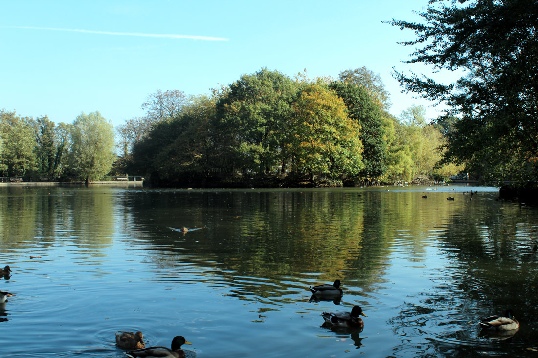
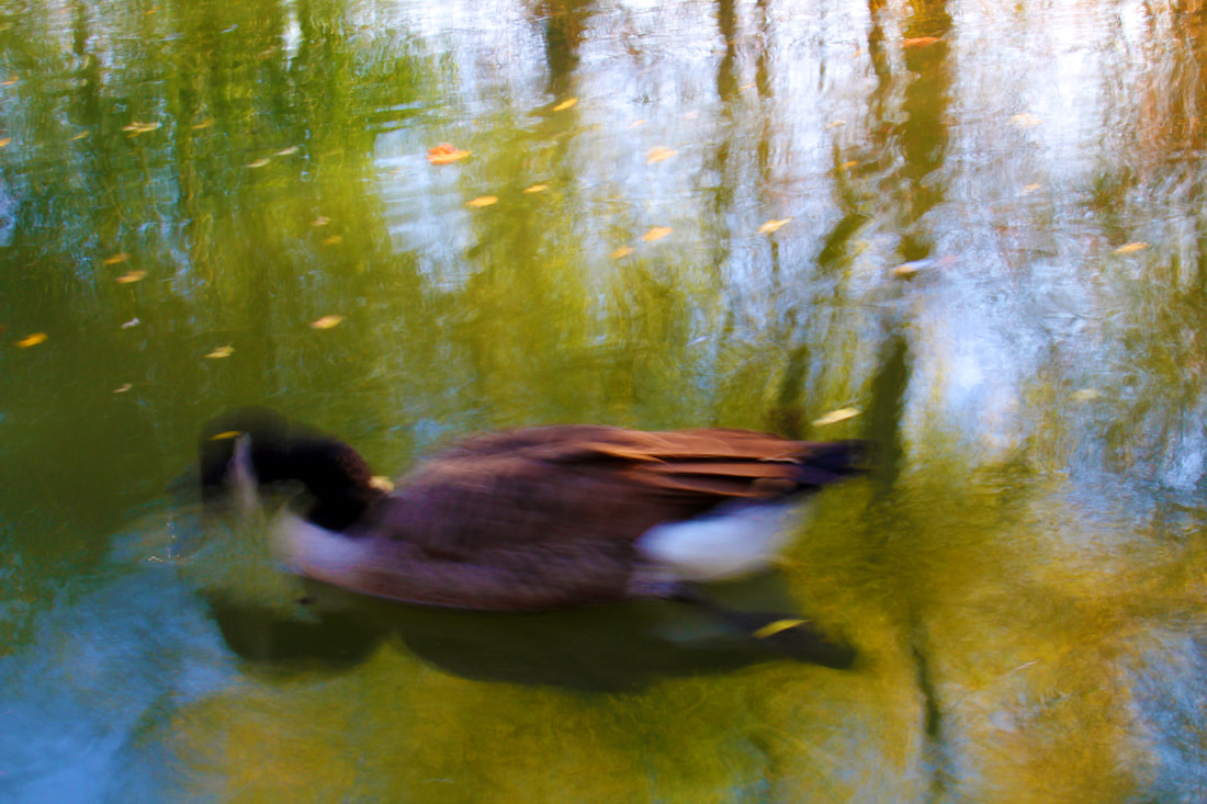
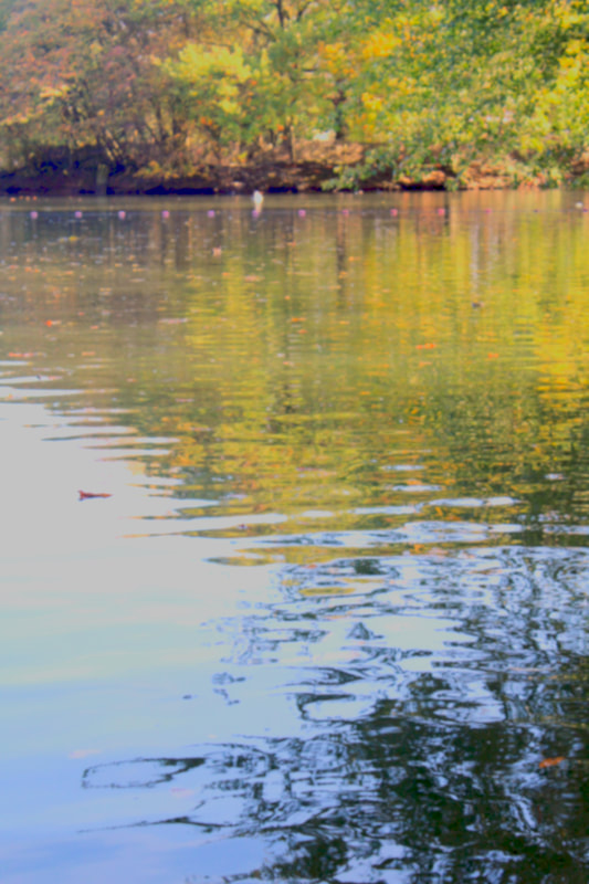
I think that there were varying degrees of success in this development. I feel that the avian photographs along with the centre left landscape personally seem to successfully recreate the impressionist style. On the other hand the two other landscapes failed to capture the impressionist style. However, I feel that the colouration of the photographs seem to replicate that of vintage recoloured photographs. Furthermore, the avian photographs have personally too much movement in them and start to become abstract. On the other hand the centre left landscape for me is the most successful in recreating the impressionist style I was aiming for due to it's colouration and how the colours seem to form on the island on the lake.
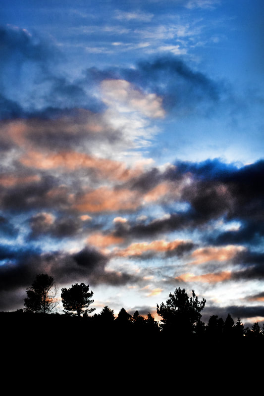
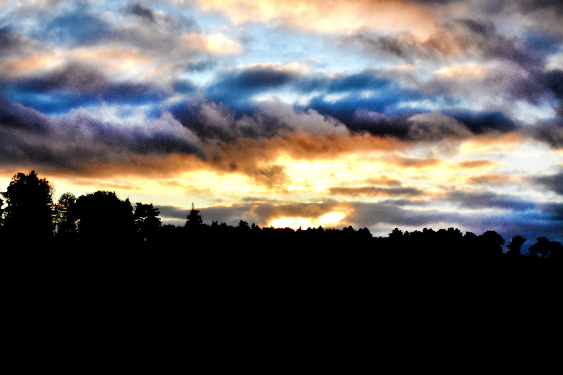
Seventh Development
|
For this development I was inspired by the pictorialist movement that aimed to make photography an art instead of a form of documentation along the same time as impressionism as at it's peak. However, it was important to emphasise the photograph's artistic
|
|
value often through manipulation of the photograph like the use of a soft focus, colour tinting or physical manipulation to try and create a fictional or ethereal landscape. To do this I wanted to focus on the sunset as this would allow me to capture a potentially transcendental scene through the bizarre and dramatic colours of the sunset, especially to urban audiences.
Contact Sheets
|
|
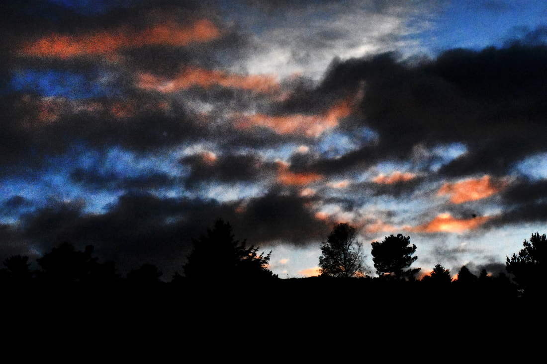
I think that was some success in this development but the quality of the photographs is not particularly good due to the low levels of light at sunset that forced me to use a higher than preferred ISO. I think that I was successful in creating a transcendental scene through the hyperbolic and bizarre colours of the sky. However, I think that the top left is the least successful due to the overly bleached gold that draws your eyes away from the better parts. I think that the portrait has the best quality and colouration and does provide, for me, an ethereal scene. I think that the colouration of the largest landscape is great but that the quality of the photograph is severely lacking and looks like the quality of a 20th century photograph.
Eighth Development
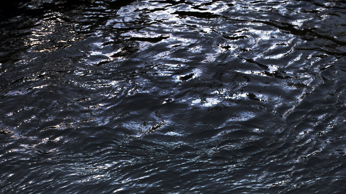
|
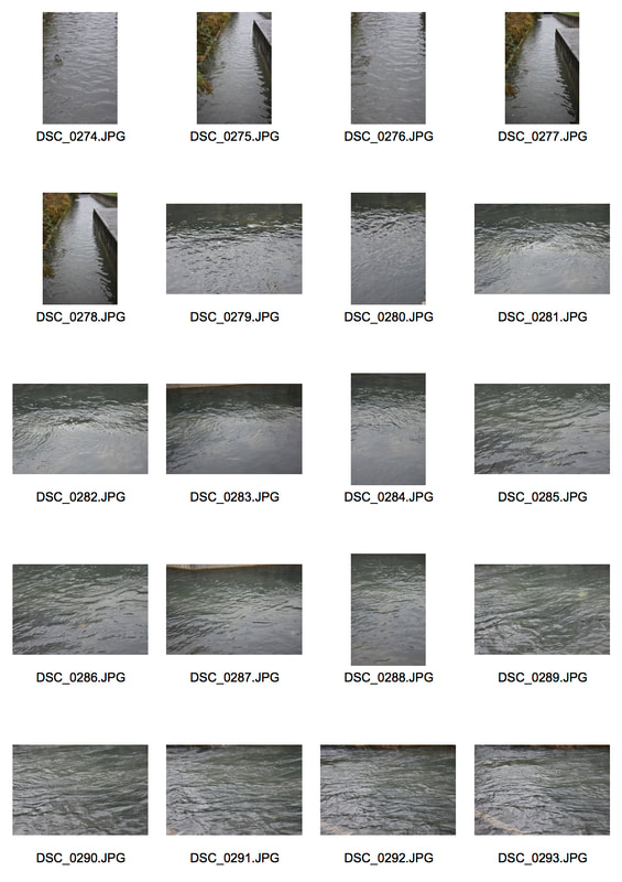
For this development I wanted to return to photographing water, like in the fifth development, after that detour. I used Andreas Gursky's 'Bangkok' series as inspiration and direction for this development and exploration of aquatic photography. I wanted a location that I could capture the still nature of the water but also the small ripples and character that the water has as Gursky did. For this reason I chose the New River canal in Hornsey, a site of recent development, like Bangkok, and gentrification. In 2011 Gursky visited Bangkok and photographed the Chao Phraya River that runs through the city. In his photographs he depicts the fast flowing nature of the river with close up shots that captures the endless
|
         |
mutating ripples of the river. The surrounding buildings of the river reflect in his image from the surrounding factories and turquoise construction netting. This, however, slowly reveals the true meaning of the image, criticising the toxic reality of urban rivers that are in fact dumping grounds for debris, dying nature. Furthermore, the rapidly changing nature of the water reflects the constant state of development of urban cities.
|
|
|
|
|
I think that the images were successful but lost some of the character of Gursky's work. I think that in contrast to Gursky's work, my own, lacks a variety of shades as mine focus solely on blue while Gursky's works with yellows, greens and browns along with having images that seem inverted. However, I do think that my images successfully captured the movement of the canal through the variations in ripples from deep, dark
|
ripples to the faint movements in the bottom left image. However, this can be best seen in the large image as it changes from dark ripples, to faint movements and then to darkness. Furthermore, the variations in light in the different images create a different character for each part of the river, hinting at a sense of change in the canal.
Ninth Development
|
For this development I wanted to expand into multimedia and instead of just capturing a snapshot of the water: capture the movement and the flowing nature of the water. To start with I wanted to experiment with the water in a controlled environment, inside. So I poured the water into a tray and exposed it with lights, that had different colour filters on them. However, I experimented with how to create ripples using different techniques, such as using a fan, blowing into it naturally, stirring the water, fanning it and shaking the tray.
There were some successes in these attempts but also many issues. The videos are out of focus, dark and hard to interpret. However, I think that the water's constant diverging ripples, along with the dark, murky colours and close proximity create a sense of uncertainty and claustrophobia in the videos. Blowing on the water and shaking the tray created the best waves in the water: the blowing created multiple variations in direction while the shaking created a |
|
consistent direction and flow of water. However, in general the videos need refinement as they are in a very crude state potentially from the dark environment they were taken in.
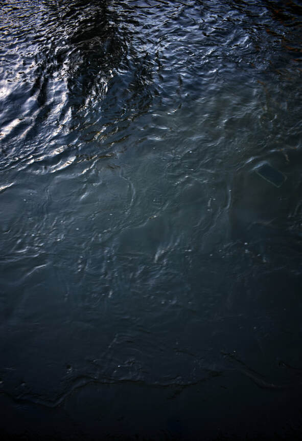
Tenth Development
For this development I wanted to refine my attempts at capturing the water in a video format. So to achieve this I wanted to go outside as the natural light would create better lighting. I returned to the New River Canal as there is a sluice gate that created a constant stream of white water and ripples.
|
|
I think that this attempt at video was much more successful but still experienced some issues with focusing due to the autofocus feature on my camera not being able to handle the constant change in subject. Furthermore in 'Wosser2' there is too much vertical movement as the frame sways later to incorporate the grass verge of the canal. However, I think my GIF and black and white image were much more successful than the videos. I think that the GIF successfully captured the flowing nature of water and the sense of water. This is emphasised due to the repetitive nature of the GIF and the repetitive nature of water. I also think that the moody lighting of the GIF added to the photo through the brown shades of the canal bed. I think that the monochrome still was also successful as the foreground seems to become like melted metals. However, the top half becomes over-contrasted, messy and pixelated.
|
Eleventh Development
|
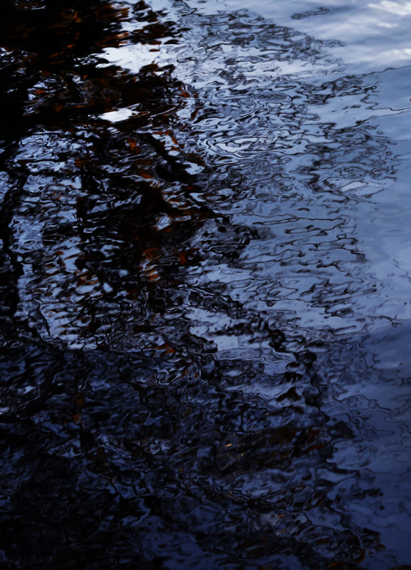
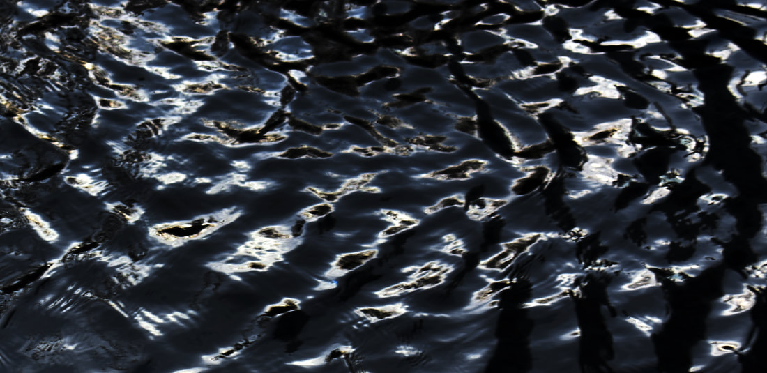
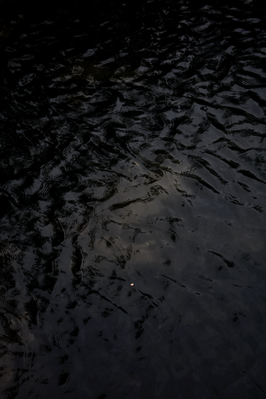
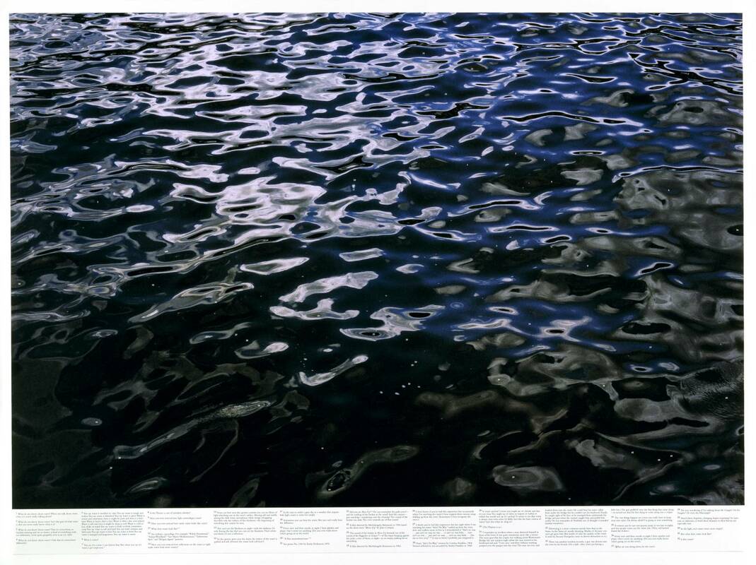
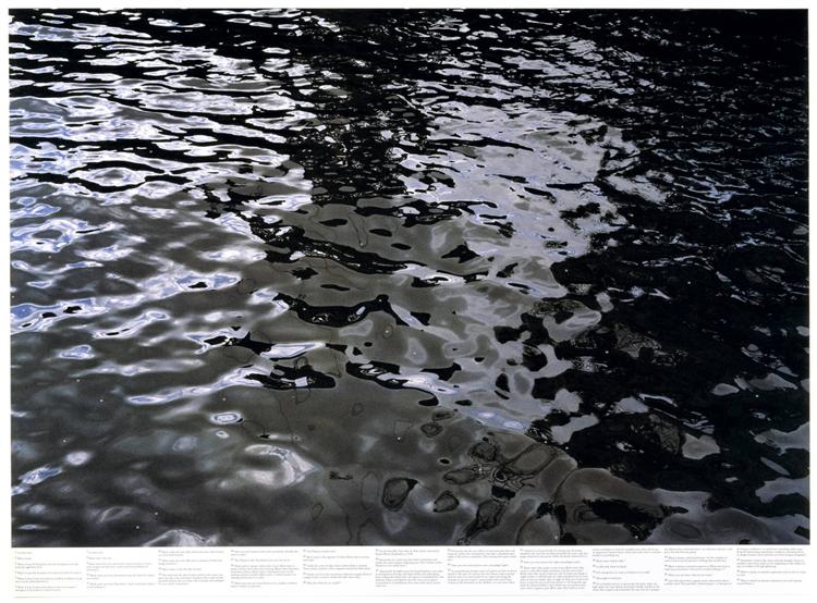
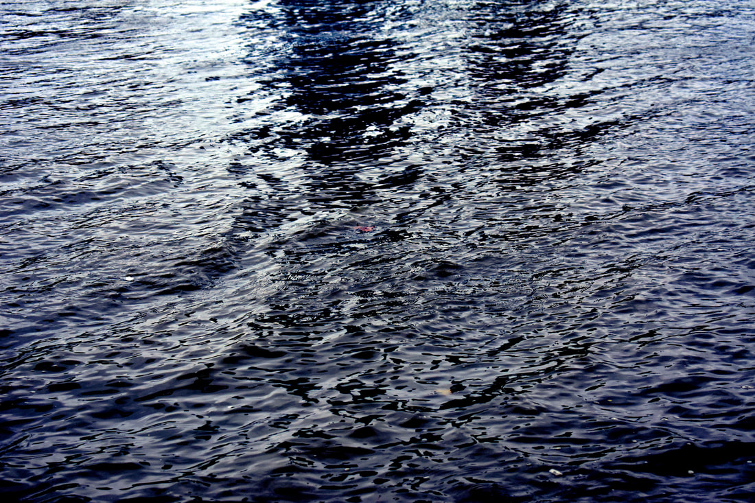
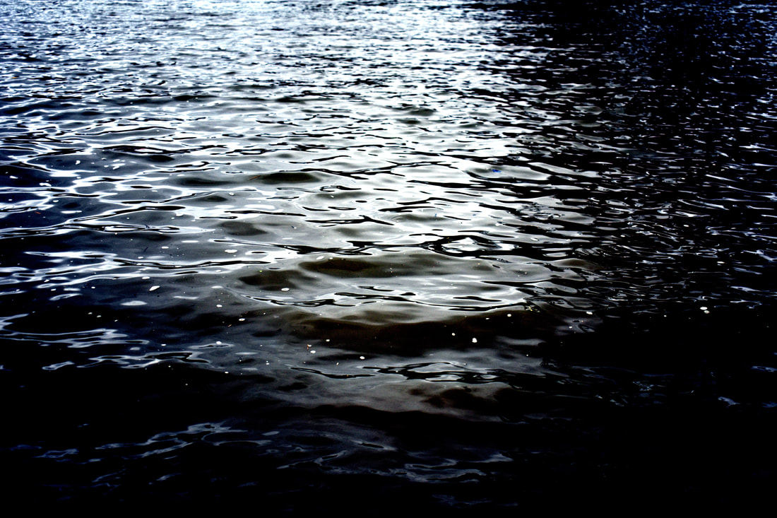
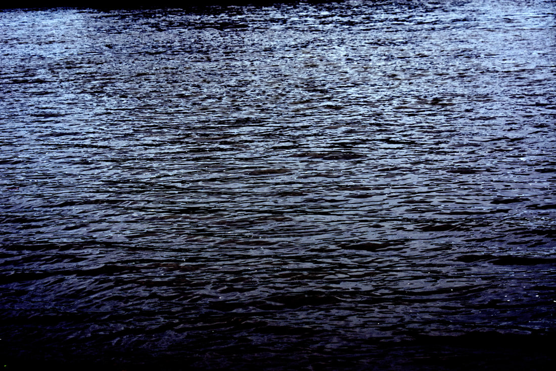
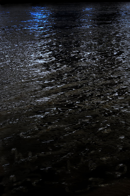
For this development, I wanted to return to still photography and a different location. I was reminded of Roni Horn's 'Still Water' when thinking of different locations to photograph but also by the intrigue of her photographs. Roni Horn’s ‘Still Water’ series explores the connotations, histories and beliefs that water and the River Thames hold. The project has its roots in Iceland, where Horn has continuously photographed and currently resides. In Icelandic folklore, children fear opaque water because they believe that it will swallow them deep into its darkness. This underlying fear of the unknown is felt in Horn’s work through the opacity of the images. She enhances this sense of fear through the addition of footnotes in which the artist includes observations of the river and fictionalised accounts of suicides and deaths, adapted from forensic archives and newspapers. She often combined these artworks with performances where she would read her footnotes from the pictures, presenting them as a stream of consciousness. A trip to London made it possible for her to explore the River Thames. “The Thames has this incredible moodiness, and that’s what the camera picks up. It has these vertical changes and it moves very quickly. It’s actually a very dangerous river and you sense that just by looking at it ... Every photograph is wildly different – even though you could be photographing the same thing from one minute to the next. It’s almost got the complexity of a portrait”. The colour and texture of these watery surfaces varies dramatically from image to image: colours range from black to blue and from dark green to khaki-yellow, and in each frame the water’s texture is differently augmented by tidal movement and the play of light; these variations all provoke different feelings and emotions. In response to these images I will play with creating a sense of endlessness through removing the horizons, playing with the sense of depth and the light in the images to create different emotions and scenarios within the images.
|
|
|
|
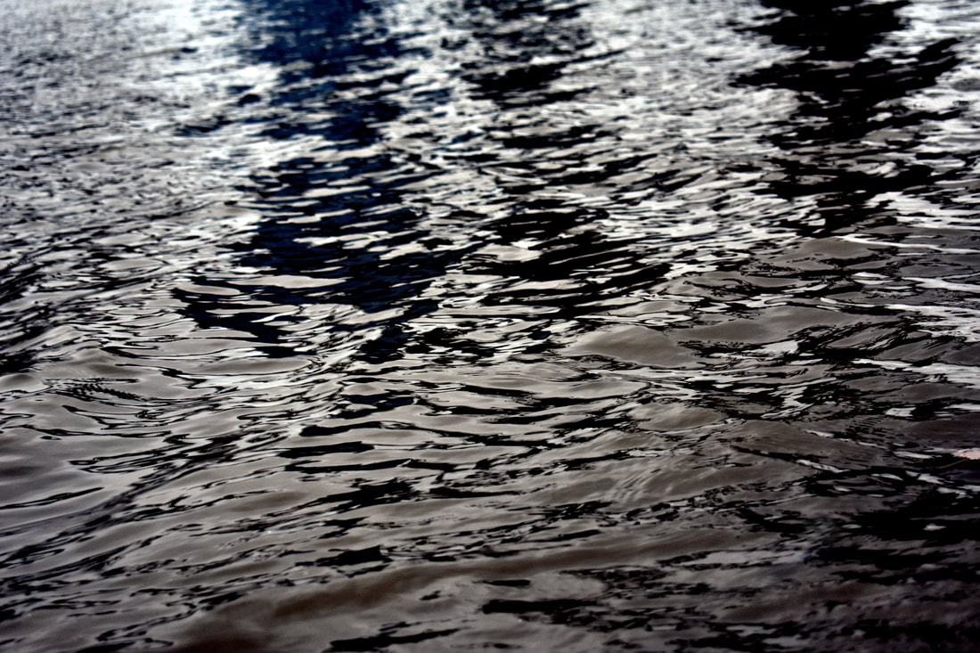
I think that this development was very successful. I think that I was able to capture a deeper meaning and impart a mysteriousness onto the images through shadows, lighting and depth of field. I also think that in many of the images a sense of distance and direction is imbued. In the second image if you look closer into the photograph you start to notice all the rubbish that covers the surface. This is furthered by the centre being encircled by darkness creating a focus on the centre of the image where the rubbish lies. In the third landscape photograph the repetition of the image creates a sense of timelessness. The change in lighting and the strong shadows also impart a sense of timelessness as it makes it lack life and seem two dimensional due to the strong shadows in the image. In the portrait photograph, the darkness and murky colours of the photograph create a dingy atmosphere and sense of murkiness. This is emphasised by the blue neon light that shines across the dark water at the top of the photograph that creates a sense of illicit activities. In contrast to the murky photographs the top and bottom images' lightness creates a much happier image, emphasised by the smooth curvature of the waves and in the top image emphasised by the bright blue shades.
Twelfth Development
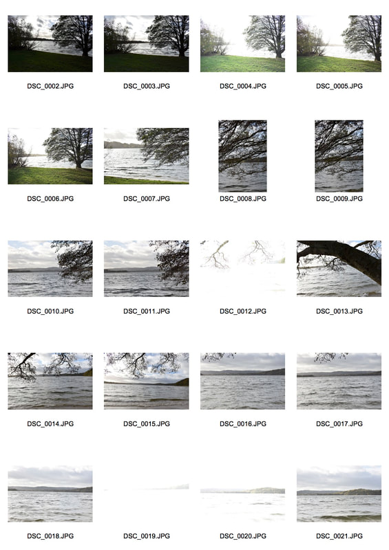
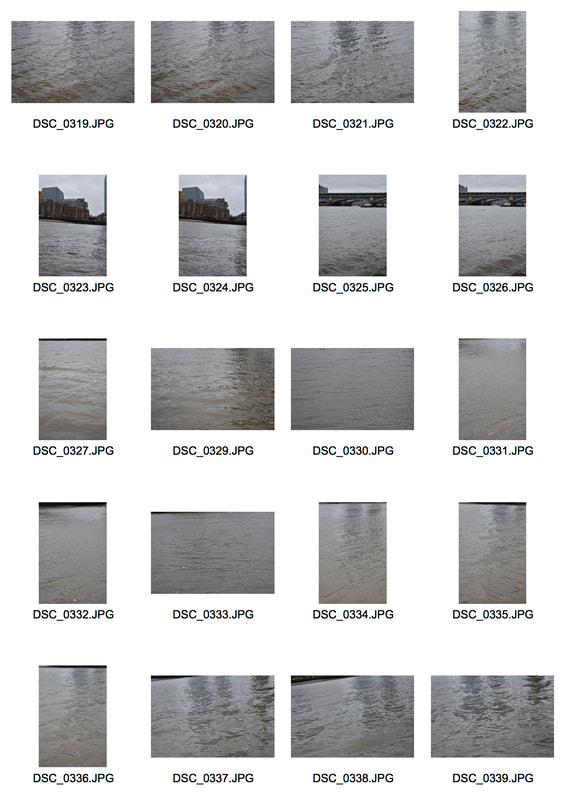
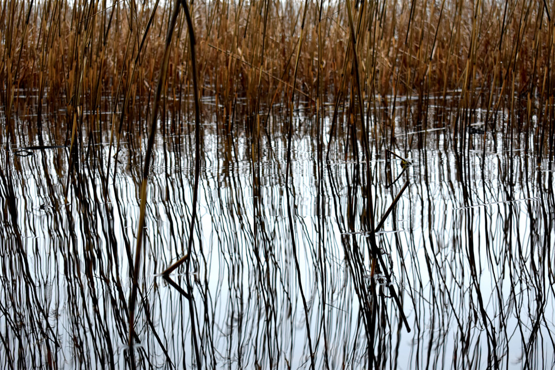
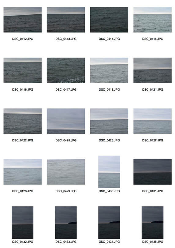
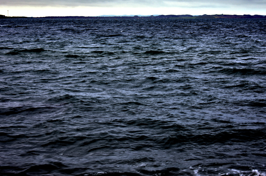
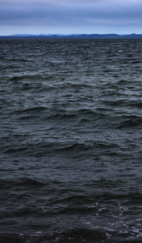
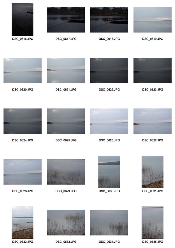
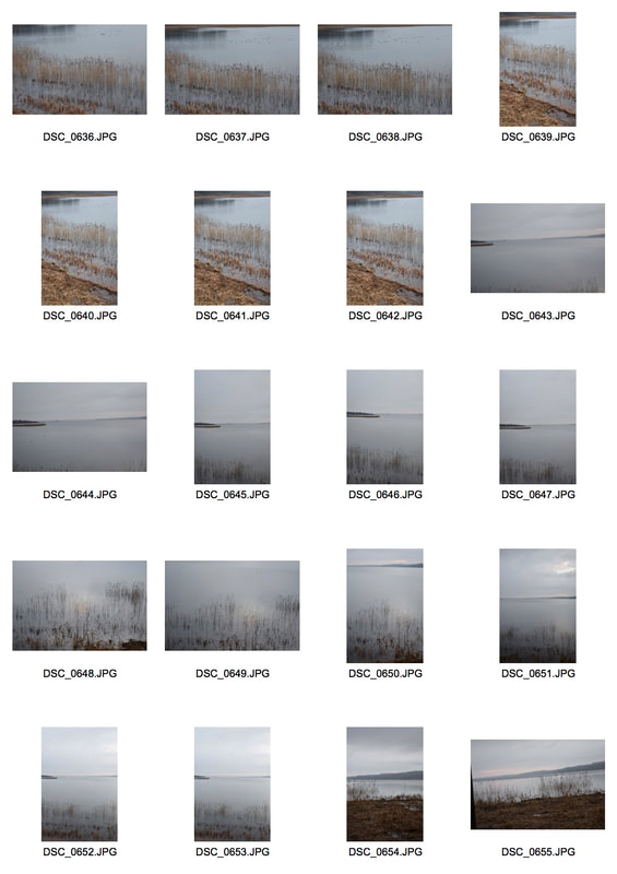
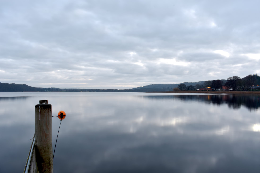
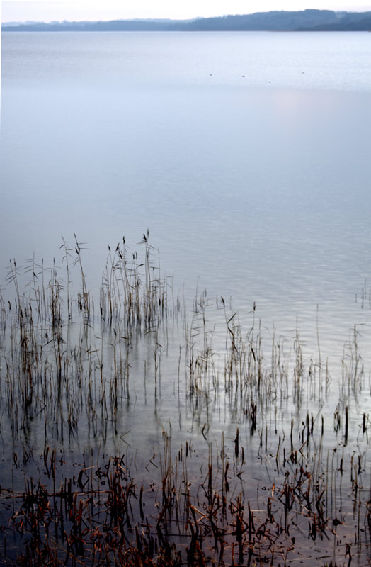
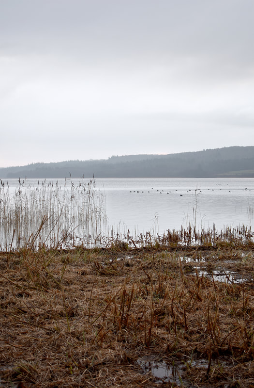
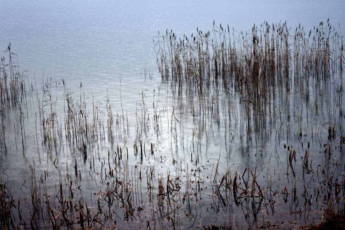
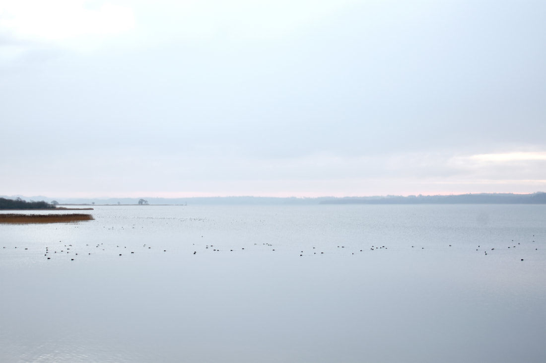
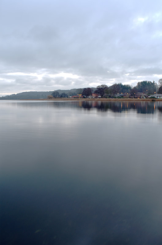
For this development I went to Denmark and I wanted to start capturing the horizons of the water to create a sense of distance but also still keep the high contrast nature of my previous photographs. For my first development in Denmark I visited the local lakes that surround my grandparents' home and have been a visually important area for my upbringing.
|
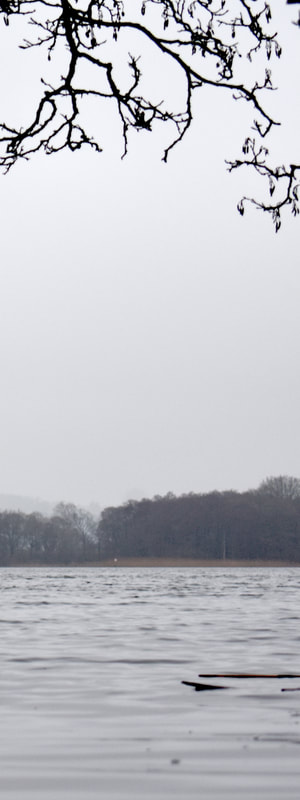
I think that this development was partially successful. I think that the product was successful but I think I failed to properly address and succeed at achieving my goals for this development. There is only one actual horizon and one pseudo-horizon. I think that the top left image is the most successful as it captures the sharp contrast that I had set out to do and I love the colouration of the image. However, it loses a lot of its
|
crispness in the top half as it fades out of focus. I think that the portrait also has it's successes but it is heavily cropped and so becomes claustrophobic losing the purpose of the horizon. I think that the dark branches at the top of the image nicely contrast the white sky. But due to the cropping the image loses a lot of it's quality. Furthermore the near vicinity to the water makes them become completely out of focus. The image of the reeds I think is very nice due to the pseudo-horizon with the meeting of the reeds to the water and the monochromatic reflection of the reeds in water.
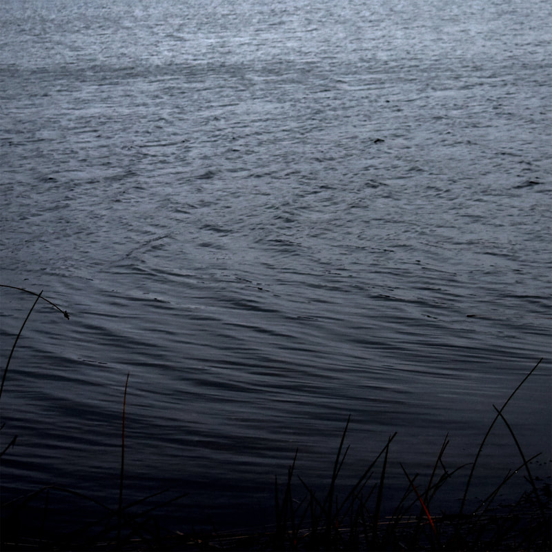
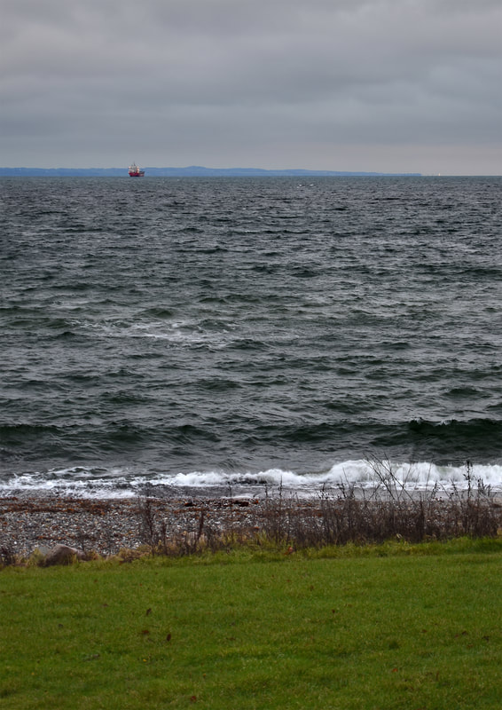
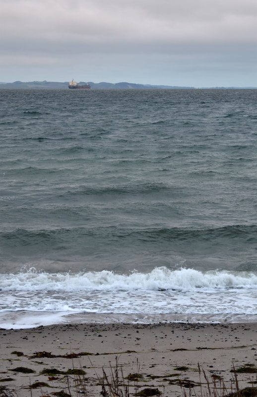
Thirteenth Development
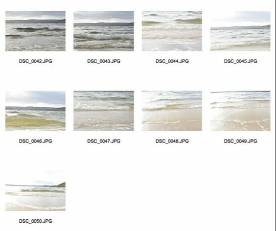
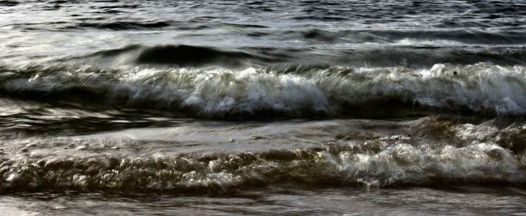
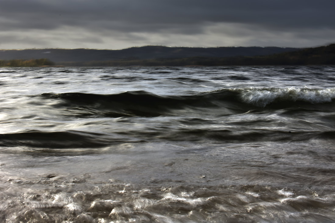
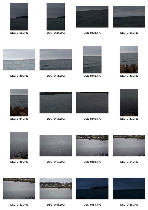
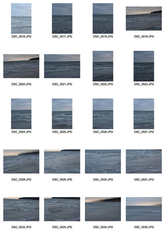
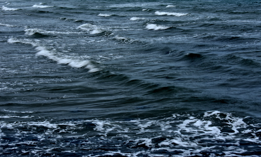
For this development in Denmark I went to the sea, to capture those horizons that I wanted to achieve in the previous development. Furthermore, I wanted to explore how it would appear if there was objects in the water such as shipping boats, life rings or light towers. I also wanted to play around with capturing movement in the images to try and capture the ever-changing nature of water. I still also wished to continue using dark, sharp contrasts in my images.
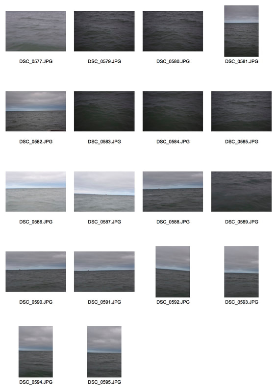
A
B
C
|
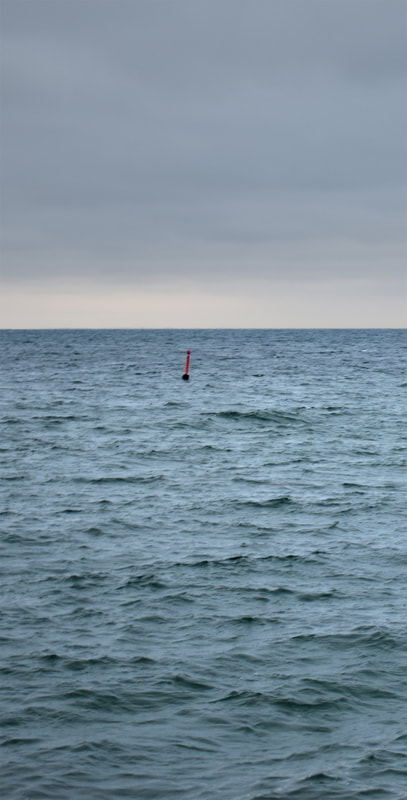
D
|
E
F
|
G
|
H
I
I think that some of the images were successful but many were too dark most likely due to the cloudy, dark lighting at the time. However, there were still some successful photographs. I think that the last two images, I&J, are the least successful especially the one directly above due to their overly dark hues that for me personally are too harsh. Photograph J I think is more successful than photograph I due to the softer edges of the waves and due to it's portrait format. I think landscape H successfully captures the movement of water due to the different angle of attack taken and slight motion blur in the waves. However, again I think it suffers from being overly dark and is slightly out of focus. I think that the two paired portraits, F&G, above are successful due to their apparent
|
J
|
similarities but also clear differences. The similarities range from the rule of thirds, the boat on the horizon, the land sloping from one side to another and the changing ground at the bottom of the photograph. However, the differences range from the lightness and behaviour of the water, to the location of the coast and a different shipping boat. Landscape E in my opinion is the most successful from it's light blues, to the capturing of the movement. Furthermore the streaks across the image create a sense of confusion and overwhelm the audience as they lose sense of scale. I think that the portraits C & D are also successful especially C due to the clear separations between sections as the boulders seem to float above the grey, repetitive waves. Furthermore, the really high horizon provides a stark contrast to many of the other horizons which lay at the line of sight. However, I also really enjoy photograph D due to the red buoy that floats in the centre of the photograph surrounded by the waves and then furthered by the similar grey hue of the upper sky. I think photograph B is also successful and is very similar to photograph E due to the sharp horizon that perfectly splits the photograph. I also think the slight motion blur that is visible at the bottom of the photograph adds to the landscape as it captures the movement of the water. However, I think that photograph A is not particularly successful again due to it being overly dark and low quality of the waves. However, I think that the off-centre boat and light skies improve the photograph drastically. I also think the lip of the waves and the sense of movement captured helps the photograph.
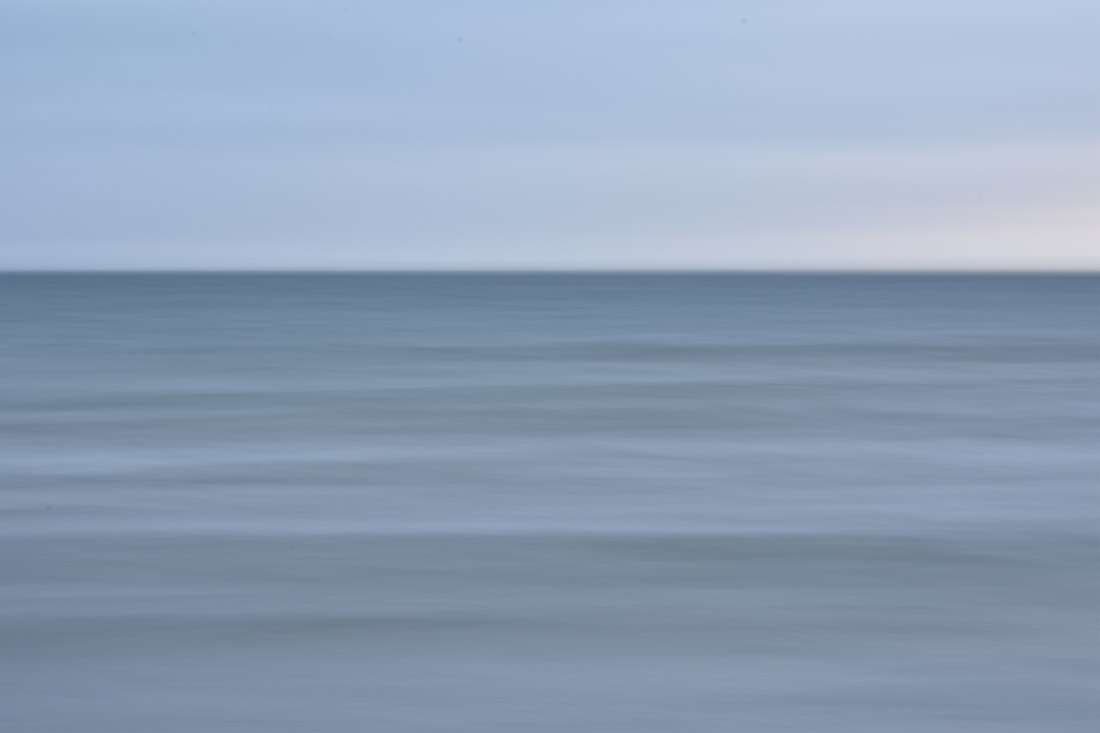
Fourteenth Development
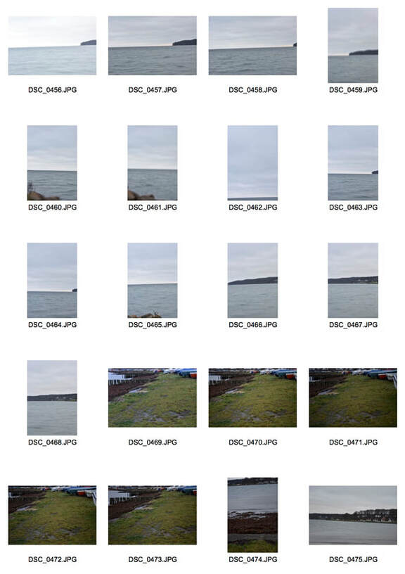
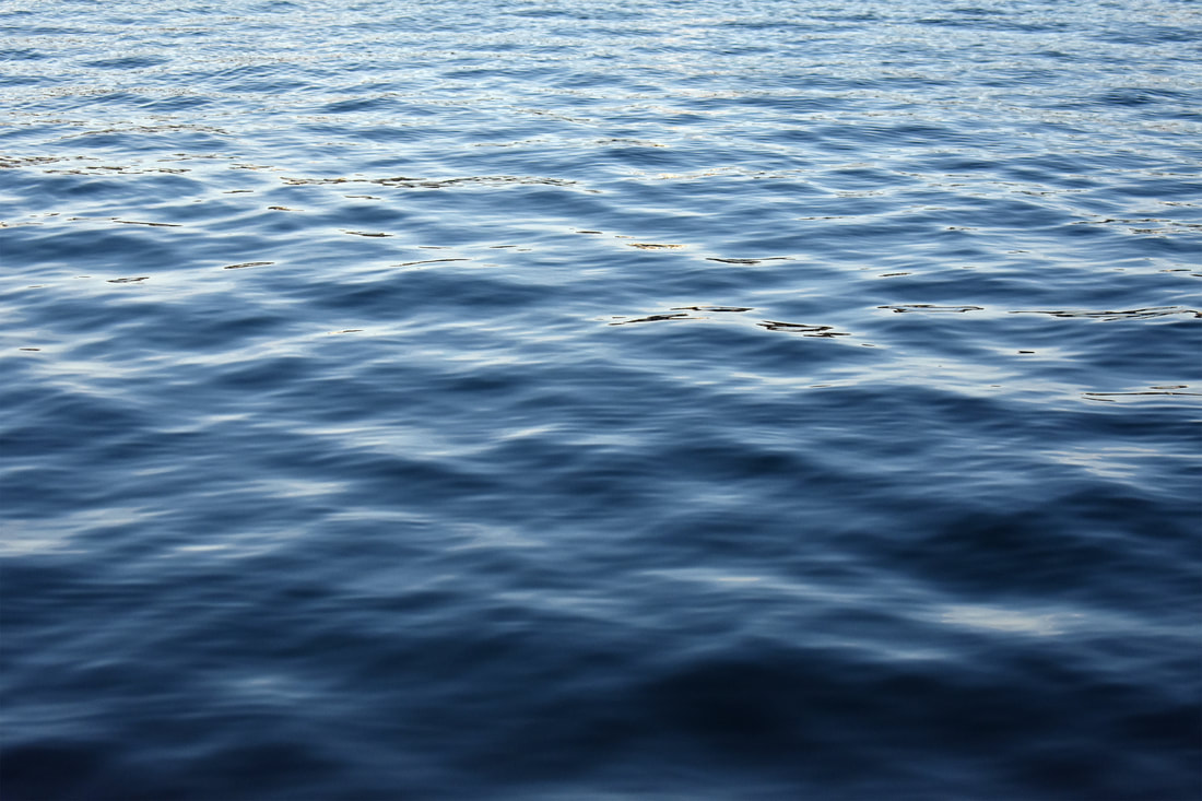
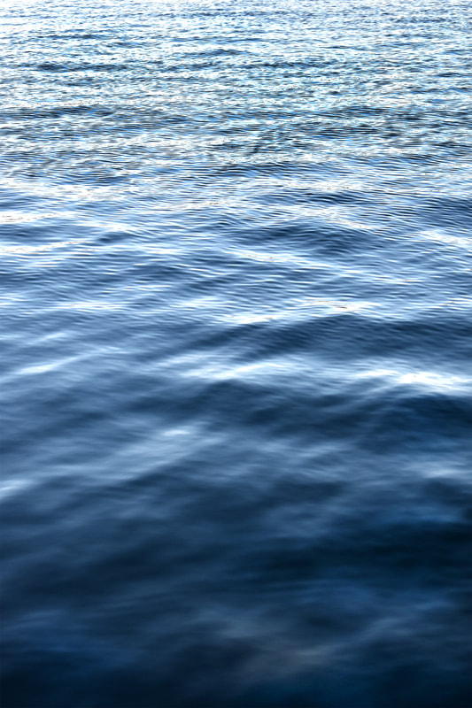
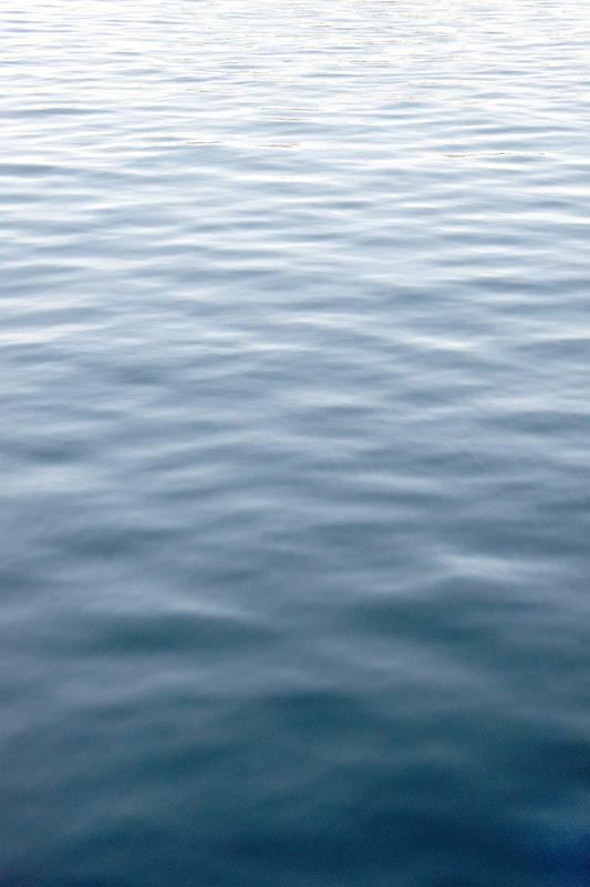
For this development I returned to the lakes that surround my grandparents home. I woke up early to attempt to capture the mist that could potentially be there when the sun rose due to the large volumes of water in the surrounding area. However, sadly, the fog did not arrive but instead it was bright and still. This allowed me to instead attempt to capture the still, calming nature of water in contrast to the chaotic nature of some of my previous photographs.
|
|
|
Even though the fog wasn't there that I had wished for, the development was still extremely successful due to the clear bright weather that came instead. This meant that I could compose particularly minimalist pieces where the sky and water seem to merge into each other. I also think that these photographs provide a great contrast to the other photographs that are quite moody and provide a counterbalance to them. However, the water still comes across as menacing due to the mirror like surface of the water that seems to hide something, this is furthered by the fact that both of the lakes photographed in this development, Mosso and Knudsø, have had human remains discovered from the stone age in their depths.In the image to the right this is furthered by the fact that at the bottom something seems to start being revealed slightly. I think that the only issue is in some of the photographs that have reeds, they have become slightly saturated in editing and have developed a reddish tint that is unpleasant, however, for me that seems to be the only issue.
|
|
Fifteenth Development
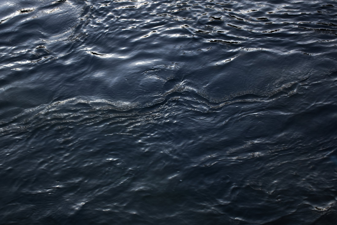
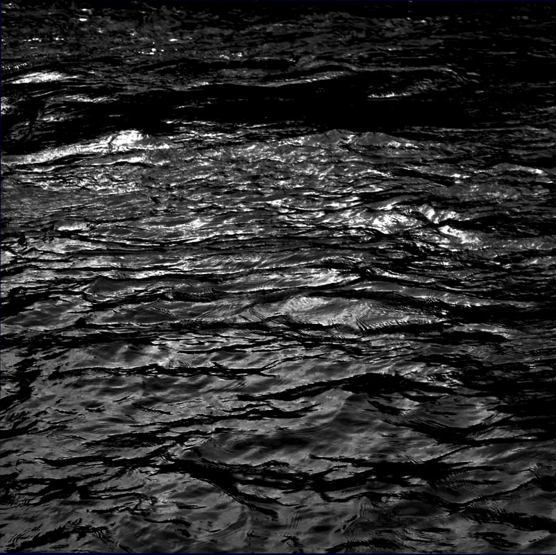
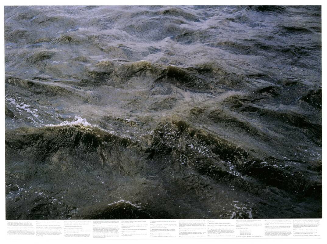
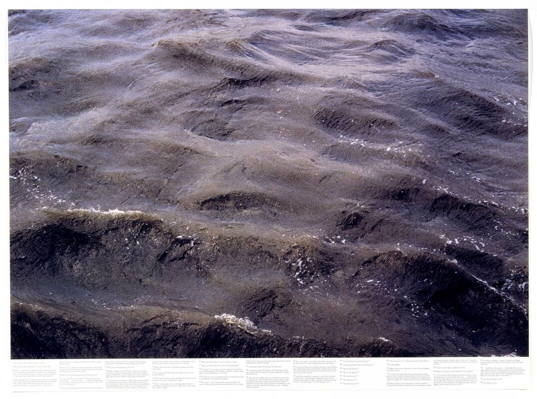
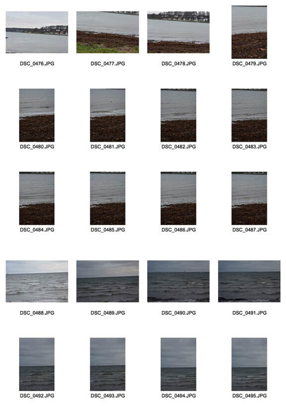
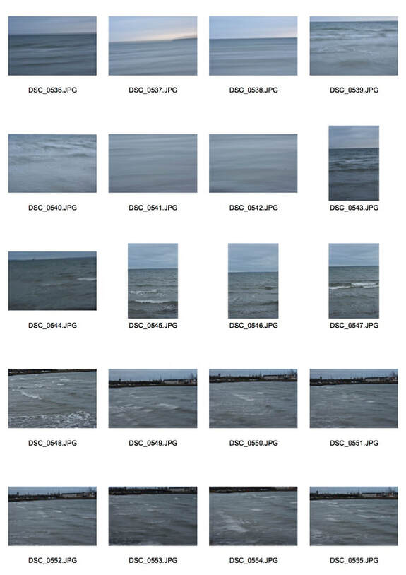
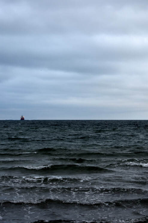
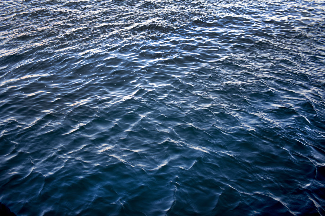
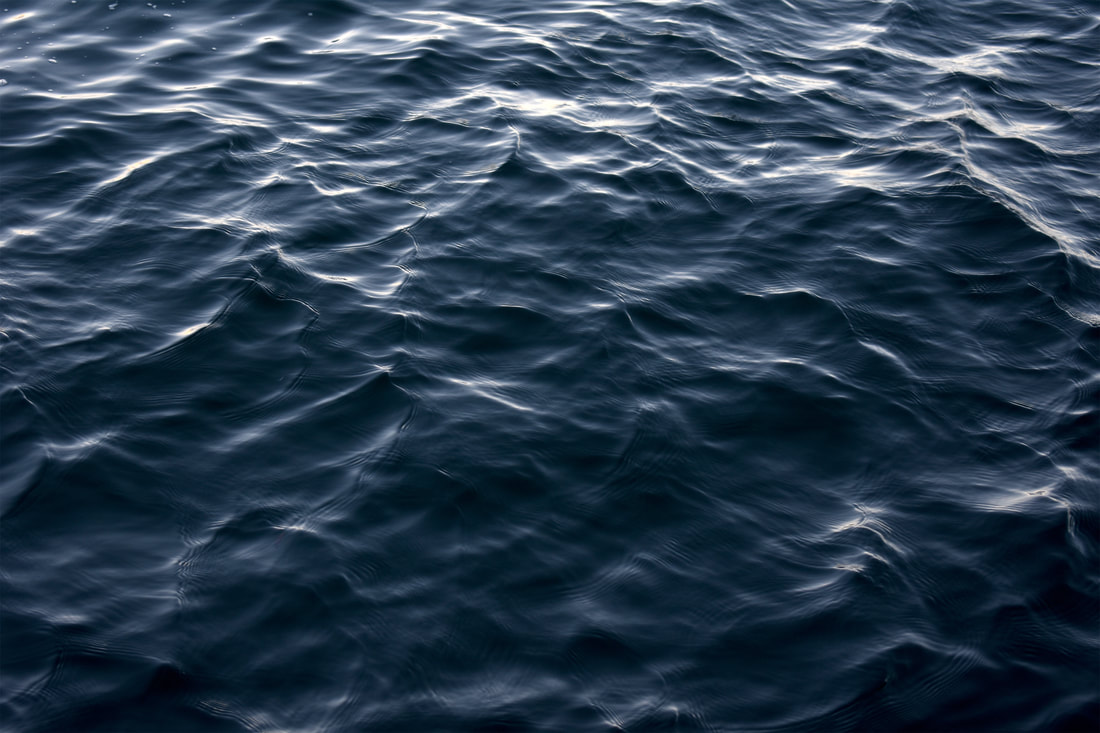
For this development I returned to the sea so I could attempt to capture the effects that an industrial environment of a port has on water and also creating photographs solely consisting of water and waves that would create a sense of entrapment but also a sense of eternity in the images. This could be viewed as menacing as the water seems to engulf everything, similar to the Icelandic folklore that Roni Horn used to influence her own work (above).
|
|
|
|
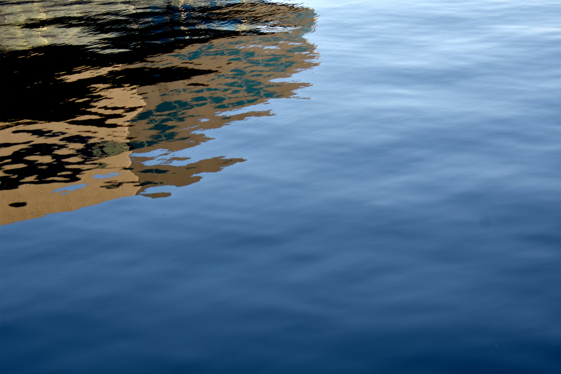
I think that this development was a huge success especially due to the varying levels of emotions from the dark, heavy water at the start to the light, windless waters at the end. I think my only issue is that the first image's bottom left corner has somehow become completely dark. However, I felt that if I cut that out it would've take the sense of change away from the photograph from the light waves at the bottom to the rapid waves at the top. This contrasts the closeup of the water in the next photograph, with all the levels and miniature changes of water being easily visible. The next layer of photographs depth comes from different methods, the left photograph's changing levels in light create a sense of sunrise while the gold streaking light in the photograph digs through the dark murky water that surrounds it. However, there is a lot of noise in the darker areas. The next five seascapes are extremely aesthetically pleasing due to their colouration, ripples, textures and variations of light. While the last photograph provides a contrast to the others with the perfectly still water and the golden brown building reflected in the deep blue water.
Printing on foil
|
As a side development I wanted to experiment and explore with alternate forms of printing. To start with I wanted to attempt printing on metals after a a Colombian artist at the Paris photo week, Leyla Cardenas, who printed his images on free standing sheets of brass and concrete. His work questions urban ruins, demolition sites and abandoned structures as indications of social transformations and loss of
|
|
memories. He presents his work in structure to further embody the abandoned structures he is photographing. The use of a rough concrete at the bottom of the structures represents the rubble at the base of these abandoned areas.
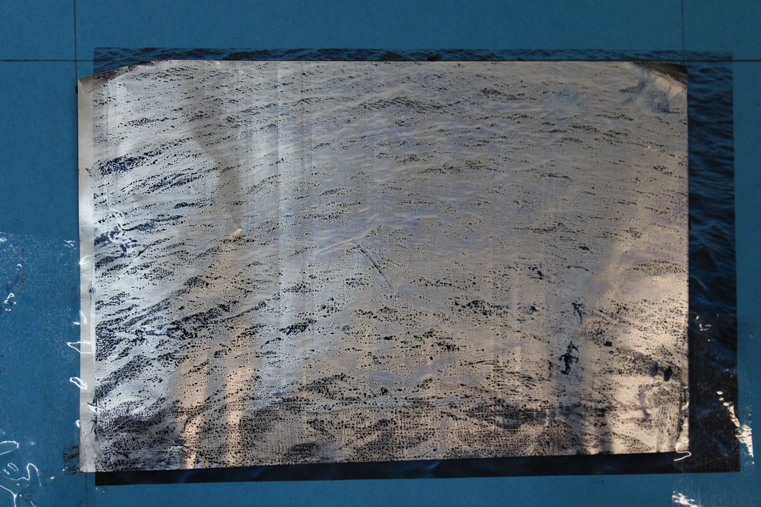
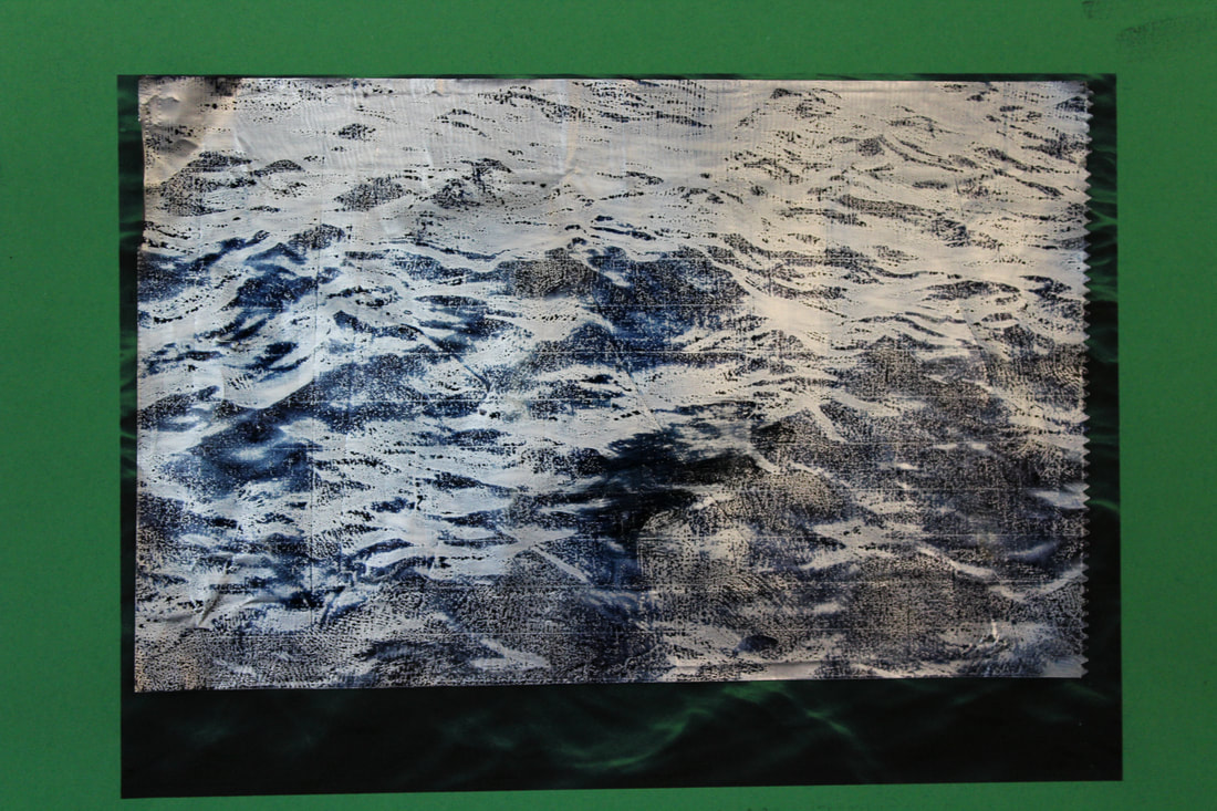
I wanted to print on metal but did not want to waste large sheets of metal and so started with small squares of aluminium foil. The thin nature of aluminium foil allowed it to be glued to a paper and then passed through an inkjet printer without problem.
I wanted to print on metal but did not want to waste large sheets of metal and so started with small squares of aluminium foil. The thin nature of aluminium foil allowed it to be glued to a paper and then passed through an inkjet printer without problem.
|
|
I think that there was some success in this development but there were many issues faced in this first attempt of printing on metals. The main issue with printing on foil was that not all the ink was able to get onto the foil and that the ink did not dry and so could smudge. The first main issue could be solved by printing on it twice so the volume of ink was increased and contrast can be seen (right image). However, as the ink struggled to attach to the print and when double printed struggled to stay attached as can be seen by the smudging of the ink in the right image. Some solutions to this issue could be by sanding the foil which might remove a protective layer from the foil and allow the ink to attach and to buy a coating that will act as a stop for the ink. However, there are some positives to take from these two attempts as I was able to capture the waves and contrast in the image especially in the left image. Furthermore the extra ink that was not able to attach to the left image creates a blue that stains the left side of the photograph to create a sea hue. However, I will not pursue this for my final piece as I feel that this printing method will lose the subtleties and intricacies of a colour print and also lose the colours and shades that add so much to the photographs.
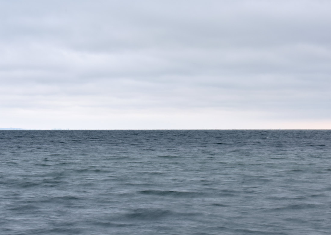
Horizonline
For this experiment I wanted to explore the aesthetics of having all of my horizon photographs in a continuous horizon even with their differing sizes and formats. This would create a sense of continuity throughout the water even with their differing locations and atmospheres and emphasise the universality and similarities of water.
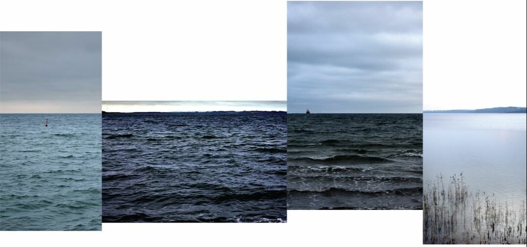
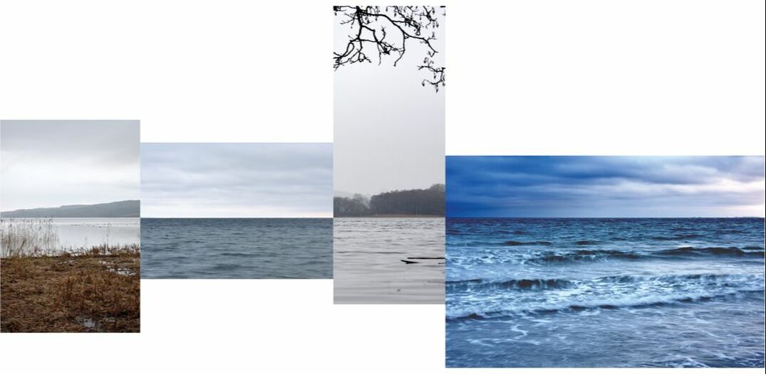
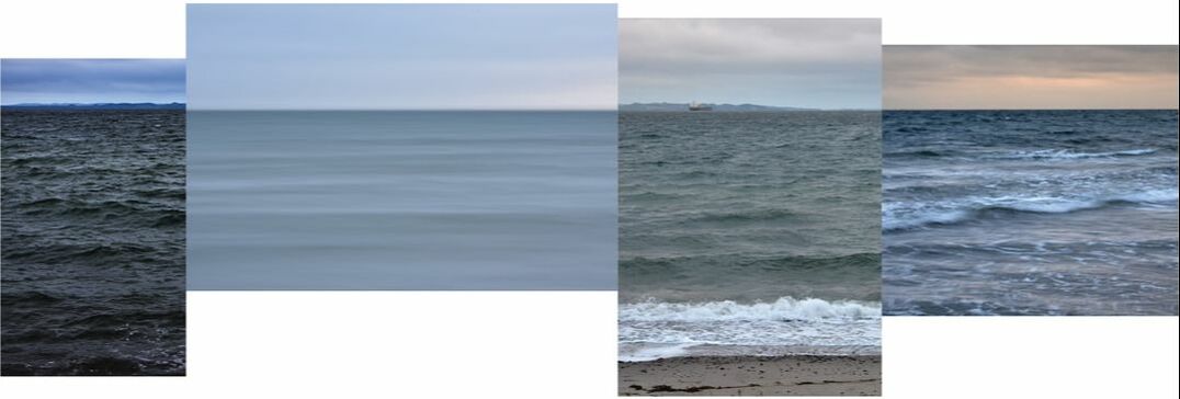
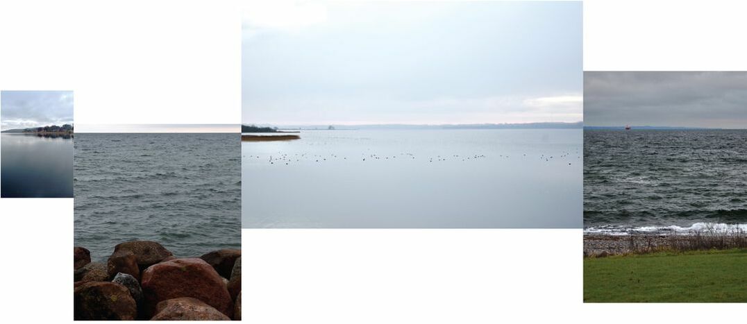
I think that this was a success conceptually, however, the varying heights of the horizon can be slightly aesthetically displeasing on the weebly, however in my final piece book 'Hav of Sø' (danish for sea and lake) which is a collection of all my danish water photography in three distinct sections, it works surprisingly well. The other issue is that some of the photograph's quality is lacking compared to others.
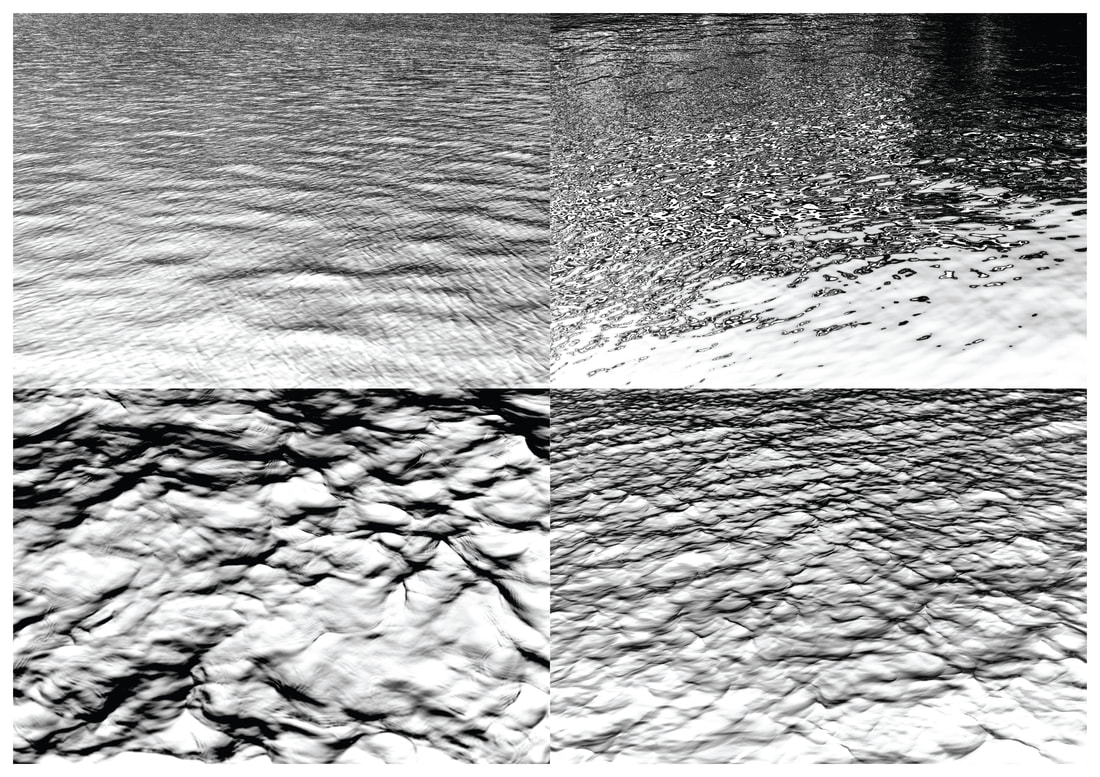
Inversion
For this experimentation I wanted to explore with how to change the photographs while keeping them the same. For this I experimented with black and white. This emphasises the dark side of the water through the connotations of colour and absorbs the audience further in and change the whole appearance of the photograph.
I think that this was a success as many of the images gained a newfound depth and intrigue through the removal of colour, however, there are some of the lighter photographs that become overly bleached by the grayscale and so become overly harsh on the audience's eyes. I also feel that some of the images that were slightly out of focus became more clearly so as the grayscale seemed to highlight this. However, the transition to black and white allowed the inclusion of other photographs that had previously been dis-included but seemed to fit in better when monochrome. This allowed for a further depth to the collection as a whole as the repetitive nature of water is further emphasised. A further section was added to my book 'Hav og Sø' which includes purely monochrome double spreads.
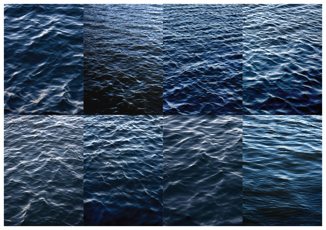
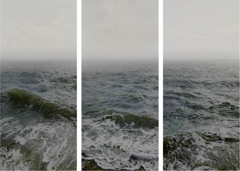
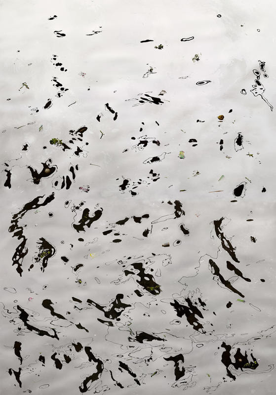
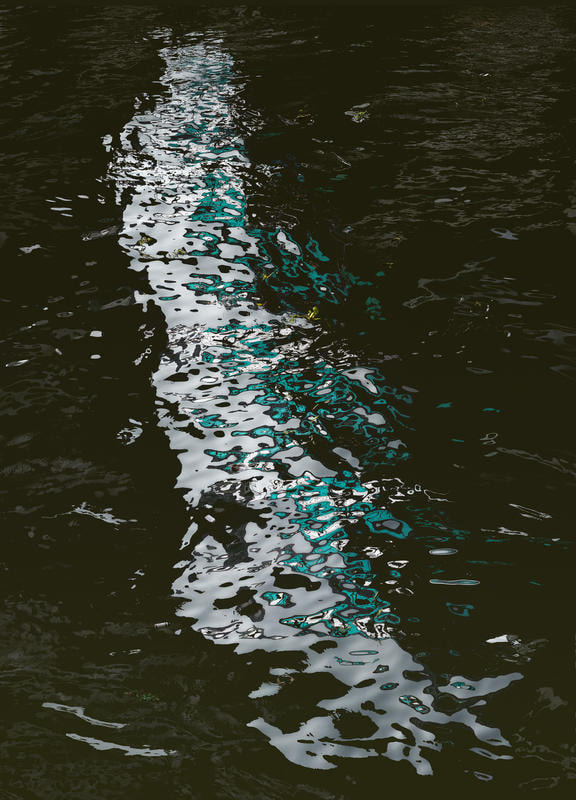
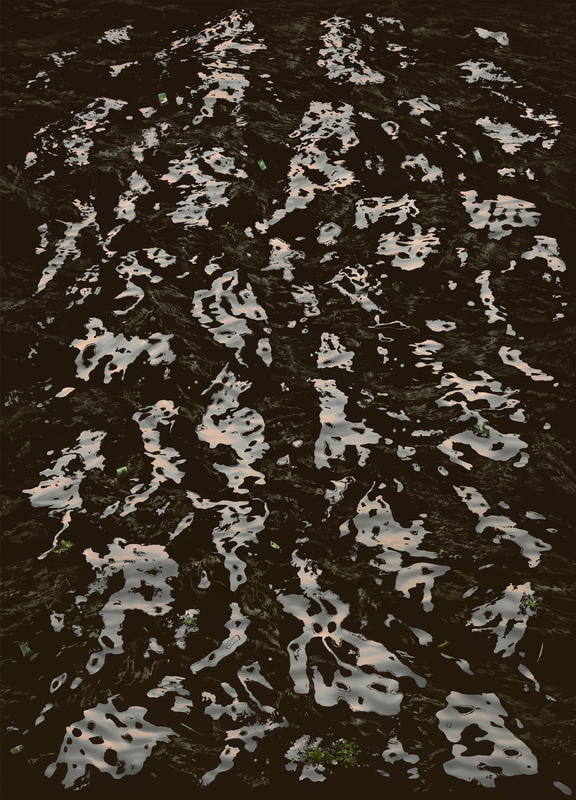
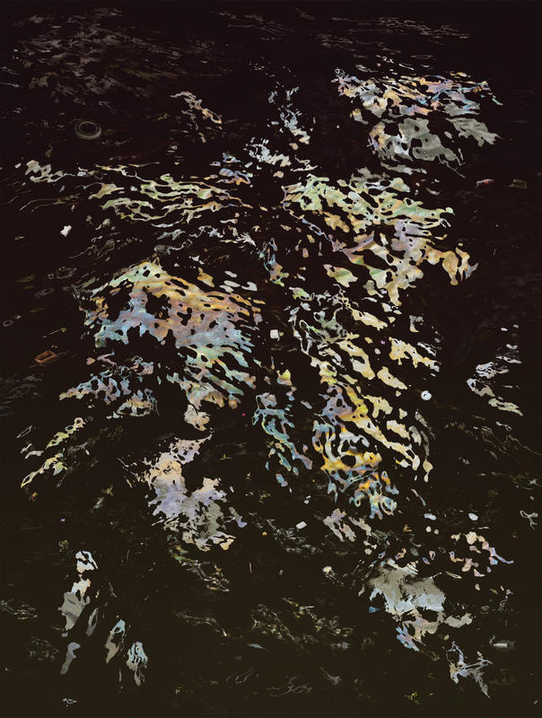
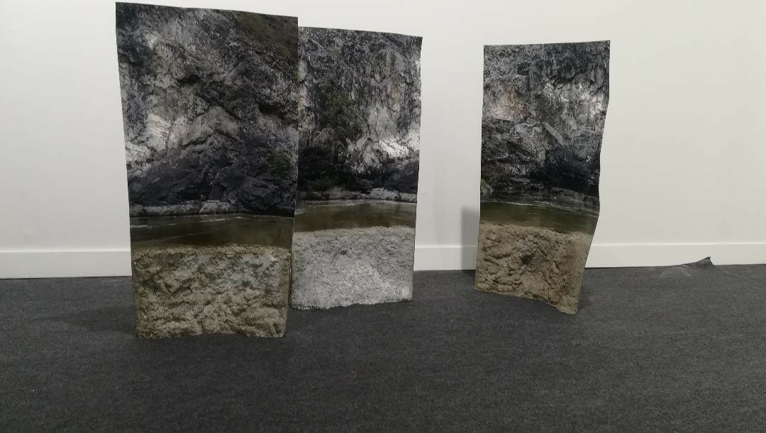
Final Piece
|
For my final piece I wanted to print the photographs on a large scale so that it would absorb the audience and engulf them as the ocean does. However, so as not to compromise the quality of the photographs I combined them to create a collage of water inspired by Doug Aitkens' geometric 'New Opposition' (2001) commenting on the effects of climate change by mirroring landscapes before and after the ice has melted due to climate change. I realised that also if I combined the photographs together that it would allow it to absorb and overwhelm the audience further but also allow the audience to appreciate the details and the whole through the same piece. This is accompanied by the book: 'Hav og Sø' (danish for Sea and Lake) that documents all of my photographs of danish water.
|
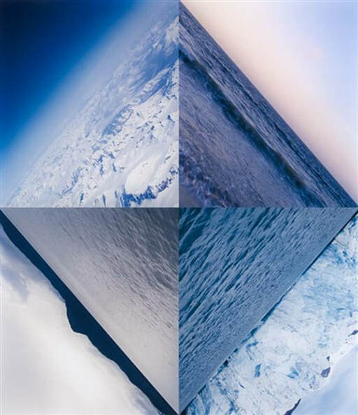
Doug Aitkens' 'New Opposition' (2001)
|