In this project I will aim to explore the different photographic interpretations of "Variation and Similarity" and develop my ideas so as to create a final piece that is a direct answer to the unit title. Below I have created a pinterest board that explores the different ideas and interpretations that I and others have had.
Typology
|
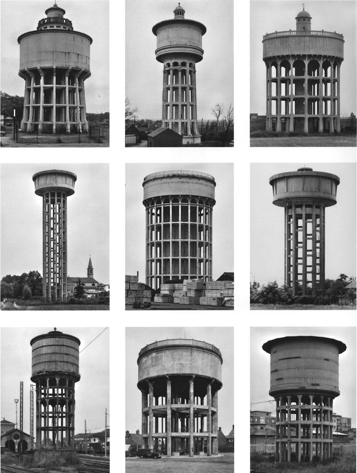
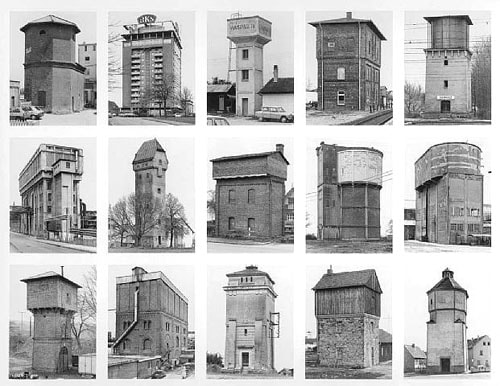
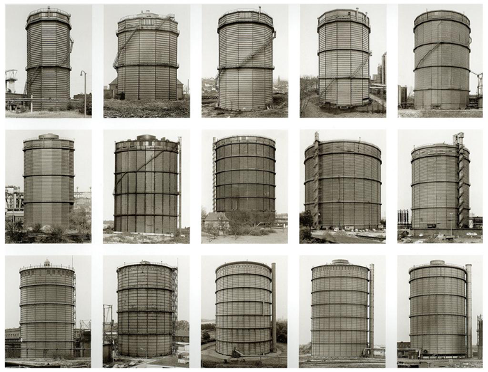
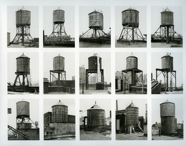
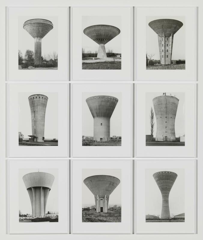
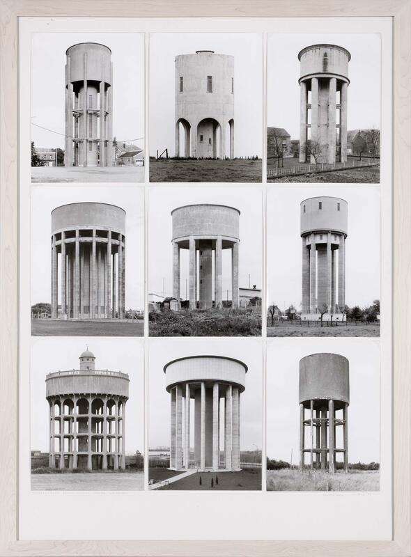
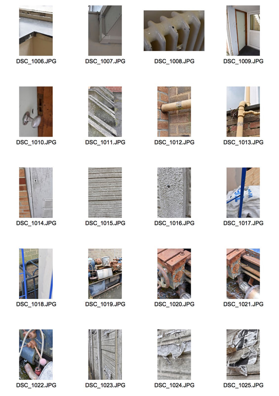
For this task we had to create a typology inspired by the work of Bernd and Hilla Becher. The Becher's photographed and catalogued the industrial and brutalist buildings of the dying Ruhr, the former industrial region of Germany. Bernd was aware that the area that he grew up in was disappearing in the 1950s: "I was overcome with horror when I noticed that the world in which I was besotted was disappearing".
However, the images are particularly scientific nature and reminiscent of the early cyanotypes of Anna Atkins categorising ferns and seaweed. The scientific nature of the typographies have often led to it being regarded as sculpture winning the sculpture award of Venice Biennale an award for sculpture to the Becher's referring to the photographs as 'anonymous sculptures'. They used a large format plate camera and photographed from straight ahead to emphasise the monotony and similarity of the industrial structures; emphasised by the grid format that they are presented in. The Bechers would photograph in the grey, early morning light to emphasise the bleakness of the structures themselves. They would also photograph from a distance to emphasise the scale of the buildings in comparison to smaller features such as street signs. |
      |
My Response
|
|
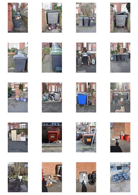
I think that my choice of bins as a subject for typology was well chosen as bins reveal a lot about the owner, similar to Mark Menjivar's 'Refrigerators' series. However, in my opinion bins reveal more about the owner than a fridge would as the contents are involuntary. However, the photographs are not of the contents but the bins themselves and are therefore not so indicative of the owner. Furthermore, I failed to photograph the bins in a uniform style, the lighting varied and so did the colour. I therefore think that this task was not overly successful for me as thew images lack uniformity in style and therefore take away from the typology itself.
Out of Focus
|
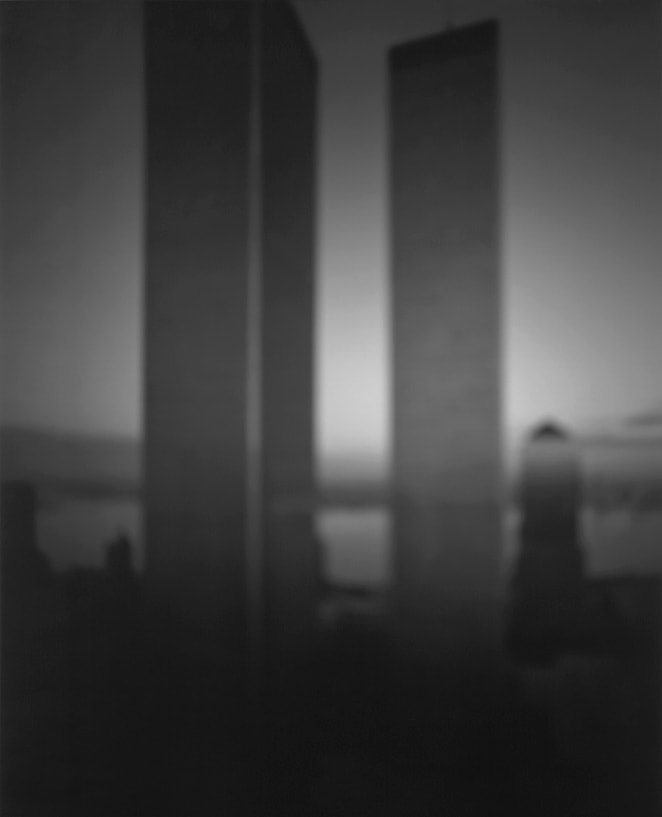
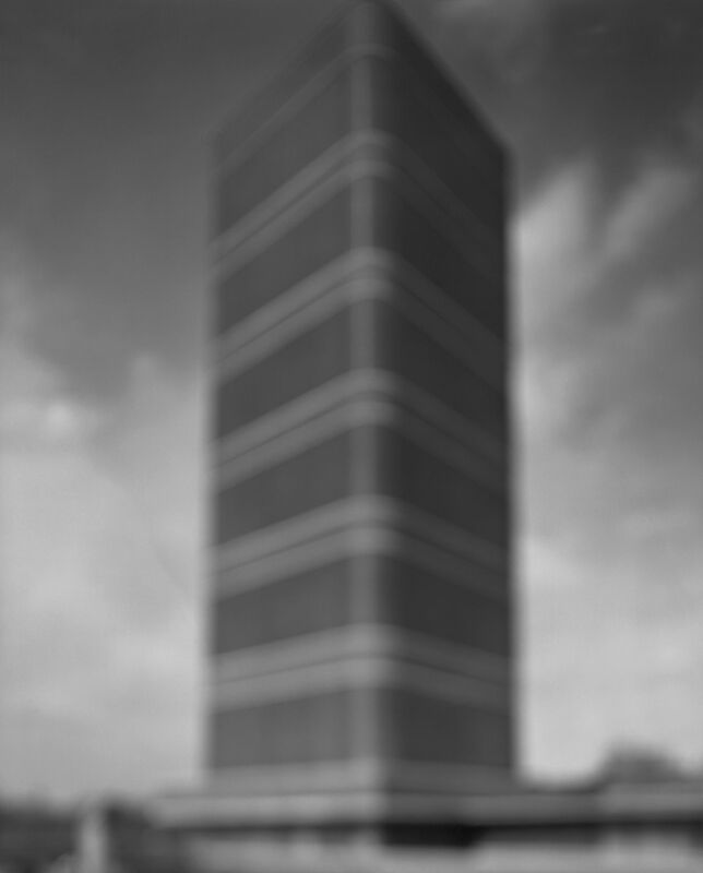
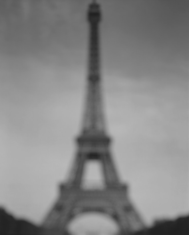
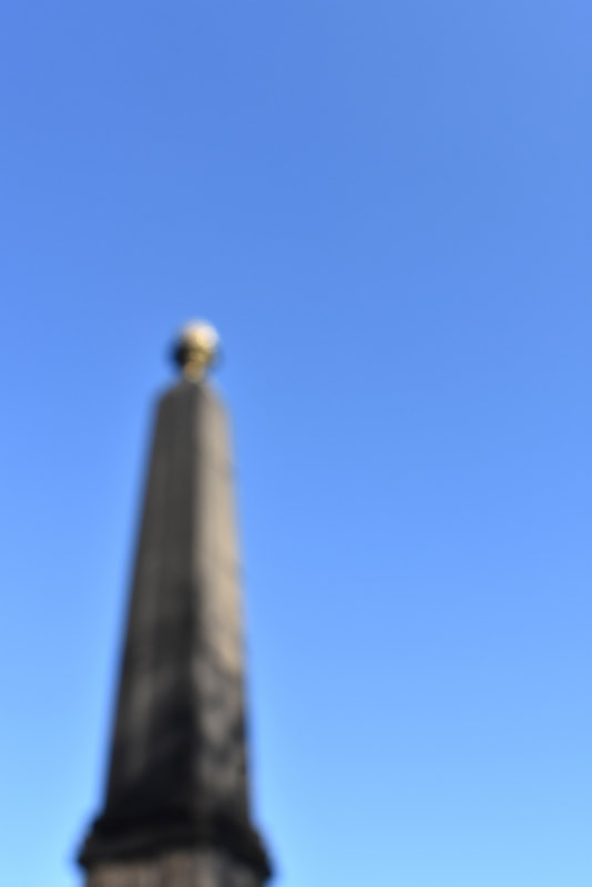
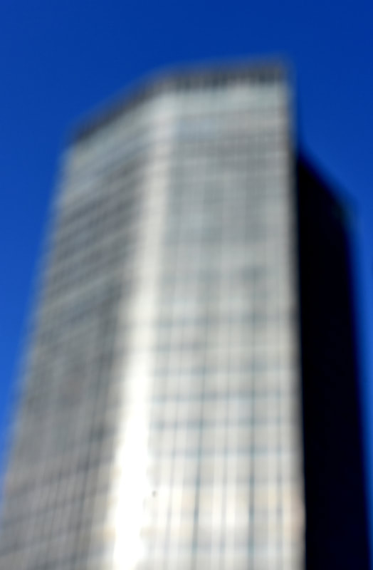
This task was inspired by Hiroshi Sugimoto's Architecture series. Sugimoto pushed his large format camera's focal length to twice infinity making the image an "utter blur". Sugimoto has contradicted all the rules of architectural photography, which usually attempt to capture the structures in crisp detail to highlight their beauty. This naturally melts away the majority of the building, muting any details, and leaving only the bare essence of the original building. Furthermore, his blurred forms evoke the passage of time, a recurring theme in his work due to his ancient camera and the timelessness of the long exposures he often uses.
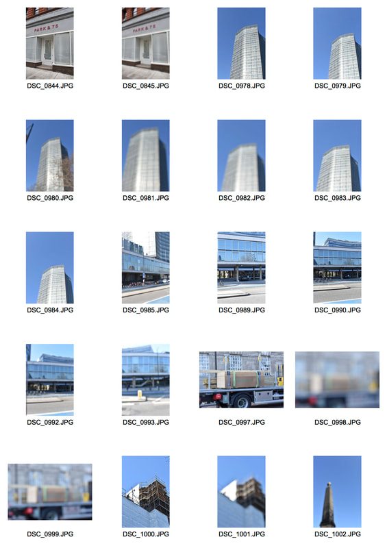
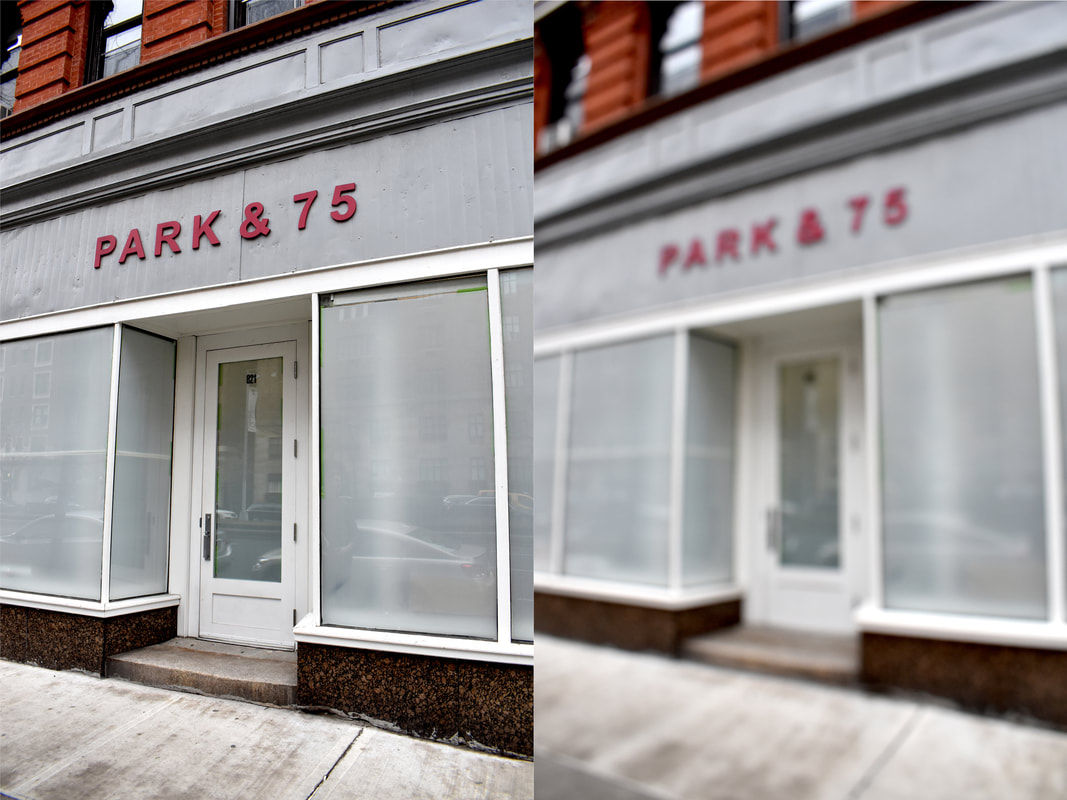
In response to this, I experimented with the focal range on each building to see how it would affect the architecture and details of the building and whether it suited it to be more abstract or detailed. |
|
|
|
My Response
|
|
I think that this task was quite successful even though I did not experiment with photographing or making the structures monochrome. I think that the lighting and good weather helped to agreat degree to emphassises the building, especially in the last two images where the empty blue sky frames the building itself; the empty blue sky implies a summer haze has overcome the buildings. I think that with the comparative pair, it would have been more successful if I had used the same angle to have a direct comparison, the same goes for the colouration and shadow in the two pieces. Furthermore, I think that it would have been nicer if there was some more of the surrounding buildings in the photograph.
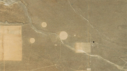
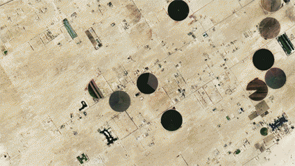
Variations and Similarities in Landscapes
|
For this task we were inspired by the work of the artist Páraic McGloughlin. For his work he created a series of GIFs and videos titled arena which were compiled of a series of similar architecture and landforms. He wanted to create "A brief look at the earth from above, based on the shapes we make, the game of life, our playing ground." Documenting how the earth is the arena of humans.
|
|
My Response
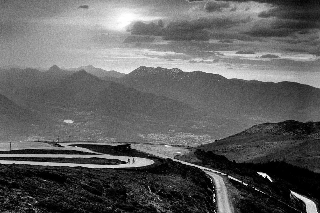
Milano San Remo
Velodromes
I think that this task was very successful, from the consistent theme in both and the length and aesthetic of them. I decided to revolve my GIFs around cycling due to the personal connection. For the first GIF I decided to document the route of the longest professional bike race in the world, the 110th Milano San Remo. The GIF shows the transition from the plains of the Po valley over the Ligurian alps to the mediterranean coast and Italian Riviera. Documenting the change from industry to frivolity. For my other GIF I decided to document multiple velodromes across the globe and how their style changes from the Keirin tracks of Japan, to indoor velodromes or small, local velodromes in Italy. However, I find it annoying that the scale constantly changes in the Velodrome GIF, taking away the sense of differing scale of each Velodrome. I fixed this in the Milano San Remo GIF as I used the keyboard arrows to formulaically journey from Milan to San Remo.
Variations in Layout and Part
|
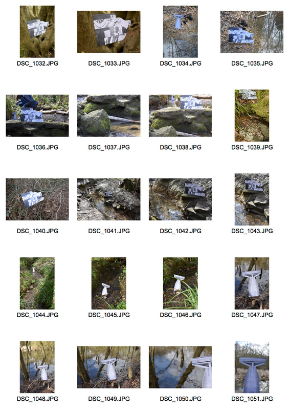
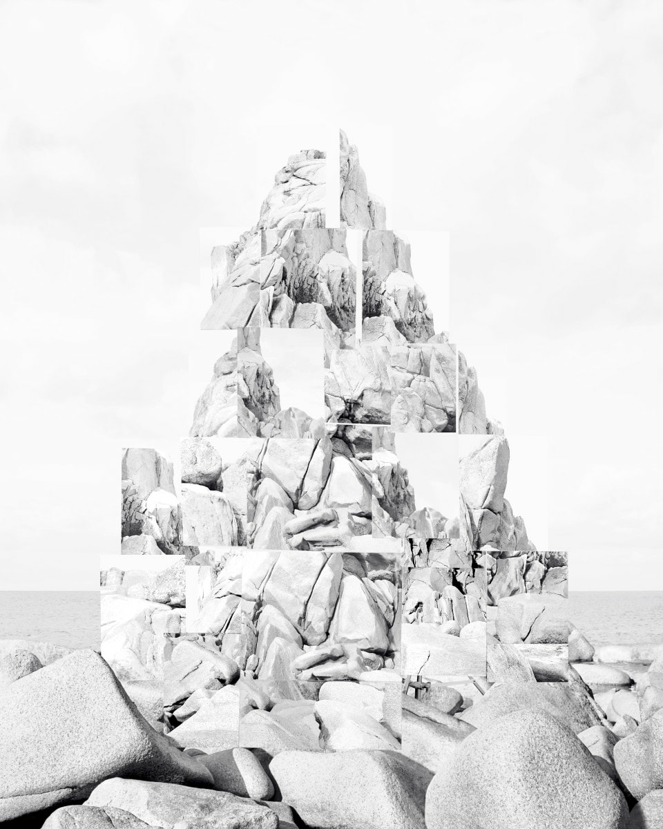
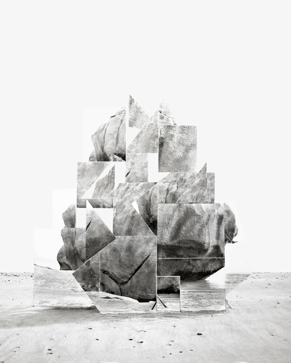
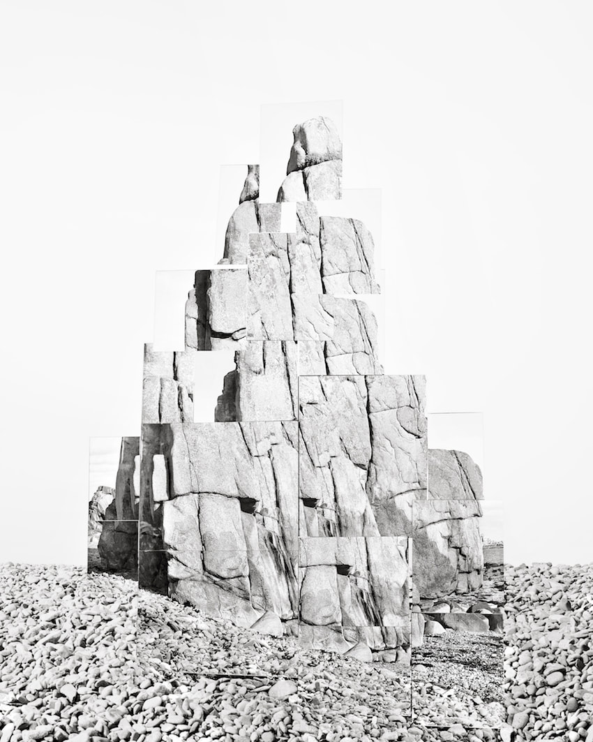
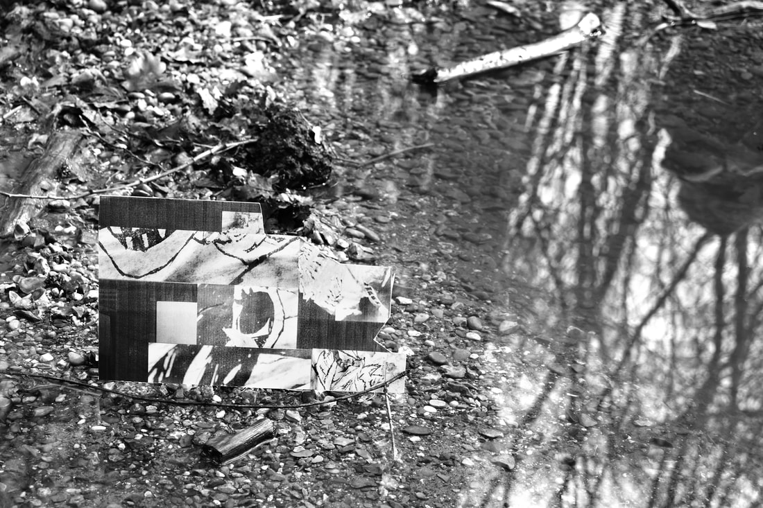
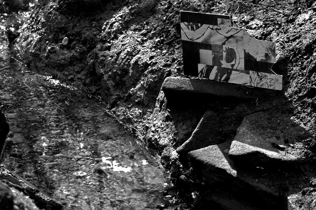
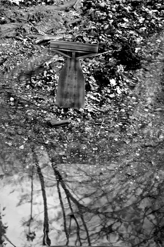
For this task I will have to photograph specific details around the school, to create a brutalist poster with. I will then have to place this new structure around different environments in the style of Noémie Goudal's Soulèvements series. In this series, Goudal uses multiple mirrors to reflect different rock formations before combining them all to form new formations in new landscapes.
|
|
|
I don't think that this task was particularly successful, I did not know exactly what the aim of the task was or what it's final aim was. Due to this my structure was very unsuccessful, aesthetically, and immediately destined the final photographs to be unsuccessful. I think that the final, in situ, photographs were much better than I had initially expected. Potentially due to me turning the photographs monochromatic, in post-production, and the clean reflection in the water due to the good lighting at the time of photographing.
|
|
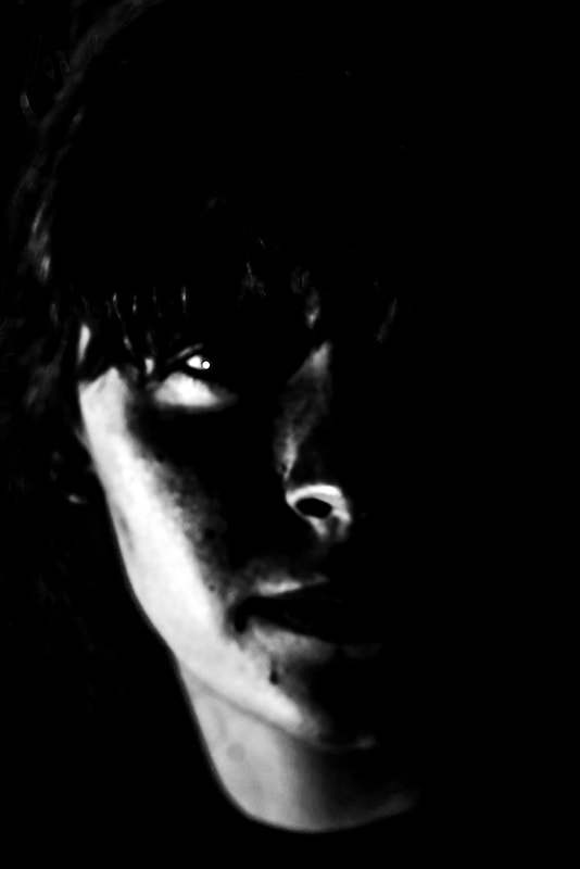
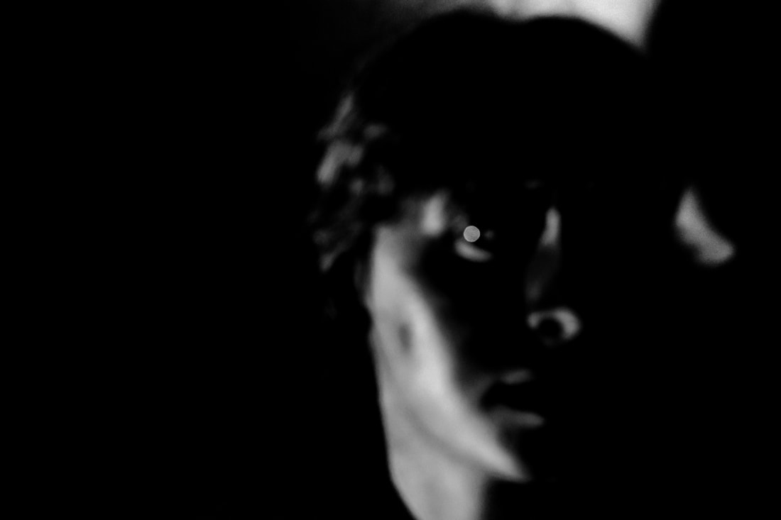
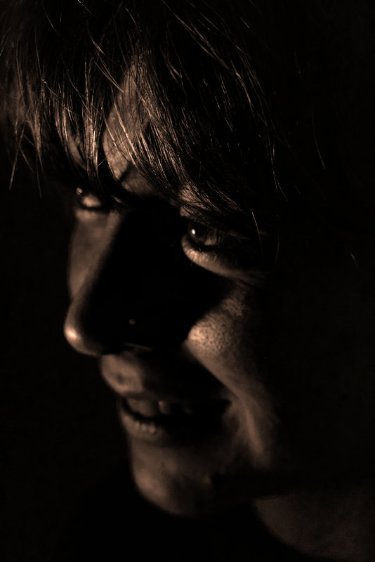
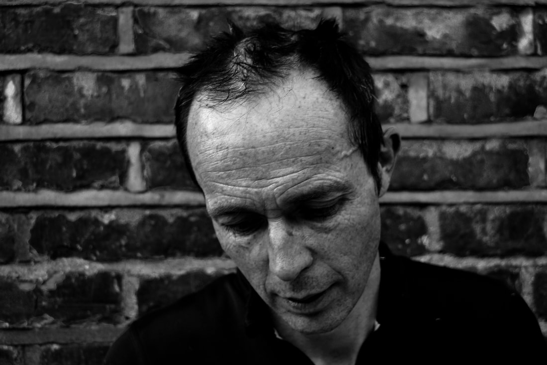
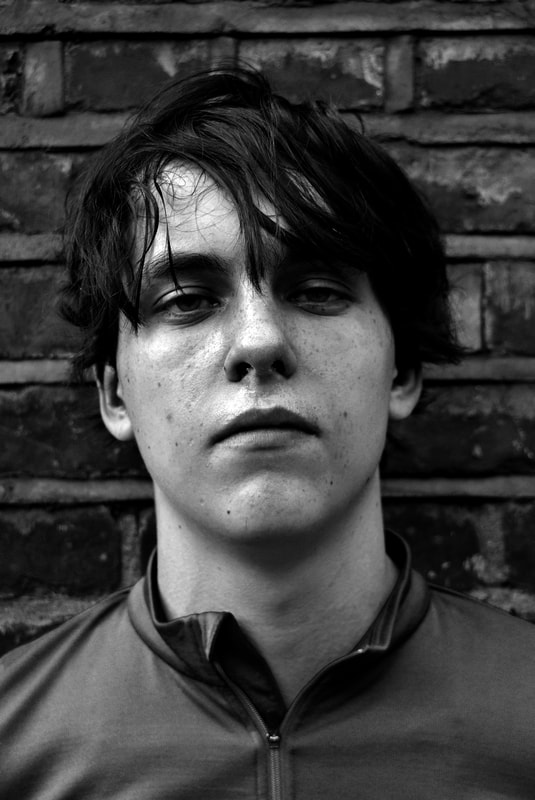
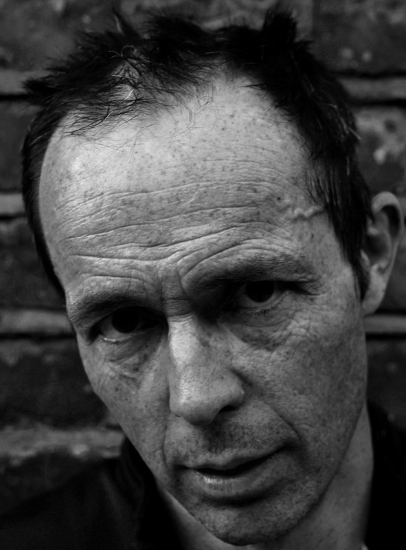
Shadow and Light
|
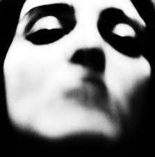
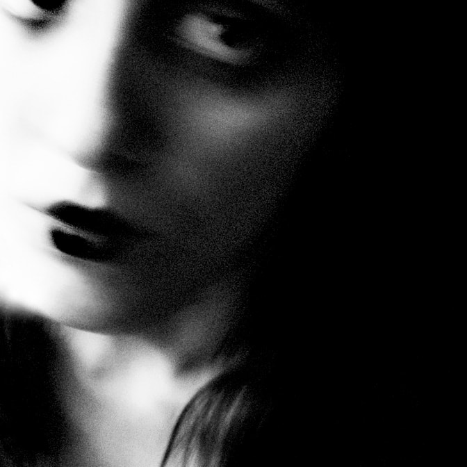
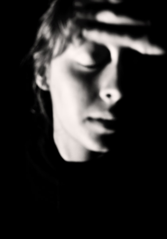
In this task we were inspired by the work of Valerie Kabis who explores melancholic themes through high contrast monochromatic images that are out of focus and have some slight motion blur to create a melancholic ghostly photograph.
|
|
|
|
|
|
|
In contrast to the previous task, I think that this task was highly successful. However, I think that the top right image is a little blotchy on the boundary between the shadow and highlight on the face. However, I think that the light catching the eye as well as highlighting the area below the eye in contrast to the surrounding shadow. I also think that the glimmer on the side of the nose is a nice contrast to the surrounding shadow. I think that the bleached, ceramic-like, lucid skin colour creates a ghostly appearance similar to that of Francesca Woodman's ghostlike photographs. This ghostlike appearance can also be said about the directly above photograph due to the complete lack of focus, creating a sense of mystery and unknown. I also think that the image to the right is successful even though it is highly different to the others in the selection, due to the sharp focus on the hair and sepia filter used.
|
|
Three Strands
Still Life
|
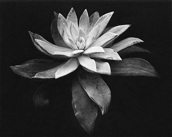
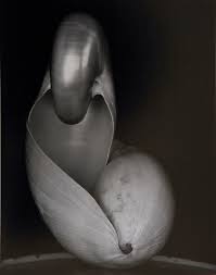
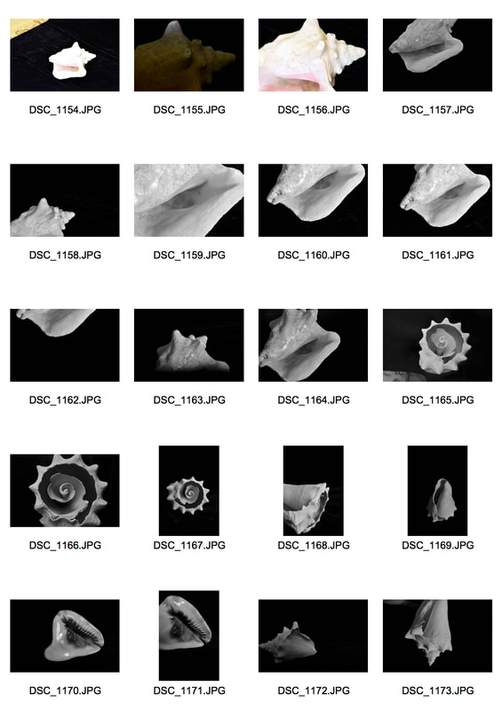
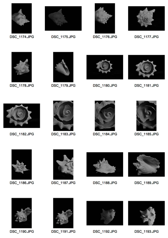
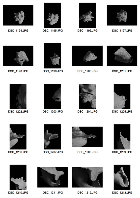
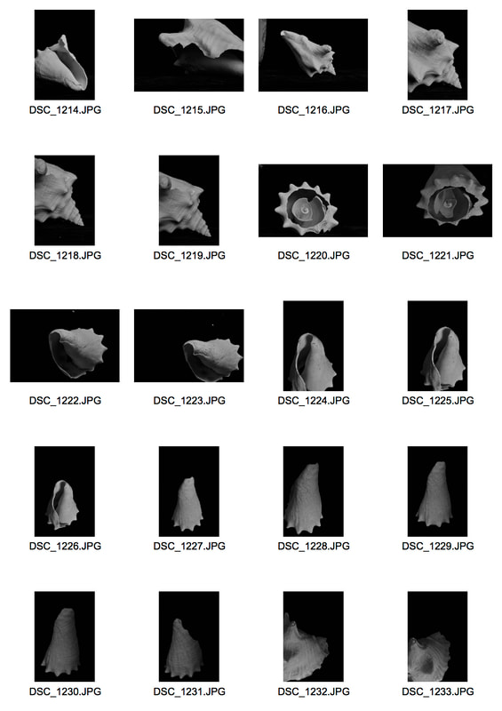
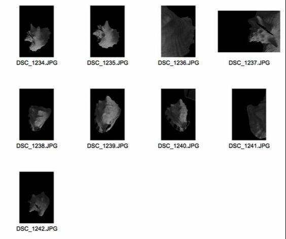
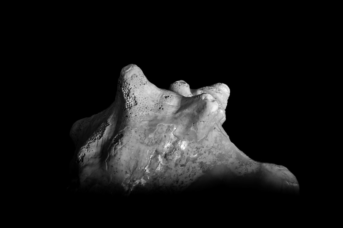
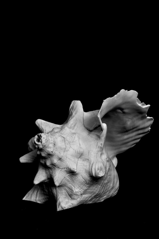
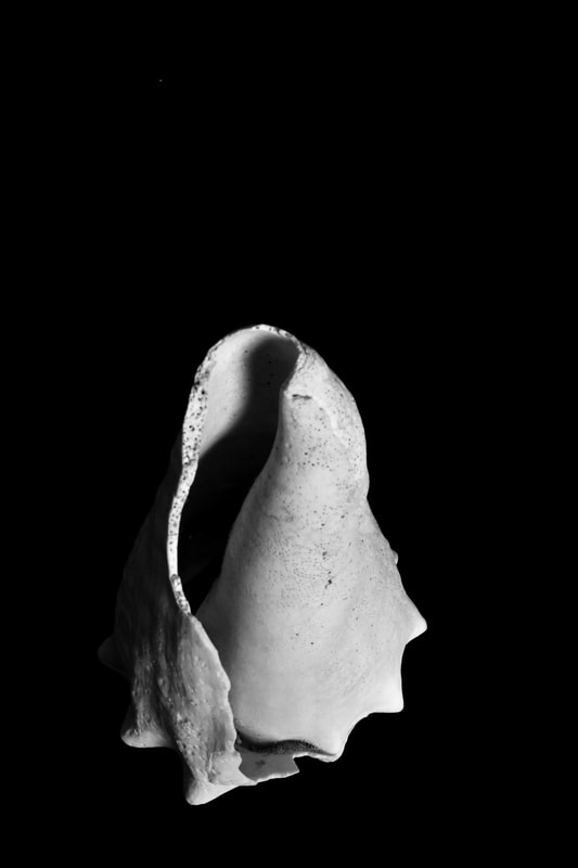
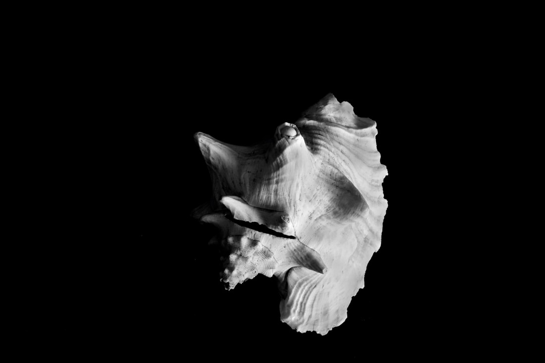
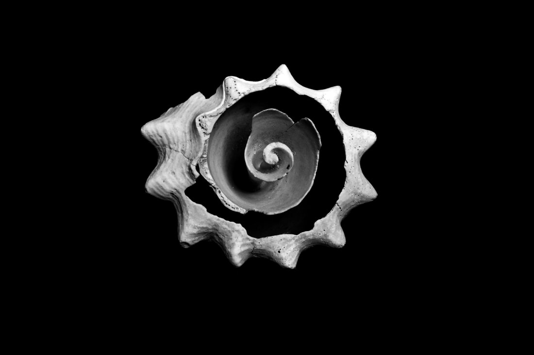
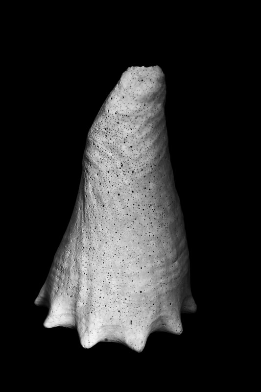
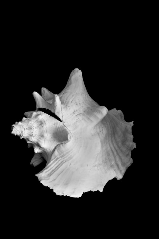
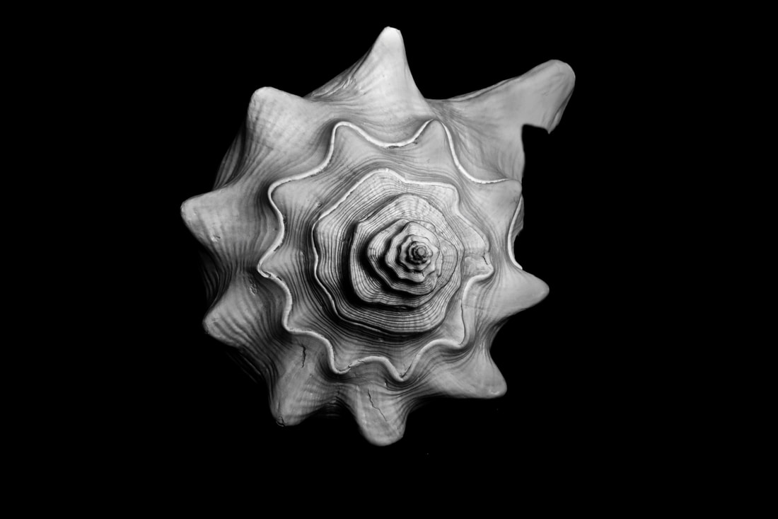
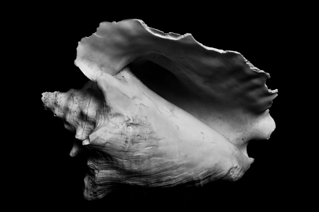
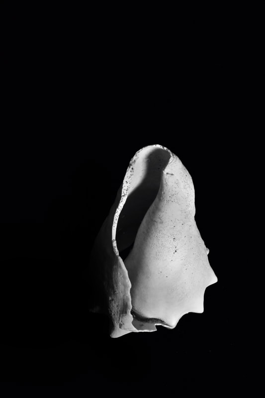
For this strand I'm inspired by the still lives of Edward Weston. For Weston “The camera should be used for a recording of life, for rendering the very substance and quintessence of the thing itself". To do this, he would reduce the objects and subjects of his still life to their basics in highly detailed still lives. In response to this I have decided to use some shells that I own and photograph them at night on a black light with studio lights to highlight the shadows and crevices of the shells. This high contrast would allow me to capture the variations in form and structure of the shells but also be able to highlight how similar they are as a whole.
|
    |
|
|
|
|
|
EDITS
|
|
|
|
|
I think that this strand was extremely successful. I think that the studio lights and dark surroundings really helped to highlight the shadows and exacerbate the ridges and individualities of the shells. I also like the sense that the shells are suspended in a void. Even though the first shell does not give the appearance of suspension, how it appears as if it is visible over the brow of a hill. In the third last photograph the high contrast becomes almost geometric. However, some of the shells seem slightly out of focus and some of the shells have a jagged edge due to some having some previous breakage. Furthermore, on the penultimate photograph the texture at the bottom of the shell does not pair well with the lack of focus. However, I think the conical shell was the most successful due to it's smooth shape, it's dark inner and the texture of the sixth all make it the most aesthetically pleasing.
|
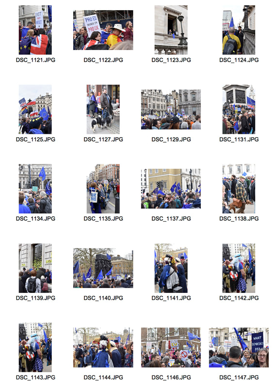
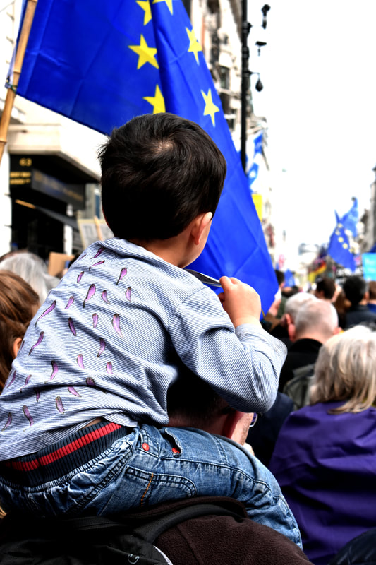
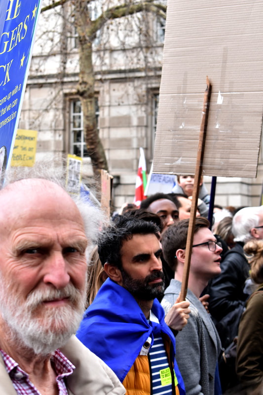
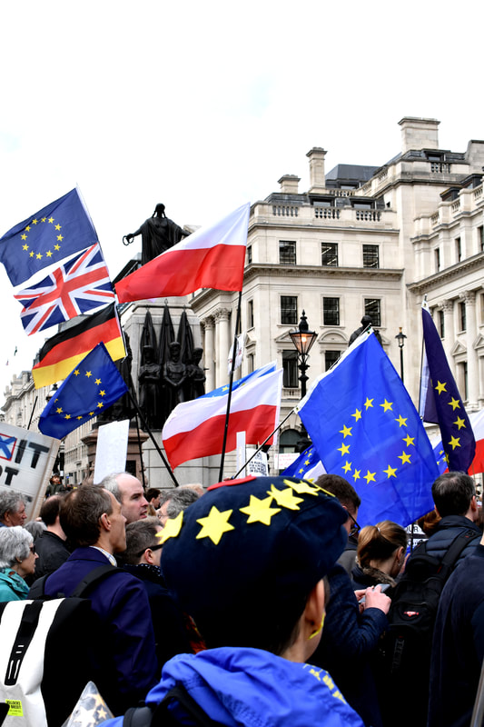
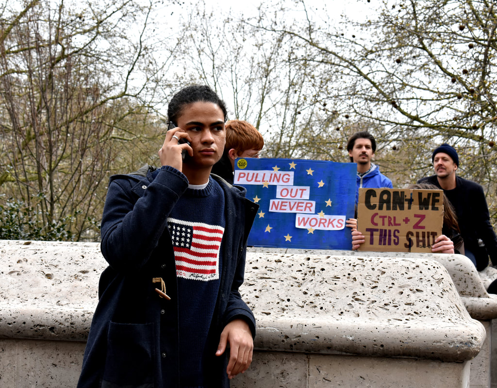
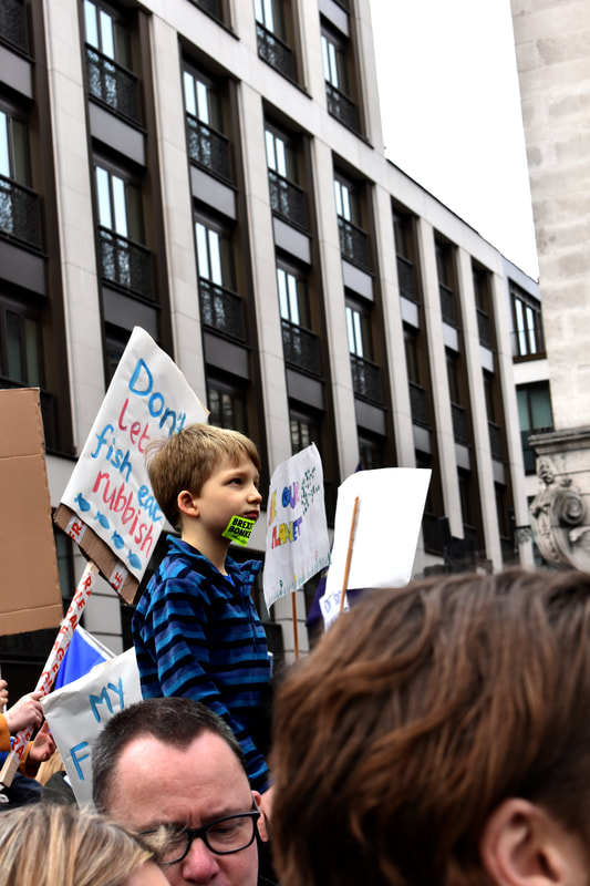
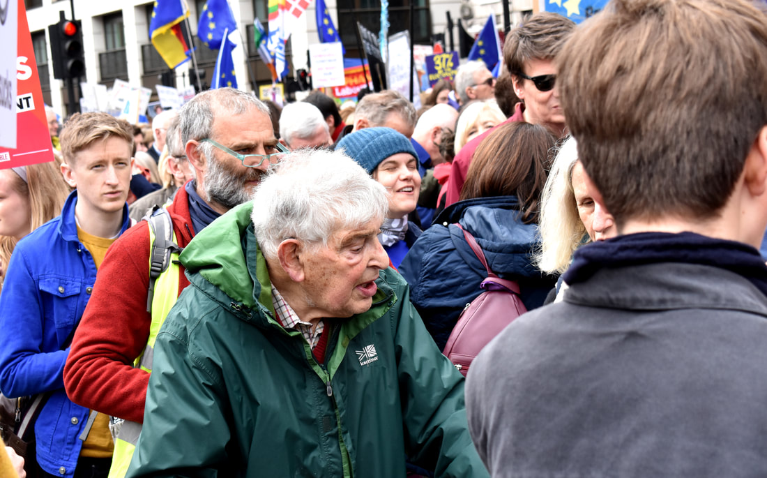
Strand 2: Protest
|
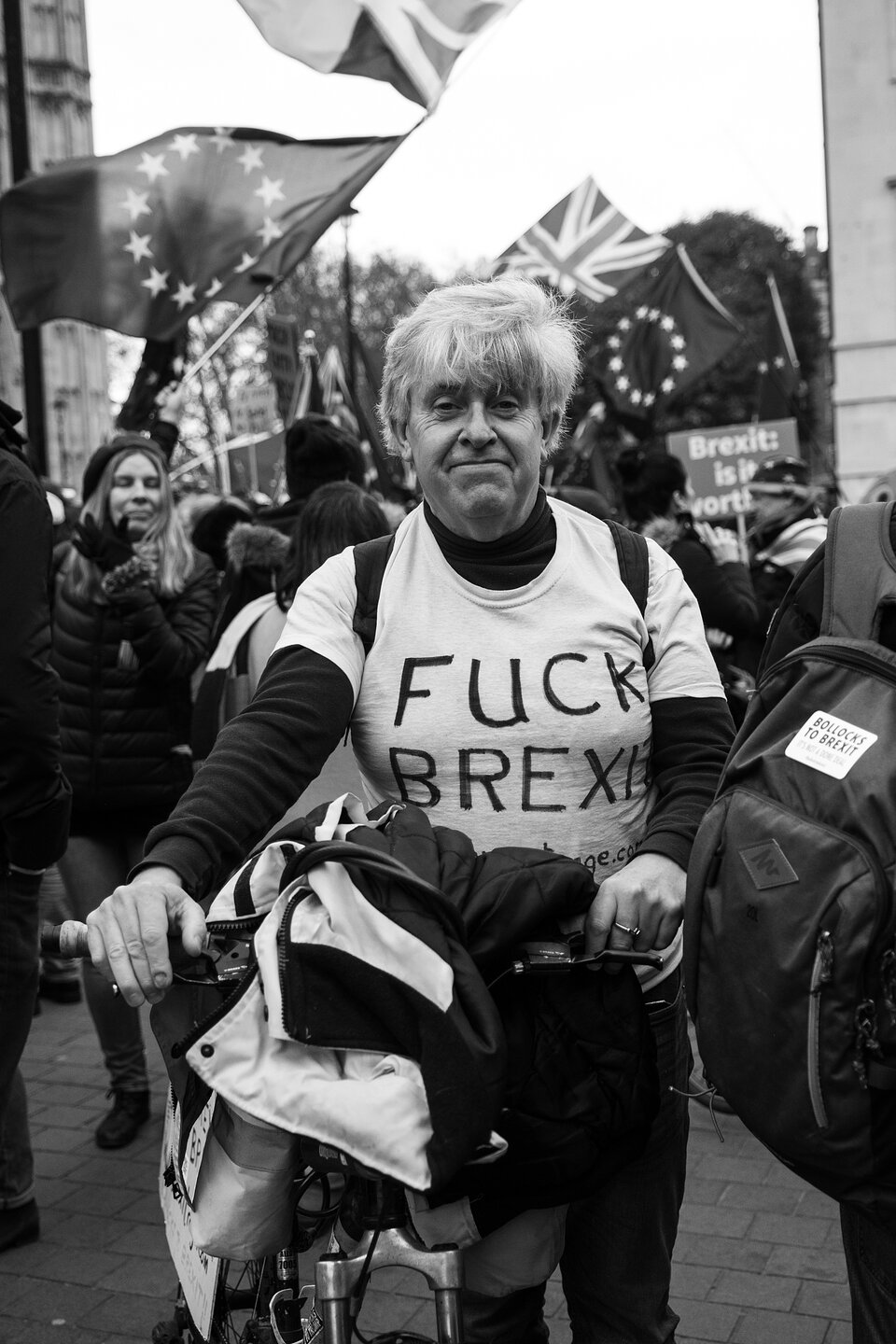
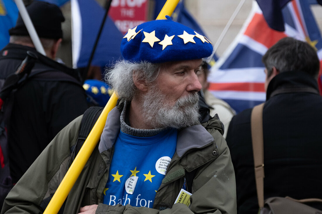
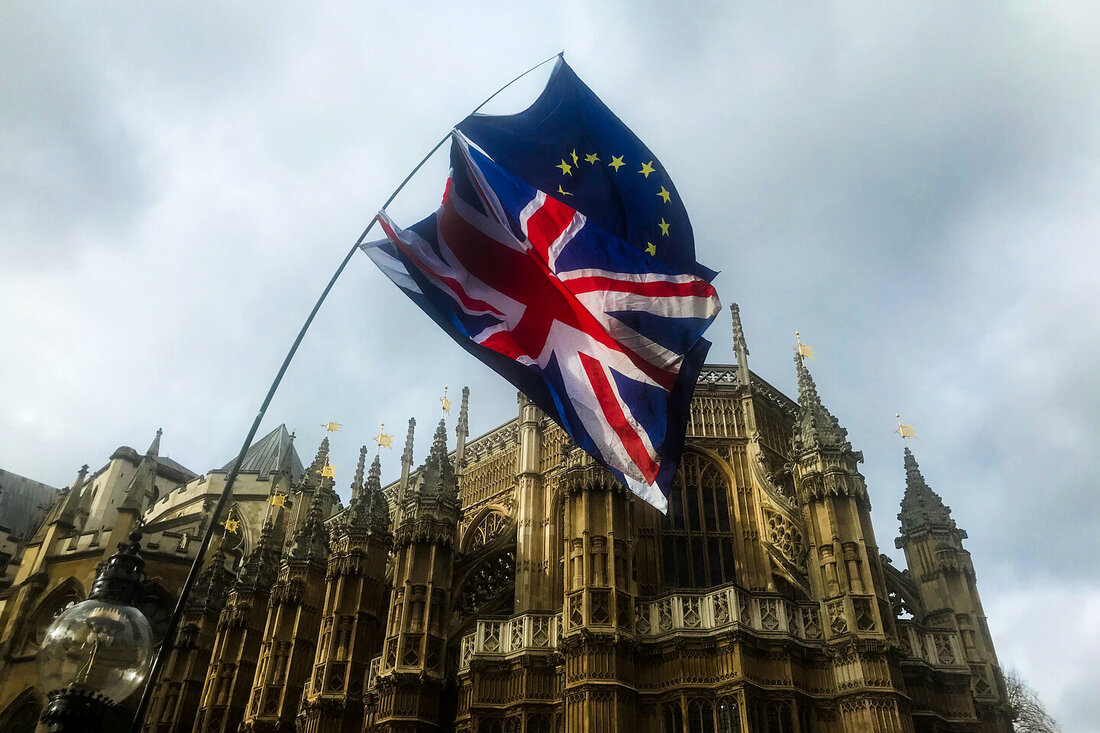
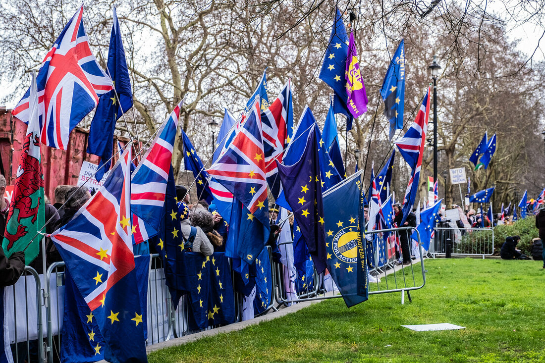
For this strand I wanted to document the recent political events around Brexit that dominate the media and dinner tables around the country. To do this I will go to the 'March to Stop Brexit' and try to document the people marching and their diversity. This is similar to the work of Robin Pope who documented both the pro and anti brexit protests across the last six months.
|
|
|
|
|
|
EDITS
|
|
|
|
|
|
|
|
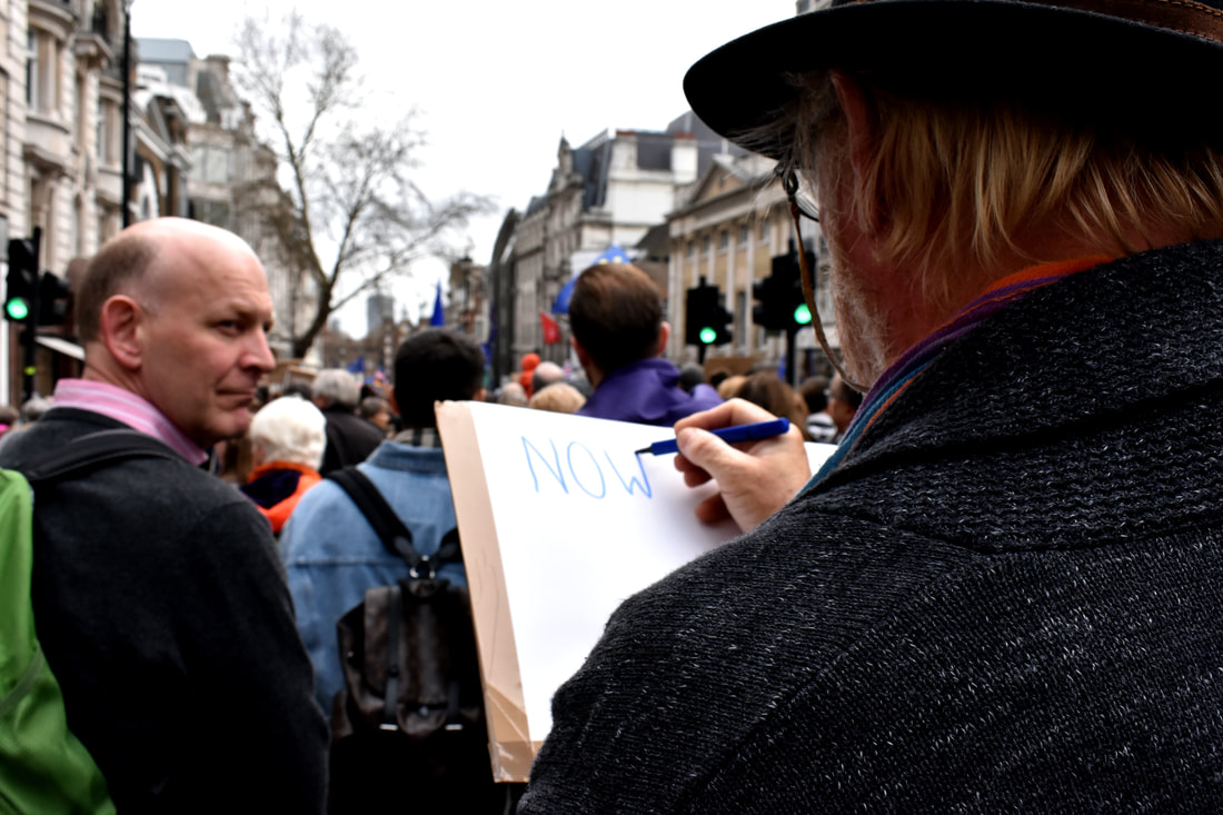
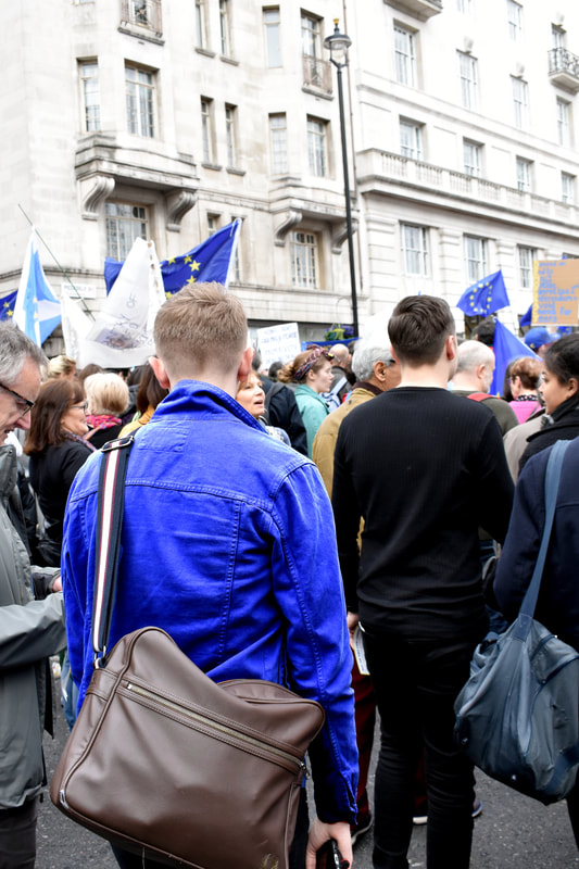
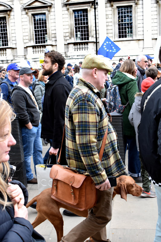
I think that this was also successful as I was able to document the march but also the individuality of multiple people there but the unison that runs throughout them and their individuality. I think that this is achieved through the line of blue throughout all of the photographs but also by focusing on individuals who stood out from everyone else's conformity. One criticism, I could mount against the photographs is that the perspective is consistently of that of an outsider looking in, however, this is because I wanted to capture individuals who stood out from the crowd and because In the mass of the protest there was minimal movement so to capture more individuals I had to go on the outside to cover a greater proportion of the protests.
Typology
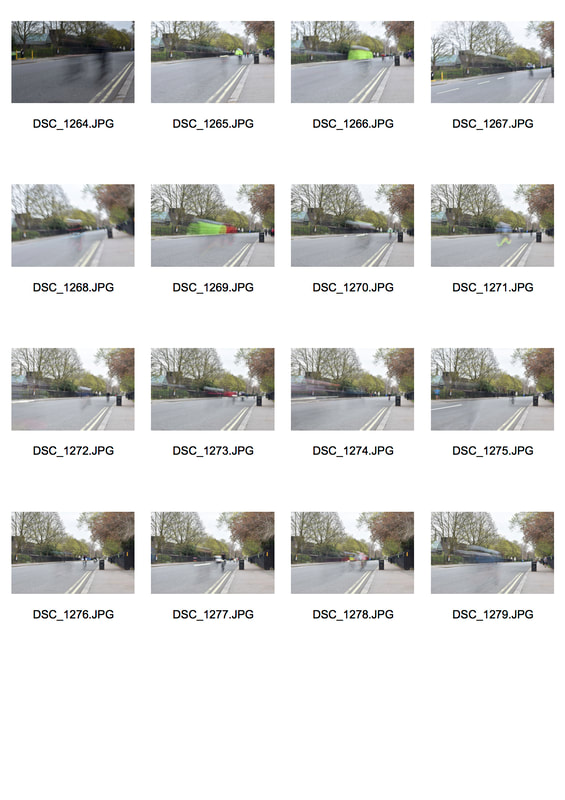
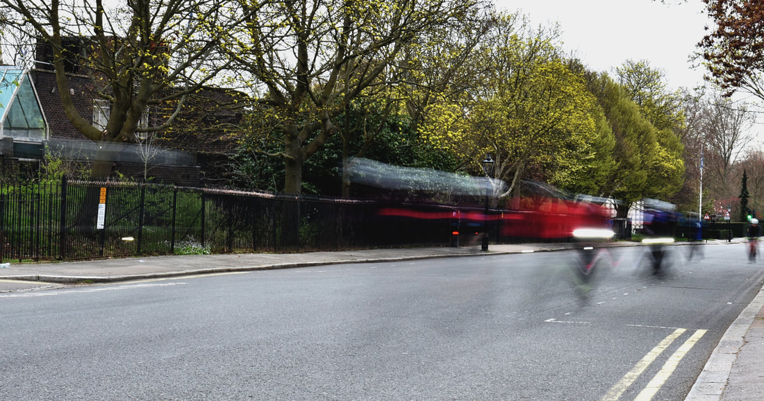
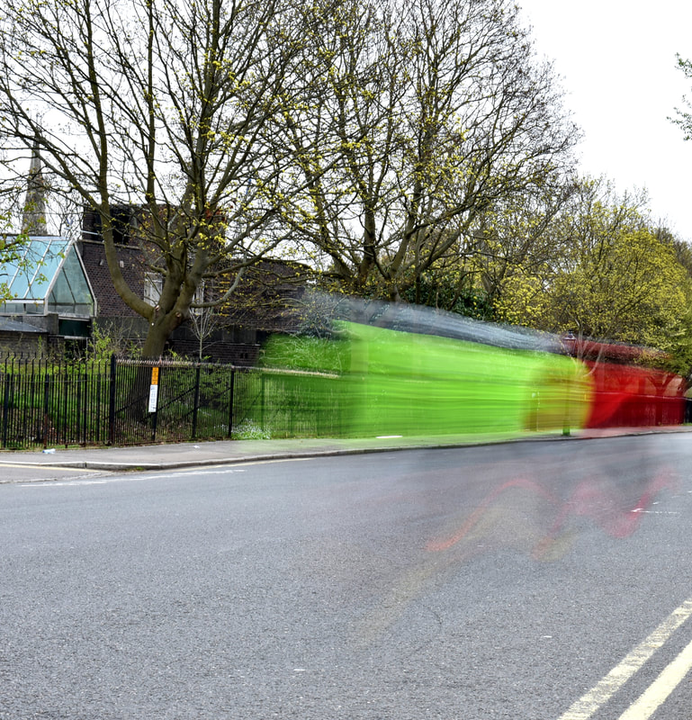
For this task I want to provide an interpretation of typology through documenting the cyclists at Regent's Park that repeatedly circle it for exercise. Each cyclist rides differently and are individual from their bike to their clothing but are still all doing the same circular, repetitive activity.
|
|
EDITS
|
|
I decided that I wanted to use a long exposure so as to further blur the boundaries of their identity and impart the sense of motion, often used in sport photography, but the inversion of what I have done. I think that there is some partial success in the photographs in capturing both the sense of repetitive motion, in the images this can be seen by the zig-zag effect created by the motion blur, and creating an anonymity for the cyclists. However, I find the colouration overly saturated and the surroundings boring and uninspiring. The pieces remind me of an inverse of the work of Christian Nicolas and Eyal Weizman in 'Random Walk' where the whole image is stretched and the background becomes completely abstract.
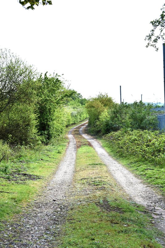
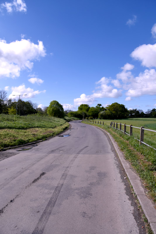
First Development
|
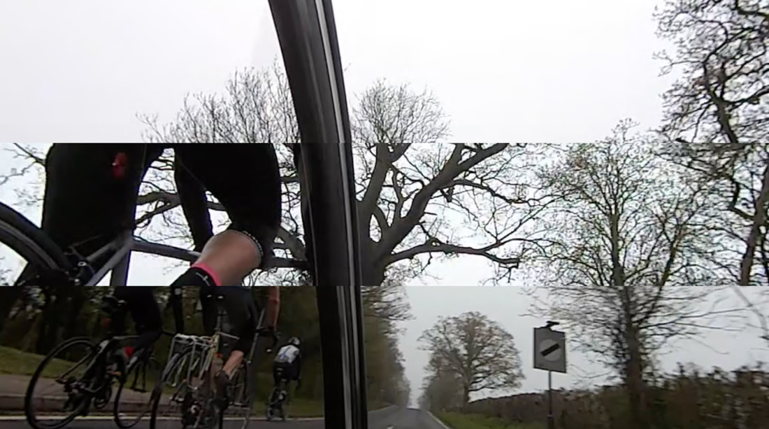
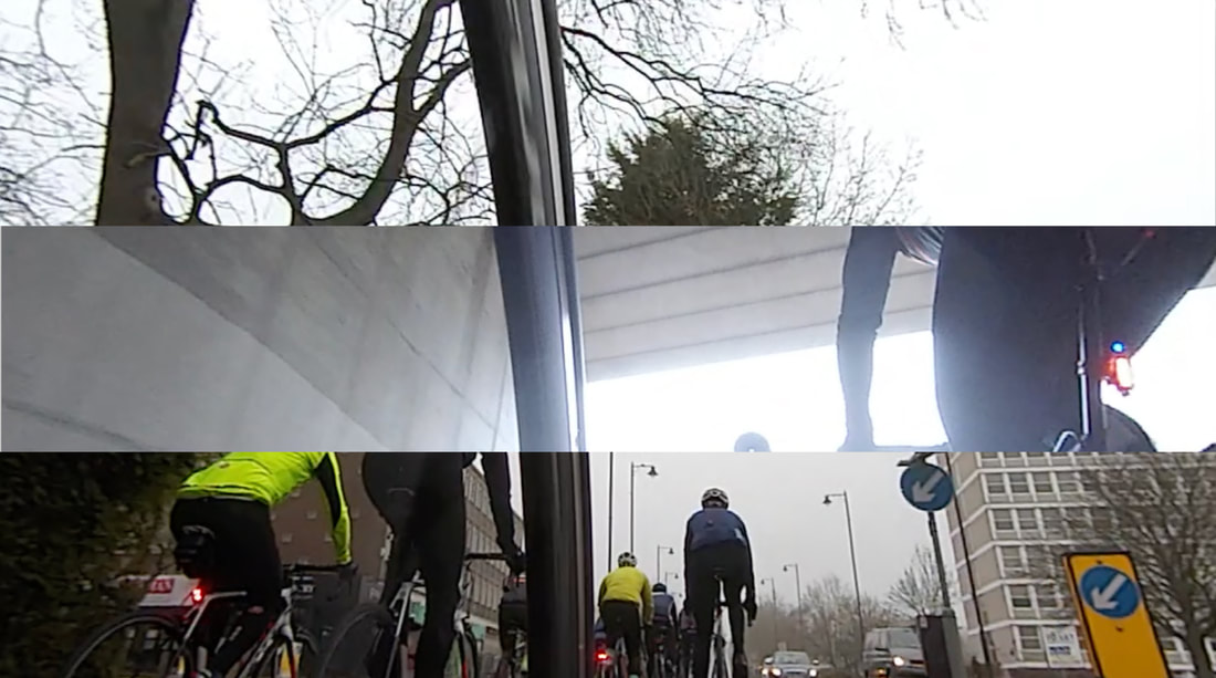
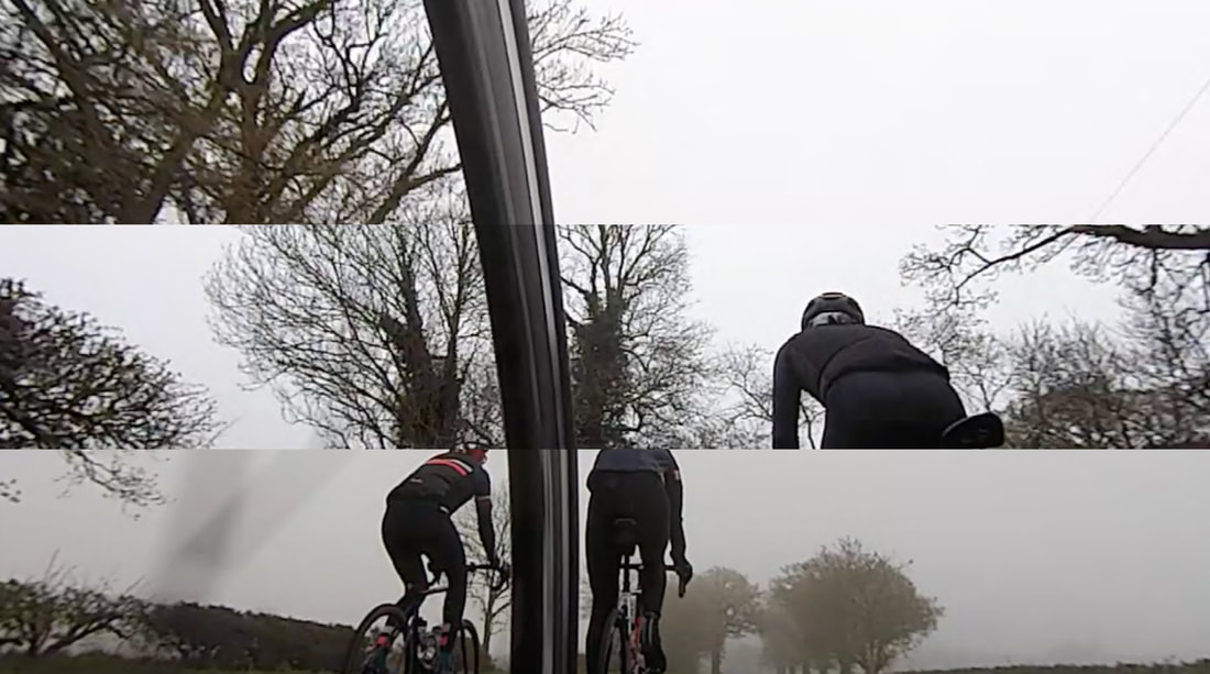
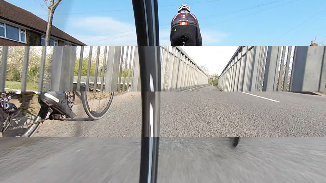
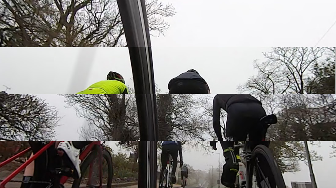
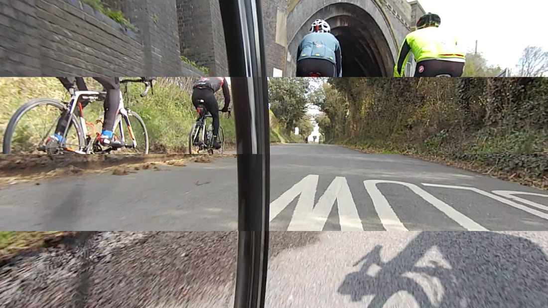
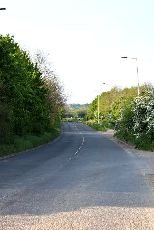
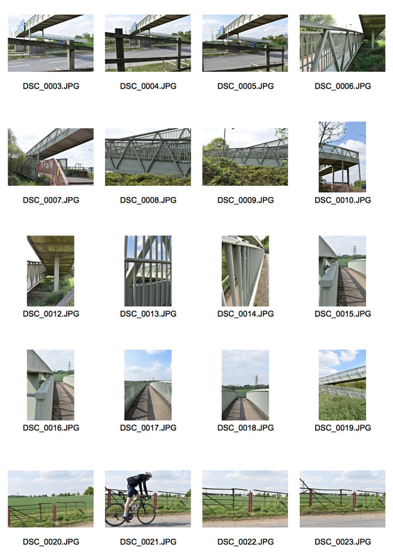
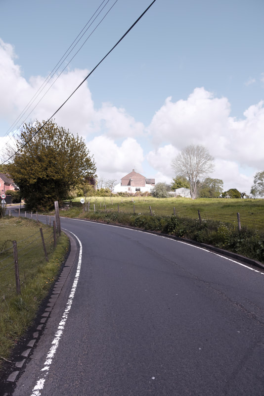
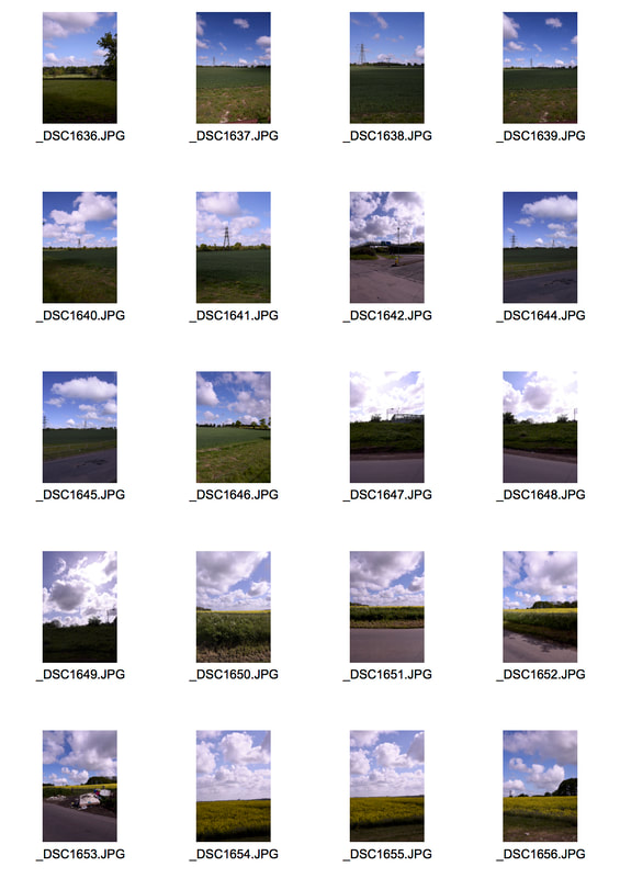
For this first development, I want to capture the journey that I go on every Sunday. Documenting the transition from the urban environment to the desired countryside. I will use my HTC RE and strap it to my front fork so I have the curvature of the rim as a constant in my photographs.
|
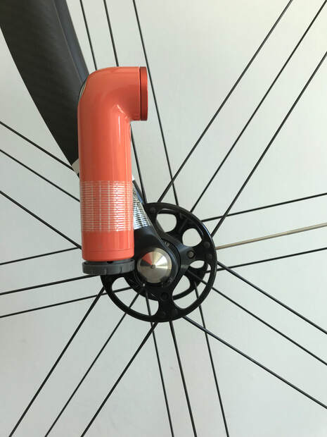
The Setup I used to film my journeys
|
|
|
|
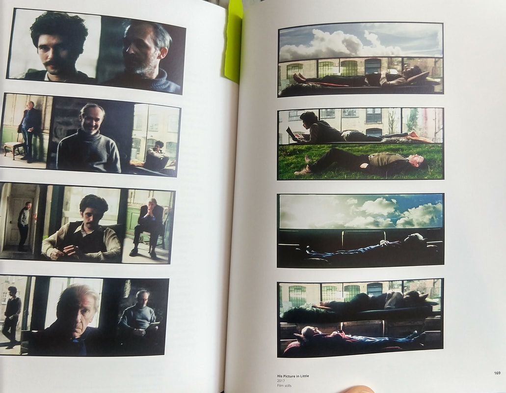
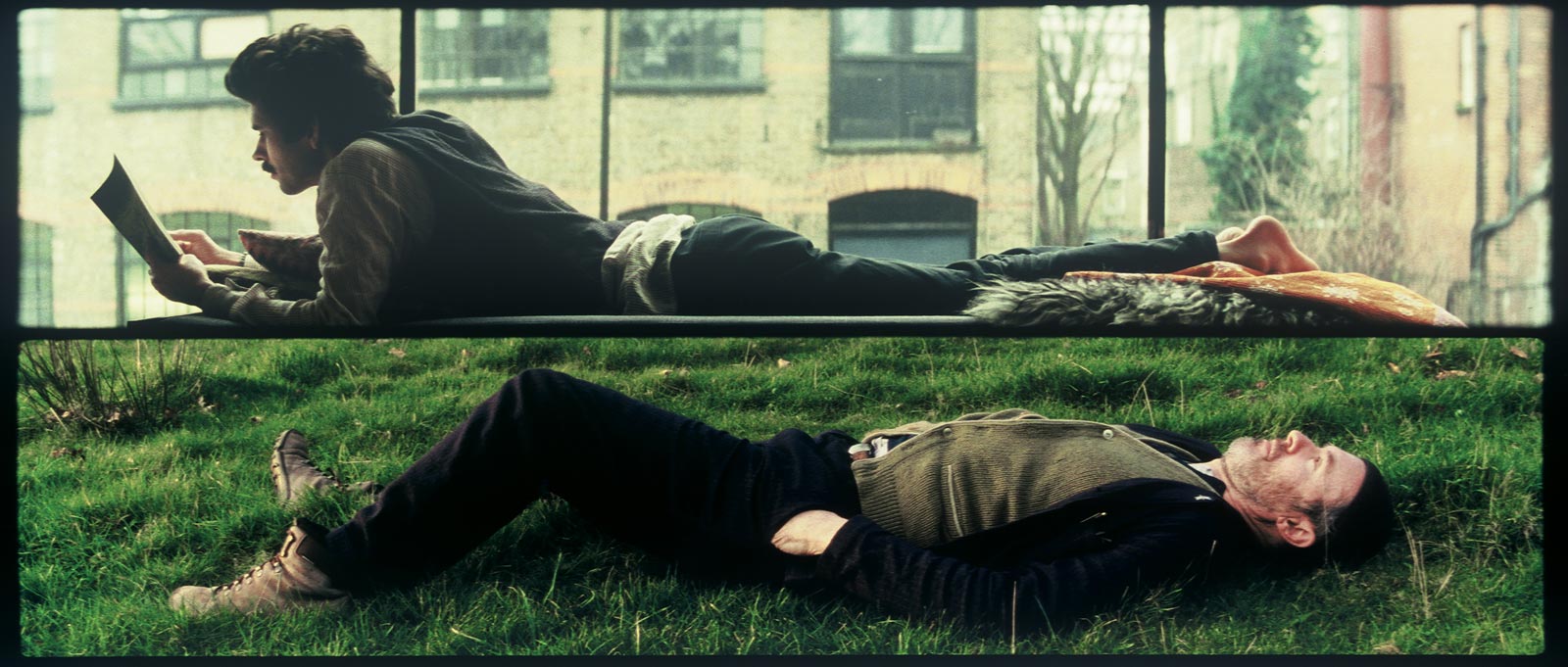
I think that there were certain successes in this development. I think that they successfully convey the sense of changing landscapes but also convey a sense of community and the group in the photographs through using this 3 way split. I was inspired by Tacita Dean's 'His picture in little', bottom right, to do this split. In this work, she borrows from a line in Shakespeare's Hamlet and depicts three different actors, Stephen Dillane, David Warner and Ben Whishaw, who have played Hamlet in different films at different time periods.
|
  |
Second Development
|
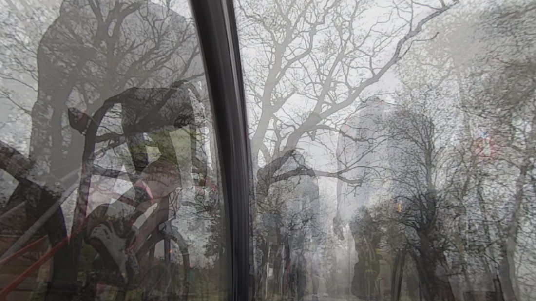
For this second development I want to capture the sense of movement that is experienced during riding. To do this I will overlay multiple photographs with different opacities to create a feeling of being in a temporary moment as it fades away into the distance. This is inspired by one of Tomato Project's works where they have overlaid multiple slightly blurred photographs of trees to overwhelm the audience. This is also done with different environments such as motorways.
|
|
|
|
I think that this strand was quite successful, in that I was able to capture a sense of movement in the photograph but I think in general it captures the sense of a fleeting moment and the temporality of cycling as the environment quickly changes and is quickly forgotten. I think that the GIF also had some successes, in that some segments seem to be continuous and in sequence but also that it documents well the change from town to countryside. However, I think that it sometimes lurches too much between some scenes. Furthermore, I don't think that the grey skies suit the GIF that well as it becomes overly grim, and detracts some life away from the footage. However, in contrast I think that the grey skies and grim weather suits the photograph, as it creates a ghostly atmosphere.
Third Development
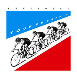
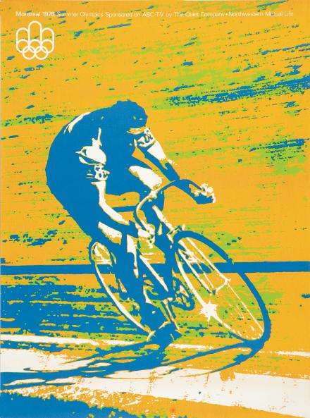
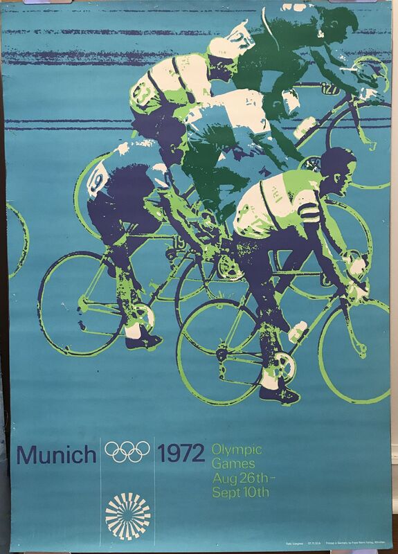
For this third development I want to explore with turning the new layered photographs into graphic prints, through block colours similar to the aesthetic of the 1972 Munich Olympics or even Kraftwerk's 'Tour de France' album cover. Otl Aicher was the leading designer of the Munich Olympics graphic design and designed the Pictograms that are most remembered and later influenced his design of the Lufthansa logo. For his posters of the sports themselves, he colour blocked the photographs and paired with soft secondary shades layered on top of each other helped create a unique poster that is celebrated among graphic designers. Kraftwerk's 'Tour De France' Poster was potentially made by the designer Emil Schult and was made of four cyclists from a 1953 Hungarian postage stamp in a paceline.
|
|
|
I think that this was very successful,I like the contrast between the red and green cyclists and how they react, clashing while combining in other areas. Furthermore, the choice of the complementary colours further help exacerbate the difference as the trees expand over the silhouette of the centre cyclist. However, I think where the trees become complicated and overly dense it creates too much noise and is definitely less successful. Furthermore, the cyclist on the left is too obvious and not a silhouette, therefore creating too much noise in the photograph.
Fourth Development
|
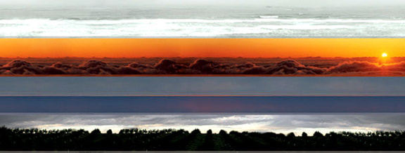
For this development I want to return to a similar style to the first development, however, I want to split the photographs into 4, to create a further sense of movement and travel. I have decided to experiment with doing more splices in the photograph, due to the work of Rebeca Mendez. In Rebeca Mendez's 'Homeland' Series she recreates the different Homeland Security coloured threat levels in 24 different panorama. From 'Peace White' to 'Severe Red' through layering multiple different horizons to create the colour. The horizon lines of the landscapes have become new, imaginary landscapes where glaciers float over puffy clouds and Nordic cows graze on top of tropical waters. Mendez uses her own global documentary photography ranging from Patagonia to the Sahara desert. Méndez’s landscapes lure the audience to beyond the horizon, which she views as “the perpetual aim of humanity.”
|
    |
|
|
|
I don't think that this strand was particularly successful aesthetically, however, I feel that they did successfully convey a greater sense of travel. I think that the photograph directly above was the least successful as the colour scheme is overly monotonous and bland, with the only real colour coming from the top layer while the rest blend into one grey mass. I think that the top right image was actually the most successful as the layers all intersplice and all contrast as there are no layers that continue and create a smooth transition. I think that the photograph to the right was fine but the highlight has to be, in contrast to the top right photograph, the smooth transition on the middle layers to the right side of the wheel as it seems to be the same road but is clearly not when observed on the inside of the wheel.
|
|
Fifth Development
|
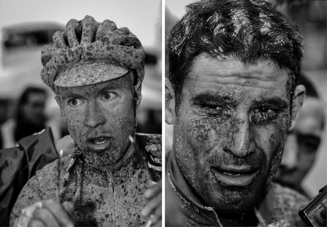
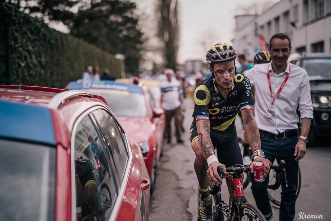
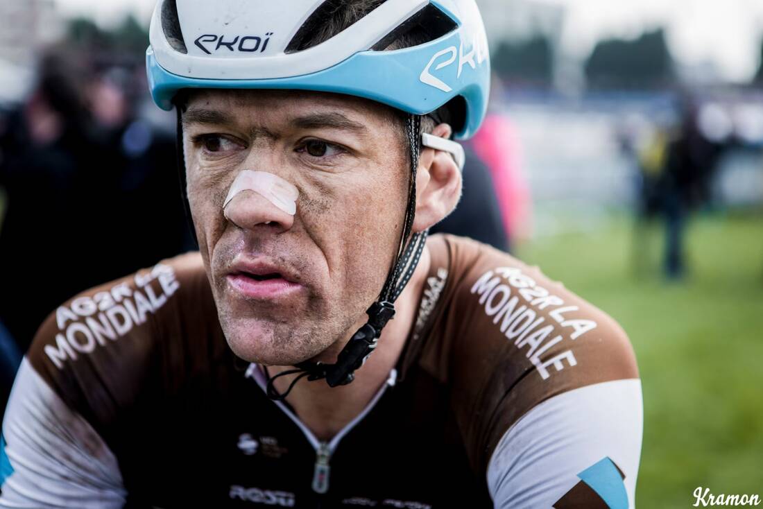
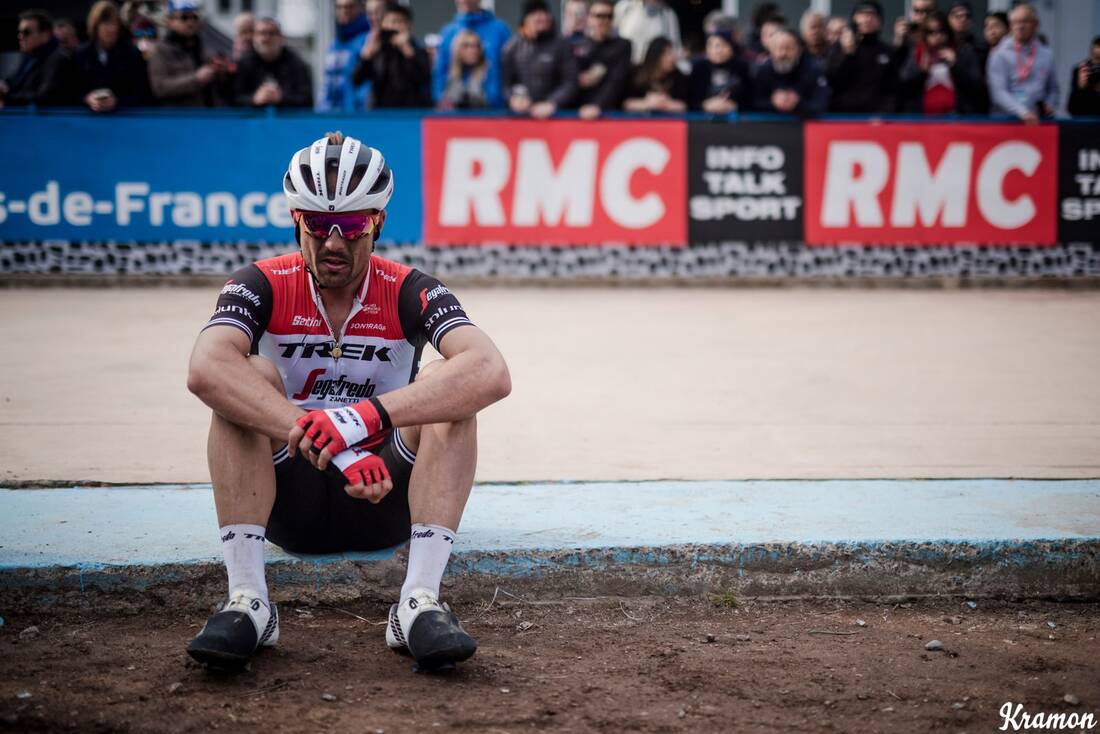
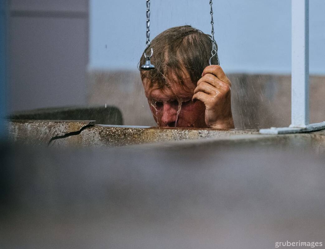
On this development I want to capture the community that revolves around cycling due to the sport's inherent social nature from the cafe stop to the chatting while riding. I have decided that I will use my DSLR and then turn the portraits into black and white in post-production so I can have more control over the contrast and depth of the black and white. I wanted to recreate the atmosphere and pain that is often photographed after a race, in particular Paris Roubaix. Paris Roubaix is arguably one of the hardest races in professional cycling due to it's long distance and multiple kilometres over french cobbles, built for miners. Due to this, the photographs after the race are often extremely unflattering as the riders have completely exhausted their energy and are covered in dust or mud.
|
|
|
|
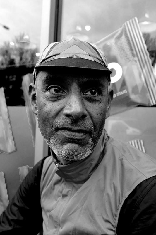
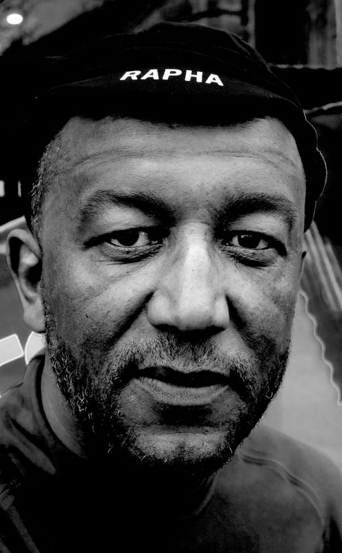
I think that this strand was extremely successful, however, there was definitely a variation in how successful some of the images were due to my shyness. Due to this on some of the portraits, I delayed asking people for a portrait so they were able to recover and there expressions became more rejuvenated and less tired. The first, third and fourth photographs were the msot successful as they were taken immediately, so the riders were much more tired and worn. Furthermore, as it had a brick background there was a greater emphasis and focus on the portrait compared to the noise that is in the second and fifth photographs. I think that the high contrast that was created in the post-production really helped exaggerate the weariness on the rider's faces and expressions.
Sixth Development
|
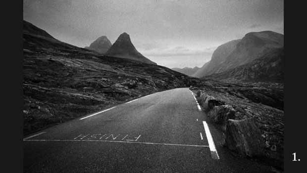
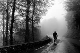
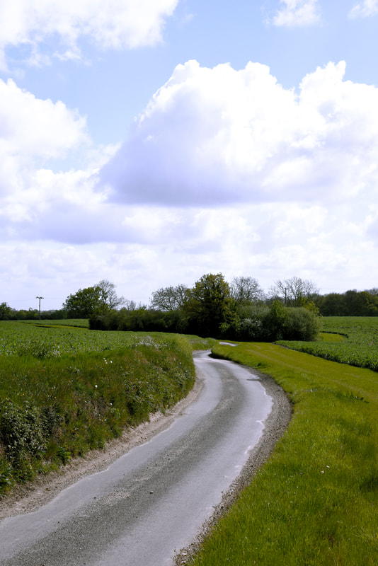
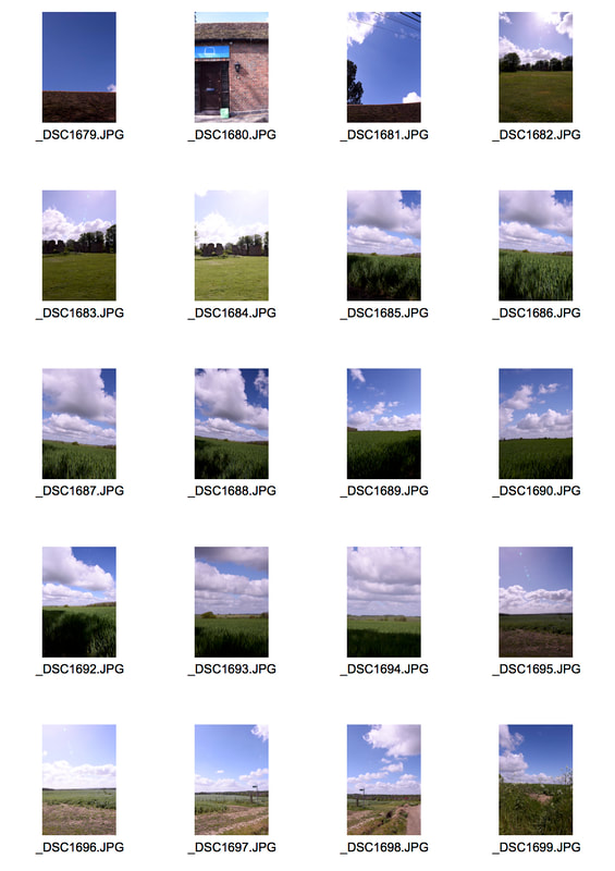
For this development I want to capture the empty road ahead, to try and create the sense of adventure and the unknown, that is experienced when riding a bike out in the countryside or when on a road trip. This was inspired by Ben Ingham's 'Journey', a homage to the roads that connect everything and allow us to travel. It is in fact a series of photographs from all of his explorations and journeys, whether that be the empty, roads, his ride companions or the culture that surrounds him.
|
    |
|
|
|
|
|
|
I think that this development was actually quite successful as I was able to create that sense of the unknown beyond the photograph but also show the monotony that exists in cycling. However, the main issue is that the photographs were taken in a small size and so was unusable for printing as they were barely able to be printed in a4. However, the photographs themselves did also create a sense of adventure especially on the gravel roads.
Seventh Development
|
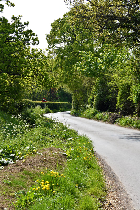
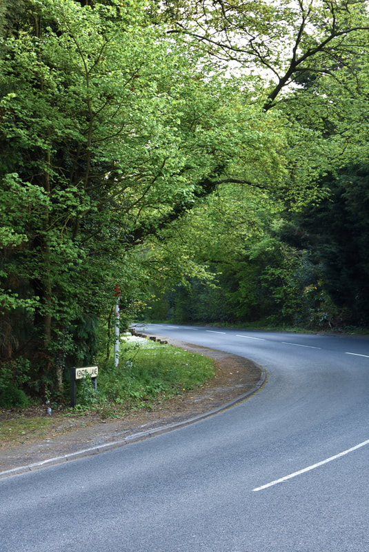
For this development I want to create a story of the journey itself, so in contrast to the film constantly capturing a part of the journey. I want to document the change in landscape across the ride but also attempt to photograph certain buildings that will create a certain sense of abandon or the typical British countryside. I want to have the photographs have a similar colouration to the work of Jack Orton.
|
    |
|
|
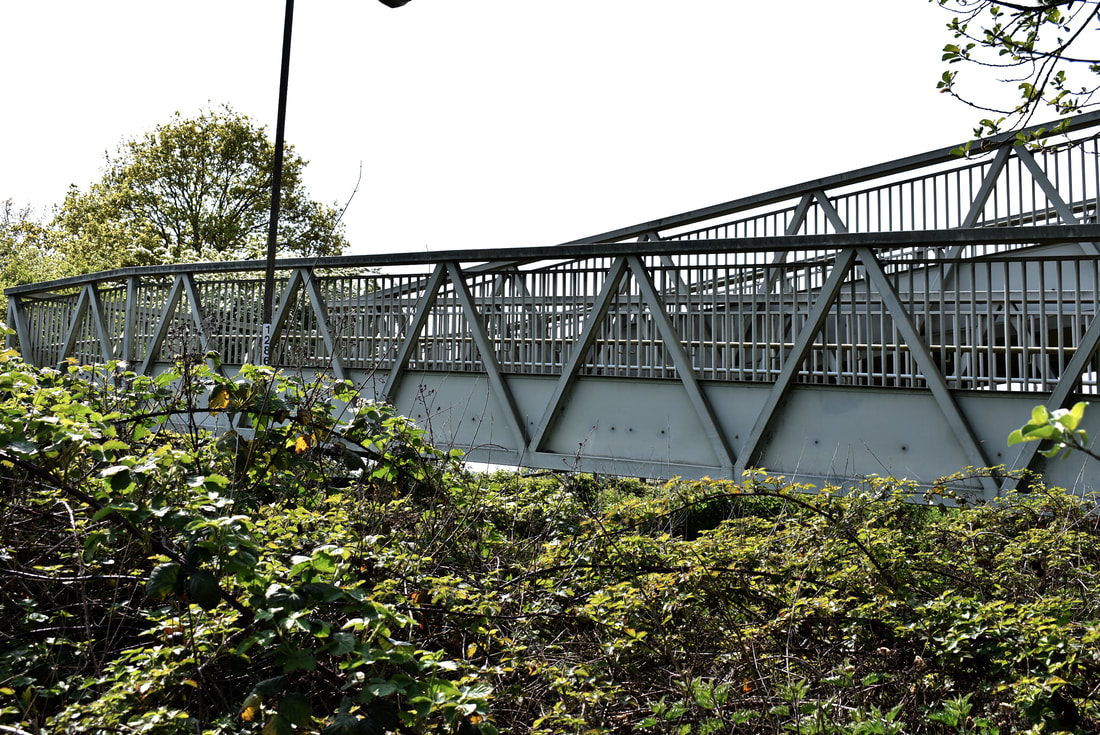
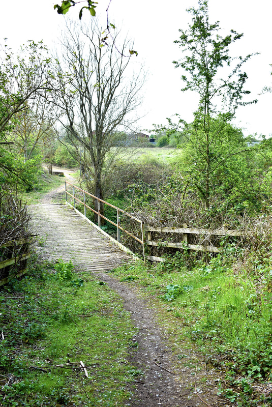
I think that this strand was quite successful, even though I was not able to get the colour palette of Orton's work as he often photographs in bleached areas full of sandy architecture and bright light compared to the vivid greens that surrounded me when I was photographing. Regardless of my inability to achieve that colouration I think that it was still successful as the colour palette ranged greatly. I think that the bottom right photograph was the most similar to that of Orton's work and I feel that it does portray an archetypal British village shop. Furthermore the contrasting vein of red colour provides a nice contrast to the rest of the lightly coloured buildings and sky. I think that the top right photograph provides a contrast to the rest of the photographs due to it's evening lights but similar to the others it is particularly patchwork from the tarmac to the building. While the directly above photograph I think is particularly pleasant due to how the metallic bridge creates a border between the thick green bush and the white sky. However, similar to the above development I had forgotten to change my image size to large from small and so sadly the photographs are too small to print.
|
|
|
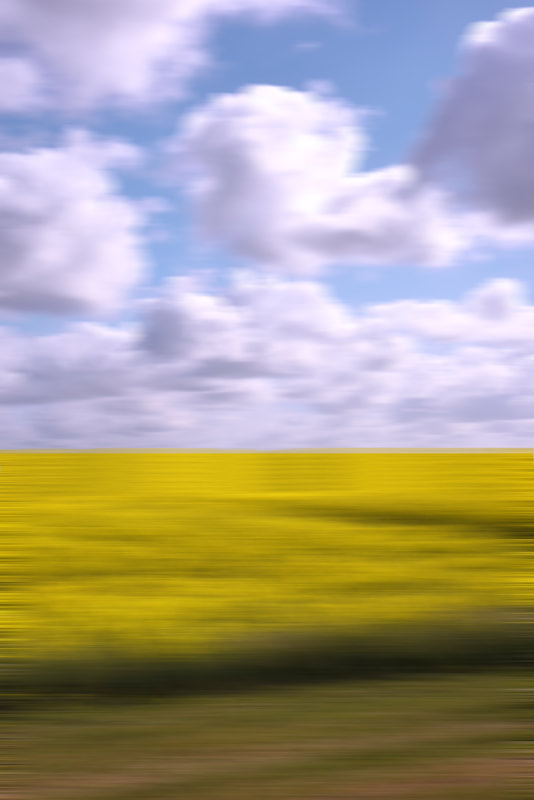
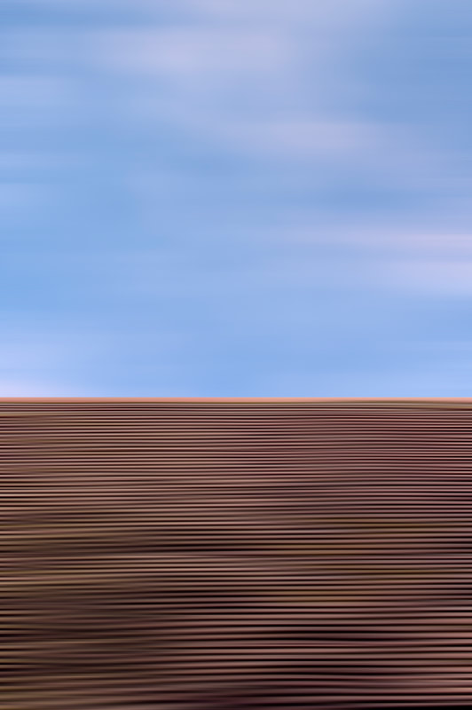
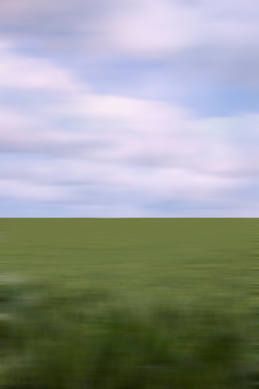
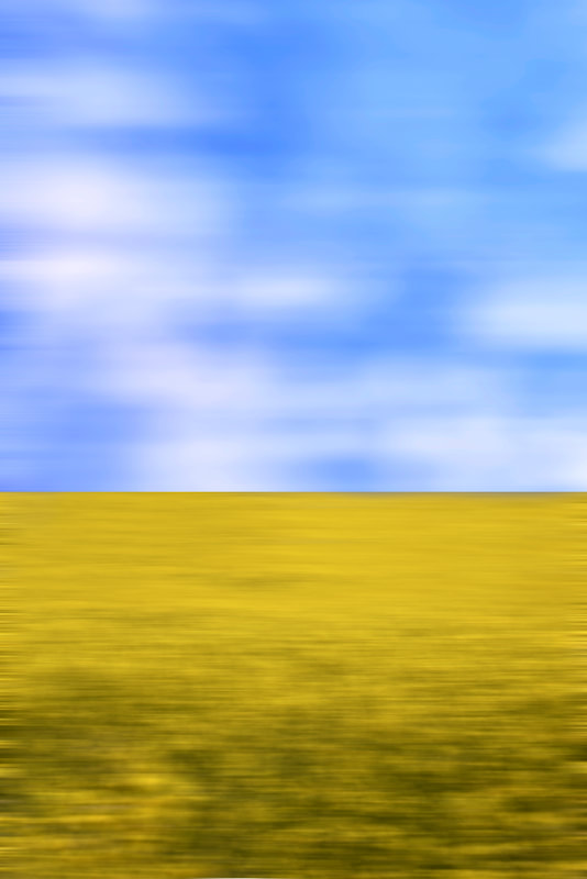
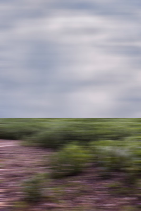
When looking through my photographs from the journey, I noticed that some of the photographs across fields had a nice horizon line between the field and the grey sky. This reminded me of Andreas Gursky's 'Utah' and 'Tokyo' taken from trains to attempt to create the sense of motion in the photograph that you experience when cycling. In response to this idea, I decided too create a harsh horizon between the field and the sky, removing the treeline that was often in the photograph. After that I would completely motion blur the photograph, to recreate the sense of motion as the landscapes rapidly fly by. Both his'Tokyo' and'Utah' works were taken from a train of a landscape. For 'Tokyo' he constructed the image through a collage of multiple individual intricacies from a Japanese high speed train. The foreground of the image is obviously out of focus but multiple buildings around the photograph are blurred reinforcing the sense of motion. In contrast, 'Utah' was inspired by a photograph on his phone out of a car consisting of the quintessential American wild west, basis of multiple films and fantasies.
|
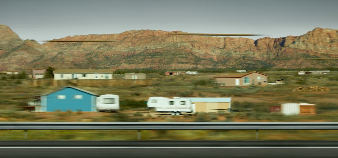
Utah
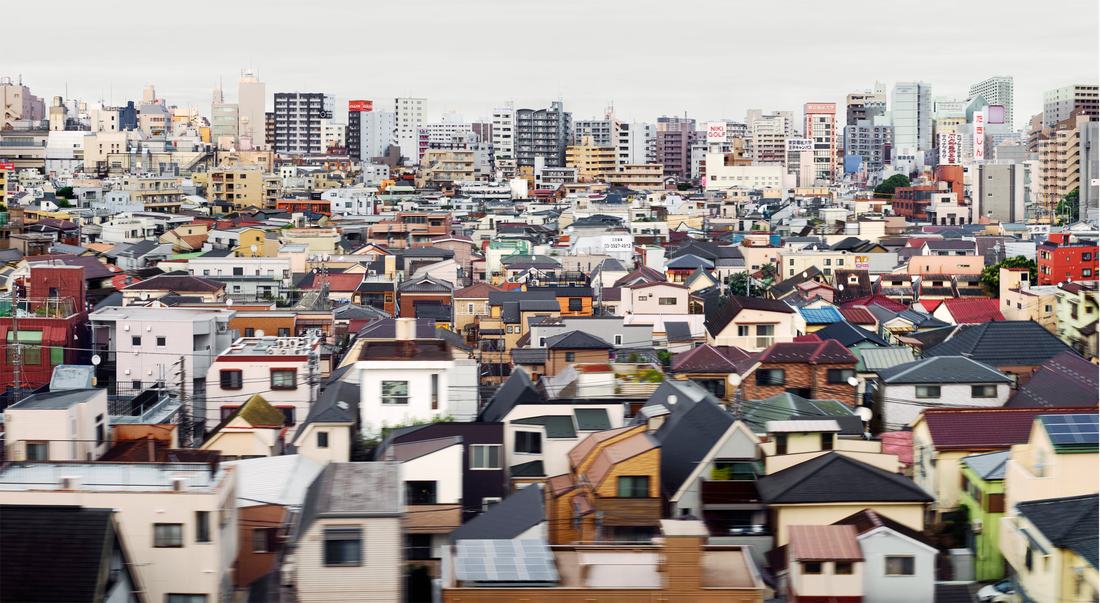
Tokyo
|
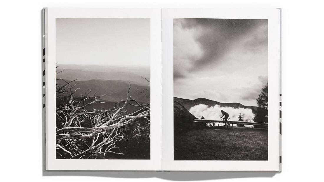
Eighth Development
For this development I wanted to revisit the empty roads and the sense of unknown that I explored in my sixth development but due to the low image size, I want to revisit it, incase I want to make prints from them and give a greater emphasis on the empty roads.
|
|
|
|
|
I think that this strand was quite successful, I do not think that the two above are as good as my previous road portraits. However, I think that compositionally they are more interesting and seem more open to exploration as the road winds away from view under trees or around a hillock. They are also more independent and singular compared to the monotony of the previous ones as my intentions were different. I think that the photograph to the left is highly successful from the colouration, that reminds me of Jack Orton, due to the pink hint and very light and pale blue skies.
|
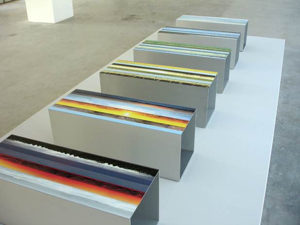
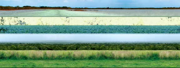
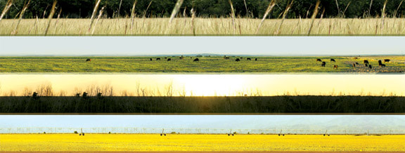
FINAL PIECE
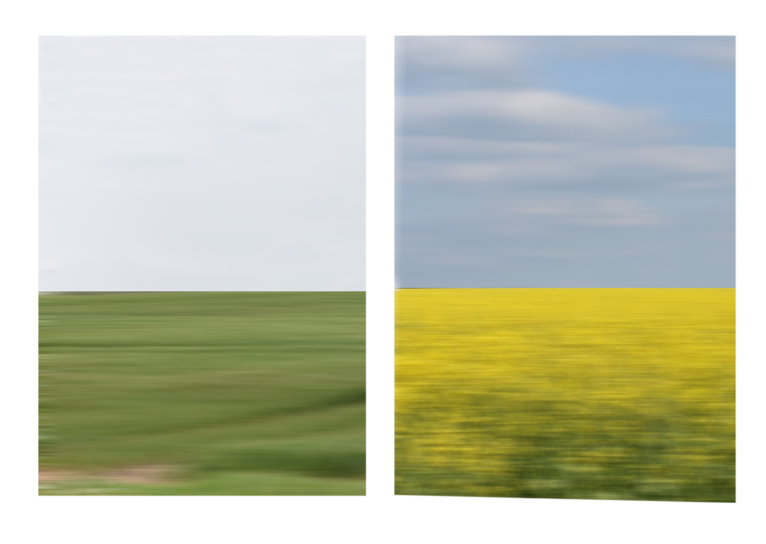
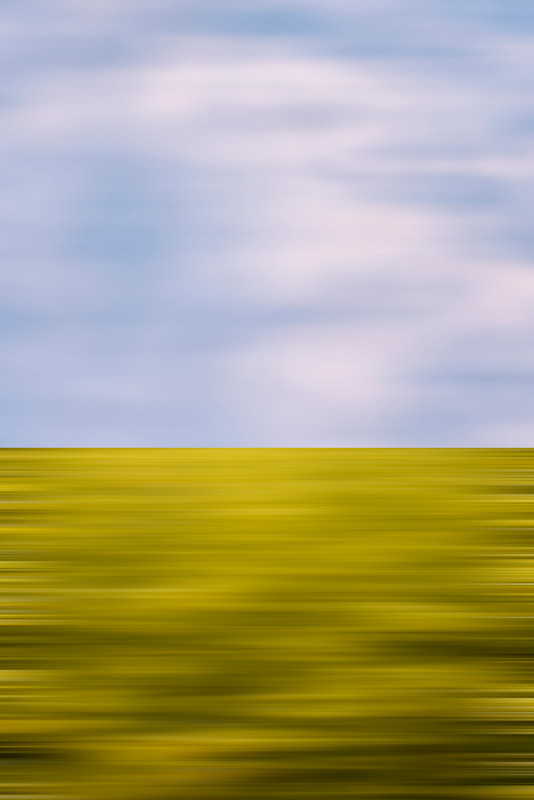
For my final piece, there will be three different segments: six horizons, a film and two enlarged newspaper prints. The six horizons are there to recreate the sense of movement as the landscapes flash past and become a blur when cycling. Similar to the experience of looking out of a car window. I decided to make the prints particularly abstract and minimalist as a contrast to the grittiness and realism of the other parts of my final piece. This abstraction is furthered by the sharp horizonline that splits the photograph in the exact same place as a continuum.
|
|
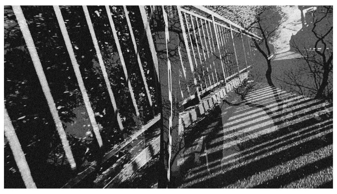
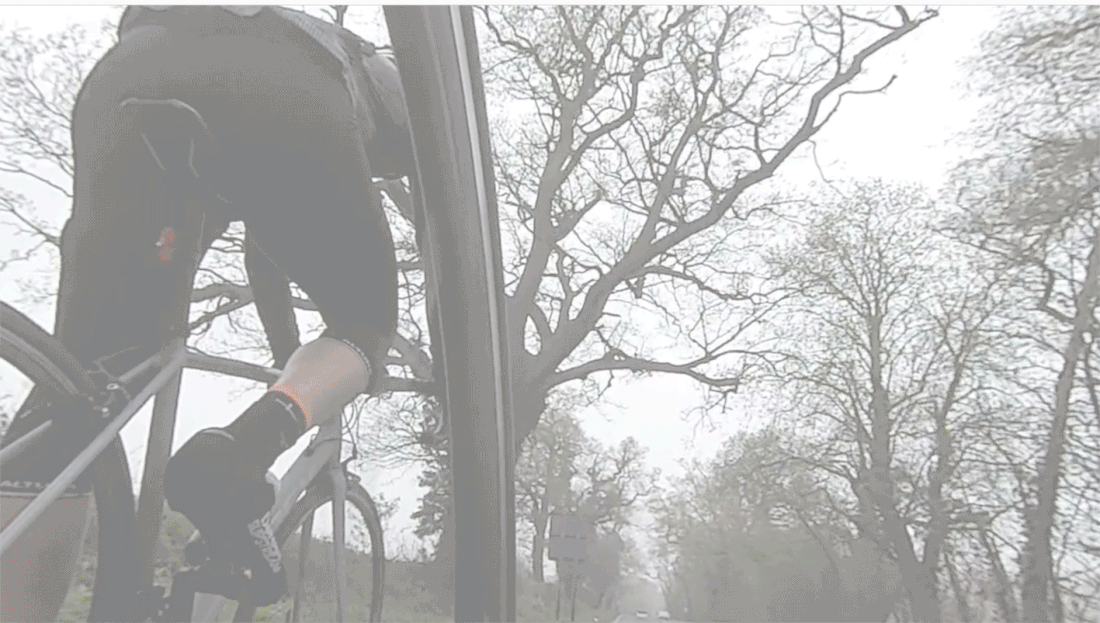
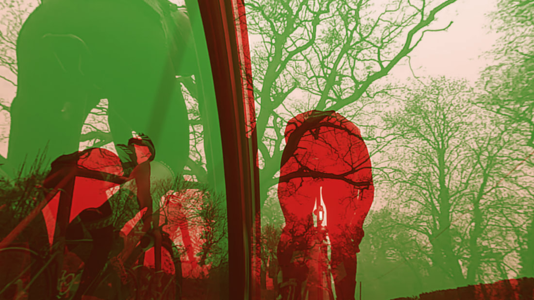
THE FILM
|
For the film, I was inspired by the Underworld Drift Ep.3 Part.5 'Poet Cat' where the Japanese road paint overlaps and clashes continuously. I was aiming to overlay multiple different camera angles of different parts of the bikes, replacing the road paint with the mechanical actions of the bikes.
To start with making the film I overlaid the empty country lanes over the journey outside to the countryside. After that I planned to |
|
|
|
further overlay other angles of the bike such as the gear changing or the revolution of the legs or pedal stroke. However, I realised that the solo adventure out in the countryside overlaid on the group ride in the city became dreamlike. So I changed my plan from a celebration of the mechanicality of the bike to creating a dream of the freedom that the bike provides to the rider once out side the confines of the city. This is why it starts off with a short introduction of the boring restrictions of the city before the dreams of fields and forests begins.
|
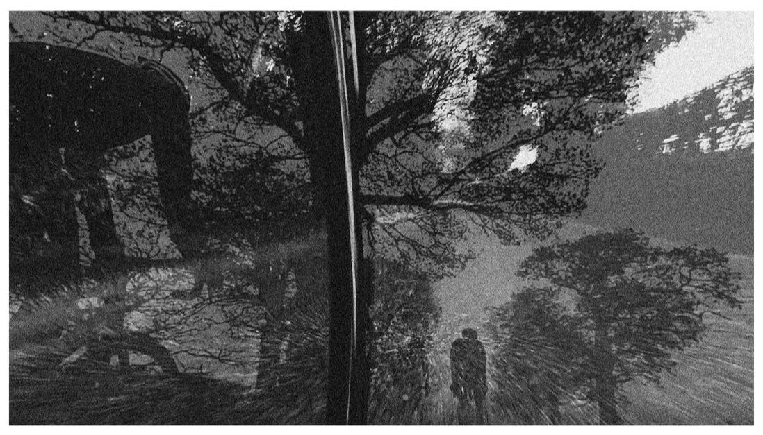
NEWSPAPER PRINTS
Originally I did not plan to have any more than just the film and the six horizons. However, once the film had been made I realised that some stills of the film had extremely interesting compositions and contrasting shapes and silhouettes especially on the scene as I cross the bridge. I decided to blow them up large, as the quality of the photograph would be low quality regardless of the size of the print. Then to make the bad quality purposeful I put on a medium mezzo tint to create a newspaper quality to the print. I decided to print these out large and on thin paper to make it a physical nod to the temporality of the moment of the still and it's surroundings but also as a homage to newspapers and their importance to cycling. Newspapers own and have sponsored many of the largest cycling races, including the Tour De France, Giro D'italia and Ronde Van Vlaanderen all being founded by newspapers and many still being owned by newspapers today. The quality of the prints is similar to that of old black and white newspapers who often were more focused on cycling due to it's previous cultural relevance and importance.